Updated June 15, 2023

Introduction to Pie Chart in Tableau
The pie chart is an interactive way of visualizing data. Represented in a circular form, the chart is helpful when there is a need to determine the shares or contributions of various categories. The shares are essentially percentage shares in total contribution. The share size for a category corresponds with the angle of the sector that represents the category. In Tableau, Pie charts can be built with ease. Tableau offers a self-explanatory approach to building Pie charts. Pie charts can be very well incorporated into dashboards and, combined with other types of charts, generate excellent insights from data.
Building Pie Chart in Tableau
Now, through a step-by-step procedure, we see how to build an interactive Pie chart in Tableau. For this demonstration, we are considering the Sales by Region dataset. Critical dimensions present in the dataset are City and Quarter, while Sales is a measure. The dataset contains Sales for Regions (Cities acting as regional clusters) broken by quarter. We intend to analyze the percentage contribution of the significant regions for various quarters. This can be achieved through a pie chart.
Let us see the procedure to build a pie chart on the above dataset. This is described in the following section.
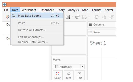
Step 1: To load the dataset into Tableau, click “New Data Source.” Alternatively, one can also click on “Connect to Data.”
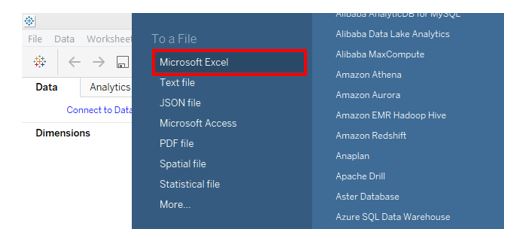
Step 2: Select the requisite data source type from the window that pops up. As shown by the below screenshot, in this case, the data source type is MS Excel, so we shall click over Microsoft Excel.
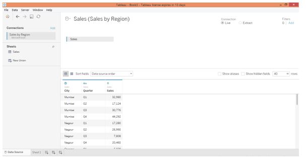
Step 3: When the dataset gets loaded, it can be seen in the “Data Source” tab, as shown in the following screenshot. It is always good to study the dataset and verify if all the records and fields have been correctly loaded without having their forms affected. This is important before proceeding to the analysis.
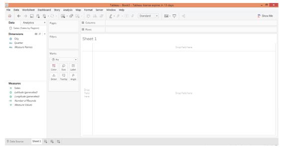
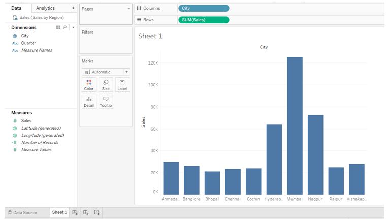
Step 4: Moving to the sheet tab, we can find the dimensions of the City and Quarter and the measure Sales loaded into requisite sections, as shown below.
Step 5: First, drag the dimension city into the Columns region, and measure Sales into the Rows region. Doing this generates a simple vertical Bar chart, as the screenshot shows.
Step 6: The next step is to convert the Bar chart into a Pie chart. For that, go to Show Me, and from options, click on the Pie chart symbol located in the Show-Me as highlighted in the following screenshot.
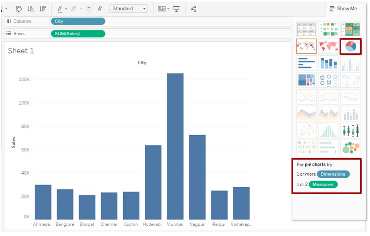
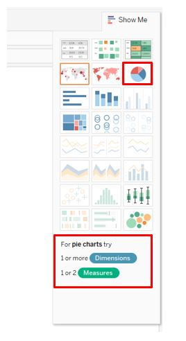
Step 7: The following screenshot gives a closer look into the selection of the Pie chart option. Note when the mouse hovers over the Pie chart symbol, on the lower side, conditions in terms of the requirement of the number of dimensions and measures appear on the lower side. This guides the user, especially the new user, to leverage the chart accordingly.
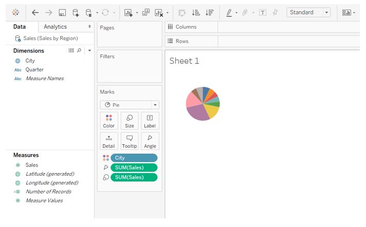
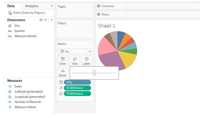
Step 8: Following the above steps gives us the pie chart in the screenshot below. We can see that the pie chart looks small, and also we need to check if the sectors represent the percentage contribution or not. We’ll bring the necessary changes using the steps described ahead. As seen in the Marks card, dimension City has got applied over Color. The Sales measure has been applied twice, first on an angle and second on size. When building a Pie chart, you must understand how to apply measures to the options in the Marks card because it affects the chart.
Step 9: We can adjust the circle size using the slider in the Size option from the Marks card. Note that having the maximum size may disrupt the chart’s shape, so the slider should be used properly.
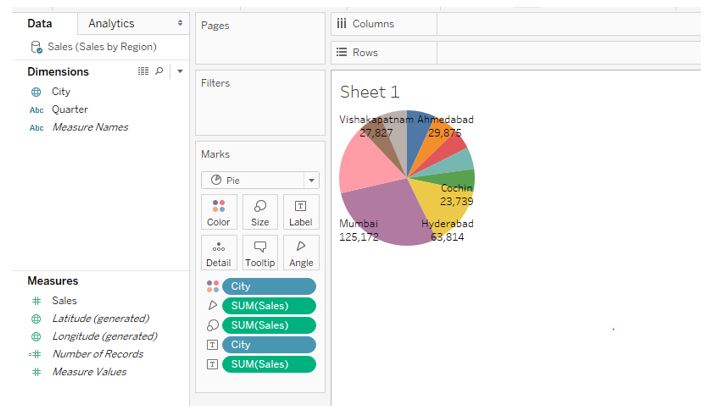
Step 10: The following screenshot shows that City and Sales value labels cannot be accommodated in the graph, and labels appear for major contributing cities. So, it better not have labels in the chart.
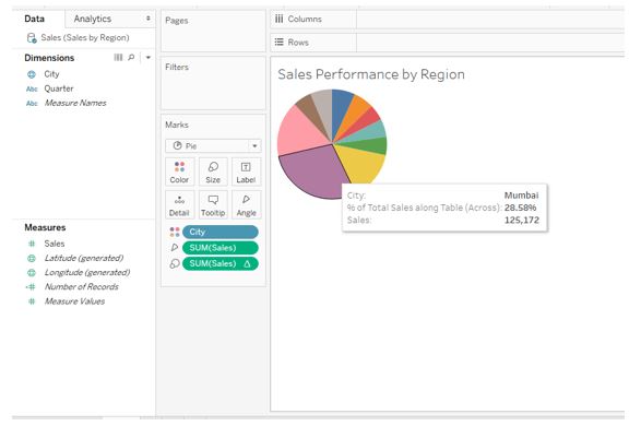
Step 11: We opted not to have labels, and to know about the contribution of any city, we can hover the mouse over the requisite portion. This is as shown in the below screenshot.
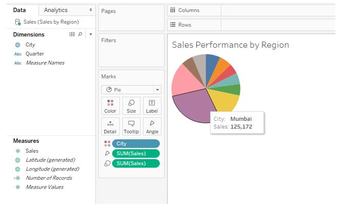
Step 12: Note in the above screenshot we got values for Sales as against the percentage contribution. The essence of the pie chart lies in its ability to show percentage contributions. You can achieve this by following the steps shown in the screenshot below. For the Sales measure applied oversize, click on the drop-down menu; in measure, click on the “Percent of Total” option.
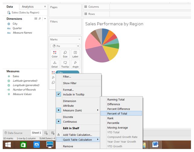
Step 13: As we can see in the following screenshot, both percentage contribution and value for the city. Here, the Sales measure over angle gives values, while the Sales measure oversize gives percentage contribution.
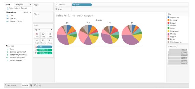
Step 14: We have quarters, too, present in the dataset. Just drag the Quarter dimension into the Columns region to have quarter-wise pie charts. As seen in the screenshot below, we get four different pie charts for four quarters. The most important thing to note here is that the size of the pie chart for the quarter “Q3” is slightly smaller than the pie charts for other quarters. This occurs because we also apply the Sales measure to the Size option in the Marks card. When we had a single pie chart, this option did not affect it. But now, this has impacted the visualization. We’ll see how to overcome this problem.
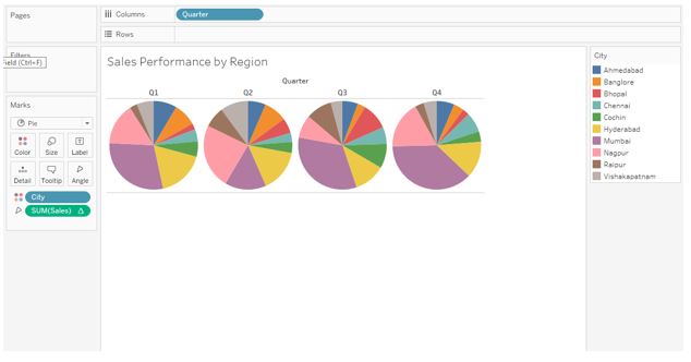
Step 15: In the following screenshot, we can find pie charts of equal size nicely obtained. We overcame the abovementioned problem by removing the Sales measure applied over the size of the Marks card. This gave us pie charts of equal size. The pie charts represent the contribution in Sales by various cities for different quarters. On the right-hand side of the screenshot, we can find cities as categories represented in different colors.
Step 16: Following the steps described in the preceding part to achieve percentage contribution gives us the result below.

Conclusion
Various charts can perform a visualization task, but pie charts are the right choice for quick contributions analyses. The charts do the work of performance monitoring and allow the decision-makers to develop necessary initiatives and strategic measures to improve performance.
Recommended Articles
This is a guide to Pie Chart in Tableau. Here we discuss the introduction and steps to build Pie Chart in Tableau. You may also have a look at the following articles to learn more –
