Updated March 22, 2023
Introduction to QlikView Charts
Let’s say you handle company’s day to day data in terms of no. of products sold, revenues generated, and target achieved, etc. across different segments and suddenly one day your CEO wants to see a business performance in terms of profit & loss to strategize business progress with the sales team. You may try to tell the figure value to your boss but he might want to see results across different dimensions or he might want to compare with the past quarter performances. What will you do then? You may go with excel for basic data visualization and try to convince your boss but what if you have some tool that can solve your complex tasks like this with advance visualization in seconds and give you a different perception of your data. Yes, Qlikview is a tool that can do such jobs for you using Qlikview charts which shows a way of representing your data in graphical form using different types of visualization. It makes data very clear and compact to read and understand the overview of it. Charts can display the frequencies of different values in a field for categorical variables or it can display calculated measures like sum, average, etc. for the numerical variables.
Types of QlikView Charts
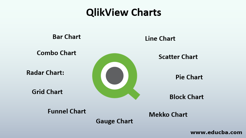
There are different chart types available like Bar chart, Pie Chart, Combo Chart, Scatter Chart, Line Chart, Radar Chart, Grid Chart, Gauge Chart, Block Chart, Funnel Chart, Mekko Chart, etc. All these charts differ from each other in terms of how they display data. You can find their differences below.
1. Bar Chart: Bar charts represent categories through bars in the x-axis and their respective calculated values like sum/count/avg in the y-axis.
2. Line Chart: Line Charts represent information as a series of data points with continuous lines.
3. Combo Chart: Combo charts are a mix of bar charts & line charts. One measure will be displayed by lines and another will be displayed by bars for the same category. You can infer multiple perceptions out of your data.
4. Radar Chart: It is a unique chart in Qlikview that can display multiple dimensional data in a two-dimensional chart using different measures. It displays categories on x-axis wrap in 360 degree round and measures in the y-axis.
5. Scatter Chart: Scatter Chart plots data points in pairs of values from two different measures/expressions. A possible scenario could be if you want to see total products sold and the total amount obtained from all products. In such cases, we can use Scatter charts.
6. Grid Chart: Grid Charts are very much similar to Scatter Charts. The only difference is that it plots dimensions and uses measures to determine the size of the grids.
7. Pie Chart: Pie charts display information in proportions and percentages between different categories. It shows a single measure across a single dimension but different segments.
8. Block Chart: Block charts display a relation between measure values as blocks. The area of each block differs depending upon the measured values. It uses a single measure and up to three dimensions where dimensions can be further divided into their sub-segments.
9. Funnel Chart: Funnel Charts are used to show stages of the progression as it passes from one stage to another stage. Each section show some percentage of the entire data.
10. Gauge Chart: Gauge Charts are used to track the business performance on certain measures like total quantity sold, profit earned, etc. using gauge meter. You can set the maximum & minimum range of gauge meter and can assess your performance accordingly.
11. Mekko Chart: Mekko Charts are similar to Bar charts with varying width. Bar width depends on the measure selection.
Benefits of Using QlikView Charts
The benefits of using the following charts are as follows:
- QlikView Charts are very easy to use and highly configurable. You can quickly create any chart by selecting a chart type. Since Qlikview uses the In-Memory data model hence slicing and dicing functionality are dynamic and quite fast.
- It can show a huge dataset instantly with any variety of distribution. It has powerful visualization capabilities.
- You can perform all kinds of graphical analytics on Qlikview with a wide variety of visualization.
- You can create your dashboards using multiple visualizations like a mix of bar charts and pie charts.
- It is a self-service BI tool that enables users to create dashboards on the go and do the analytics on the data visually.
- You can easily segregate information from your data using different sorts of pie charts, block charts, etc.
- It is a very cost-effective and worth tool.
Examples to Create QlikView Charts
To create any visualization in Qlikview, data needs to be loaded first in memory. You can choose any kind of input data and using Load Script in the script editor to load the data. Let’s consider simple CSV format data for our example. Our data contains four fields – Product, Product Category, Selling Date and Units sold. We want to see how many units of each product has been sold in the past month. After loading data in memory, you can convert your data in a tabular format for better data understanding. You can create a ‘Table Box’ by selecting the ‘Layout’ then ‘New Sheet Object’ followed by the ‘Table Box’ option. You can select all the fields that you want to be displayed in a table. After selection click ‘Apply’ and then ‘Ok’. This will show your data in tabular form. To create charts out of this data you need to use the ‘Quick Chart Wizard’. On clicking that, you will be prompted to select a chart type. From here you can choose any chart type like Bar Chart, Line Chart, Gauge Chart, etc.
For our example let’s choose Bar chart. After selecting chart type you will be prompted to select chart dimensions on which you want to see your visualization. Let’s select the Product as a dimension as we want to see the performance of the products. Before this, we can slice our data for last month only. After dimension selection, you will be prompted for measure selection i.e. what is the value you want to see on your dimension. Here we want to see the sum of the total quantity sold in the last month for every product. Hence let’s select ‘sum’ as a measure. After this, you will be asked to select Chart format where you can define your style and orientation of a chart. For simplicity let’s choose the basics and click on ‘Finish’. And here we go! We have got our Bar chart.
Conclusion
With the simple example of Bar Chart creation, we tried to bring the method to create basic charts in QlikView. You can do much more than this, you can create any kind of chart as per your problem statement. As explained above, you just need to select the right chart to get the right information. For e.g., if you want to compare your business performance over the past years then you can select the Waterfall chart. Isn’t it amazing? Yes, it is!
Recommended Articles
This is a guide to QlikView Charts. Here we discuss the basic overview along with types and benefits of using QlikView Charts along with example. You can also go through our other suggested articles –
