Updated March 21, 2023
Introduction to Tableau Visualization
Business intelligence is a technology-driven process for analyzing data and presenting actionable information to help corporate executives, business managers, and other end users make more business decisions. It is an understanding of the business situation, especially if we have a large volume of data that can be used for decision making to interactive business data and find the root cause of the particular problem and it wills helps us to improve our business eventually. Tableau Visualization is a business intelligence tool that helps us figure out what has happened in the past and why it happened. Sometimes, using Tableau Visualization, we can also predict future terms.
Tableau Analysis
In data science, workflow tableau is used for data exploration and reporting. Let’s look at a few workflow analysis of tableau.
- Collection
- Exploration
- Merging
- Modeling
- Validation
- Reporting
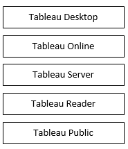
Tableau is a business intelligence and data visualization tool that allows users to make sense of data through graphs, charts, diagrams, etc. In addition, tableau provides some tools for exploration and modeling: Tableau Desktop, Tableau Online, Tableau Server, Tableau Reader, and Tableau Public. In this Tableau, Desktop and Tableau online are used to prepare different types of reports, and Tableau Server, Tableau Reader, and Tableau Public are used to publish the reports.
It has very good compatibility with different types of database systems like spreadsheets, databases, big data, Access data warehouses, cloud applications, cloud databases, etc. Moreover, it supports different types of devices to publish (for example, Desktop, Tablet, Phone).
Types of Data Visualization
Data visualization is a graphical representation to correspond information in a simple way. We will now have a look at their types.
- Charts
- Graphs
- Maps
- Tables
- Graphics
- Dashboards
This is general types used for data visualization; in this, there are more specific examples which are used to visualize the data in proper manner like Area chart, Bar charts, Distribution map, Pie charts, Circle view, Gantt chart, Bullet graph, Cartogram, Heat map, Highlight table, Matrix, TreeMap, Timeline, Word cloud, Text Tables, Stream graph, Network, Scatter plot, Radial Tree, waterfall chart, basic funnel chart, Advance funnel chart, Histogram, etc.
Examples and Simulation
- Tableau desktop version is just Drag n Drop operation where we can just drag whatever fields we want at an appropriate place in rows and columns.
- On the left side, there are two fields, Dimensions and Measures. Basically, Dimension is a categorical variable value( for example, employee id, joining date, region, etc.), and Measure is a numerical value ( for example, No of records, age, salary, etc.); using this information, we can create 24 different types charts in tableau. It took only 30 seconds to prepare any chart.
Now we will see how to visualize information in graphical representation.
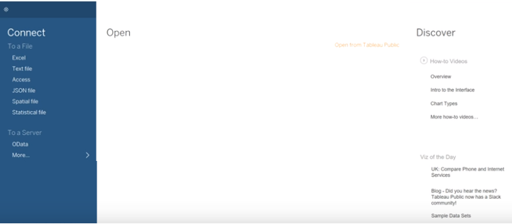
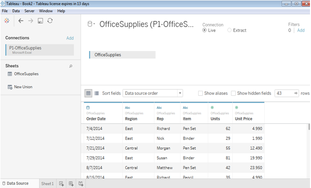
Screen 1 shows the front end of the Tableau Desktop. One option is ‘Connect’; we can connect our database to the tableau by using this tab.we can connect any type of data in excel, Text file, Access, etc.
- There are three broad categories for data Nominal, Ordinal, and Ratio.
Nominal data can not be compared with other fields (Name, Gender, etc.). Ordinal data is the data which put in order. Still, we can not find ratio or difference(for example, performance rating ), and ratio data is the data we can compare and differentiate. We can find out the ratio(for example, Age, Salary, etc.)
- Scatter plots have points that show the relationship between two sets of data; let us consider one example the ice-cream seller keeps track of how much ice cream they sell and how much is noon temperature for that day(table 1).
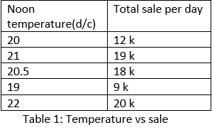
- In above table 1, we can easily identify as the temperature increases, sale increases this is a simple example of linear growth. In this example, there are perfect numbers, or we can perfect values in the database, so in this case, we calculate the difference, ratio, and we can compare the value. In these cases, scatter plots gives an accurate graphical representation of the database.
Tableau Dashboards
In this example, the Illustration is as follows;
In the first screen, we can see the database is connected to the tableau. There are two options live and extract; as we are using this dataset as it is, we select a live option.
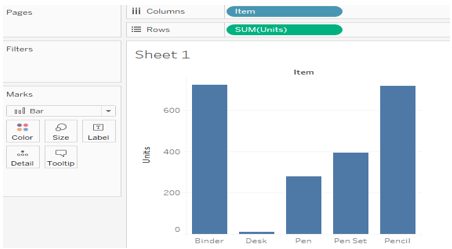
1. Horizontal Bars
It shows the relation between items and total units.
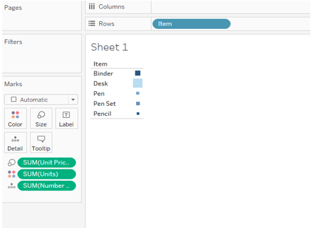
2. Heat Map
It shows the relation between the number of units, total units with respect to the item name.
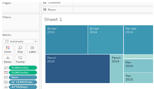
3. TreeMap
It shows more details in the graph; we use one attribute: a date, item name, units, and unit price.
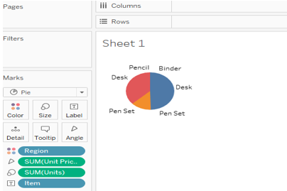
4. Pie Chart
It is a 360-degree graphical view here; we added one more attribute region along with item name, units and unit price.
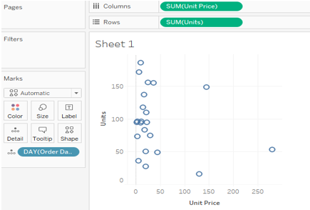
5. Scatter Plots
It is a discrete representation of the database; it is mandatory to have two or more measure fields.
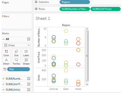
6. Circle Views
In Circle views, we can add more dimension fields with measures.
Advantages of Tableau Visualization
- Speed: Simulation in Tableau is a very fast process. It takes only 30 seconds to prepare a report in Tableau.
- User-friendly: tableau has provided various tabs for a particular operation; therefore, it is easy to understand and use.
- Interactive dashboards: we can slice and dice through the data to easily identify waste in the system and improve the decision-making process.
- Easy publishing and sharing: it is very easy to share our works with others by direct tab in Tableau.
- Growing market: it handles a large amount of data there because of speed and capacity it has a growing market.
Conclusion- Tableau Visualization
- Tableau is a very effective tool for graphical representation, and it has more than 24 different graphical views to display data.
- Though the dataset is complex or the dataset is very big, in tableau, we can create dashboards very easily and within less time.
Recommended Articles
This is a guide to Tableau Visualization. Here we discuss the Introduction, Types of Data Visualization, which includes Charts, Graph, Maps, Tables, Graphics, and Dashboards along with Advantages of Tableau Visualization. You may also look at the following articles to learn more–
