EDUCBA

EDUCBA

MENUMENU
  • Free Tutorials
  • Free Courses
  • Certification Courses
  • 360+ Courses All in One Bundle
  • Login
Home Data Science Data Science Tutorials Tableau Tutorial Dashboard in Tableau
Secondary Sidebar
Tableau Tutorial
  • Tableau Dashboard
    • Dashboard in Tableau
    • Tableau Dashboard Examples
    • Tableau Dashboard Creation
    • Tableau Dashboard Design
    • Tableau Workbook
  • Basic
    • What is Tableau
    • What is Tableau Dashboard
    • What is Tableau Server
    • Uses of Tableau
    • Tableau Versions
    • Tableau Architecture
    • Is Tableau Free
    • Tableau New Features
    • How To Install Tableau
    • How to Use Tableau?
    • Install Tableau Server
    • Tableau Commands
  • Charts
    • Tableau Charts
    • Tableau Bar Chart
    • Tableau Chart Types
    • Donut Chart in Tableau
    • Tableau Gauge Chart
    • Funnel Chart in Tableau
    • Gantt Chart in Tableau
    • Bubble Chart in Tableau
    • Pareto Chart in Tableau
    • Sankey Chart In Tableau
    • Stacked Bar Chart in Tableau
    • Tableau Bullet Chart
    • Waterfall Chart in Tableau
    • Line Chart in Tableau
    • Heat Map in Tableau
    • Histogram in Tableau
    • CrossTab in Tableau
    • Treemap in Tableau
    • Trend Lines in Tableau
    • Tableau Reference Lines
    • Tableau Dual Axis
    • Legend in Tableau
    • Pie Chart in Tableau
    • Tableau Storyline
  • Statement
    • Tableau IF Statement
    • Case Statement in Tableau
  • Functions
    • Tableau Functions
    • Tableau String Functions
    • Concatenate in Tableau
    • Rank Function in Tableau
    • Tableau Aggregate Functions
    • Window Sum Tableau
    • LOD Expressions in Tableau
    • LOOKUP Function in Tableau
    • Tableau Fixed Function
    • Tableau Count Distinct
    • Tableau Window Functions
  • Sort/Filters
    • Sorting in Tableau
    • Filters in Tableau
    • Types of Filters in Tableau
    • Tableau Action Filter
    • Context Filter in Tableau
    • Tableau Parameter Filter
    • Adding Filters in Tableau Dashboard
    • Tableau Context Filter
  • Advanced
    • Tableau Bins
    • Tableau 3D
    • Tableau Export to Excel
    • Tableau Reporting
    • Tableau Reader
    • Tableau Map
    • Tableau Viewer
    • Tableau Prep Builder
    • Tableau Bridge
    • Tableau Tooltip
    • Tableau Hyper
    • Tableau Zen Master
    • Tableau Union
    • Tableau Templates
    • Tableau Alerts
    • Tableau Reporting Tool
    • Conditional Formatting in Tableau
    • Tableau Web Data Connector
    • Tableau BI Tool
    • Data Blending in Tableau
    • Parameters in Tableau
    • Tableau Data Sets
    • Creating Set in Tableau
    • Tableau Drill Down
    • Tableau Dynamic Parameters
    • Tableau Table Calculation
    • Tableau Visualization
    • Tableau Joins
    • Pivot in Tableau
    • Data Visualization With Tableau
    • Forecast in Tableau
    • Map Layers in Tableau
    • Group in Tableau
    • Tableau Group by
    • Hierarchy in Tableau
    • Sets in Tableau
    • How to create a Set in Tableau
    • Tableau Order of Operations
    • Tableau User Group
    • Tableau Calculated Field
    • Custom SQL in Tableau
  • Interview Questions
    • Tableau Interview Questions

Related Courses

Tableau Certification Course

Business Intelligence Courses

Data Visualization Courses

Dashboard in Tableau

By Priya PedamkarPriya Pedamkar

Dashboard-in-Tableau

Introduction to Dashboard in Tableau

Dashboards are very crucial elements of any BI tool. No matters how extensive analyses are performed if they are not brought into a dashboard. Dashboards allow quick and effective insight capturing and thus assist decision-makers in effective decision making. In Tableau, dashboards can be created easily. Many features provided by the tool pertaining to the concept help in building a highly interactive dashboard. The user-friendly mechanism provided by Tableau helps in implementing difficult dashboard concepts easily in Tableau, and even a new user can learn the procedure easily and quickly.

Working with Dashboard in Tableau

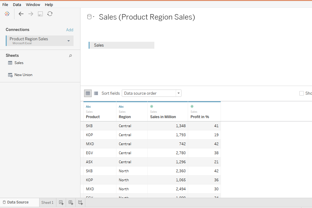
In order to understand dashboards in Tableau and various features offered by the tool in the context of the concept, we shall go through a step-by-step procedure as given below. For this demonstration, we are using the Product Region dataset. The dataset contains sales and profit percentage figures for various products given region wise. The measures present in the dataset are “Sales in Million” and “Profit in %”, while Product and Region are dimensions. Let’s go through the following section to understand dashboards in Tableau.

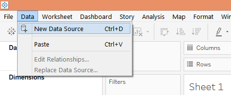
1. First, load the requisite data source into Tableau. For that click on “New Data Source” under the Data tab as shown below.

New Data Source

Start Your Free Data Science Course

Hadoop, Data Science, Statistics & others

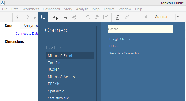
2. In “Connect”, select the requisite data source type. In this case, it is MS Excel, so we selected Microsoft Excel as shown below.

Microsoft excel -Connect

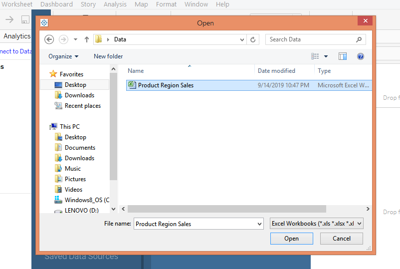
3. Now, select the requisite file from the location it is stored at as shown below.

Dashboard in tableau

4. When the file gets loaded successfully, it can be seen in the Data Source tab as shown in the following screenshot. Examine the data prior to proceeding for analysis.

All in One Data Science Bundle(360+ Courses, 50+ projects)
Python TutorialMachine LearningAWSArtificial Intelligence
TableauR ProgrammingPowerBIDeep Learning
Price
View Courses
360+ Online Courses | 50+ projects | 1500+ Hours | Verifiable Certificates | Lifetime Access
4.7 (86,584 ratings)

tableau

5. Moving to the sheet tab, we can find the measures and the dimensions present in the respective sections.

Dashboard in tableau

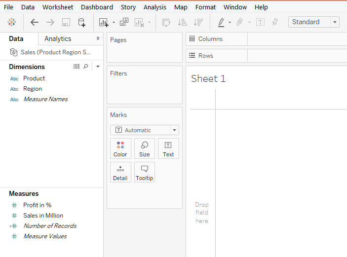
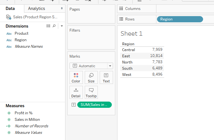
6. We will create the first analysis, for that brings Region dimension into Rows region and drag “Sales in Million” measure over Text in Marks card. We get a table as shown below.

Dashboard in tableau

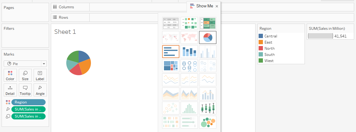
7. Now, in Show, I click on the Pie Chart symbol as highlighted in the below screenshot, and we get a pie chart.

Dashboard in tableau

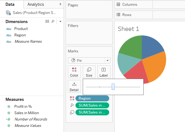
8. Adjust the size of the pie chart through the slider in the Size option in Marks card. This is as shown below.

Dashboard in tableau

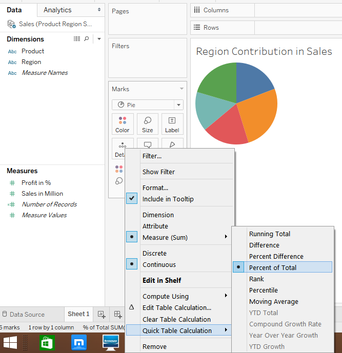
9. The default setting for the pie chart is that it takes into consideration the values. We want it to display the percentage contribution. This can be done by following the process as illustrated in the below screenshot. It is also important to name a sheet appropriately.

the pie chart

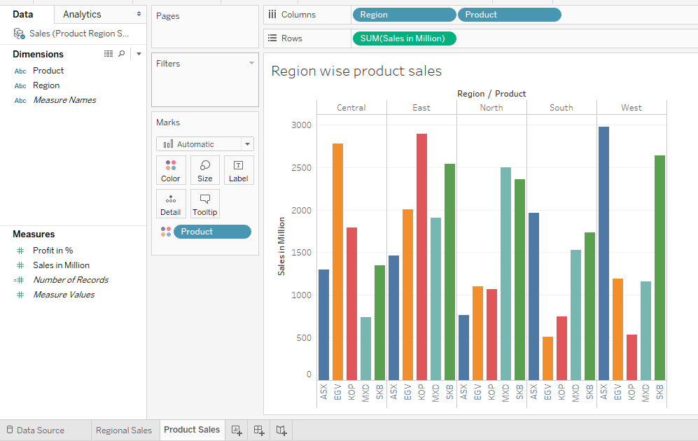
10. In the second sheet, we created another analysis that gives us product wise sales for different regions using a vertical bar chart. This has been shown by the following screenshot.

vertical bar chart

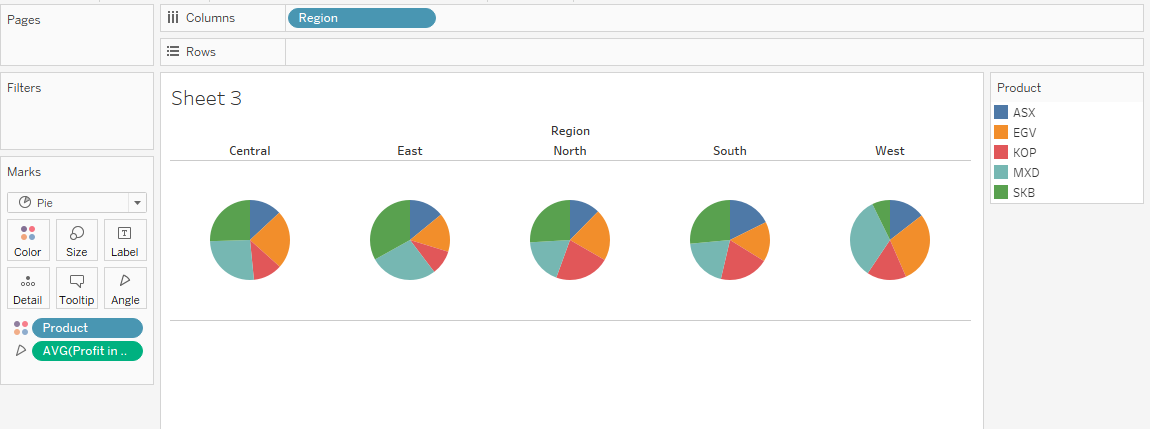
11. Now, we will create a third analysis, which basically gives us an idea of the average profit contribution for products by various regions. The following pie charts accomplish this.

create a third analysis

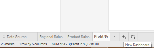
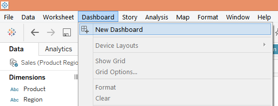
12. We will now create a dashboard based on these three analyses created above. To create a dashboard, click on the “New Dashboard” symbol as shown in the following screenshot. Alternatively, we can also create a dashboard by clicking over the “New Dashboard” option in the Dashboard menu as shown by the screenshot subsequent to the below one.

Dashboard in tableau

New Dashboard

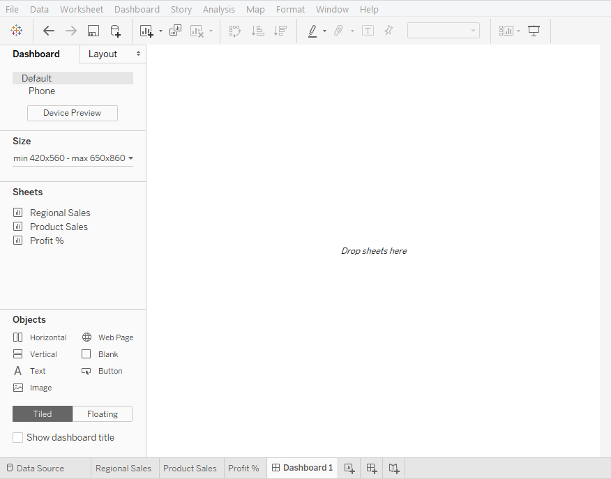
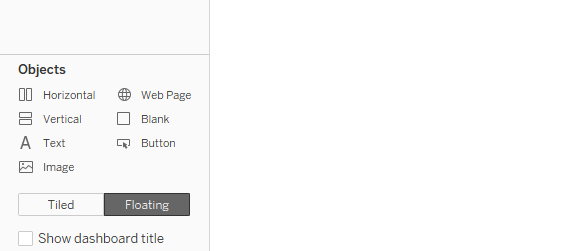
13. When we create a dashboard, initially, the blank dashboard looks like as shown below. On the left-hand side, there are various sections including Sheets which shows all the sheets in the workbook. Double click on the requisite sheet to bring it into the Dashboard or just drag it.

left-hand side

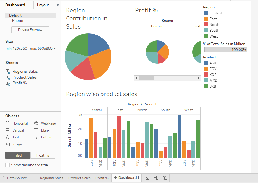
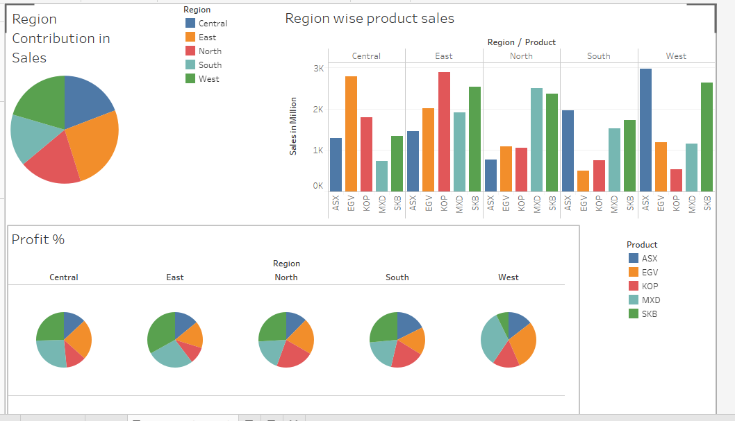
14. We brought all the three sheets into the dashboard as shown below. It can be seen that things appear quite messy. This is because by default the Tiled option is active. We will have to change it to Floating.

 Tiled option

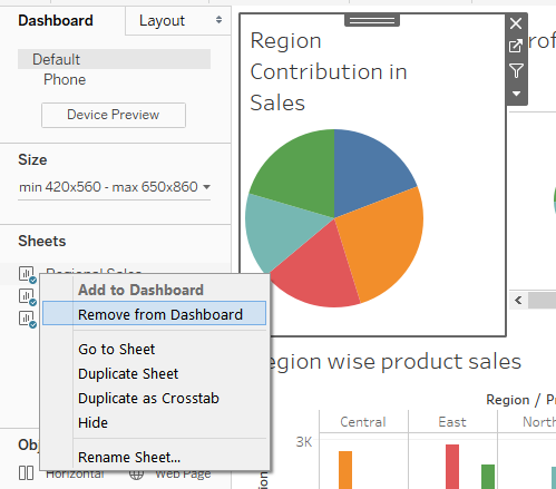
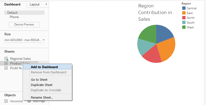
15. Let’s first remove each sheet from the dashboard and then apply Floating. To remove a sheet, right-click on it and select “Remove from Dashboard” as illustrated below.

Remove from Dashboard

16. Now, change the setting from Tiled to Floating as shown below.

Tiled to Floating

17. As can be seen below, we arranged the sheet “Regional Sales” systematically in the way we wanted. The Floating option allows us to float the objects, including legends and charts, freely across the dashboard layout. In a similar way, we shall arrange the three sheets systematically. To add a sheet into the dashboard, right-click on the sheet and click on “Add to Dashboard”.

Add to Dashboard

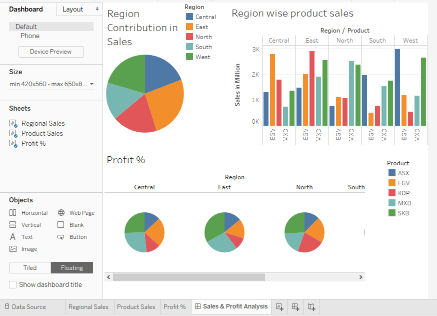
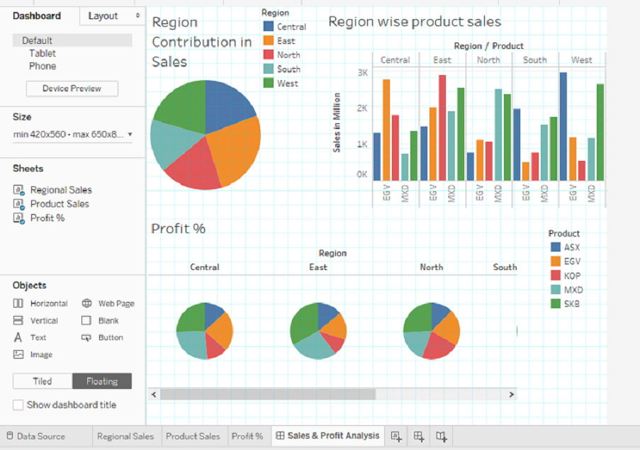
18. Using the approach mentioned in the previous step, we brought all the three sheets into the dashboard, as shown below.

Using the approach

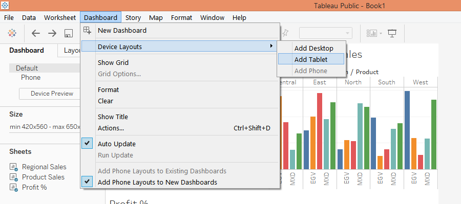
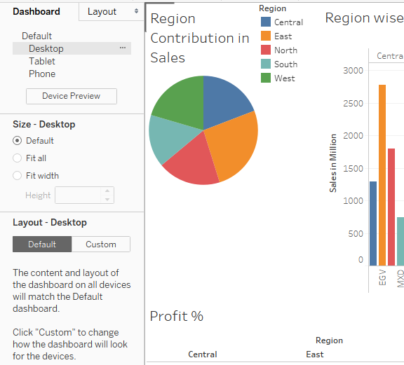
19. We can change the layout of the dashboard by going to “Device Layouts” in the Dashboard menu. The following screen illustrates selecting the “Add Tablet” layout.

Device Layouts

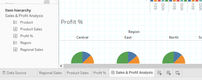
20. When Tablet layout is selected as above, then the layout gets spread across and appears as shown by the following screenshot.

tableau

21. On the left-hand side under the Dashboard section, we can find various options. Explore them to know how they affect the dashboard.

Dashboard sections

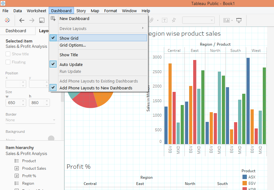
22. We can have grids in the layout. For that select the “Show Grid” option as shown below. We can see the light-blue colored grid in the layout.

Show Grid

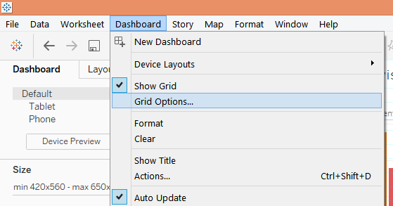
23. Click on “Grid Options”, as shown below, to explore more about grids.

Grid options

24. Now, on the left-hand side, there’s a section called “Item hierarchy”. It shows the hierarchy of the objects in the dashboard.

Item Hierarchy

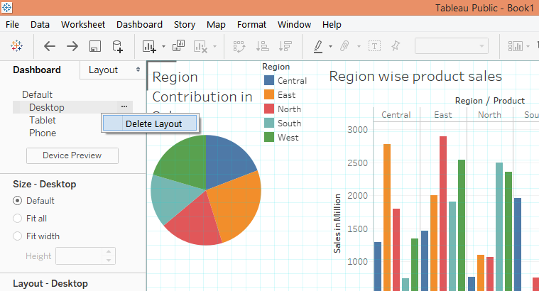
25. We can delete the layout by clicking on “Delete Layout” in “More options” of the particular Layout. The following screenshot illustrates the deleting of the Desktop layout.

delete layout

26. When we delete a layout the default settings get restored as can be seen in the following screenshot.

Region wise product

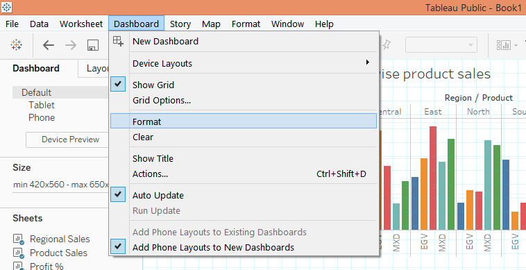
27. We can format the dashboard by clicking on the Format option in the Dashboard menu as illustrated below.

Device layout

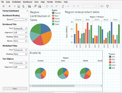
28. When we click on Format, the “Format Dashboard” appears on the left-hand side as shown below. We can apply the changes as required. The clear button at the bottom clears the settings applied.

format dashboard

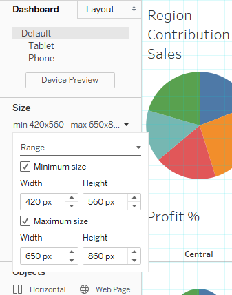
29. The Size option allows us to set the size of the dashboard as required, as shown below.

Region contribution

Conclusion

Dashboards are those objects which basically complete Tableau as a visual analytics tool. Tableau distinguishes itself from other BI tools in the context of dashboard making by providing various and multiple options that basically help in driving in-depth analytics using dashboards.

Recommended Articles

This is a guide to Dashboard in Tableau. Here we discuss the Introduction, Working with Dashboard in Tableau along with basic points implemented. You can also go through our other suggested articles to learn more–

  1. BorderLayout in Java
  2. Rank Function in Tableau
  3. Tableau Context Filter
  4. Tableau Dashboard Creation
  5. Concatenate in Tableau | How to Use?
  6. Tutorial on Tableau Action Filter
  7. Learn the Various Operations of Legend in Tableau
  8. How to Use Tableau Fixed Function?
Popular Course in this category
Tableau Training (8 Courses, 8+ Projects)
  8 Online Courses |  8 Hands-on Projects |  55+ Hours |  Verifiable Certificate of Completion
4.5
Price

View Course

Related Courses

Business Intelligence Training (12 Courses, 6+ Projects)4.9
Data Visualization Training (15 Courses, 5+ Projects)4.8
1 Shares
Share
Tweet
Share
Primary Sidebar
Footer
About Us
  • Blog
  • Who is EDUCBA?
  • Sign Up
  • Live Classes
  • Corporate Training
  • Certificate from Top Institutions
  • Contact Us
  • Verifiable Certificate
  • Reviews
  • Terms and Conditions
  • Privacy Policy
  •  
Apps
  • iPhone & iPad
  • Android
Resources
  • Free Courses
  • Database Management
  • Machine Learning
  • All Tutorials
Certification Courses
  • All Courses
  • Data Science Course - All in One Bundle
  • Machine Learning Course
  • Hadoop Certification Training
  • Cloud Computing Training Course
  • R Programming Course
  • AWS Training Course
  • SAS Training Course

ISO 10004:2018 & ISO 9001:2015 Certified

© 2022 - EDUCBA. ALL RIGHTS RESERVED. THE CERTIFICATION NAMES ARE THE TRADEMARKS OF THEIR RESPECTIVE OWNERS.

EDUCBA
Free Data Science Course

SPSS, Data visualization with Python, Matplotlib Library, Seaborn Package

*Please provide your correct email id. Login details for this Free course will be emailed to you

By signing up, you agree to our Terms of Use and Privacy Policy.

EDUCBA Login

Forgot Password?

By signing up, you agree to our Terms of Use and Privacy Policy.

EDUCBA
Free Data Science Course

Hadoop, Data Science, Statistics & others

*Please provide your correct email id. Login details for this Free course will be emailed to you

By signing up, you agree to our Terms of Use and Privacy Policy.

EDUCBA

*Please provide your correct email id. Login details for this Free course will be emailed to you

By signing up, you agree to our Terms of Use and Privacy Policy.

Let’s Get Started

By signing up, you agree to our Terms of Use and Privacy Policy.

This website or its third-party tools use cookies, which are necessary to its functioning and required to achieve the purposes illustrated in the cookie policy. By closing this banner, scrolling this page, clicking a link or continuing to browse otherwise, you agree to our Privacy Policy

Loading . . .
Quiz
Question:

Answer:

Quiz Result
Total QuestionsCorrect AnswersWrong AnswersPercentage

Explore 1000+ varieties of Mock tests View more