Updated May 31, 2023

Introduction to Heat Map in Tableau
Tableau is used for displaying data with a different representation of colors. Heat maps in the tableau can be created with multiple dimension members along with measured values. Different scenarios in a business process can be addressed using tableau heat map as the number of products which are above expectations or number of products which have fallen short.
In short, heat maps are a specific set of graphs among the different graphs available in tableau displaying information with the help of a matrix of colors. Usually, the color density matrix representation is used to denote the concentration of information or the magnitude of the values. This helps to spot patterns depending on information density or concentration.
When to Use a Heat Map in Tableau?
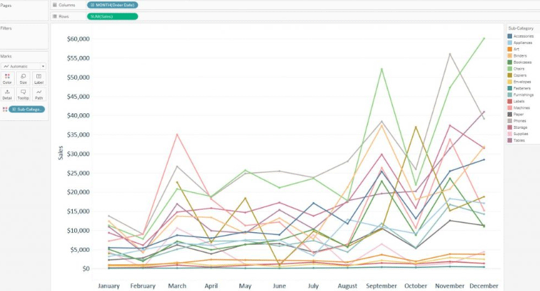
Assuming we have been analyzing on evaluating the sales for each product subcategory using the sample superstore data set provided by Tableau. Also, let us assume that we are analyzing the month of the order date for finding out seasonal trends in the data. As we are evaluating using the month of the order date as time, people might think of using a line graph for the analysis. Below is the example of a line graph for the analysis.
From the below screenshot we can understand that the graph is not very clear on expressing the data. It can be seen that there are 17 lines which are causing overlap and many of the subcategories are much smaller on the scale compared with the others which make it very difficult to analyze the graph. Under such a scenario, a heat map has to be chosen.
Steps to Create Heat Map in Tableau
Below are a few steps to create a heat map in tableau:
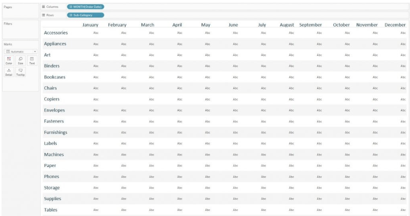
Step 1 – Select the appropriate layout of rows and columns which will be used as the visualization grid. For the concerned data set, months have to be listed as columns in the top view. The month of the order date dimension will create the column and it has to be put column shelf. Next, the subcategory should be placed in the rows shelf. Thus each subcategory in the data set will have independent rows.
Below is an image showing the above set up.
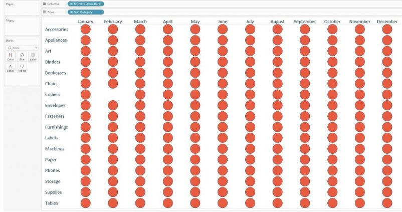
Step 2 – The next task is to set the marks according to the data set. Marks tab is shown on the left-hand side of the tableau desktop window. The default mark is always set to text. This can be changed to a circle by selecting the circle option from the menu. Tableau heat maps created with circle marks are the most suitable ones. Besides circles, shape or square mark types are also available.
Below is the image of the data set with circle marks used in visualization.
Step 3 – Now mark has already been set at the intersection of each month of order date and subcategory. These can now be encoded by using two measures – one measure will be used to determine the intensity of the marks the other measure will denote the size of the mark. To achieve the encoding, place the measured value that has to be encoded for size onto the size marks card on the left-hand side panel and the measure that we want to use for colors onto the color marks card. For the initial analysis lets colors and size the circle with the same measure.
Below is an image showing the above set up.

Step 4 – Just to observe the difference the line graph uses exactly the same fields as the above, it can be seen that it is very much easier now to analyze and compare the subcategories with the specific months on reading the chart vertically. A comparison of the seasonality can be also achieved on the subcategory by reading the chart horizontally. In the graph size, colors are defined in the same fields which helps in gaining more insights on the data in the graph.
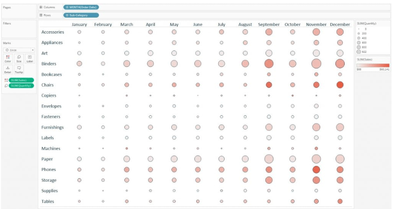
A different measure can also be chosen, one for size and one for the colors depending on the analysis that is going to be performed. Below is an example of a heat map where the circles are sized by quantity measure and colored based on sales measure.
Now according to the setup and the colors and size used, the circles which are large and light gives the impression that that particular subcategory made a relatively low amount of revenue selling a large quantity. It signifies low sales per item. The circles that are small in size and dark in colors give the impression that the subcategories generated high revenue selling a small quantity. It signifies high sales per item.
Importance of Heat Map in Tableau
To create a heat map requires one or more dimensions and one or two measures. The highlight table requires one or more dimensions and only one measure. The key feature that separates the two is the heat map which requires encoding of the marks by an additional measure compared to the highlight table.
Since the highlight table allows color marking by one thing at a time, the encoding can be done only for one measure. Unlike the highlight table, with heatmap, the marks can be colored using one measure along with sizing the marks by a second measure. Depends on the background of the business logic this type of visualization can add a valuable piece of information in the analysis.
Conclusion
Heat Map is a very good feature provided by Tableau. It provides an excellent encoding along with different sizing and color representation of the data. This kind of visualization helps the analyst to get the readily available representation of data at a single glance. With all these excellent features this type of encoding can cause some confusion for the end users if it is explicitly not stated what the size and colors represent.
Though there are limitations, still tableau heat map is a good alternative to choose from compared to a line graph or highlight table. It is really efficient when there is a need for comparison between dimension members with varying scales across multiple measurements.
Recommended Articles
This has been a guide to Heat Map in Tableau. Here we discussed the concepts, use, importance, and steps to create a Heat map in Tableau in detail. You can also go through our other suggested articles to learn more –
