Updated July 28, 2023
Introduction to Tableau Storyline
Stories are important components of business analysis. They help present the findings in an effective and efficient way. Using stories, the final analysis can be presented in a way that is understandable to every stakeholder connected with the project or assignment in the context in which the analysis has been driven. Tableau comes with an option to create a story. Under this option, there are various functionalities available that help the analyst create a beautiful and meaningful story out of the findings. These stories are sheet-based and dynamic. Moreover, based on the requirement, the stories can also be incorporated into dashboards. In this article, we will discuss the Tableau Storyline in detail.
Creating Story in Tableau Storyline
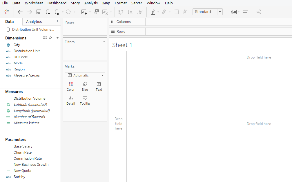
To understand how to create a story in Tableau, we will use a simple example featuring the distribution unit volume dataset. It contains data of distribution unit wise volume for a product. Important dimensions are the Distribution Unit and Region. The distribution Unit is a business area smaller than Region. Distribution Volume is a measure that we use in the analysis.
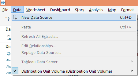
1. Load the data source into Tableau. Click on “New Data Source” under the “Data” tab.
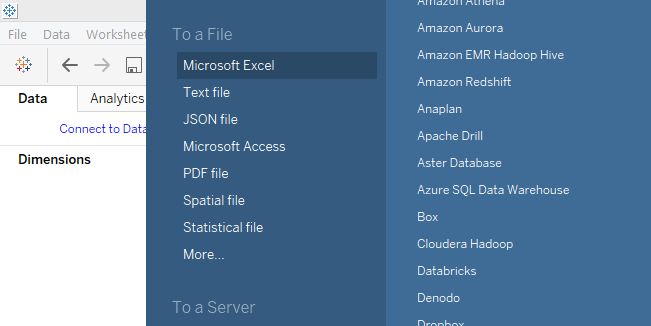
2. Click on the appropriate data source type as in the below screenshot. As our data source consists of Microsoft Excel file, we will click on “Microsoft Excel”.
3. The data gets loaded into Tableau as in the below screenshot.
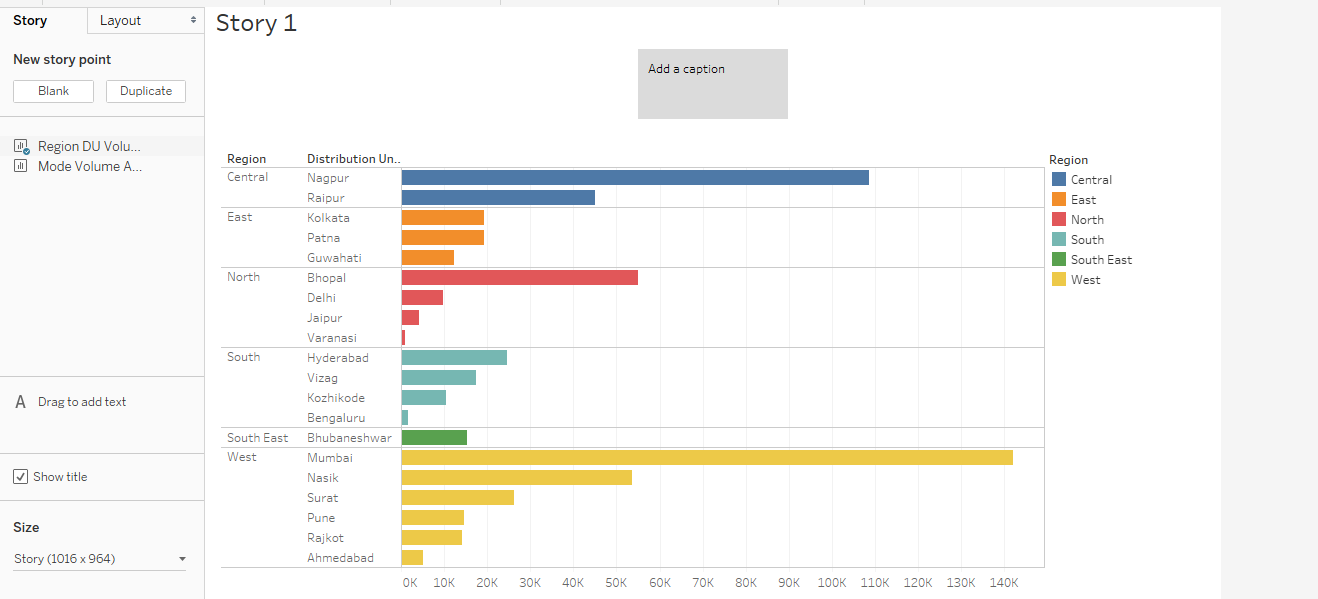
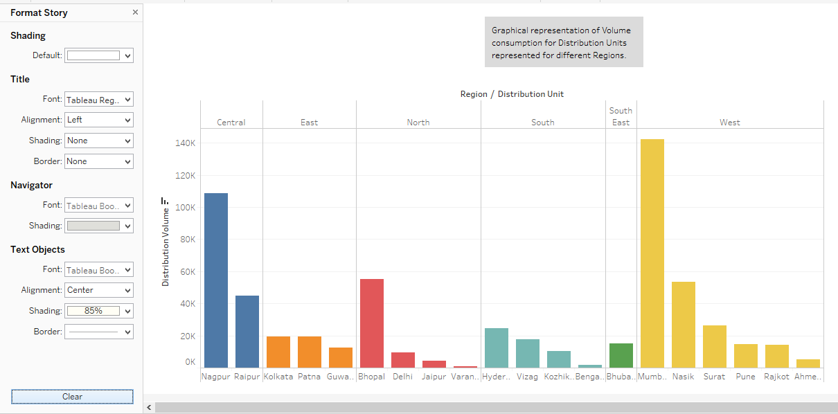
4. Initially, let’s perform analysis to understand regional sales. Drag dimensions Region and Distribution Unit in Columns region and Distribution Volume measure in Rows region. Drag dimension Region over color in Marks card. We get a vertical bar chart below.
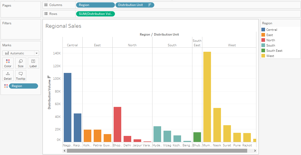
The above graphical analysis shows the distribution unit wise volume for each region. Each region has been represented with a separate color. The result has been sorted in descending order of volume for quick identification of the highest volume generating distribution unit in a region.
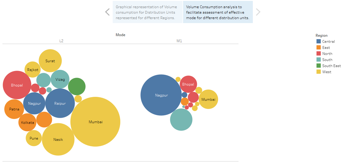
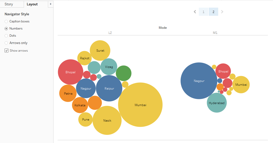
5. In another sheet, we’ll perform another analysis to understand if mode of distribution unit has any effect on volume. Drag dimension Mode into columns region. Drag dimension Distribution Unit and measure Distribution Volume over Label and Size in Marks card respectively. If the default chart type is bar chart, then click on “packed bubbles” in Show Me, a bubble chart gets created. Finally, drag dimension Region over Color in Marks card. The visualization that we get is as follows:
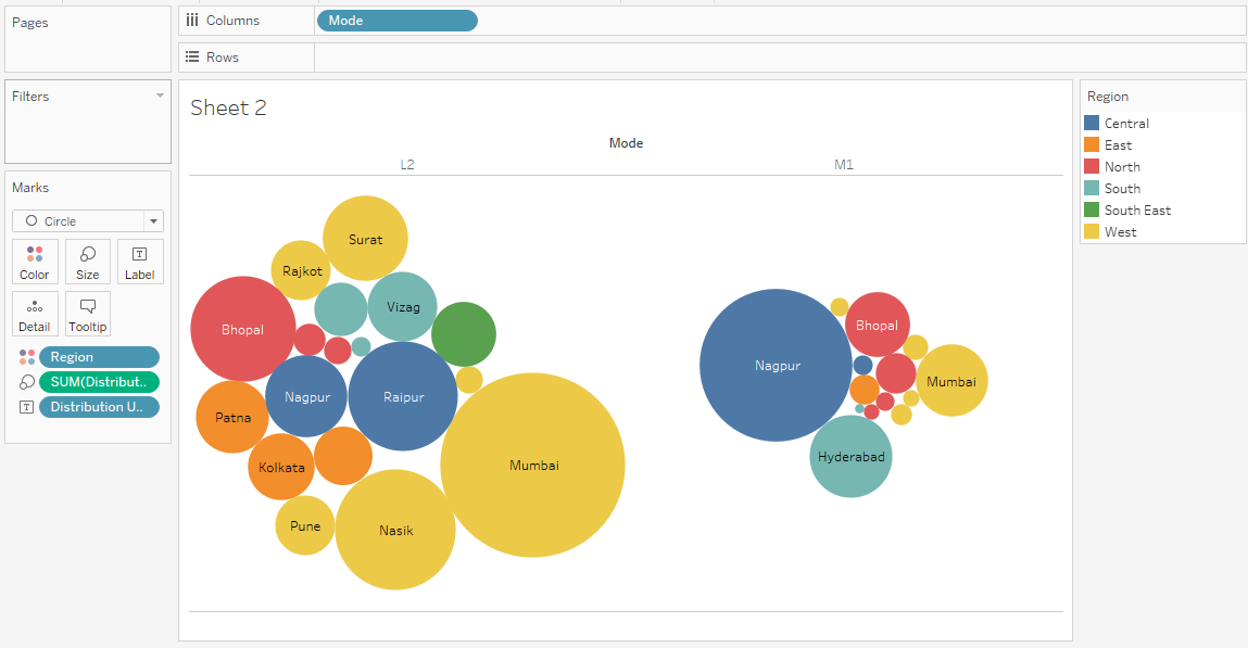
The above visualization makes use of bubble chart. Bubble chart is a powerful tool that represents the value in form of size. The above chart helps us understand the mode-wise distribution volume for different distribution units. Different regions have been indicated by different colors. As can be seen, the volume distributed to Mumbai by mode L2 is high as compared to mode M1, while reverse applies in the case of Nagpur. This helps us understand the mode feasibility in network analysis and network planning.
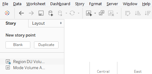
6. We’ll now try to create a story out the above findings. To create a story click on the “Story” option in the menu bar, then click on “New Story” as shown below.
Alternatively, the story can also be created by clicking over book symbol in sheet tab as shown in the below screenshot.
![]()
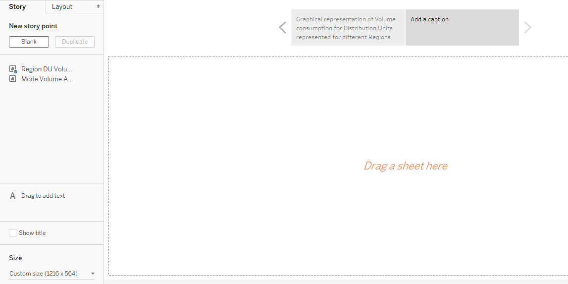
7. The blank story that gets created appears as follows:
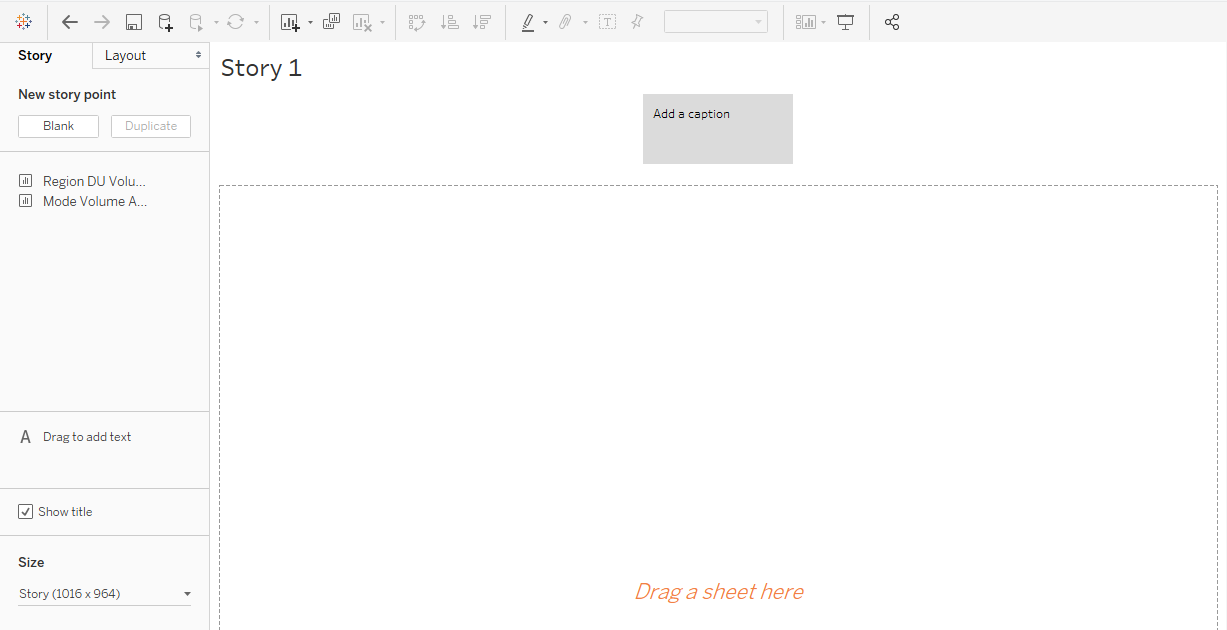
The story is completely blank, and the sheets that we have created appear in the left-hand side of the screen as seen above. There are various options that we’ll explore as we go ahead.
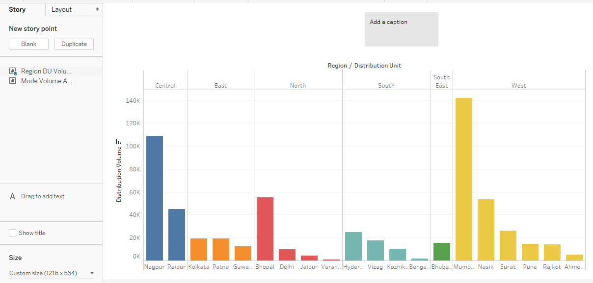
8. Drag the first sheet i.e. Region DU Volume Analysis into “Drag a sheet here” pane. The analysis gets imported as it is.
 Note, as we changed the chart type to horizontal in the sheet, it got reflected in the story as it is. This is the reason why the stories are sheet-dependent and dynamic.
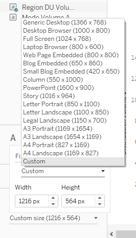
9. We can change the dimension of the visualization in the story by using the “Size” option located in the lower-left corner of the screen. There are various options available for resizing including the custom options.
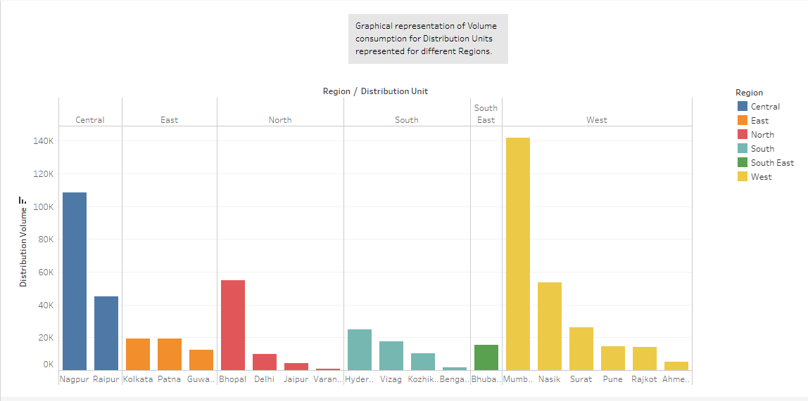
10. Right-click on the story tab and click on Rename. Name it as “Volume Analysis”. Volume Analysis also appears as the title. If we don’t want the title to appear, just unselect “Show title” and vice versa.
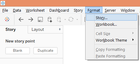
11. The “Add a caption” box is blank by default. A meaningful and insightful caption should be added. The caption box can be resized using mouse just by dragging as needed. To format the caption box, click on “Format” menu and click on “Story” as shown in the below screenshots.
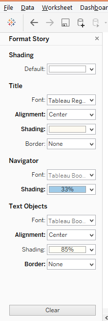
12. Clicking on Story option pops-up “Format Story” section in the left side. There are various options in the section pertaining to shading, title, navigator and text objects.
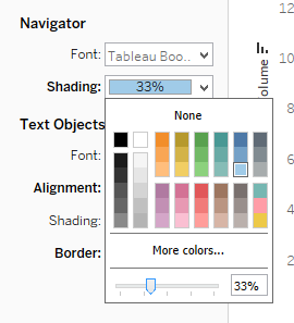
To change the background color in the caption box, in the Navigation section, click in Shading and the shading percentage can be changed using the slider as shown above. The caption box now appears as shown below:
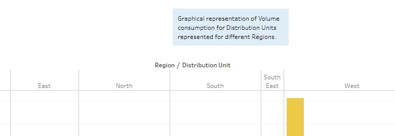
To remove the above formatting, just click on Clear button and default setting gets restore as shown in the below screenshot.
13. To add a new story point click on Blank under “New story point”. If a copy of the story is needed click on “Duplicate”. The below screenshot shows this.
The blank story point that gets created next in the sequence of analysis is as below.
14. Now, drag the sheet Mode Volume Analysis into “Drag a sheet here” pane. We shall also add a relevant caption suitable to the analysis. The analysis is as illustrated in the below screenshot.
We can navigate between the story points just by clicking over the caption box. The caption box facilitates navigation and it can be represented in multiple ways, for that click on the “Layout” section to explore various representation options.
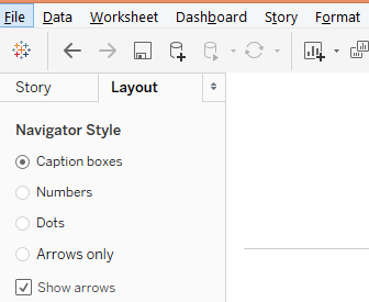
When selected the “Numbers” option, observe that navigation changed from caption box to number buttons.
15. Tableau allows us to analyze and work upon every object separately in a story. Just click on that object. Like in the below screenshot, we clicked on mode M1.
Conclusion
Graphical visualizations can be transformed to insights if they are represented as meaningful results. Only then does the analysis stands useful. This is facilitated through story creation. Tableau offers a strong feature to create stories on visualizations that helps understand patterns and trend from data facilitating a 360-degree analysis.
Recommended Articles
This is a guide to Tableau Storyline. Here we discuss the basic concepts and how to create a dashboard story in Tableau storyline with examples. You can also go through our other suggested articles –
