EDUCBA

EDUCBA

MENUMENU
  • Free Tutorials
  • Free Courses
  • Certification Courses
  • 360+ Courses All in One Bundle
  • Login
Home Data Science Data Science Tutorials Tableau Tutorial Pareto Chart in Tableau
Secondary Sidebar
Tableau Tutorial
  • Charts
    • Tableau Charts
    • Tableau Bar Chart
    • Tableau Chart Types
    • Donut Chart in Tableau
    • Tableau Gauge Chart
    • Funnel Chart in Tableau
    • Gantt Chart in Tableau
    • Bubble Chart in Tableau
    • Pareto Chart in Tableau
    • Sankey Chart In Tableau
    • Stacked Bar Chart in Tableau
    • Tableau Bullet Chart
    • Waterfall Chart in Tableau
    • Line Chart in Tableau
    • Heat Map in Tableau
    • Histogram in Tableau
    • CrossTab in Tableau
    • Treemap in Tableau
    • Trend Lines in Tableau
    • Tableau Reference Lines
    • Tableau Dual Axis
    • Legend in Tableau
    • Pie Chart in Tableau
    • Tableau Storyline
  • Basic
    • What is Tableau
    • What is Tableau Dashboard
    • What is Tableau Server
    • Uses of Tableau
    • Tableau Versions
    • Tableau Architecture
    • Is Tableau Free
    • Tableau New Features
    • How To Install Tableau
    • How to Use Tableau?
    • Install Tableau Server
    • Tableau Commands
  • Statement
    • Tableau IF Statement
    • Case Statement in Tableau
  • Functions
    • Tableau Functions
    • Tableau String Functions
    • Concatenate in Tableau
    • Rank Function in Tableau
    • Tableau Aggregate Functions
    • Window Sum Tableau
    • LOD Expressions in Tableau
    • LOOKUP Function in Tableau
    • Tableau Fixed Function
    • Tableau Count Distinct
    • Tableau Window Functions
  • Sort/Filters
    • Sorting in Tableau
    • Filters in Tableau
    • Types of Filters in Tableau
    • Tableau Action Filter
    • Context Filter in Tableau
    • Tableau Parameter Filter
    • Adding Filters in Tableau Dashboard
    • Tableau Context Filter
  • Tableau Dashboard
    • Dashboard in Tableau
    • Tableau Dashboard Examples
    • Tableau Dashboard Creation
    • Tableau Dashboard Design
    • Tableau Workbook
  • Advanced
    • Tableau Bins
    • Tableau 3D
    • Tableau Export to Excel
    • Tableau Reporting
    • Tableau Reader
    • Tableau Map
    • Tableau Viewer
    • Tableau Prep Builder
    • Tableau Bridge
    • Tableau Tooltip
    • Tableau Hyper
    • Tableau Zen Master
    • Tableau Union
    • Tableau Templates
    • Tableau Alerts
    • Tableau Reporting Tool
    • Conditional Formatting in Tableau
    • Tableau Web Data Connector
    • Tableau BI Tool
    • Data Blending in Tableau
    • Parameters in Tableau
    • Tableau Data Sets
    • Creating Set in Tableau
    • Tableau Drill Down
    • Tableau Dynamic Parameters
    • Tableau Table Calculation
    • Tableau Visualization
    • Tableau Joins
    • Pivot in Tableau
    • Data Visualization With Tableau
    • Forecast in Tableau
    • Map Layers in Tableau
    • Group in Tableau
    • Tableau Group by
    • Hierarchy in Tableau
    • Sets in Tableau
    • How to create a Set in Tableau
    • Tableau Order of Operations
    • Tableau User Group
    • Tableau Calculated Field
    • Custom SQL in Tableau
  • Interview Questions
    • Tableau Interview Questions

Related Courses

Tableau Certification Course

Business Intelligence Courses

Data Visualization Courses

Pareto Chart in Tableau

By Priya PedamkarPriya Pedamkar

Pareto Chart in Tableau

Introduction to Pareto Chart in Tableau

In this article, we have come up with the process to create the Pareto chart in Tableau. The Pareto chart gets its name from the Pareto principle, which says that for any events the 80% of the effects come from 20% of its cause. In General terms, we can say that for any event, nearly 80% of the changes come from 20% of the contributors. There are several synonyms for this principle,

  • 80/20 rule
  • Law of vital few
  • Principle of factor sparsity

Steps for Creating Pareto Chart in Tableau

This chart (i.e. Pareto) has two kinds of charts build into it, one being the line graph and the other is the line graph. The decreasing or descending values are represented by bar charts whereas the increasing or the ascending data are represented by the line graph. Let us begin with the process -4.

Note: We have performed the process on ‘Orders – Sample Superstore’ data that comes with Tableau Desktop application.

Step 1: We will drag and drop the ‘Sales’ data into the ‘Rows’ section. This will give us a bar chart for sales. Also after this, we will drag and drop the ‘State’ data from the ‘Dimension’ section to the ‘Column’ section of Tableau. This will give a bar chart with Sales data (on Y-Axis) and State data (on X-axis). Follow the below screen.

State and Sales

Start Your Free Data Science Course

Hadoop, Data Science, Statistics & others

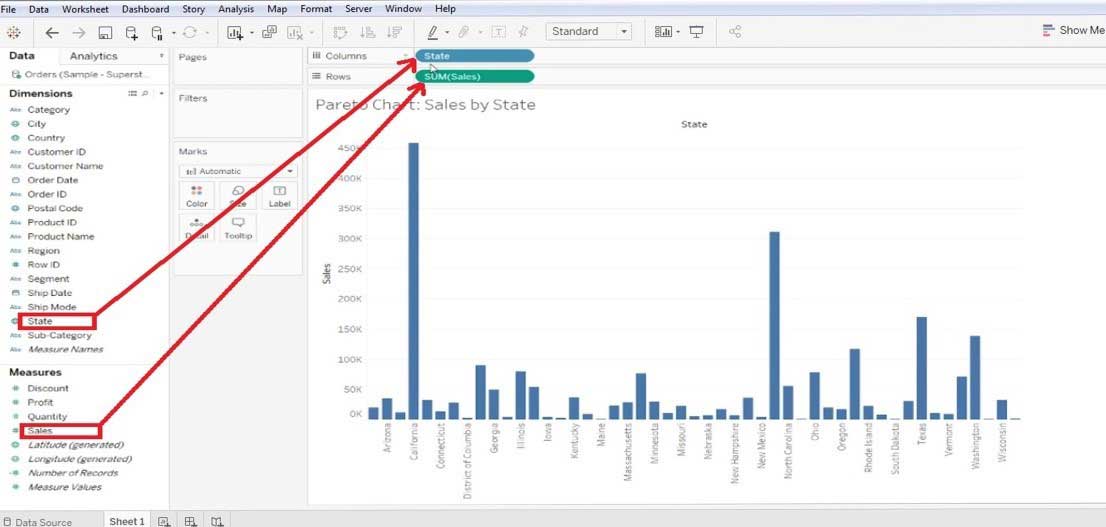
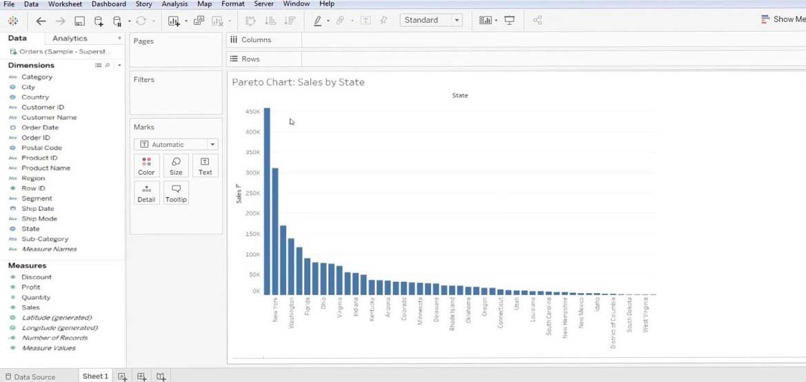
  • It is better that you sort the graph (either ascending/ descending) – we have sorted it as descending.

Pareto Chart in Tableau 1-2

Step 2: After then go to the ‘Sales’ in the ‘Rows’ section and mark the ‘Quick Table calculation’ to ‘Running Total’. Follow the below screen.

Quick Table calculation

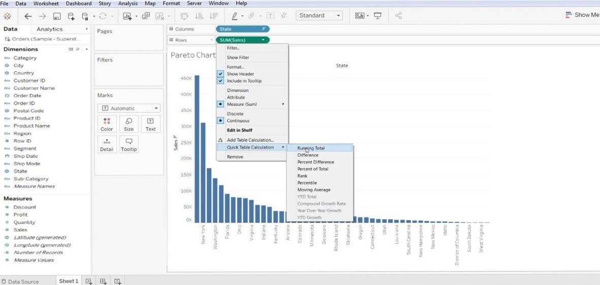
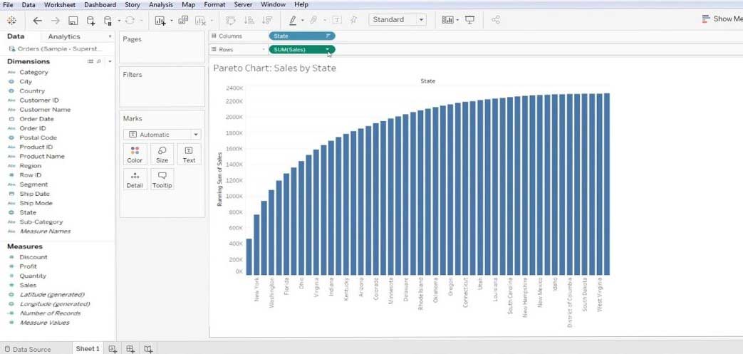
  • After performing Step 2 it will show below screen.

Pareto Chart in Tableau 1-4

Step 3: Now, follow the same procedure, i.e. Sales>>Edit Table Calculation.

Edit Table Calculation

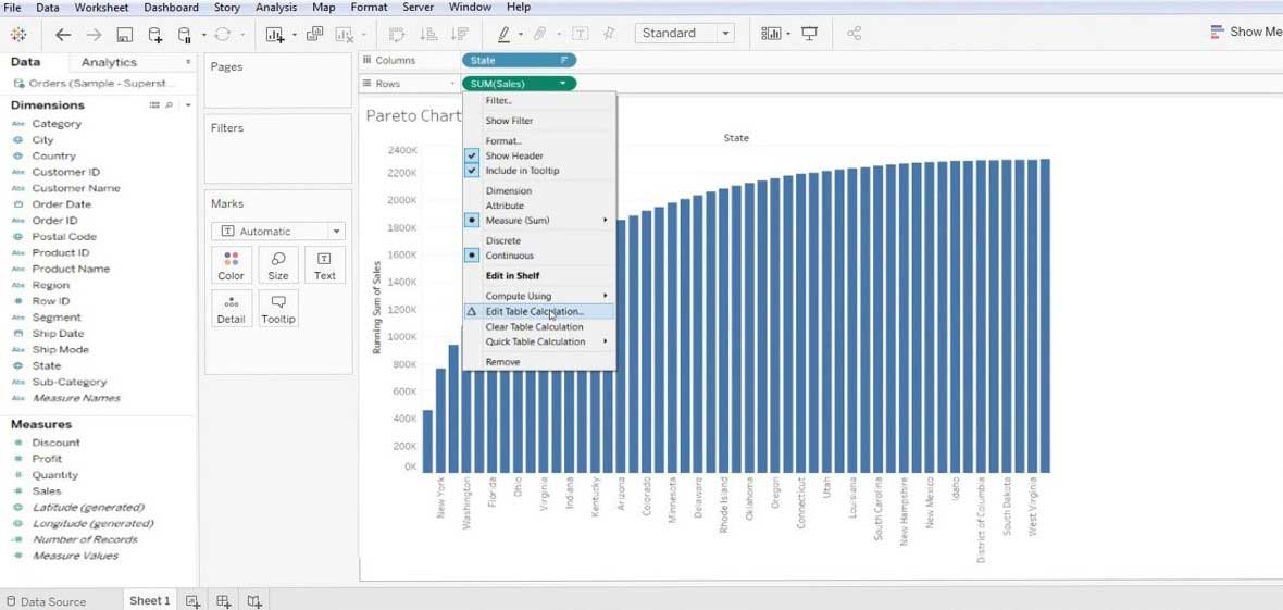
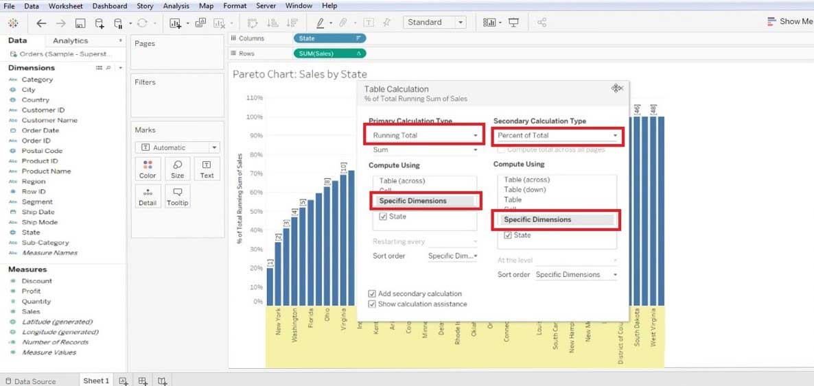
  • Here we are trying to sort the table w.r.t ‘Specific Dimension’ and ‘Calculation Type’. With this, we will get a pattern of data with ascending type.

Pareto Chart in Tableau 1-6

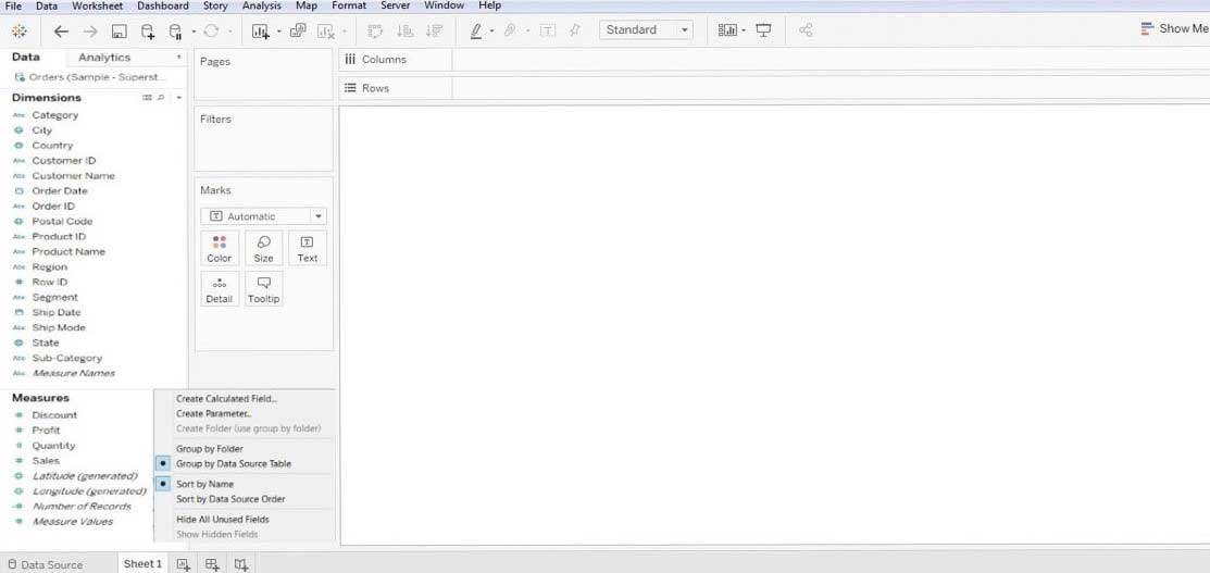
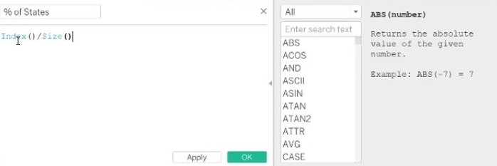
Step 4: Now we have to create a new calculated field, this can be done by right click on the ‘Measure’ section >> ‘Create Calculated field’. This will bring a Calculation dialog box on the screen where we have to rename it as per our convenience and create the function.

Pareto Chart in Tableau 1-7

  • We have created this function – Index()/Size() and then click on the OK button.

Pareto Chart in Tableau 1-8

Step 5: After this, we have to drag this newly created filed from the “Measure’ section and drop in the ‘Column’ section. Once you have done this you have to make some changes. Edit this calculated field by ‘Compute Using’ >> State. After this drag the ‘State’ from the ‘Column’ to the “Marks’ section and also change the bar type to ‘Line’. This will give a line chart for the working data.

Again we have to ‘Format’ the data, below we have listed some formatting we performed.

  • Graph>>Format>>Numbers (to percentage)>>No decimal.

Pareto Chart in Tableau 1-9

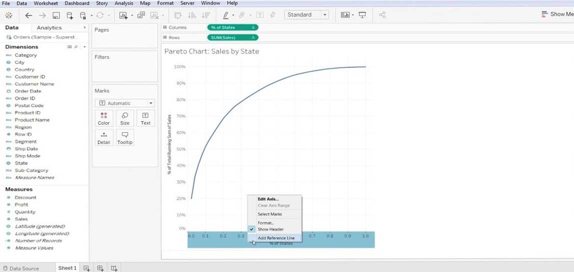
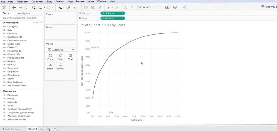
  • Graph>>Add reference line>>value(.2) and (constant)>>click OK – for y-axis.

Pareto Chart in Tableau 1-10

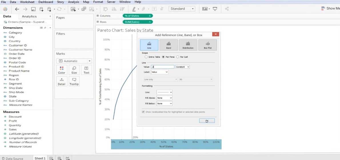
  • Graph>>Add a reference line.

Add a reference line

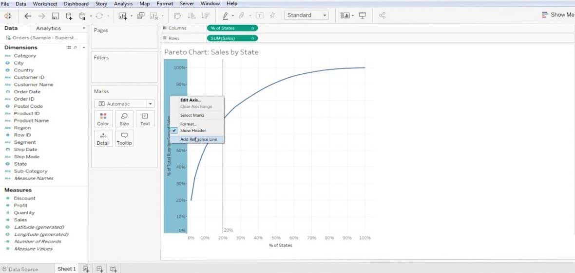
  • value(.8) and (constant)>>click OK – for x-axis.

Pareto Chart in Tableau 1-12

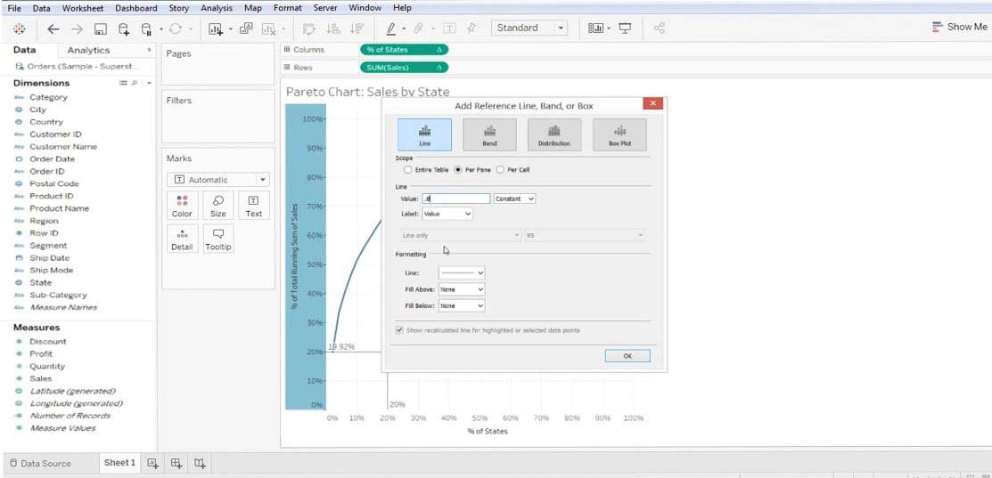
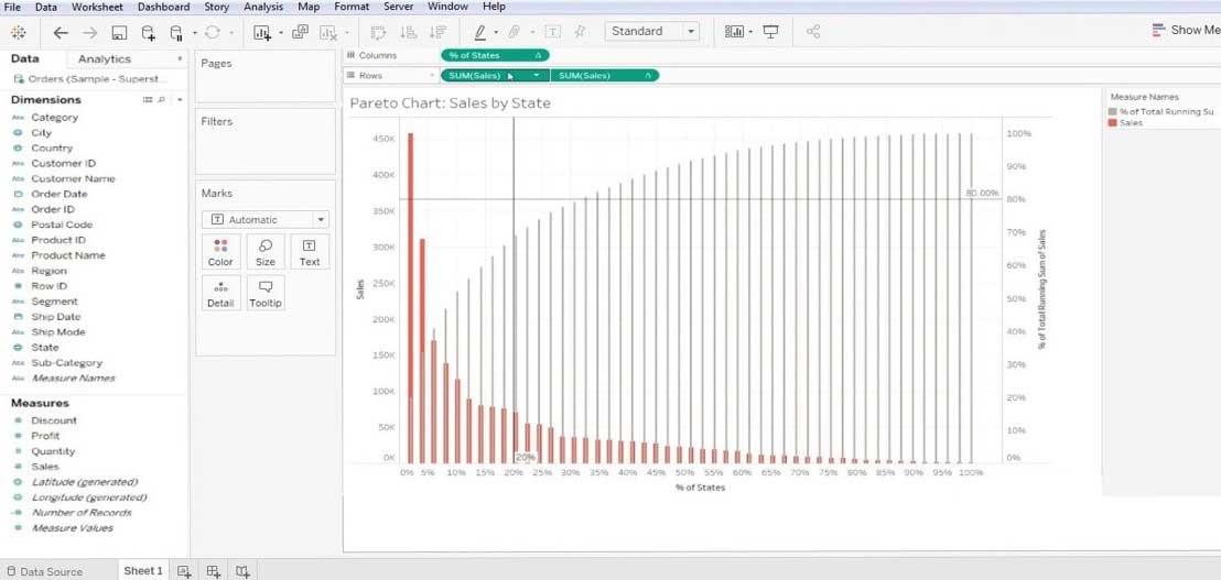
  • With this, we get a reference line at 0.8 and 0.2 along the X and Y-axis. Refer to the below screen. This is a basic Pareto chart.

Pareto Chart in Tableau 1-13

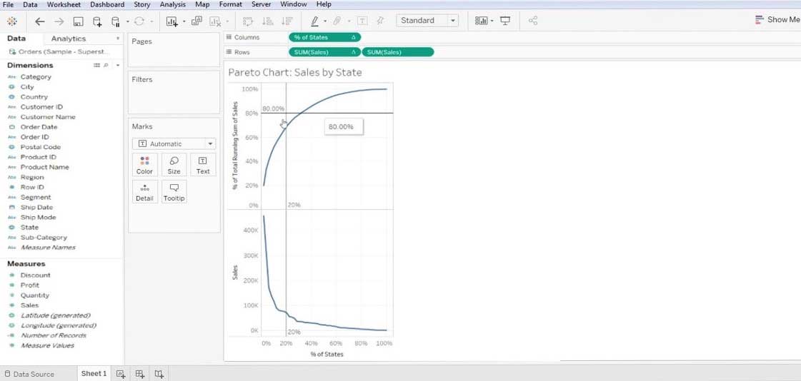
  • Now, we have to customize it further, we will again drag the ‘Sales’ from the “measure’ section to the ‘Rows’ section. This will give us multiple charts, refer to the below screen.

Pareto Chart in Tableau 1-14

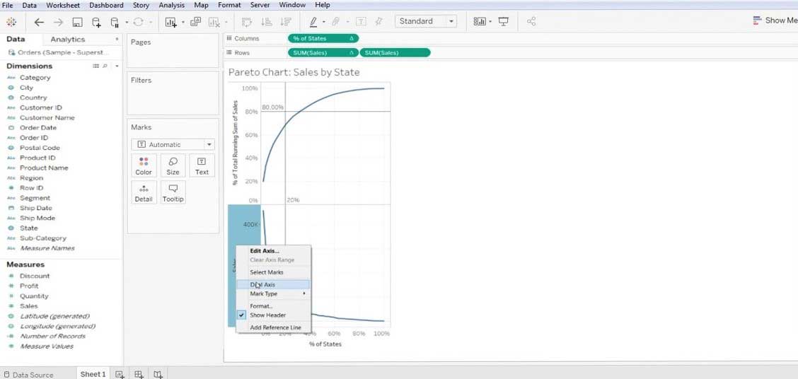
  • Now we will right-click on the bottom chart and select the “Dual Axis”.

Pareto Chart in Tableau 1-15

  • Make changes to the type of bar charts (i.e. SUM Sales 1 and SUM Sales 2).

Sum Sales

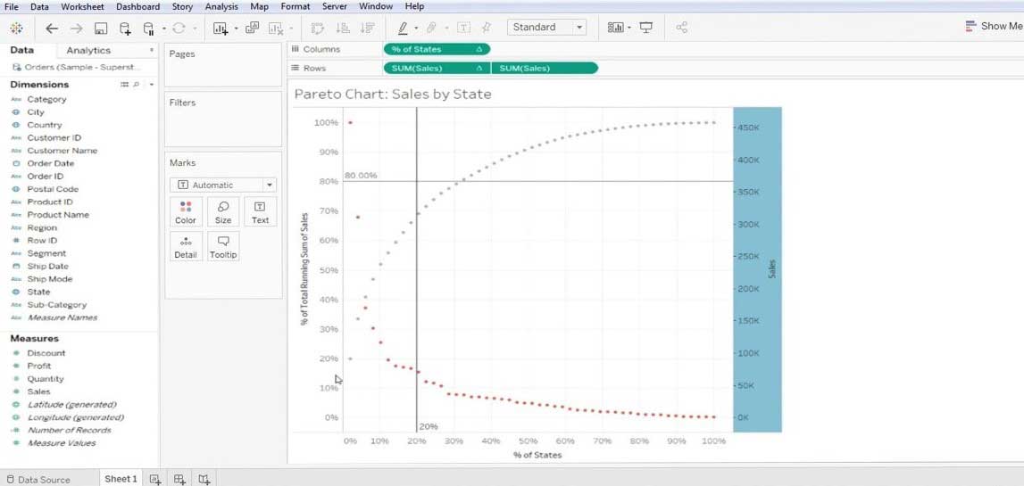
  • For one make the Line bar and for the other make it a bar chart.

Line bar

Note: This is how we create Pareto in Tableau. We also like to mention that data has varying complexity and also the chart. We have layed down the standard method to create a chart – the user can customize (means add color, details, axis, parameters) it as per his need.

Summarised Process Steps

1. First thing first we have to connect the database to the tableau.

2. Bring the “first measuring data” to the column section from the dimension section.

All in One Data Science Bundle(360+ Courses, 50+ projects)
Python TutorialMachine LearningAWSArtificial Intelligence
TableauR ProgrammingPowerBIDeep Learning
Price
View Courses
360+ Online Courses | 50+ projects | 1500+ Hours | Verifiable Certificates | Lifetime Access
4.7 (86,354 ratings)

3. Bring the “second measuring data” to the row section from the measure section of the data.

4. Sort the column under the subcategory followed by some formatting discussed below,

  • Select the descending order of sorting.
  • Select Field type under the Sort by column.

5. Every other value to be unchanged.

6. Lastly, click the OK button to exit the sorting option.

Importance of Pareto Chart in Tableau

Pareto is highly applicable to any kind of business mapping. A highly effective technique to know the performances build into any business process. We have listed some benefits to adopt Pareto for better business data visibility.

  • A chart that graphically summarizes the relative importance group of data.
  • A very useful tool that helps to concentrate on the big problem in your business.
  • This chart is mostly used to get one of the most crucial business problems – Which areas are creating more problems in business? It simply means was to focus more.
  • It solves the issue – what 20% of inputs are creating 80% of benefits or problems.
  • It gives the output in %age value; it forms a valid data to take necessary actions.
  • It is reusable and can be customized once we change the data (Tableau).

Conclusion

The concluding thoughts regarding the Pareto data analysis approach are very effective, though it may not be suitable for every case it solves the business-critical problems. It helps in allocating time, esource and effort. Pareto is a kind of observation towards your business data and not a theorem or any kind of law.

Recommended Articles

This is a guide to Pareto Chart in Tableau. Here we discuss the introduction and steps for creating the Pareto chart in tableau along with its importance. You may also look at the following articles to learn more –

  1. How to Create Gantt Chart in Tableau?
  2. Importance of Donut Chart in Tableau
  3. Using Rank Function in Tableau
  4. Different Types of Tableau Data Sets
  5. Complete guide to Pivot in Tableau
  6. Introduction to Features and Attributes of Tableau
  7. How to Create JavaFX Bar Chart
  8. How to Create Groups in Tableau?
  9. Tableau Dual Axis | How to Apply?
Popular Course in this category
Tableau Training (8 Courses, 8+ Projects)
  8 Online Courses |  8 Hands-on Projects |  55+ Hours |  Verifiable Certificate of Completion
4.5
Price

View Course

Related Courses

Business Intelligence Training (12 Courses, 6+ Projects)4.9
Data Visualization Training (15 Courses, 5+ Projects)4.8
0 Shares
Share
Tweet
Share
Primary Sidebar
Footer
About Us
  • Blog
  • Who is EDUCBA?
  • Sign Up
  • Live Classes
  • Corporate Training
  • Certificate from Top Institutions
  • Contact Us
  • Verifiable Certificate
  • Reviews
  • Terms and Conditions
  • Privacy Policy
  •  
Apps
  • iPhone & iPad
  • Android
Resources
  • Free Courses
  • Database Management
  • Machine Learning
  • All Tutorials
Certification Courses
  • All Courses
  • Data Science Course - All in One Bundle
  • Machine Learning Course
  • Hadoop Certification Training
  • Cloud Computing Training Course
  • R Programming Course
  • AWS Training Course
  • SAS Training Course

ISO 10004:2018 & ISO 9001:2015 Certified

© 2022 - EDUCBA. ALL RIGHTS RESERVED. THE CERTIFICATION NAMES ARE THE TRADEMARKS OF THEIR RESPECTIVE OWNERS.

EDUCBA
Free Data Science Course

SPSS, Data visualization with Python, Matplotlib Library, Seaborn Package

*Please provide your correct email id. Login details for this Free course will be emailed to you

By signing up, you agree to our Terms of Use and Privacy Policy.

EDUCBA Login

Forgot Password?

By signing up, you agree to our Terms of Use and Privacy Policy.

EDUCBA
Free Data Science Course

Hadoop, Data Science, Statistics & others

*Please provide your correct email id. Login details for this Free course will be emailed to you

By signing up, you agree to our Terms of Use and Privacy Policy.

EDUCBA

*Please provide your correct email id. Login details for this Free course will be emailed to you

By signing up, you agree to our Terms of Use and Privacy Policy.

Let’s Get Started

By signing up, you agree to our Terms of Use and Privacy Policy.

This website or its third-party tools use cookies, which are necessary to its functioning and required to achieve the purposes illustrated in the cookie policy. By closing this banner, scrolling this page, clicking a link or continuing to browse otherwise, you agree to our Privacy Policy

Loading . . .
Quiz
Question:

Answer:

Quiz Result
Total QuestionsCorrect AnswersWrong AnswersPercentage

Explore 1000+ varieties of Mock tests View more