Updated March 23, 2023
Introduction to Group in Tableau
In the article Group in Tableau, the group is a feature by which we can combine multiple dimension values into desired categories. Sometimes we may have numerous values for a dimension. Driving visual analytics over such a number of dimension values may not be feasible as it may not convey any useful insights. However, a combination of different dimensions values based on some similarities between them can allow us to create groups that we can use for analysis. These groups will convey insights in a much better manner than what the individual dimension values would have otherwise conveyed. The “Group” in Tableau is thus a very useful feature.
Creating Groups in Tableau
For this demonstration, we are using the Regional Sales dataset. The dataset contains quarter wise sales by different sales units in India. Here, important dimensions are the Sales Unit and Quarter, while Sales is a measure. Twenty major Indian cities represent different sales units across the country. We want to understand the regional contribution as against sales unit contribution in total sales. However, we don’t have a region as a dimension in the dataset. So, we’ll apply the concept of “Groups” to achieve the target.
Step-by-step procedure to create groups
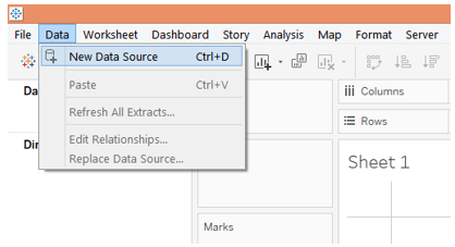
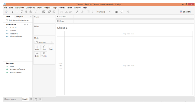
1. Load the dataset into Tableau. For this click on “New Data Source” under the Data menu. Alternatively, click on “Connect to Data”.
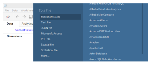
2. Next, select the requisite data source type. In this case, the data source type is MS Excel, so we selected Microsoft Excel.
3. The data gets loaded into Tableau and can be seen in the “Data Source” tab as shown by the below screenshot. Note, the data must be verified prior to proceeding to the analysis.
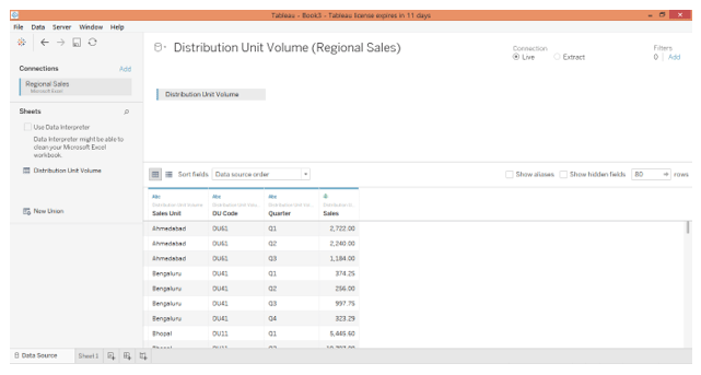
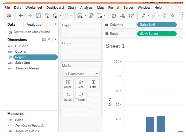
4. Moving to the sheet tab, we can find the dimensions DU Code, Quarter, and Sales Unit, and the measure Sales present in the requisite sections.
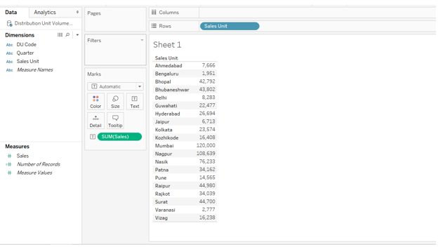
5. As a first step, just double click the over-dimension Sales Unit and measure Sales. The automatically Sales Unit goes into the Rows region. As we can see, we get a table giving Sales figures by Sales Units.
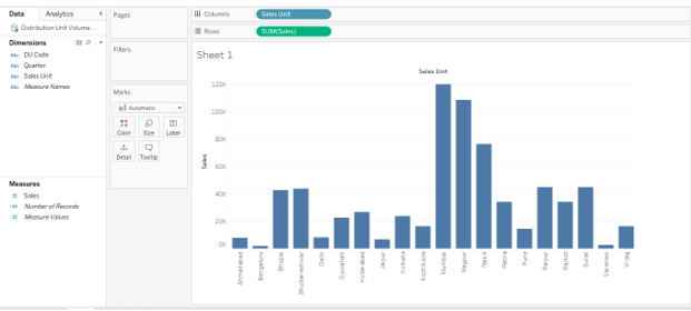
6. We converted the above table into a vertical bar graph, which conveys the insights in a better way. However, the data is present in the Sales Unit wise. In order to understand the regional performance of sales, we need to have regions in the analysis. Moreover, trying to interpret regional performance through sales units is quite difficult. So, in order to get the region as a dimension into the analysis, we will create groups of dimension values.
Here, different sales units belong to different regions. Some belong to the East, some to South, etc. So, based on the geographical location of the sales units, we’ll classify them into five groups namely East, West, North, South, Central. When we incorporate this region dimension into the analysis, we’ll be able to have a panoramic view of the sales performance across the entire network.
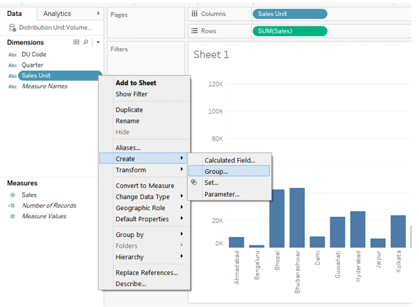
7. To create the groups, click on the drop-down menu of the dimension whose values we want to combine into groups. In this case, the dimension is Sales Unit, so, in its drop-down menu, in “Create”, select Group, and click on it. This is illustrated in the below screenshot.
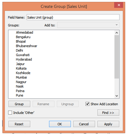
8. A “Create Group” dialogue box appears, as shown below. In this dialogue box, we can select desired dimension values to create a particular group.
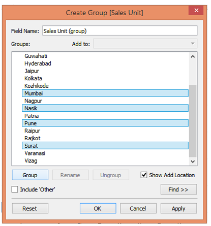
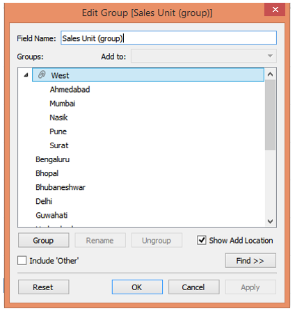
9. To create the first group, we selected Ahmedabad, Mumbai, Nasik, Pune, and Surat by pressing Ctrl, as shown in the below screenshot. Then clicking on Apply generated the group. The group has been named as “West” denoting the West region as shown by the screenshot subsequent to the below one.
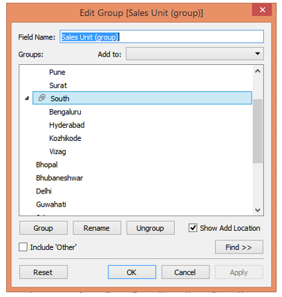
10. Following the above procedure, we created a second group which is “South” containing Bengaluru, Hyderabad, Kozhikode, and Vizag as shown below.
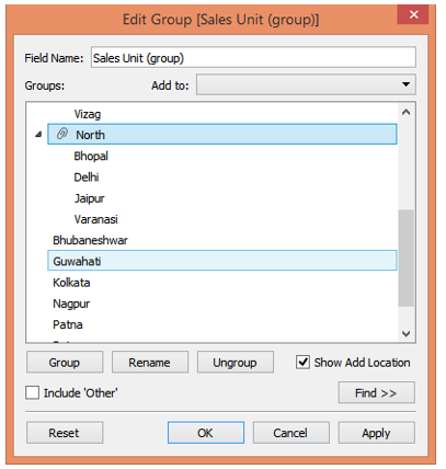
11. The third group we created consists of Bhopal, Delhi, Jaipur, and Varanasi. All these belong to North India, so, we named the group “North”.
12. Last but one, we created the “East” region following the very same process, which is composed of Bhubaneshwar, Guwahati, Kolkata, and Patna. This is as shown by the below screenshot.
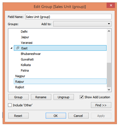
13. Lastly, we create the “Central” region which contains Nagpur and Raipur.
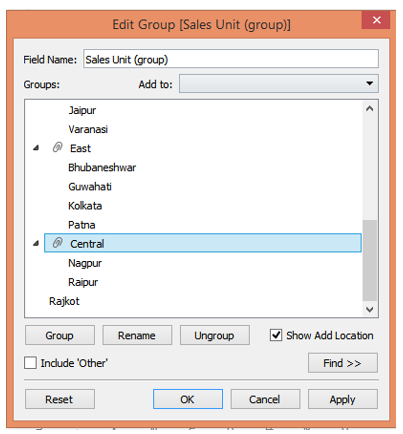
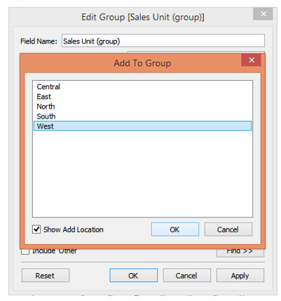
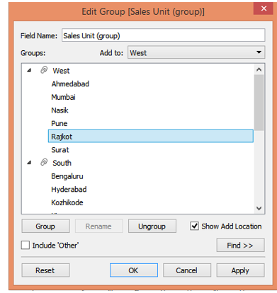
14. We successfully managed to create groups representing different regions containing different sales units. However, as can be seen in the above screenshot, we forgot to include Rajkot in a particular group. Rajkot is located on the west and so must be included in the “West” group. To include it, right-click on Rajkot, and then click on “Add to” as shown below. Now, as shown in the screenshot subsequent to the below one, from the list of Regional groups, select “West” and click on OK.
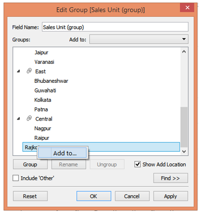
15. Following the above procedure just familiarized us with another approach to add values to a group. And we can see, now, Rajkot appears under West.
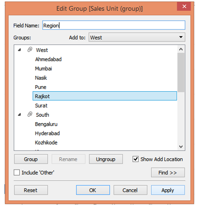
16. These groups will now act as dimension values for a newly created dimension. We must give it an appropriate name. So, in the “Field Name” section, we named it “Region”. Finally, click on Apply and then on OK. This is as illustrated in the below screenshot.
17. As we can see now, the newly created field as dimension appears in the dimension section. Now, we can very well use it in the analysis. Note, the dimension Region will not affect the dataset but only facilitate visual analysis at the view level. So, by combining different dimension values, we can create an effective visual analysis based on the need, without affecting the original data.
18. The following screenshot gives us a closer look into the newly created dimension Region containing various groups as values.
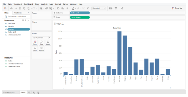
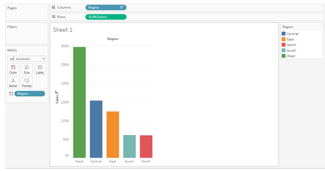
19. We included the dimension Region into the analysis, and sorting the result in the descending order of sales generated the following analysis. The following bar chart gives us a direct insight into regional sales performance.
Conclusion- Group in Tableau
In certain situations, requisite data might be present in the dataset but not in the way we wanted it to be. However, through a combination of different dimension values, we may obtain a new dimension convenient for analysis. Tableau facilitates the user to apply this approach through the functionality of Groups.
Recommended Articles
This has been a guide to Group in Tableau. Here we also discuss the introduction and creating Group in Tableau. You may also have a look at the following articles to learn more–
