Updated March 22, 2023
Introduction to Pivot in Tableau
Pivot in general means a point that supports turning towards any direction coupled with balancing. With respect to data-based operations, the concept came from MS Excel, where Pivot tables help deal with data, the way the user wants. Tableau too offers a mechanism to pivot data, supporting aggregation and data arrangement functionalities based on the user requirements. The new fields that are created after pivoting can be successfully leveraged to create insightful visualizations that are otherwise not possible to generate. Moreover, Tableau doesn’t restrict the user here as the pivoted data can also be un-pivoted to its original state.
Steps to Create Pivot in Tableau
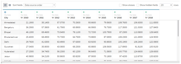
Now, we shall see the step-by-step process to pivot data in Tableau. For this demonstration, we are considering sales data for twenty major cities in India. The sales figures are present year wise. Years from 2010 to 2018 are present as columns and against them, the sales figures are present for respective cities. We’ll import this data into Tableau, and work pivot operation over it for analysis.
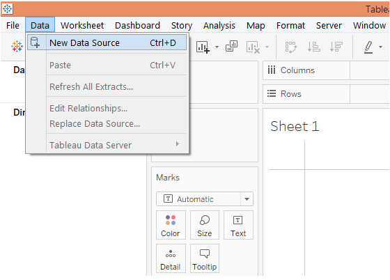
1. To load the data source, click on “New Data Source” in the Data menu. Alternatively, click on “Connect to Data”.
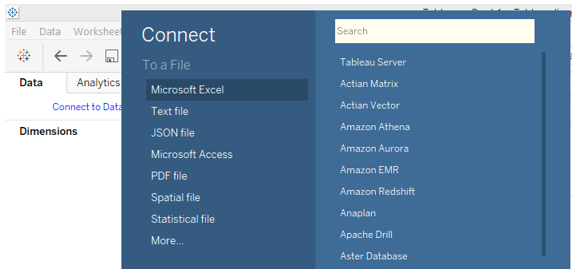
2. Select the requisite data source type. In this case, the data source is present as a Microsoft Excel file, so click on Microsoft Excel, and select the file.
3. The data gets loaded into Tableau as below.
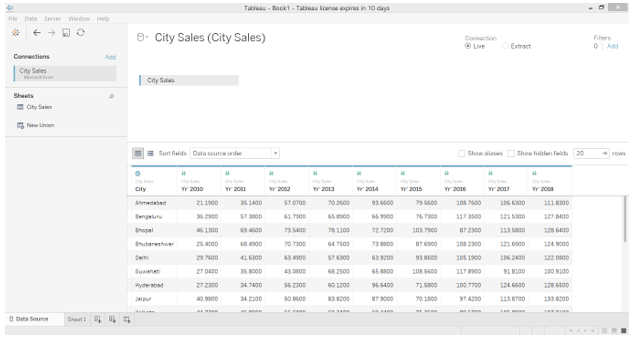
4. The following screenshot gives a closer look at the dataset. As can be seen in the following screenshot, each year is present as a separate column. And a row indicates sales for a city across different years.
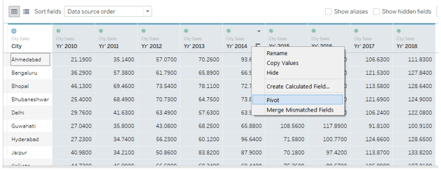
5. With the existing arrangement, it is not possible to view aggregated sales for a city as sales figures are present for different years separately. Using the “Pivot” option helps us overcome this. Select all the columns that we intend to pivot, like, in this case, we shall select all the year columns. Right-click on the selected columns and click on the Pivot option as illustrated in the below screenshot.
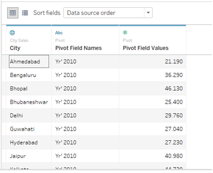
6. As soon as we click on the “Pivot” option, the data gets pivoted as shown below. The default names for new fields created as a result of pivoting are “Pivot Field Names” and “Pivot Field Values” for dimension and measure respectively. However, we shall rename them with meaningful names.
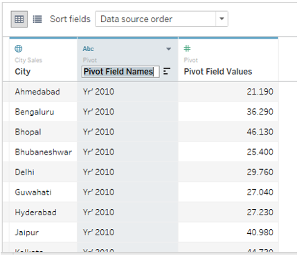
7. To rename a pivot field, just double click over it and type the requisite name. The name should suit the context and meaningfully convey the crux of the field.
8. We successfully renamed Pivot Field Names and Pivot Field Values as Year and Sales respectively as illustrated below.
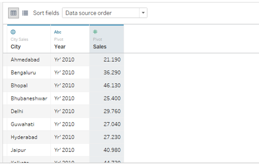
9. Moving to the sheet tab, we can see that pivot fields have successfully been brought into which we can now use for analysis. They are highlighted as shown in the below screenshot.
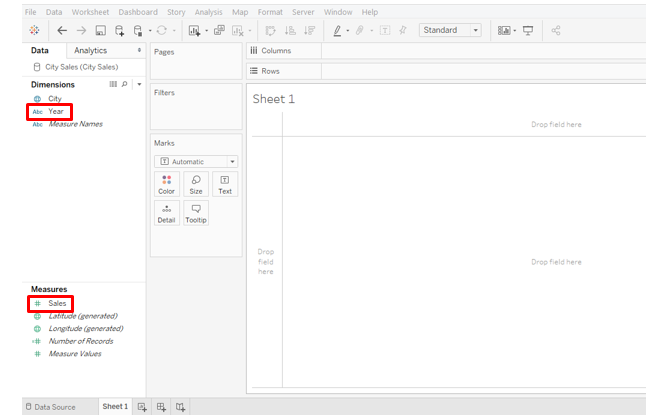
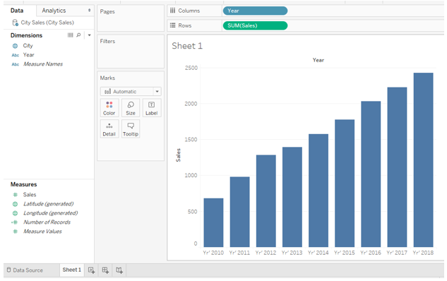
10. Just drag newly created dimension Year into Columns region and measure Sales into Rows region. We get a visualization depicting year wise sales for all the cities as below. Note, the default chart type is a bar chart that can be changed from the Marks card.
11. From the Marks card, change the chart type to Line and we get a line depicting the sales trend over the period under consideration. For better insights and analysis, we will modify this chart slightly. In Marks card, click on Color. In Color, under Markers, select the “All” option. Performing these steps will give us a line chart with markers as can be seen in the below screenshot.
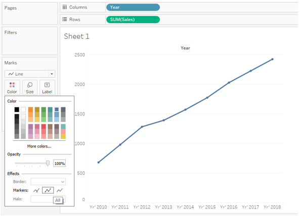
12. The line chart indicates an increasing trend from 2010 to 2018. However, as an analyst, we may want to get deeper into sales figures. To make the sales figures visible around the labels, just drag Sales on Label in Marks card. We get a line chart with Sales figures as shown in the below screenshot.
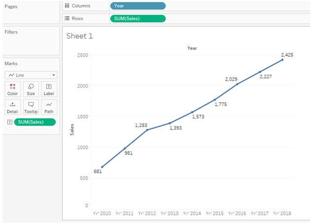
The above graph is more insightful and offers an easy and quick way to make year over year comparisons and percentage calculations.
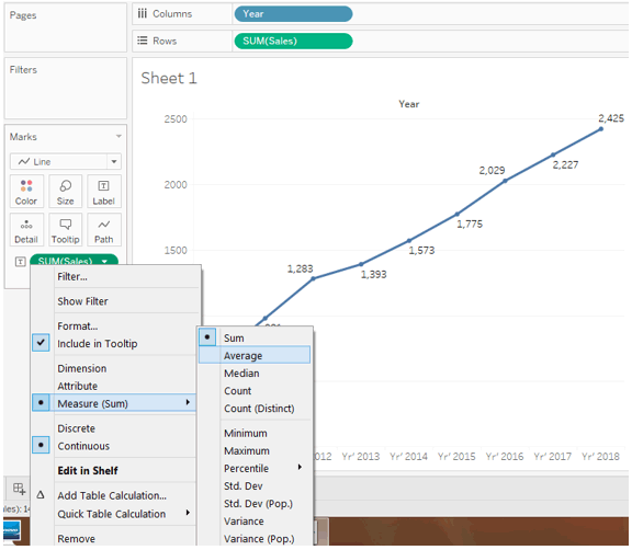
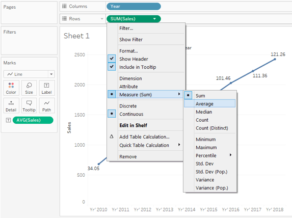
13. In the above analysis, we worked over total sales. Sometimes, it becomes important to analyze the average sales. In our example, to analyze average sales over a period of time, we will have to change the aggregation measure from SUM (Sum) to AVG (Average). Note, we have Sales present in the Columns region as well as the Marks card, so we will have to modify the aggregation measure at both the places. To change the aggregation measure, click on the drop-down menu of the dimension Sales, then in the “Measure” section select “Average”. The following screenshot shows the procedure to change the aggregation measure in the Marks card and the subsequent screenshot shows the procedure for dimension Sales present in the Columns region.
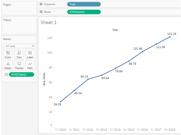
14. The following screenshot shows the average sales trend for twenty major cities across India for the period 2010 to 2018.
In the above part, we saw how pivoting data helps us perform crucial analysis and work with the data using different aggregation measures and data arrangement options. This is a crucial aspect of pivot in Tableau.
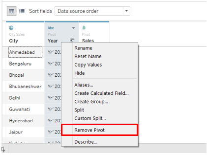
15. We can remove the pivot and restore the data to its original state. To remove the pivot, just right click on any pivoted field, and click on the “Remove Pivot” option.
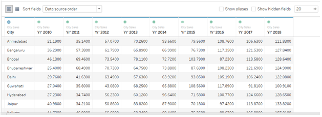
16. The below screenshot shows how clicking over the “Remove Pivot” option restored the data to its original state. This is important because, based on the requirement we can pivot the data, perform analysis and once the purpose is served, restore the data to the original state. This serves two purposes: Performing Analysis and Keeping the data intact.
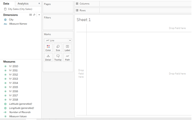
17. Just see what happens if we do not pivot the data and used it as it is for analysis. As we can see in the below screenshot, separate years appear as separate measures and it is not possible to aggregate them so as to get a year-wise sales trend. Remember, we have overcome this using Pivot.
Conclusion
Deriving its name from the mechanical pivot, the pivot functionality in database operations refers to the mechanism to work over and aggregate data as required. The Pivot option in Tableau helps to work with the data to obtain a suitable data arrangement which can be further used for context-based analysis.
Recommended Articles
This is a guide to Pivot in Tableau. Here we discuss the Step-by-Step Procedure to create Pivot in Tableau and also work pivot operation over it for analysis. You may also look at the following article to learn more –
