EDUCBA

EDUCBA

MENUMENU
  • Free Tutorials
  • Free Courses
  • Certification Courses
  • 360+ Courses All in One Bundle
  • Login
Home Data Science Data Science Tutorials Tableau Tutorial Gantt Chart in Tableau
Secondary Sidebar
Tableau Tutorial
  • Charts
    • Tableau Charts
    • Tableau Bar Chart
    • Tableau Chart Types
    • Donut Chart in Tableau
    • Tableau Gauge Chart
    • Funnel Chart in Tableau
    • Gantt Chart in Tableau
    • Bubble Chart in Tableau
    • Pareto Chart in Tableau
    • Sankey Chart In Tableau
    • Stacked Bar Chart in Tableau
    • Tableau Bullet Chart
    • Waterfall Chart in Tableau
    • Line Chart in Tableau
    • Heat Map in Tableau
    • Histogram in Tableau
    • CrossTab in Tableau
    • Treemap in Tableau
    • Trend Lines in Tableau
    • Tableau Reference Lines
    • Tableau Dual Axis
    • Legend in Tableau
    • Pie Chart in Tableau
    • Tableau Storyline
  • Basic
    • What is Tableau
    • What is Tableau Dashboard
    • What is Tableau Server
    • Uses of Tableau
    • Tableau Versions
    • Tableau Architecture
    • Is Tableau Free
    • Tableau New Features
    • How To Install Tableau
    • How to Use Tableau?
    • Install Tableau Server
    • Tableau Commands
  • Statement
    • Tableau IF Statement
    • Case Statement in Tableau
  • Functions
    • Tableau Functions
    • Tableau String Functions
    • Concatenate in Tableau
    • Rank Function in Tableau
    • Tableau Aggregate Functions
    • Window Sum Tableau
    • LOD Expressions in Tableau
    • LOOKUP Function in Tableau
    • Tableau Fixed Function
    • Tableau Count Distinct
    • Tableau Window Functions
  • Sort/Filters
    • Sorting in Tableau
    • Filters in Tableau
    • Types of Filters in Tableau
    • Tableau Action Filter
    • Context Filter in Tableau
    • Tableau Parameter Filter
    • Adding Filters in Tableau Dashboard
    • Tableau Context Filter
  • Tableau Dashboard
    • Dashboard in Tableau
    • Tableau Dashboard Examples
    • Tableau Dashboard Creation
    • Tableau Dashboard Design
    • Tableau Workbook
  • Advanced
    • Tableau Bins
    • Tableau 3D
    • Tableau Export to Excel
    • Tableau Reporting
    • Tableau Reader
    • Tableau Map
    • Tableau Viewer
    • Tableau Prep Builder
    • Tableau Bridge
    • Tableau Tooltip
    • Tableau Hyper
    • Tableau Zen Master
    • Tableau Union
    • Tableau Templates
    • Tableau Alerts
    • Tableau Reporting Tool
    • Conditional Formatting in Tableau
    • Tableau Web Data Connector
    • Tableau BI Tool
    • Data Blending in Tableau
    • Parameters in Tableau
    • Tableau Data Sets
    • Creating Set in Tableau
    • Tableau Drill Down
    • Tableau Dynamic Parameters
    • Tableau Table Calculation
    • Tableau Visualization
    • Tableau Joins
    • Pivot in Tableau
    • Data Visualization With Tableau
    • Forecast in Tableau
    • Map Layers in Tableau
    • Group in Tableau
    • Tableau Group by
    • Hierarchy in Tableau
    • Sets in Tableau
    • How to create a Set in Tableau
    • Tableau Order of Operations
    • Tableau User Group
    • Tableau Calculated Field
    • Custom SQL in Tableau
  • Interview Questions
    • Tableau Interview Questions

Related Courses

Tableau Certification Course

Business Intelligence Courses

Data Visualization Courses

Gantt Chart in Tableau

By Priya PedamkarPriya Pedamkar

Gantt Chart in Tableau

Introduction to Gantt Chart in Tableau

Many projects end up into a complete disaster in their initial phase as they try to bite more than they can chew. There can be multiple reasons for this failure – one such crucial aspect is a lack of a proper project visualization tool. Project managers need to have complete control over the planning, monitoring, and adjusting changes, either big or small, whenever needed. We, in this Gantt chart in tableau article, have discussed one such great and widely accepted PM tool – the Gantt chart.

Gantt chart – is a line/bar chart (more common type) that captures and illustrates project endeavored schedule and the dependency relationship between all the related activities with milestones, achievements, tasks, etc.

Let us see how one can create a Gantt chart in Tableau, also its importance in day to day life of Project managers in making their project a success.

How to Create a Gantt Chart in Tableau?

  • To begin with the process of creating a Gantt chart, the Tableau software needs to connect with the data source. The data source can be either an – Excel spreadsheet, MySQL, any server.
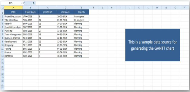
  • We are working with the Excel spreadsheet,

Gantt chart in Tableau - Excel spreadsheet

Start Your Free Data Science Course

Hadoop, Data Science, Statistics & others

  • Once you are ready with your Data source, you need to open your Tableau Application so as to connect the data source.
  • Open Tableau > Go to Connect Data Source >> Open the Saved Excel Sheet file containing the Data.
  • Once you have done this, you will get a screen like this –

GCT8

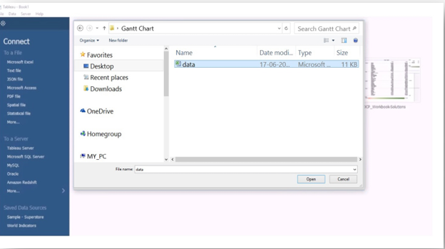
  • Select the data source file, and you will get a screen like this –

Gantt chart in Tableau - Data source file

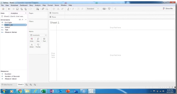
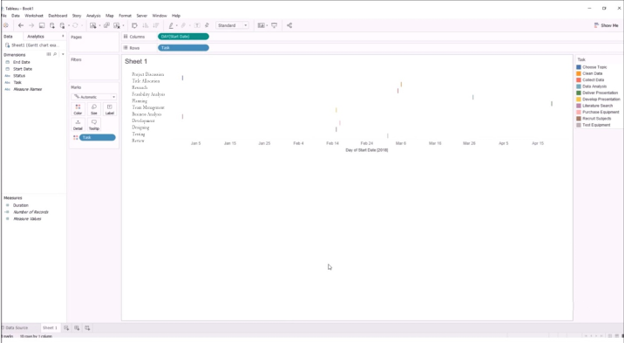
  • The above screen is the dashboard of Tableau; this is where we will create the Gantt chart.

Before we move ahead, let us first brief our audiences about the sections –

1. Dimension: This section holds the columns present in the datasheet which we have created in Excel. We can see under the Dimension section all the columns are present.

2. Measure: the name itself gives some idea. These are the measuring parameters.

3. Marks: marks are a kind of edit tool to enhance our Gantt chart with colors, size, text, tooltip, etc. These are to enhance the presentation style.

4. Columns & Rows: Columns represent the column data. All the info in the column section represents the column data. Same with the Rows data

5. Sheet Area: The sheet is the area where the Gantt chart will be visible to us; it is initially blank until some work progress.

  • The next thing is to customize your data as per your need. Click on the ‘Sheet’ tab and start customizing the data. Use the ‘Marks’ option to display your data more visually. In Tableau, there are several kinds of charts – bar, line, maps, pie, donut, area, and several others.
  • For the Gantt chart, normally, a bar cart is preferred, as the Gantt chart represents the time intervals for works in different stages.
  • Follow the below screen –

GCT6

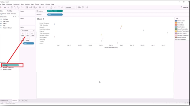
  • In the above screen, we can see that the intervals are very minute, so we will drag the ‘Duration’ from the ‘Measures’ column and drag it to the ‘Size’ under the ‘Marks ‘ section. Follow the below screen.

GCT5

  • Once you have done this, you will get something like this – follow the below screen.

GCT4

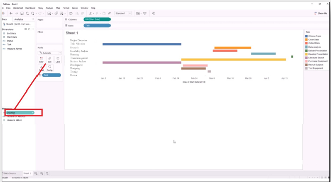
  • Now you have the duration interval for each task; you can see that the duration is unorganized. You should organize (means to sort) it by following the below steps.

TASK >> SORT >>

GCT3

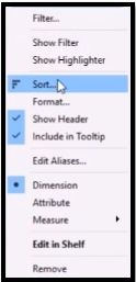
  • With this, the ‘Sort’ dialogue box will open up where you have to select the
  • FIELD radio button and select the “START DATE”…….let us see the below screen.

GCT2

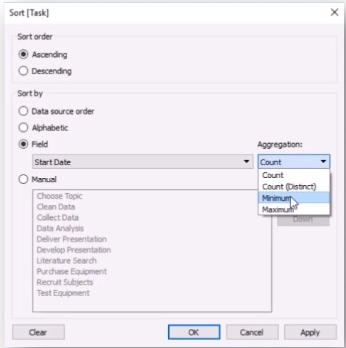
  • In the Aggregation drop-down menu, you have to select the “MINIMUM” and then click on the ‘APPLY’ and “OK” button.
  • Once you have clicked the OK button, you will get an organized bar chart. Have a look at the below screen.

GCT1

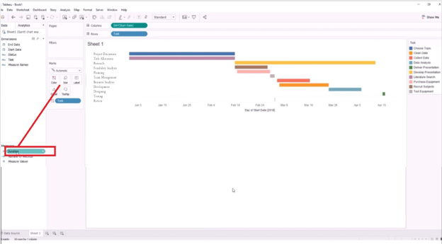
  • This is how you will make a Gantt chart. With this, we also say that there can never be similar requirements for making a Gantt chart. A user can customize from here onwards as per his needs by changing colors, time duration, size of the chart, and so on.
Note: The chart complexity may vary as per the requirement.

Importance of Gantt chart

  1. With the Gantt chart, the team knows what exactly is going in the project, how far they have come, and where are they lagging behind. It is one of the most widely used projects visibility tools.
  2. It acts as a medium for improved and better communications as we know that poor communication techniques and lack of evidence become one of the most crucial reasons for project failure. It eliminates this issue.
  3. More clarity
  4. Better grip on time management

Conclusion

  • Gantt chart is one of the crucial tools to track project-related management. It also eliminates the need for any other tool for project management.
  • Those who have really used it or those who have read about it they can relate and understand its importance.
  • TABLEAU as an application has gained huge momentum in the current industry; its ability to make these PM-related documents are one of the promising reasons for its wide usability.

Recommended Articles

This has been a guide to the Gantt chart in Tableau. Here we have discuss how to create a chart in Tableau with the importance of the Gantt chart. You can also go through our other suggested articles to learn more –

  1. Tableau vs QlikView
  2. Stacked Bar Chart in Tableau
  3. Overview of Funnel Chart in Tableau
  4. Line Chart in Tableau
Popular Course in this category
Data Visualization Training (15 Courses, 5+ Projects)
  15 Online Courses |  5 Hands-on Projects |  105+ Hours |  Verifiable Certificate of Completion
4.5
Price

View Course

Related Courses

All in One Data Science Bundle(360+ Courses, 50+ projects)
Python TutorialMachine LearningAWSArtificial Intelligence
TableauR ProgrammingPowerBIDeep Learning
Price
View Courses
360+ Online Courses | 50+ projects | 1500+ Hours | Verifiable Certificates | Lifetime Access
4.7 (86,650 ratings)
Tableau Training (8 Courses, 8+ Projects)4.9
Business Intelligence Training (12 Courses, 6+ Projects)4.8
0 Shares
Share
Tweet
Share
Primary Sidebar
Footer
About Us
  • Blog
  • Who is EDUCBA?
  • Sign Up
  • Live Classes
  • Corporate Training
  • Certificate from Top Institutions
  • Contact Us
  • Verifiable Certificate
  • Reviews
  • Terms and Conditions
  • Privacy Policy
  •  
Apps
  • iPhone & iPad
  • Android
Resources
  • Free Courses
  • Database Management
  • Machine Learning
  • All Tutorials
Certification Courses
  • All Courses
  • Data Science Course - All in One Bundle
  • Machine Learning Course
  • Hadoop Certification Training
  • Cloud Computing Training Course
  • R Programming Course
  • AWS Training Course
  • SAS Training Course

ISO 10004:2018 & ISO 9001:2015 Certified

© 2022 - EDUCBA. ALL RIGHTS RESERVED. THE CERTIFICATION NAMES ARE THE TRADEMARKS OF THEIR RESPECTIVE OWNERS.

EDUCBA
Free Data Science Course

SPSS, Data visualization with Python, Matplotlib Library, Seaborn Package

*Please provide your correct email id. Login details for this Free course will be emailed to you

By signing up, you agree to our Terms of Use and Privacy Policy.

EDUCBA Login

Forgot Password?

By signing up, you agree to our Terms of Use and Privacy Policy.

EDUCBA
Free Data Science Course

Hadoop, Data Science, Statistics & others

*Please provide your correct email id. Login details for this Free course will be emailed to you

By signing up, you agree to our Terms of Use and Privacy Policy.

EDUCBA

*Please provide your correct email id. Login details for this Free course will be emailed to you

By signing up, you agree to our Terms of Use and Privacy Policy.

Let’s Get Started

By signing up, you agree to our Terms of Use and Privacy Policy.

This website or its third-party tools use cookies, which are necessary to its functioning and required to achieve the purposes illustrated in the cookie policy. By closing this banner, scrolling this page, clicking a link or continuing to browse otherwise, you agree to our Privacy Policy

Loading . . .
Quiz
Question:

Answer:

Quiz Result
Total QuestionsCorrect AnswersWrong AnswersPercentage

Explore 1000+ varieties of Mock tests View more