Updated March 21, 2023
Introduction to Tableau Data Sets
Tableau data sets are heterogeneous data that are sourced from various data sources and used for data visualizations. Dataset is the core component that is part of any business process related to business intelligence(BI). Once the data set is prepared and imported to Tableau’s workbook, it is easy to manage the data quality and calculated values. Some commonly used functionalities on the Tableau data set are creating standard and drill-down visualizations and adding reference lines, bands, distributions, and boxes for condition-specific identification. In addition, tableau supports dashboards and stories that are a sequence of related visualizations created using the data sets.
How To Reference Line in Tableau Data Sets?
We can use the Reference line is to compare results between measures and dimensions. We will download some data sets from the mentioned link above and perform a reference line inside the table.
- Download file named 2018 FIFA World Cup Rosters
- Save it on the computer.
- Open Tableau Desktop or Public.
- Open the downloaded file into tableau.
- Drag Group dimension into columns Drags Caps measures into rows.
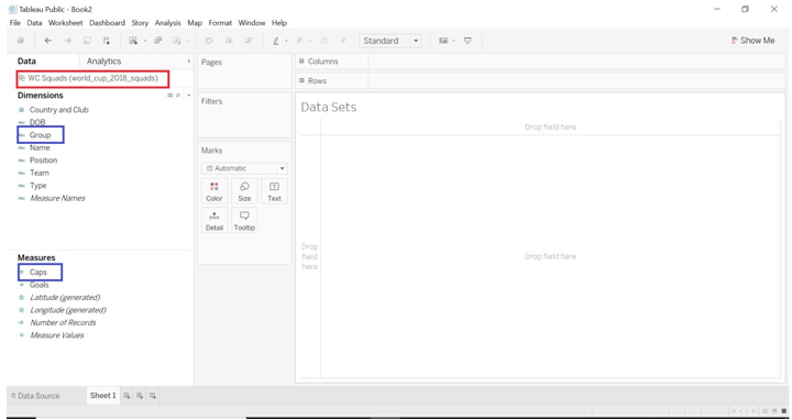
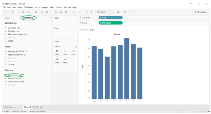
When we have done with dragging of dimensions and measures into the tableau, you will get to see the below picture.
By default, Bar Chart will get displayed because there is a one-dimension and measure.
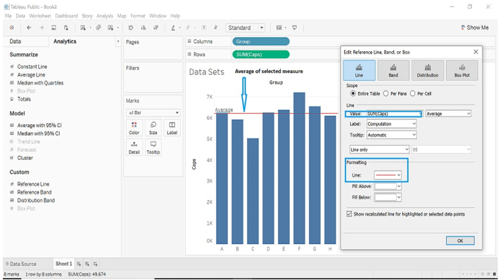
- Go to the Analytics->Custom->Reference Line
- Drag the Reference line into the chart.
- Select scope as you want like Entire Table, Per cell and Per Pane
- We will start with scope as Entire Table Select value as Sum, Average
- Label as Computation.
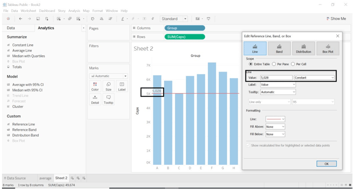
- In the formatting region Line change color to red (you can choose your favorite color).
- We will set the value as constant; this option will show the constant value of the specified measure as per the data we have selected. We can change this value. Data we have now, tableau will show constant value as 5,028.
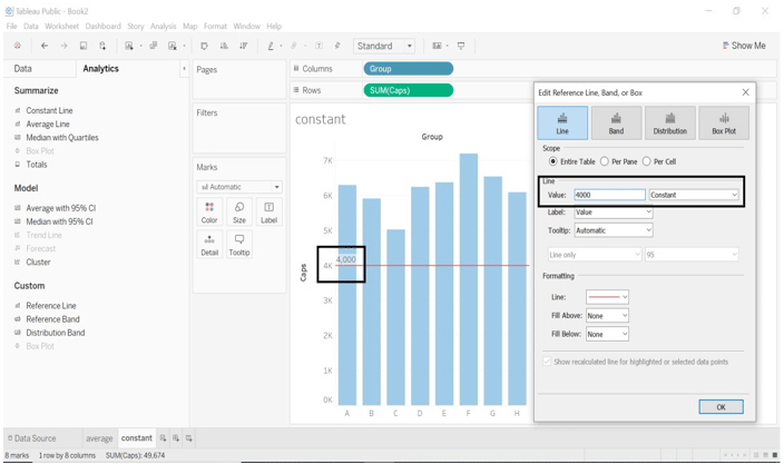
- We will change the constant value to 4000.
- Below two images will show constant value from default to change.
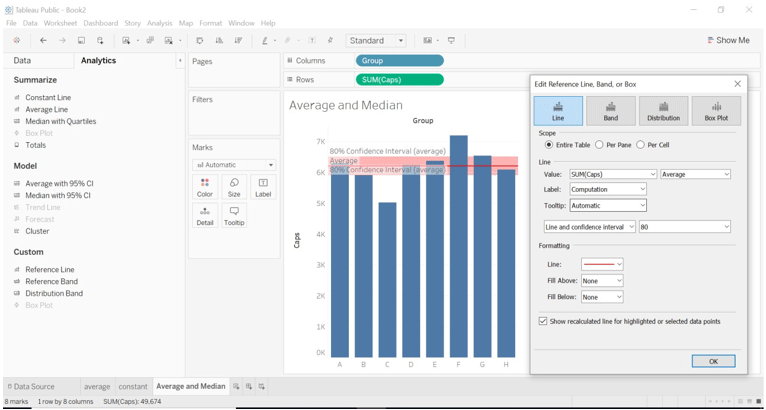
- We can change the Line type when we select the value as Average and Median only.
- When we select the value as Average, we changed Line only change to the Line and confidence interval.
- We have kept Label as Computation; when we select a different label, then the picture will be different.
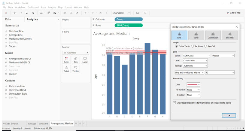
- When we select the value as Median.
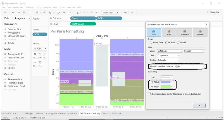
Per Pane
- When we select scope as per pane, tableau will calculate aggregation for each pane. For example, in the below example table, each group calculated the average for specified data for goals.
- Drag Group and DOB dimensions into columns.
- Drag Goals into columns.
- Drag DOB into Filters, select date as you want.
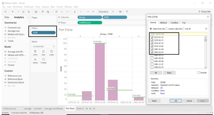
- We have selected Line type as Line and confidence interval; we can size of it or customize size as per we want.
- We have formatted Fill Above and Fill Below colors.
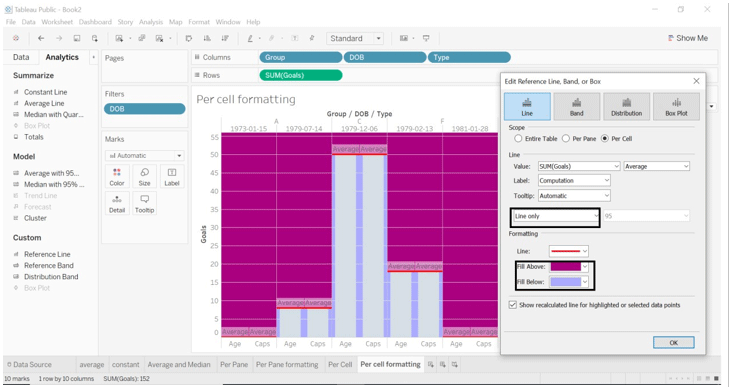
Per Cell
- If we select scope as Per cell, it adds a reference line to each selected cell.
- Tableau will calculate aggregation for each cell we select.
- Select Group, DOB, Type dimensions to columns.
- Select Goals to rows.
- Drag reference line to per cell.
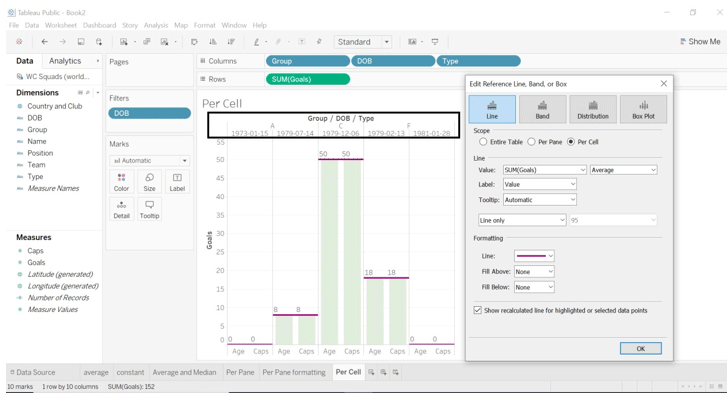
- Have a look at the below image; we have used the formatting region here.
- We have changed Fill Above and Fill Below color.
- We kept Line only.
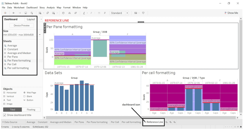
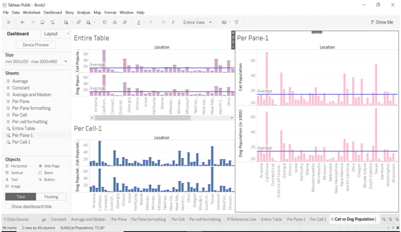
Dashboard
- The dashboard is a collection of several worksheets that provide a view of the different worksheets we have made a visualization with.
- We are going to compare the result between the scope we have selected for Reference Line.
- Steps to follow to create a dashboard.
- Go to the Dashboard (Dashboard icon given on the bottom bar of the sheet.)
- Have a look at the left side of the dashboard; you will see the number of worksheets we have worked on or created.
- Drag and Drop sheet into the dashboard.
- We are going to see the average created for the Entire table, Per Pane and Per Cell.
- We can change dashboard title (select Show dashboard title->right click on title name->select Edit title->give title name you want)
- Show the dashboard title option given on the bottom of the left side of the dashboard. In the below image you can see that.
- You can see in the below image; we have dragged worksheets.
- Average (worksheet)- Scope as the Entire table. The average is calculated on the entire table concerning the dimensions and measures we have selected from the dataset.
- Per pane formatting (worksheet)- Scope as Per Pane. The average is calculated on Per Pane concerning the dimensions and measures we have selected from the dataset.
- Per cell formatting (worksheet)- Scope as Per Cell. The average is calculated on Per Cell concerning the dimensions and measures we have selected from the dataset.
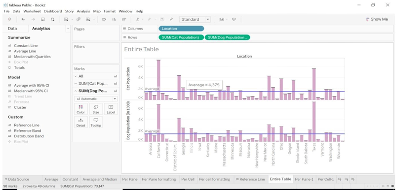
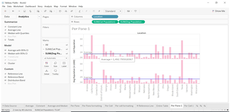
We will look into different dataset name Cat vs Dog Popularity in the US (dataset from the link given above)
- Download the dataset from the link mentioned above.
- Open it into tableau desktop or tableau.
- Drag Location from dimension into columns.
- Drag Cat Population and Dog Population into rows.
- Apply Reference Line into Entire Table, Per Pane and Per Cell.
Entire Table
Per Pane
Per Cell
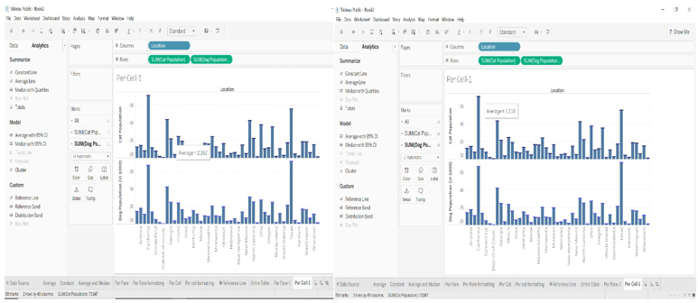
- We have created a dashboard for showing different views in one sheet, i.e. Dashboard. We can see how average differs as per the Entire Table, Per Pane, and Per Cell.
Conclusion
By adding reference lines to different types of data sets, we will get a different view. We can compare the result generated by each view. It will be easy to look into every dimension and measure. Tableau offers different types of the dataset, which will help us visualize data with a different value. We can get expertise with the tableau tool.
Recommended Articles
This is a guide to Tableau Data Sets. Here we discuss the different types of datasets, which will help us visualise data differently. You may also look at the following article to learn more –
