Updated March 24, 2023
Introduction to Dual Axis in Tableau
Dual Axis refers to the fact that we have two axes over the same graph. An axis is a very important component of any graph, and it represents the quantitative measure based on which visualization is created. In some situations, we may intend to analyze multiple measures simultaneously. Having them plot as different graphs may not be that insightful and deriving suitable meaning out of the insights may not be easy. Dual-axis overcomes these issues owing to its ability to have graphs for multiple measures over the same plot. Tableau allows applying Dual-axis in a very easy manner.
How to Apply Dual Axis in Tableau?
In order to understand how Dual-axis can be applied, and other features related to it, we shall go through the following demonstration. The dataset used here contains daily temperature and precipitation data for a month. Using the concept of dual-axis we will try to study the daily pattern for temperature and precipitation. This can be accomplished using a dual-axis. The measures present in the dataset are “Precipitation in %” and “Temperature in Celsius”, while City and Date are the dimensions.
Let’s now proceed to understand how the dual-axis can be applied for a meaningful analysis. This is as described in the following section.
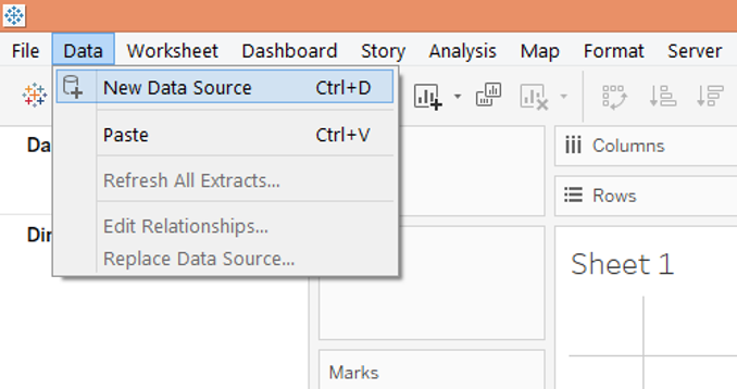
Step 1: First load the requisite dataset into Tableau. For this click on the Data menu, and under it, click on the “New Data Source” option. Alternatively, one can also load the data source by clicking on “Connect to Data”.
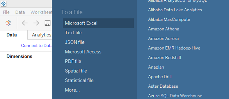
Step 2: Select the requisite data source type. In this case, it is Microsoft Excel. This is as shown below.
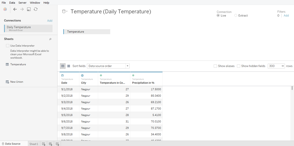
Step 3: The data gets loaded and can be seen in the “Data Source” tab. Examine the data prior to proceeding to the analysis. The following screenshot shows this.
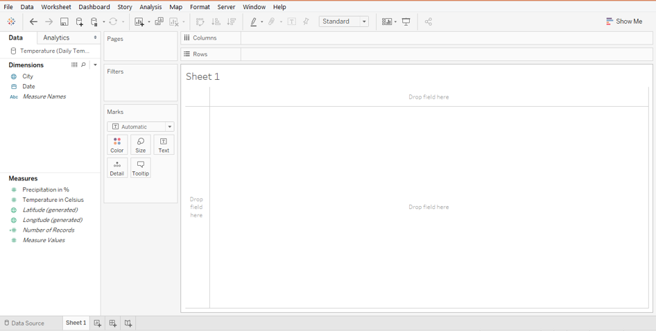
Step 4: Moving to the sheet tab, one can find the dimensions and the measures present in the requisite sections as shown below.
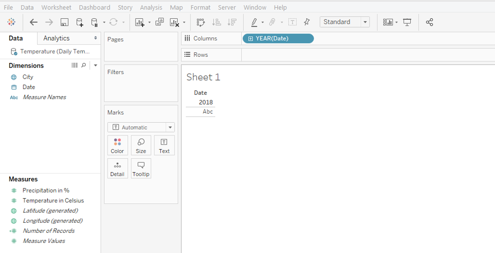
Step 5: First drag the Date dimension into the Columns region or just double click over it. As shown in the following screenshot, automatically, the YEAR function gets applied over the Date dimension.
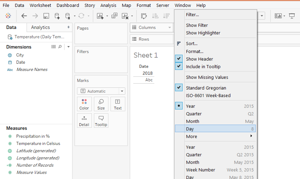
Step 6: We want the graph to be generated day wise. So, in order to change the automatically applied YEAR function, as shown above, click on the drop-down menu of the Date dimension in the Columns region. From the menu, select the “Day” function as shown in the following screenshot.
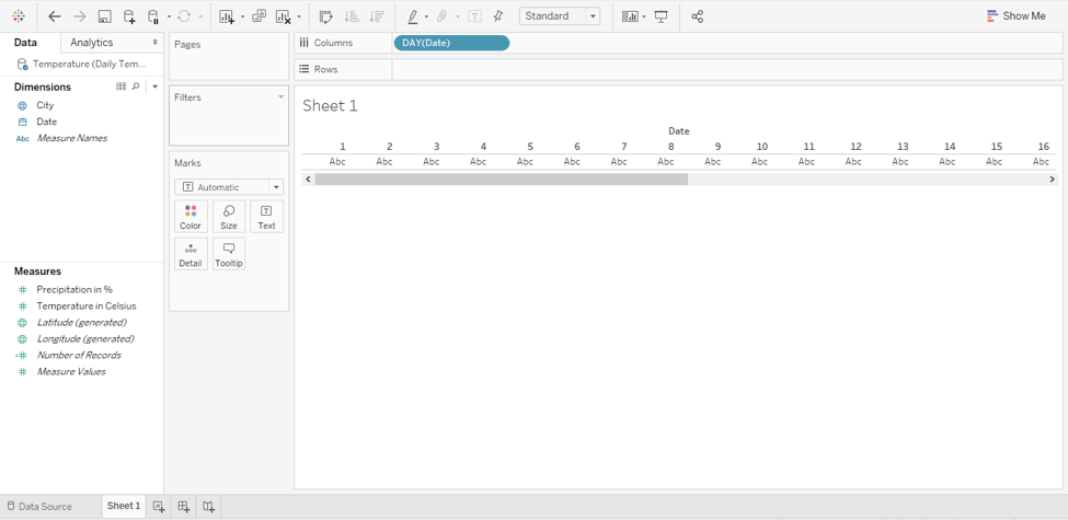
Step 7: When Day function gets applied, as shown in the following screenshot, day-wise data appears.
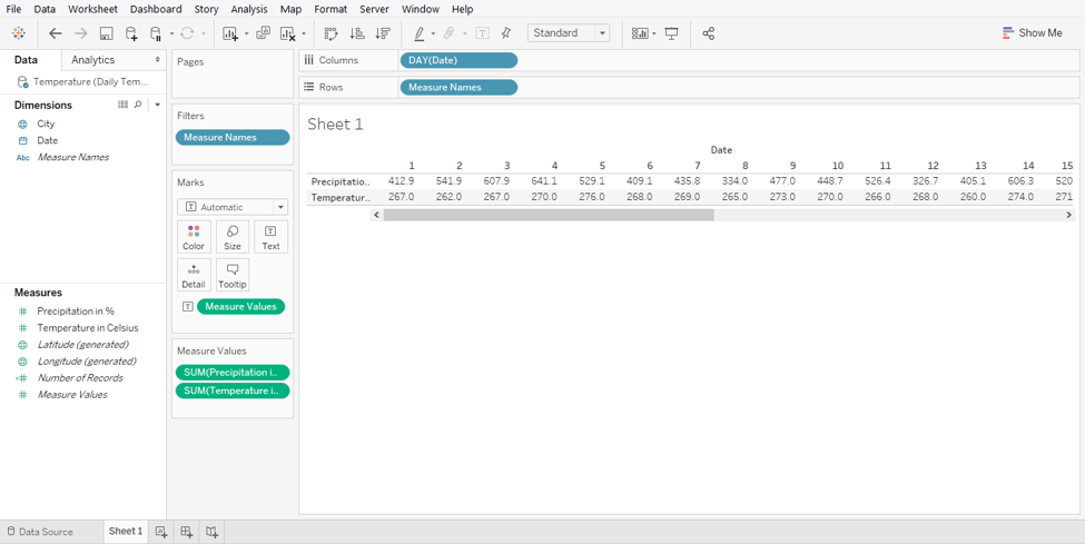
Step 8: Now, we shall bring the measures “Precipitation in %” and “Temperature in Celsius” into the analysis. Just double click over them, and we get a table giving date wise values for the two measures. This is as shown in the below screenshot.
Step 9: In order to create visualization over the above data, go to “Show Me”. In Show Me, click on the “horizontal bars” symbol.
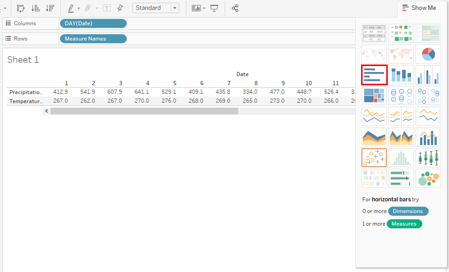
Step 10: Following the above steps result in the generation of two horizontal bar graphs, as shown in the following screenshot.

Step 11: Studying the bar graphs in the above screenshot is difficult. We will convert them into vertical bar graphs using Ctrl + W command. The vertical graphs are as shown below. Now, the graphs present the insights much better.

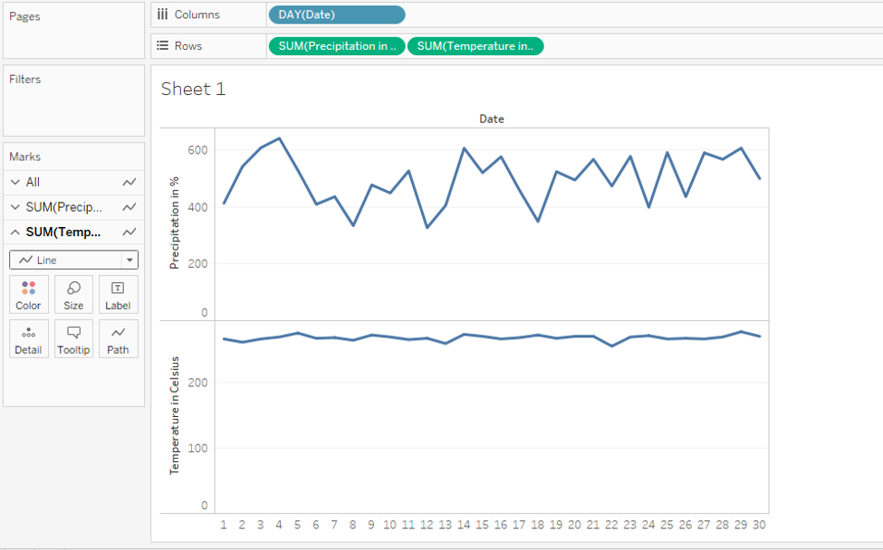
Step 12: Bar graphs, as shown above, allow better insight capturing. However, in order to analyze temperature vs precipitation trends, the line chart is the most effective. We shall convert both the horizontal charts into line charts. This is simple. Just change the type of both the charts to “Line” from the menu in the Marks card. This is as highlighted in the below screenshot.

Step 13: Following the above steps gives us the line charts as shown by the below screenshot. They are present as two different graphs and it is difficult to analyze the patterns of the measures. Using dual-axis, we can compare the daily temperature vs precipitation trend.
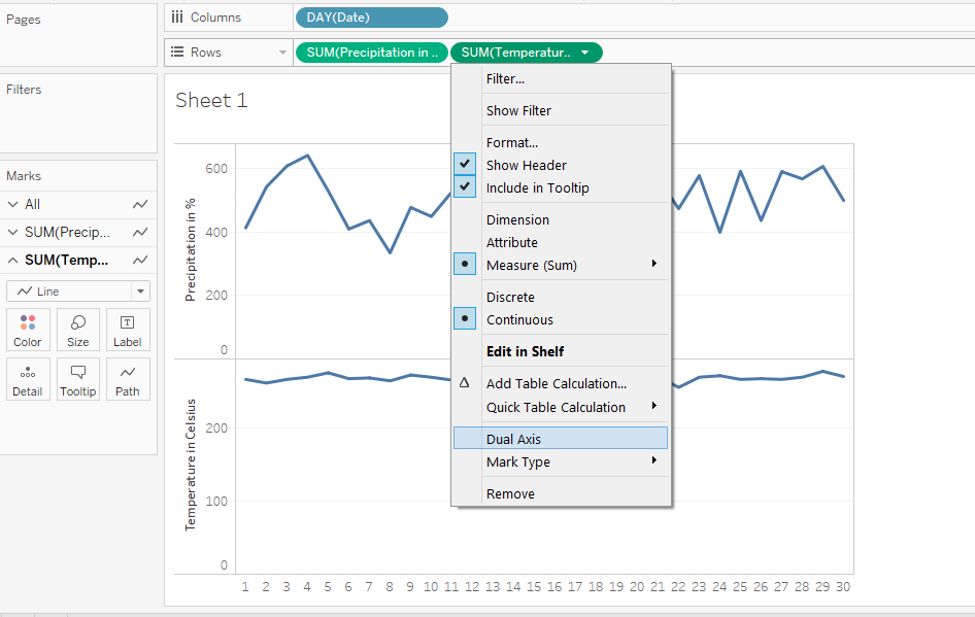
Step 14: Now, we’ll create a dual-axis. A very important thing to note here, dual-axis can be created for the measure which is present on the right side amongst the two measures in the Rows region. Like in this case “Temperature in Celsius” is present on the right side, so, we can create a dual-axis for it. In order to have a dual-axis, just click on the drop-down menu of the measure. From the menu select “Dual Axis”. This is illustrated in the following screenshot.
Step 15: We have successfully created a dual-axis which is as shown in the below screenshot. A couple of important things to note here: two-line charts representing two different measures appear as two different categories represented through different colors. The categories appear on the right side of the screenshot. A secondary axis has got generated for the “Temperature in Celsius” measure. This can be seen on the right side of the plot. Note, based on the range of values for a particular measure, the maximum value for the axis is decided.
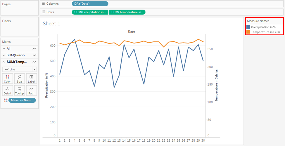
- The maximum value for both primary and secondary axes isn’t the same. This limitation is overcome by dual-axis which allows us to compare two measures at a time irrespective of the range of its values.
- The above analysis using dual-axis allows us to easily compare the temperature vs precipitation trend. We can see that though the temperature isn’t varying much, precipitation is fluctuating as depicted by the jagged line chart.
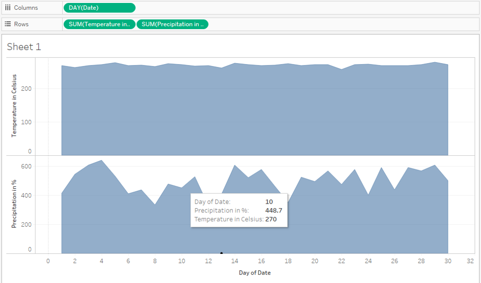
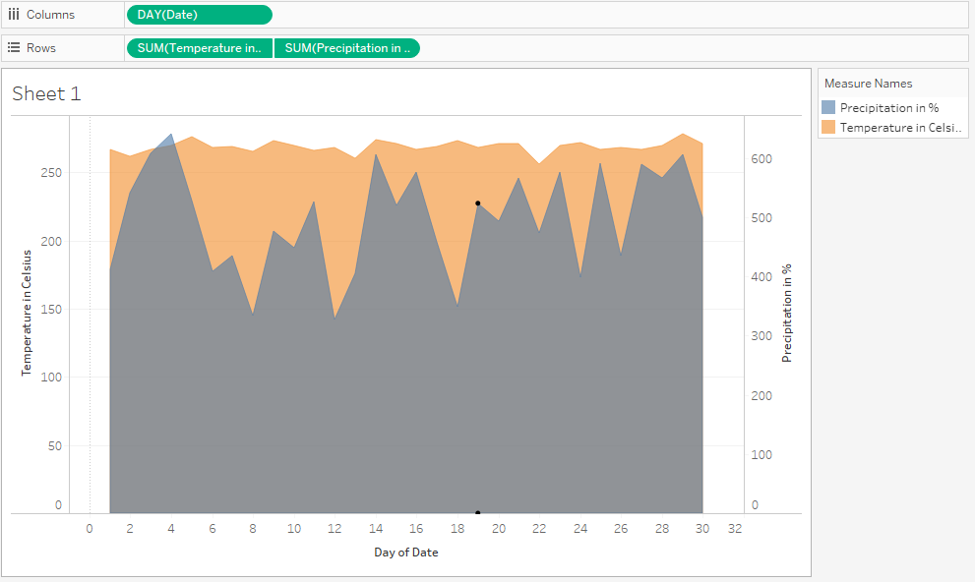
Step 16: We can analyze the trend using the area chart also. However, for using area charts, drag “Precipitation in %” to the right side, and create a dual-axis for it.
Step 17: As we can see in the below screenshot, we got area charts for two measures using dual axis. We kept “Precipitation in %” to the right side, because, otherwise, it would have got eclipsed by the area graph of “Temperature in Celsius” measure. The position of the measure in Rows or Columns region must be set accordingly, as it affects the visualization.
Conclusion – Tableau Dual Axis
When it comes to analyzing multiple measures simultaneously, the concept of dual-axis proves handy. Tableau offers a very easy-to-implement method for applying the dual axis. This approach is in fact, much simpler than the one available in Excel. Moreover, through settings, we can modify the axis as per the requirements.
Recommended Articles
This is a guide to Tableau Dual Axis. Here we discuss an introduction and steps to understand how Dual-axis can be applied with related features. You can also go through our other related articles to learn more –
