Updated March 21, 2023
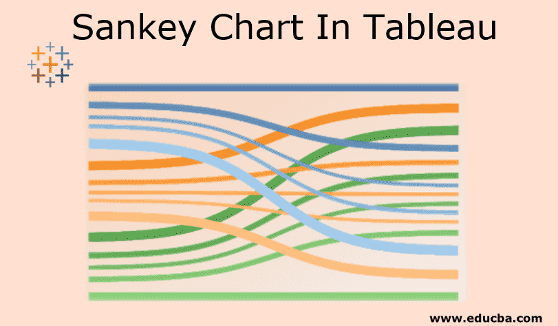
Introduction to Sankey Chart In Tableau
Sankey chart in the tableau is a great diagram. This diagram will show the flow and relationship between two different elements. These two different elements are called nodes and relationship or connection between two different elements called as links. When we have two different dimensions (it is qualitative data or description of data) and want to know the relationship between them or mapping then the Sankey chart is the best way to use. Three major points in the Sankey chart are Target, Source, and Size. These three parameters will generate the Sankey chart.
How to Create a Sankey Chart in Tableau?
There are two ways to create Sankey chart:
1. Using a Sankey Template
- https://public.tableau.com/views/..
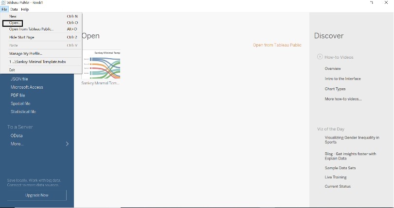
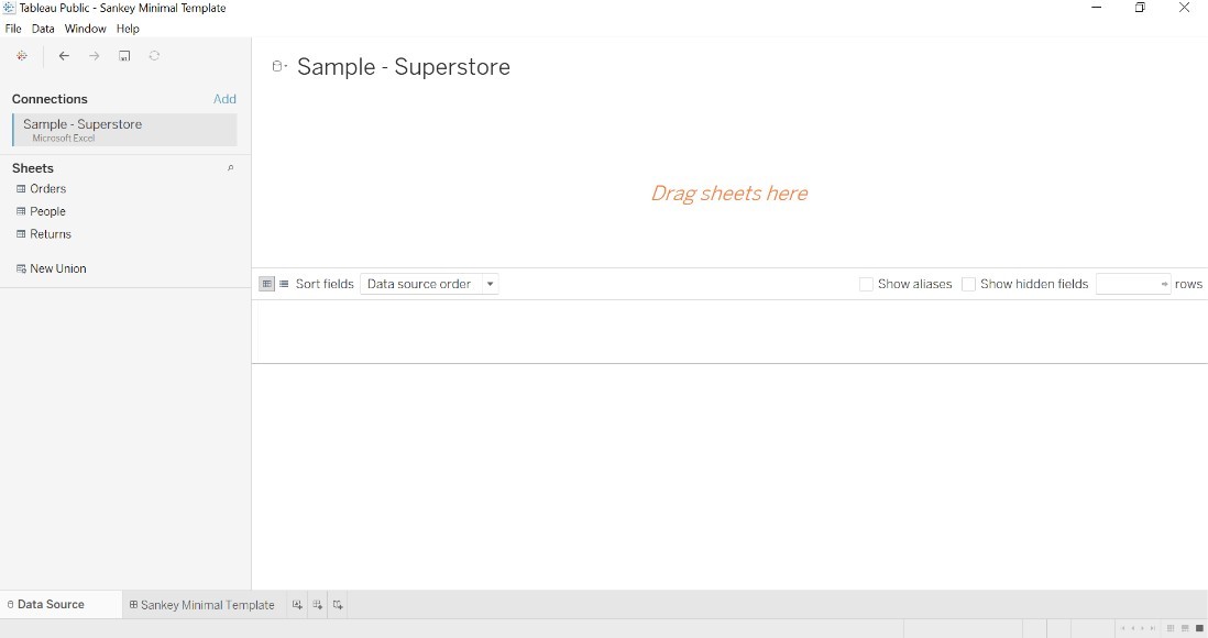
- Go to download and download the template. Save the template to your desktop.
- Open tableau desktop or public version.
- Go to the File->Open->Open download templated.
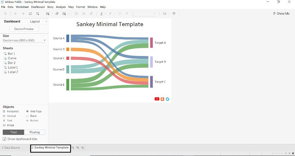
- The Below window will appear once the template gets loaded into the tableau.
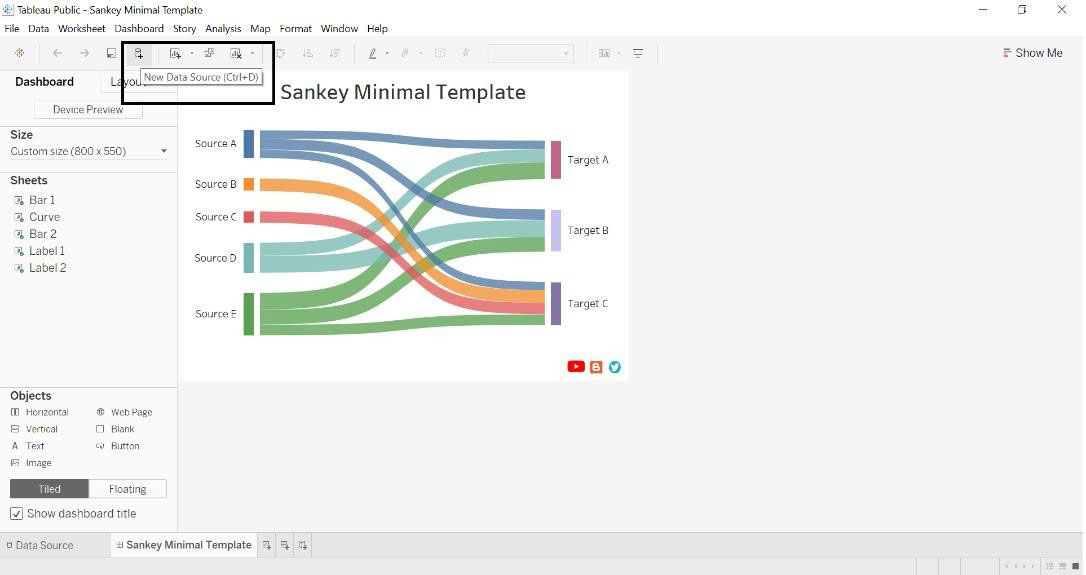
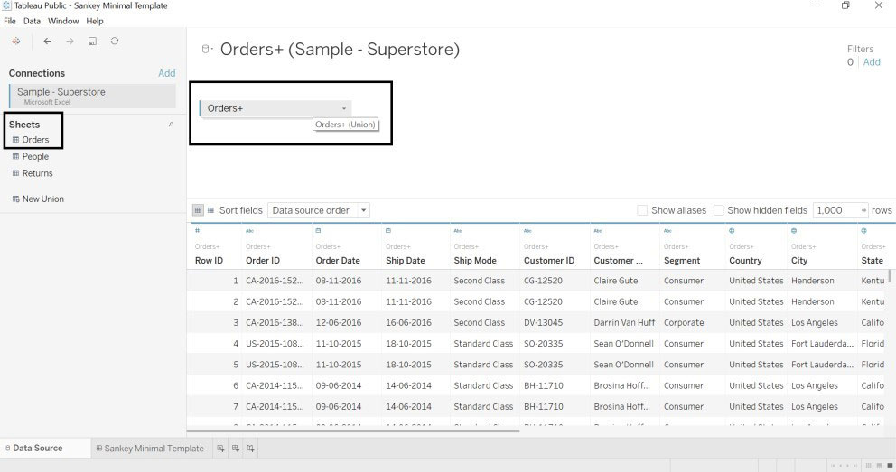
- Click on the new data source and connect to the database (we have referred to the sample superstore database).
- Once we retrieved the data source, the below window will appear.
- Drag orders table into Drag sheets here twice to form a union.
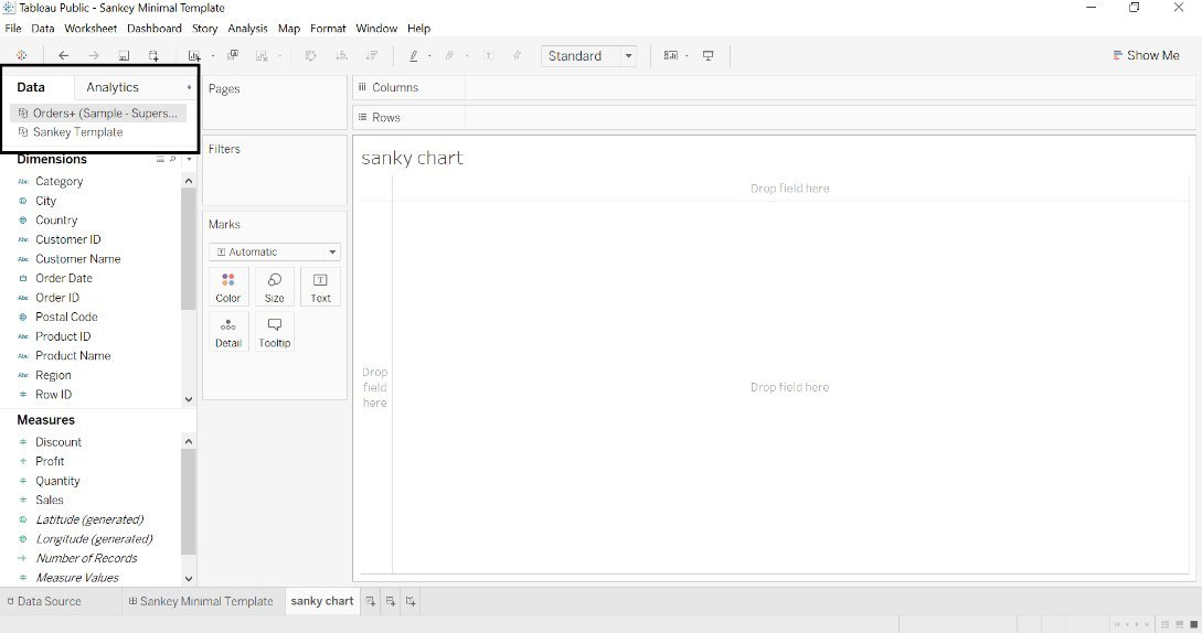
- Go to the worksheet where we can see the Sankey template and data source.
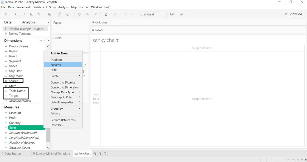
- We have renamed city dimension to the source, sub-category to target and sales to size. The table name is generated automatically.
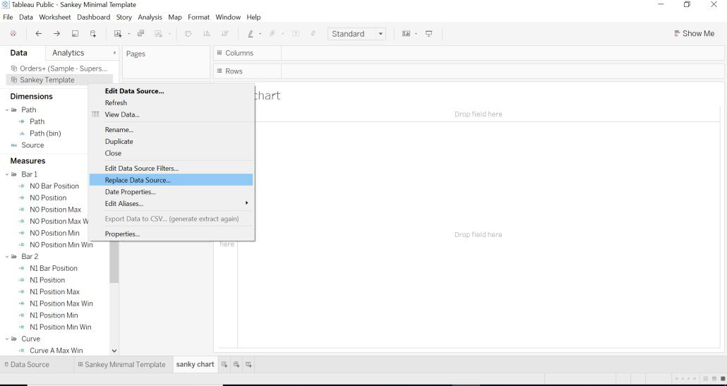
- Select Sankey template->right click->Replace Data Source
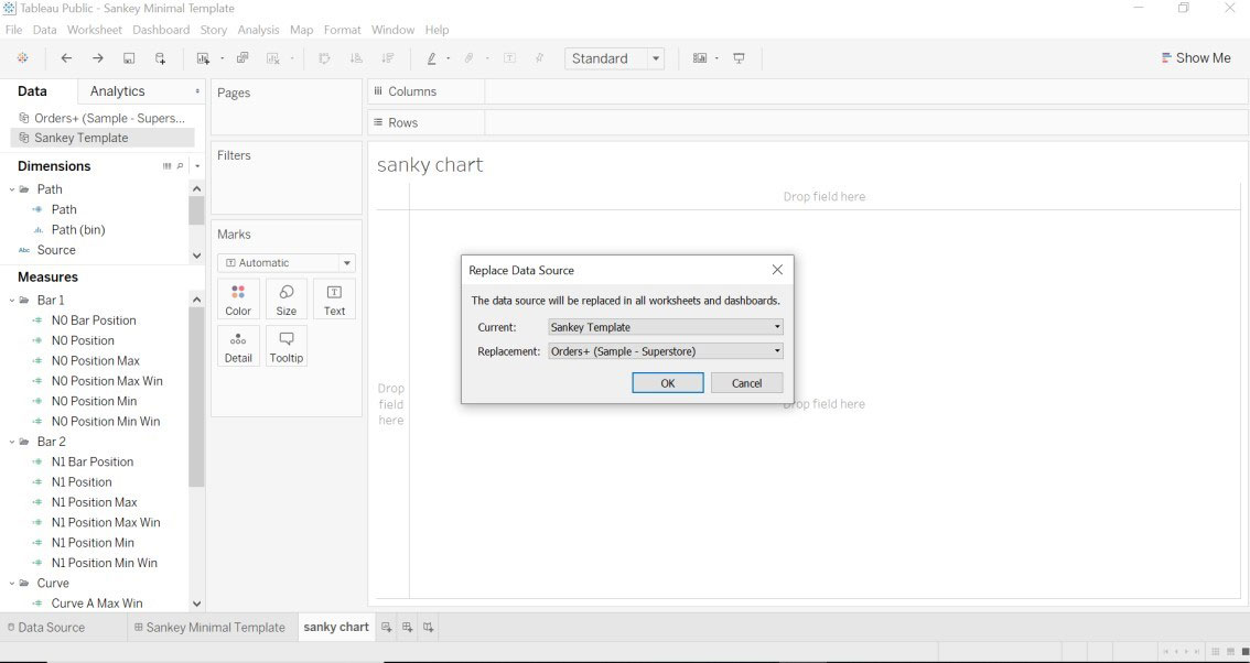
- Go to the Sankey template and we can see data we have loaded.
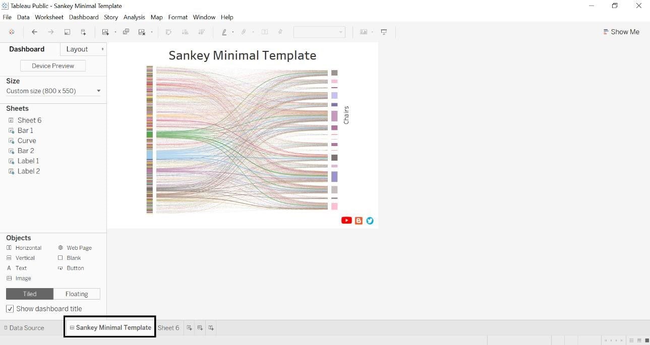
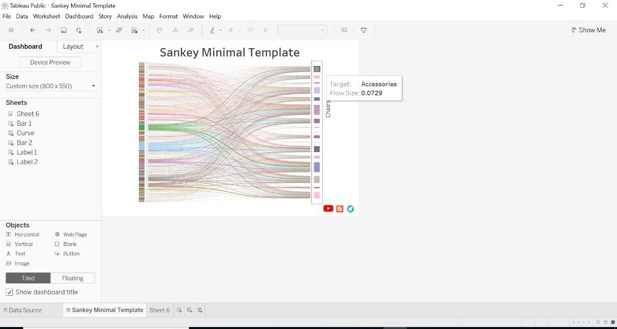
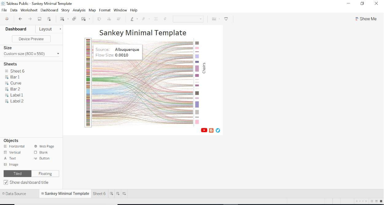
- We can look at below source and target
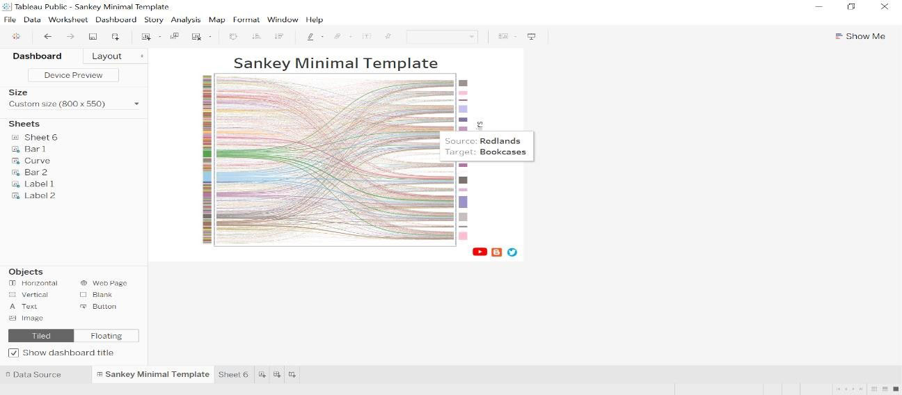
- Sales i.e. size for each sub-category(target) and city(source).
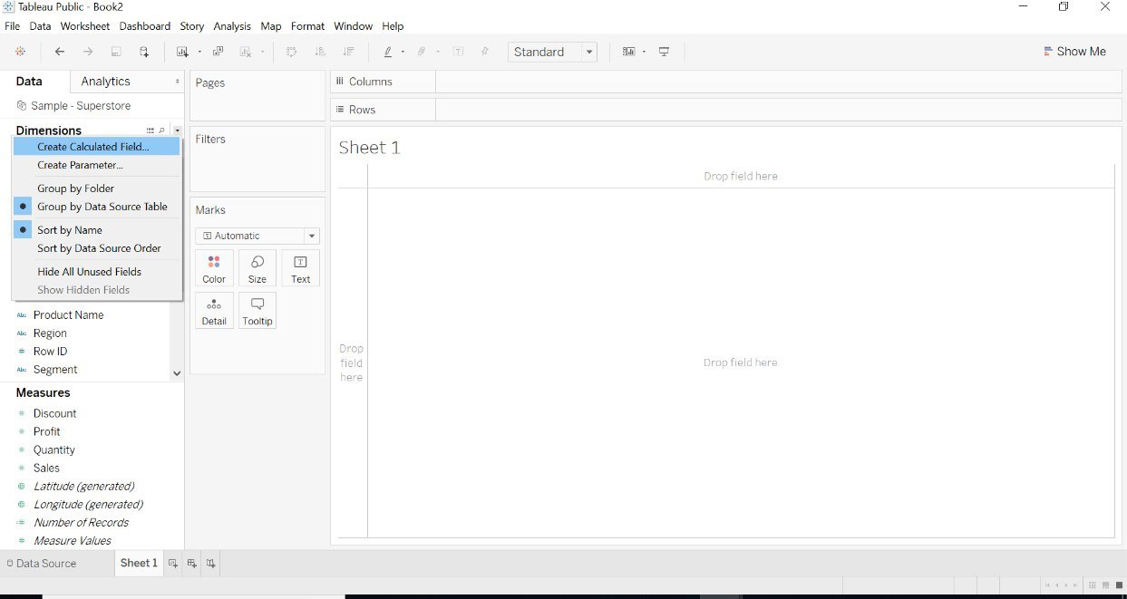
2.With Calculated Field
- Open data source -> go to dimension->click on Create Calculated Field.
- This is X-axis.
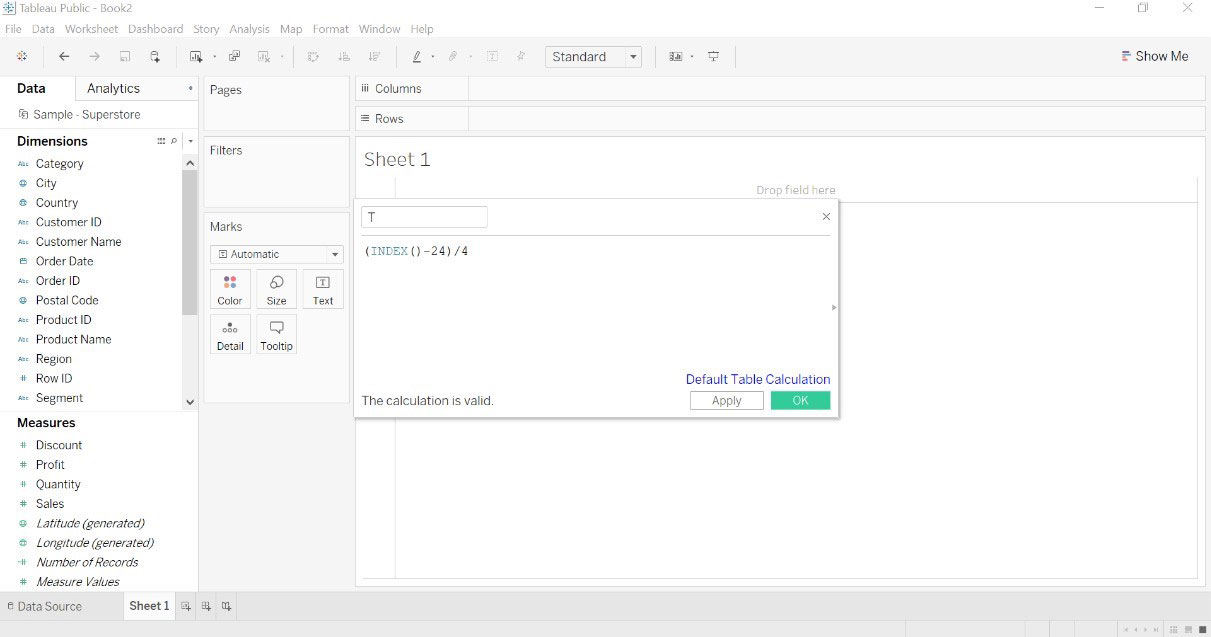
- Make the second calculated field as given below image.
- These two calculations are telling the tableau were to put a line. These calculations are graphically meaningful. The Region on left side and category on the right side, draw the connection between these two categorial.1 and 49 is for drawing a curve.
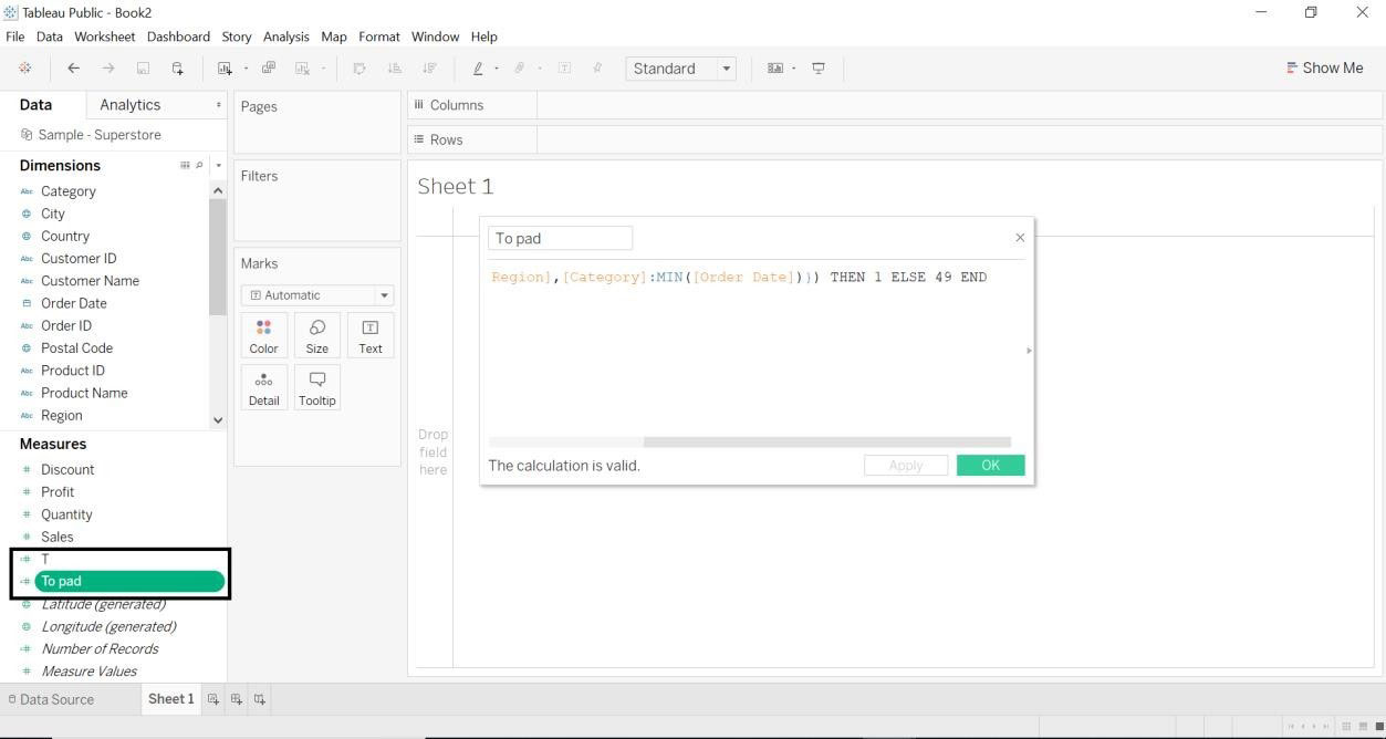
- Transfer the data between the interval of 0 and 1.
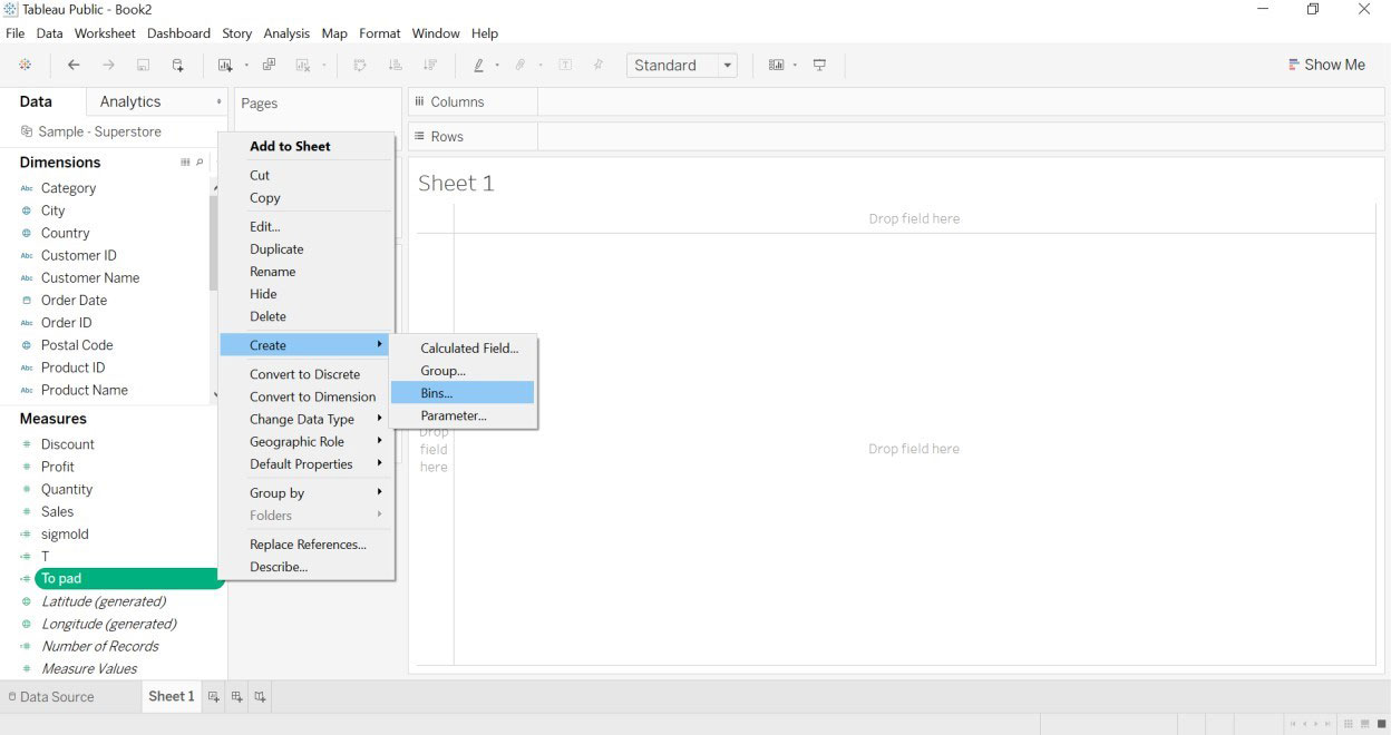
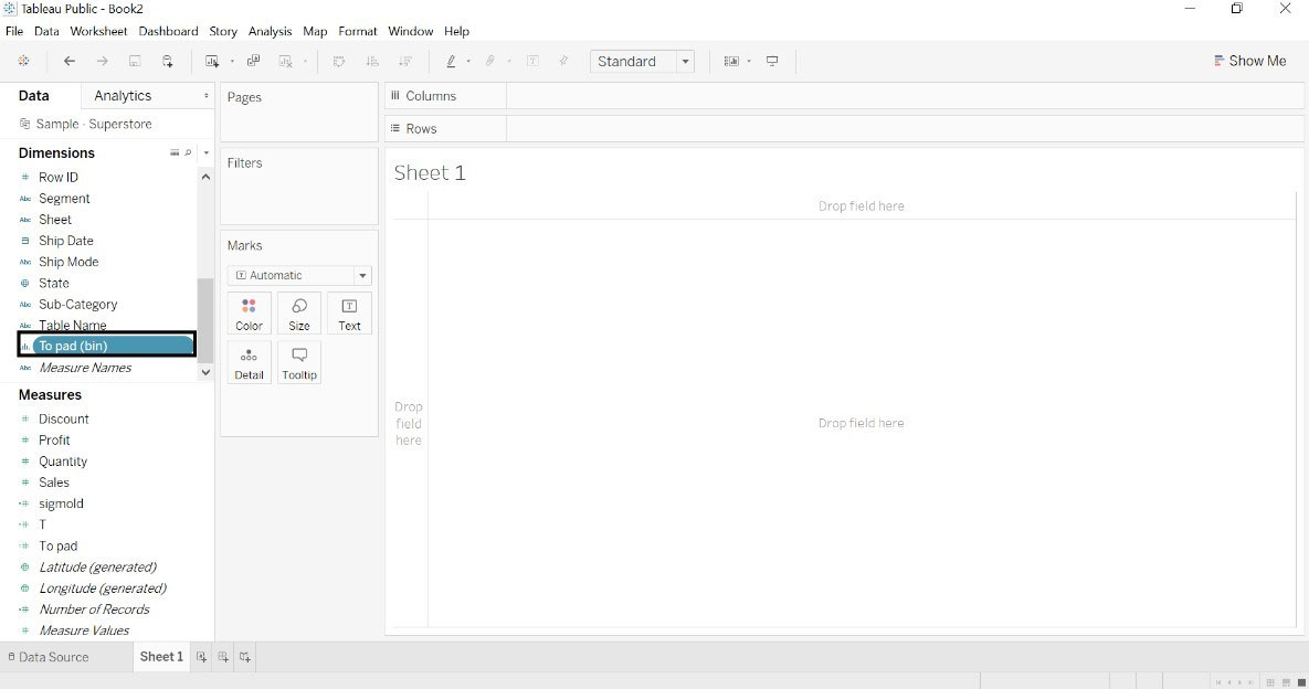
- Select To pad->Create->Bins
- Put value as 1 in Size of Bins
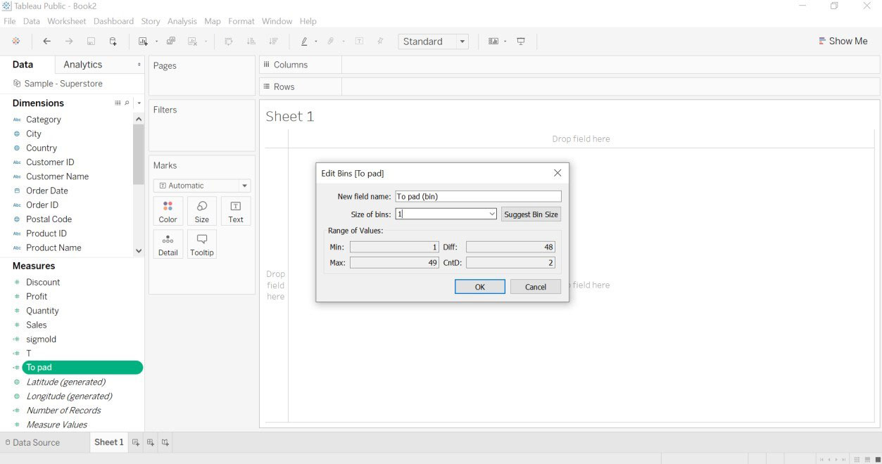
- A new to pad(bin) dimension will get created.
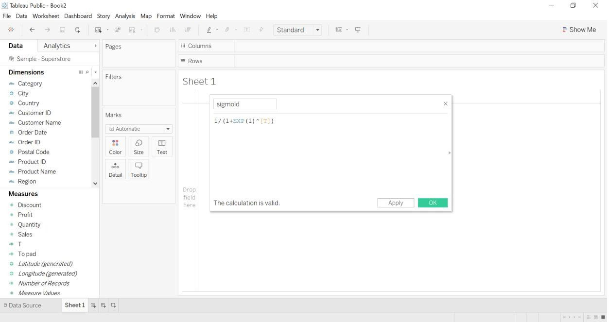
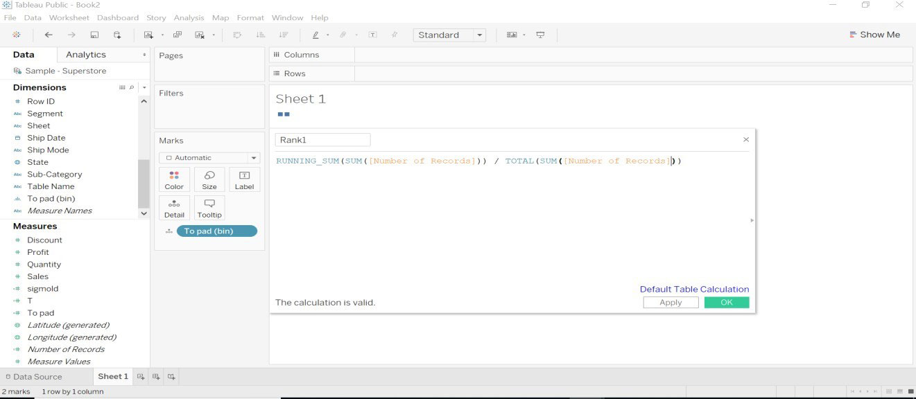
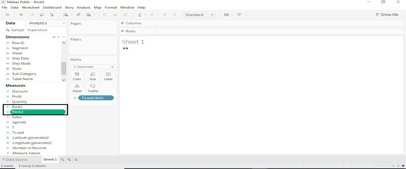
- Create Rank1 and Rank2 calculated field for the curve.
- Create a calculated field named Curve. Showing curvature between the elements.
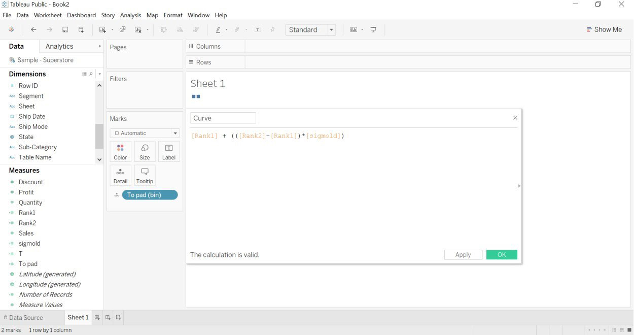
- To define the size of the curve. More number of records = Thicker curvature and Less number of records = Thinner the curvature.
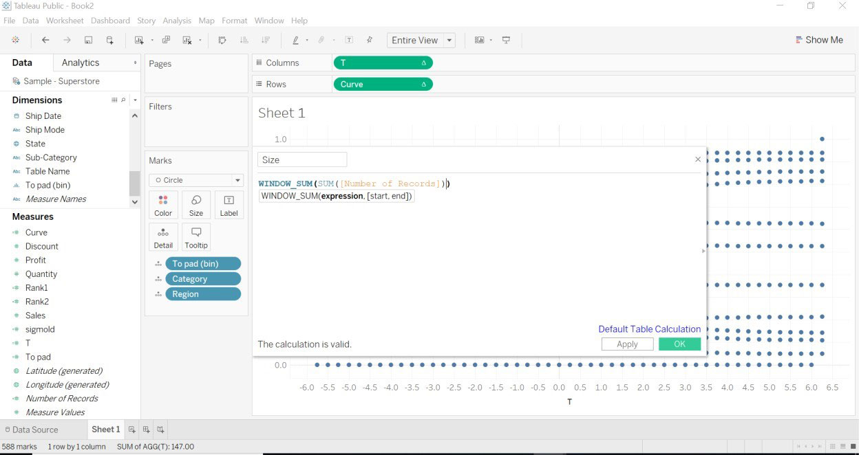
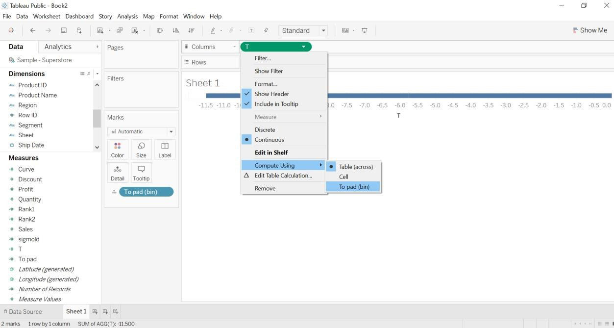
- Drag T (measure to columns)->compute using->To pad(bins)
- Drag category and region into Details (Marks card)
- Drag curve to rows.
- Go to the curve->edit table calculations.
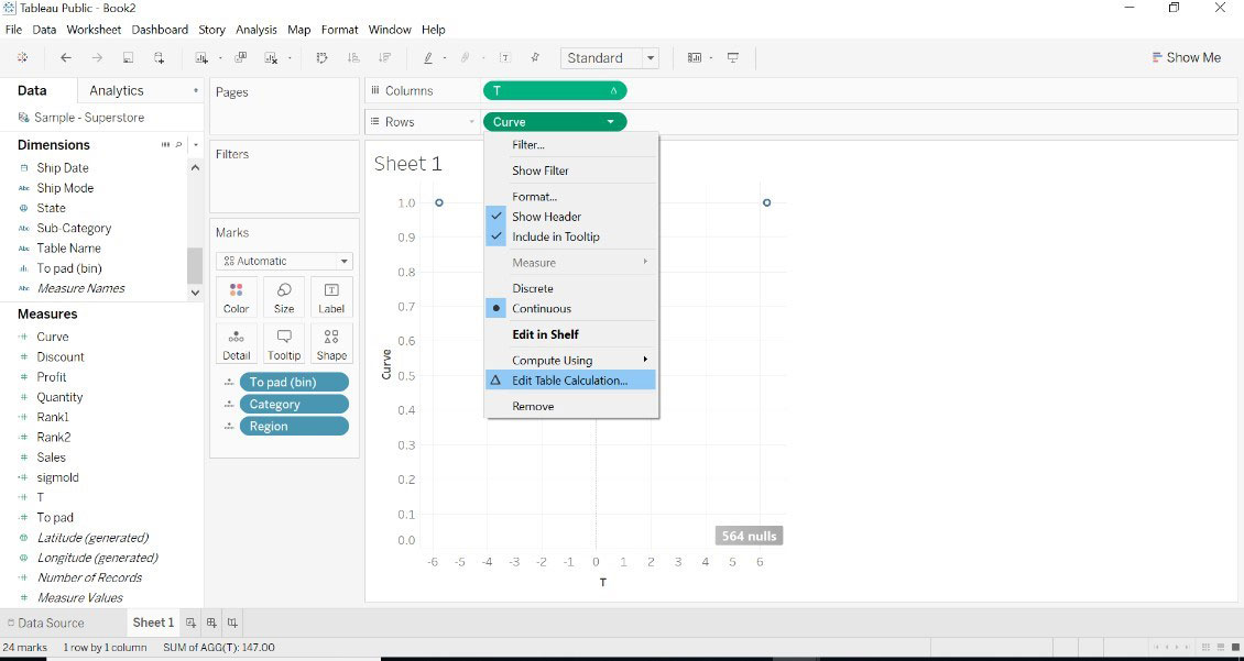
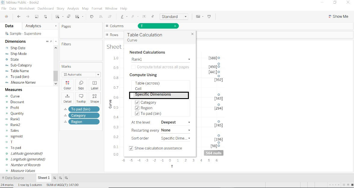
- Select Rank1->Specific Dimensions->select below given all dimensions. You can see values on the right side
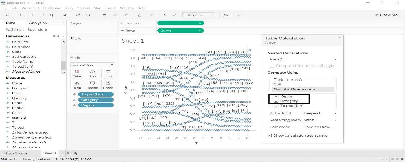
- When we want to see values on both the side. Change the order flow of rank2. Shown in the image below.
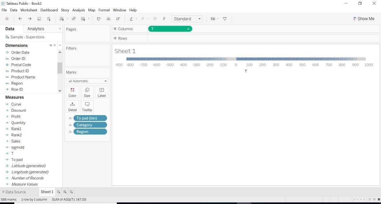
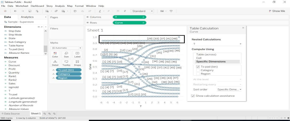
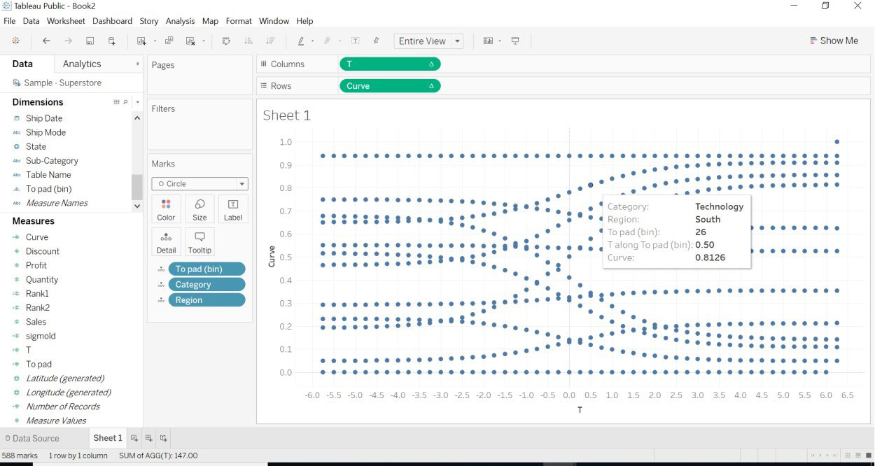
- Select the T dimension and the chart will be different.
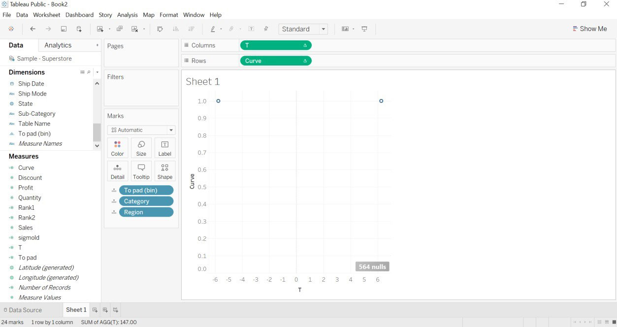
- Once the T curve is applied, we see some curvature in the below image.
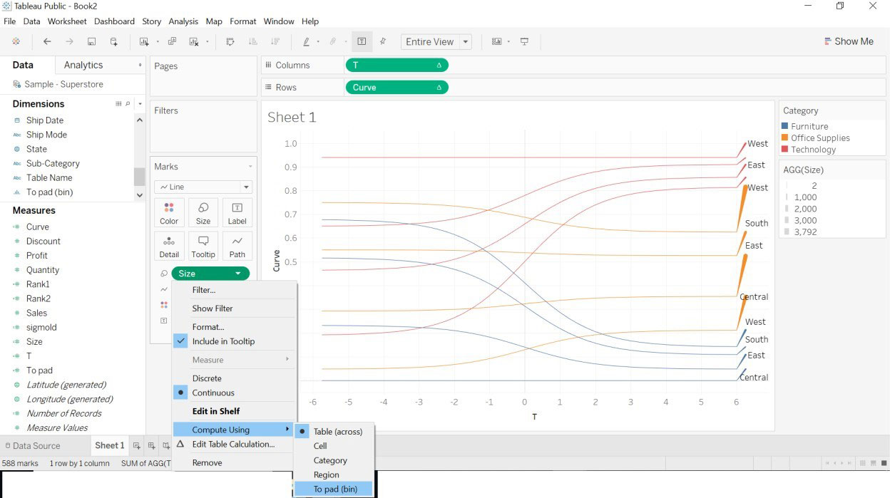
- We must do some formatting to chart.
1.To pad(bin)->Path
2.Category -> color
3 Region->Label
4 Drag Size->Size (Marks card)
5.Size->Compute Using->To pad(bin)
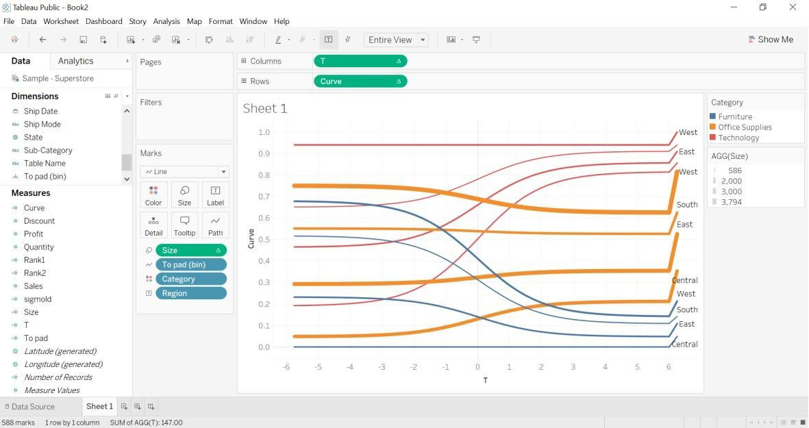
- The Below image will appear once we are done with the formatting mentioned above.
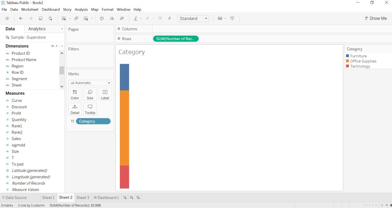
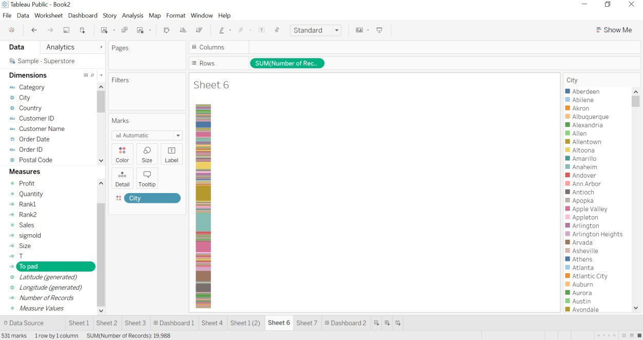
- Open new worksheet->drag Category into color->drag number of records into rows. The below image will be created.
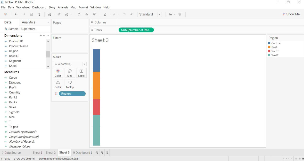
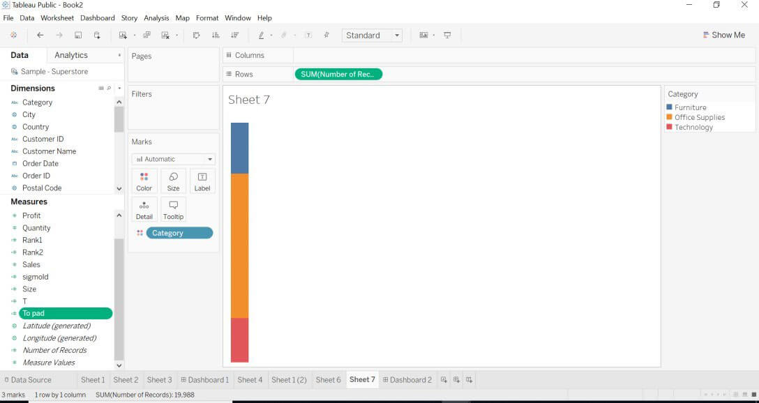
- Duplicate the previous sheet drag region into color->drag number of records into rows.
The below image will be created.
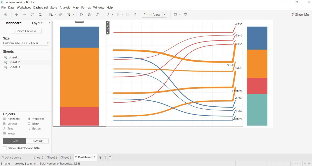
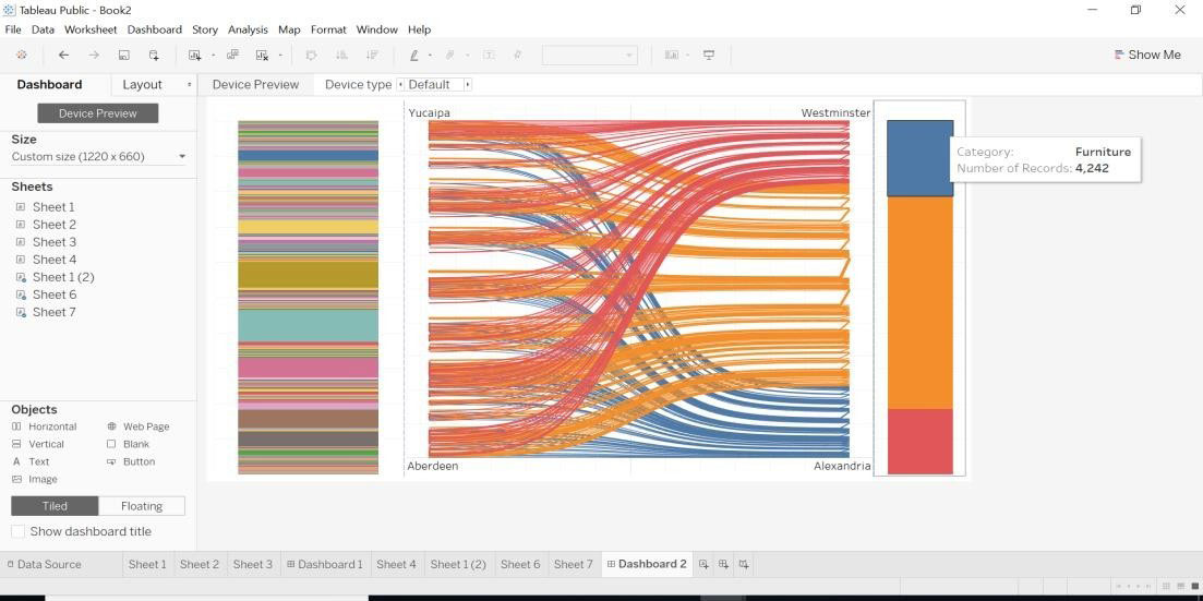
- We will create a dashboard for the Sankey chart.
- Drag sheet1 to the dashboard.
- Drag sheet 2 (category) to the dashboard.
- Drag sheet 3 (region) to the dashboard.
- Hide sheet title.
- Hide all the filters like categories, regions.
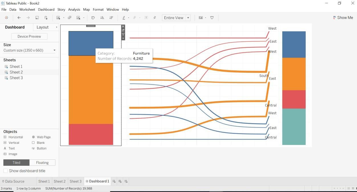
- As we have hidden the category details, but when we move arrow onto a category. We will get the number of records in each category.
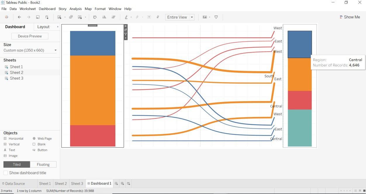
- As we have hidden the region details, but when we move the arrow region. We will get the number of records in each region.
- We can see Sankey with different the dimension of how data and Sankey chart changes.
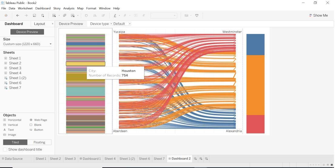
- We have made a change into the To pad. Data is retrieved for city and category.
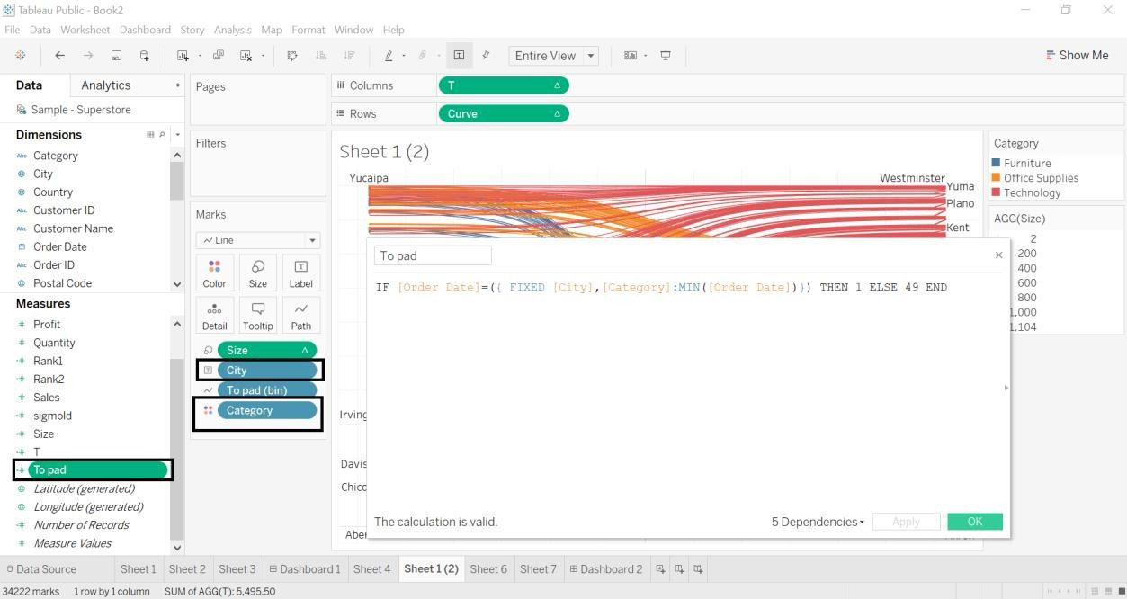
- A city with a number of records
- Category with a number of records.
- We have created a dashboard for city and category dimensions with the Sankey chart.
Conclusion
We have seen what is Sankey Chart In Tableau and how to create it with two different dimensions. Whenever we need to map data with different dimensions Sankey chart is the best-suited way. It helps us show the mapping source and target with the help of the size.
Recommended Articles
This is a guide to Sankey Chart In Tableau. Here we discuss two different ways to create a Sankey chart one is by using Sankey Template and the second is by using Calculated Field in a tableau along with the steps. You may also look at the following articles to learn more-
