Web Design Trends From Interactive
Web Design Trends can understand using different elements that make your website up-to-date, highly functional, elegant look, easy to use, and well-performing. It is necessary to change elements and features of the website from time to time due to becoming overdone, tired, and outdated. That is why sometimes you lose the connection with your audience on your website. It is good to see that an award-winning web design agency updates website trends for a high-performing website.
In this article, I will tell you about some of the latest standard, innovative design trends of 2022-2023. It becomes easy to give your website a new look to attract an audience. Here I will tell you about top web design trends to provide you with more accurate information about it, and after going through this article, you can use these trends to make your website up to date. The very first thing on which you should focus is Page Speed.
Top Different Web Design Trends For Website
Given below are the different web design trends:
1. Page Speed
Page speed is one of the top design trends, that is, at the top of this list, because if the loading speed of the page and navigating process is quick, then it will help your web design. You should remember that you never misunderstand page speed when going to ‘Create new page designs,’ ‘Launching site updates,’ and ‘Building of new site design.’ If you don’t focus on it, you may face issues such as traffic, search results rankings, conversions, etc. Many search engines like Google evaluate websites based on page speed in the fast-experiencing website trends. Once you have good page speed for your website, you should take the next trend into your implementation, which is accessibility.
2. Accessibility
Accessibility provides your users with tools and features to easily use your website. For that, it must meet the standards set by ADA (Americans with Disabilities Act), Standards for Accessible Design, and other essential requirements. This is the main reason that most companies invest in tools or compliance services of ADA.
For example, if you are working with a WordPress website, several plugins must be available for it in this concern. It would be best if you wanted to get a good standard of your website as soon as possible by choosing a service provider or a tool.
3. Simplicity
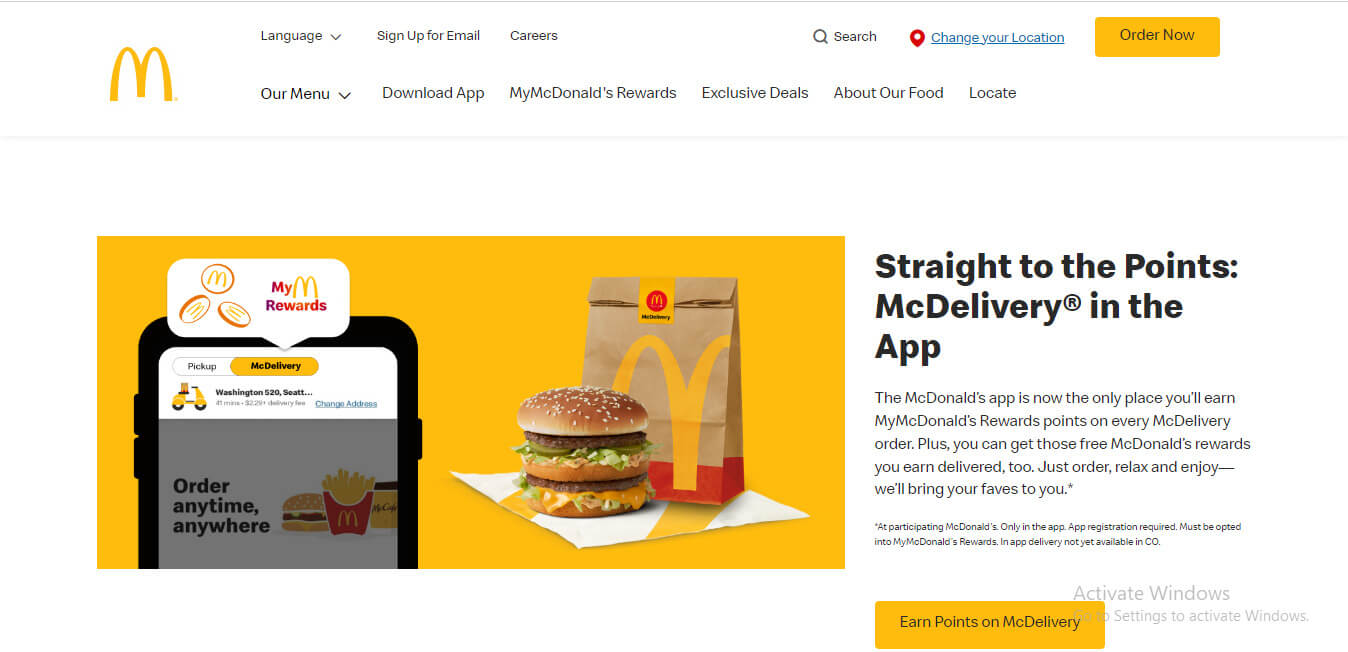
The Web Design trend for 2022-2023 should be simple and easy to use. You must have heard about ‘keep your design simple,’ which means users want a website with easy-to-navigate menus, tabs, less page loading time, and no high motion graphics. You can take the example of a food website ‘ McDonald’s; if you check out this website, you will notice there are few colors and simple graphics used even though it has such a beautiful and elegant look. So this type of simplicity is doing a good job nowadays.
You can try simplicity in your website by focusing on some areas and matching them with future web design trends.
They are:
- Navigation type used in your website
- Graphics used
- Design of the home page
- Color scheme used
After Simplicity, you must focus on using Illustrations on your website page because it is a most demanding feature of today’s design trend.
4. Illustrations
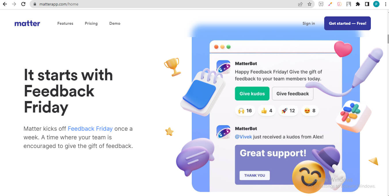
Undoubtedly, illustrations add a new look to your website page because, in the recent web design trends, it has become popular among web designers to express the real purpose of their content on the website. The benefit of using illustrations on your web page is that you can use illustrations in the same color theme of your brand colors and add as much detailing to give it the same feeling you are thinking about. www.matterapp.com is an excellent example of an illustration. Here you can see not only 2d illustrations but also 3d illustrations also.
Now after reading this illustration trends part, if you want to add an illustration to your website, then first think to check that it fits the current style of your website; if it doesn’t fit with your website design, then no need to add pressure here. Adding illustrations to your website can be a good idea if you are thinking about rebranding or want a modern look for your website. If you’re looking for a professional, award-winning Saskatoon web design agency, consider partnering with experts who can seamlessly integrate these design trends into your website. Now you can understand that if we are talking about illustrations, there must be a place for GIFs in this web design trend.
5. GIFs as Graphics
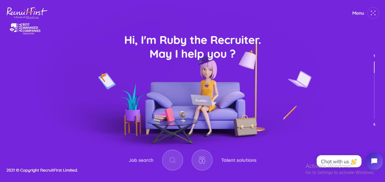
The most relevant part of the web design trend in 2022-23 is using GIFs with your content instead of using several images. GIFs are animated image formats that give your website a trendy and designed look and attractively engage your users. Here you can see the home page of https://www.recruitfirst.co/, where we have some illustrations and animated GIFs, giving us an elegant look.
If you want to use GIFs on your website page, then you can use gifs creating apps and make sure to use small size gifs file for better website speed. After discussing the animated image that is gifs, you must consider what if you use animations on your website page. Then, yes, it is the next web design trend of 2022-2023.
6. Animations
As we use GIFs as a design element of our website, we can go with animations in object animation, calls to action, and so on. This animation can use on the home page of the website. These animations are becoming trendy daily because they grab the attention of website users and make them interested in our website. If you want to use animation on your website page, then use animations on your essential page, such as the home page.
7. Flat Design 2.0
Don’t go by the name flat design! It’s not here to make you a fool. Flat designs wooed people’s minds in 2020 also, but there were issues with that based on usability. 2020 has brought many changes which will make it more successful in terms of usability. It will provide a never seen UI with a better visitor user experience. Signifiers are being used to create designs that are easy for people to use.
Flat design is a phenomenon of skeuomorphism, which focuses on strict 2D usage with no drop shadows, textures, gradients, etc. It is one of a kind. It also has minimalist features, meaning less is more, and bold and vivid colors generate interest. People using it can also add a personal touch. Otherwise, the integrity can be maintained as it is.
The newer version of Flat, version 2.0, deviates from the skeuomorphism phenomenon and incorporates the much-needed 3D design elements that enhance a website’s look. The best example of these changes and advancements in the website of 450 GSM, where Flat 2.0 successfully added and intensified the beauty of the homepage using 3D elements like shadows and highlights to bring the layers into focus.

8. Color Contrast is the New Black!
Do you think you are a web designer? Do you have that sense of design, a creative bent of mind? Designing is not merely dragging and dropping a few elements onto a webpage or adding a few texts here and there. The theme of your website and the colors used to bring that theme to life are the little things that make your website unique. The colors on a webpage keep the users hooked to it and even direct them toward their destination.
One has to delight the customers pleasantly and give them an unforgettable experience. There is a huge importance of choice. A designer’s sense of choosing which color to use in the proper context is a significant factor behind what a website finally looks like. Every color has its meaning. A designer has to use the right combination of colors to be soothing to the eyes. Those who will master it will be benefited in the long run. Designing involves color as one of the top most priority.
This design has made sure that the color mix has to be perfect. This design is meant to increase the number of purchases by around 90% and more people. For example, Girls prefer wearing black dresses for parties, making them look thin.
Using the right colors for site designs will decide whether the customer prefers buying them. If opted for, the designs will be cherished forever.
The advantages customers will get from this color coding will be: they will be quick to locate things (where to contact, where to check internal pages), and the colors will let us know different and essential parts of websites.
9. Tell your Story with a Video
Using the right combination of colors has been attractive enough, but using the right images has also been a fruitful effort from the designers’ side. Mega images help to increase the conversion rate of websites. For images used, there are nowadays features of using videos also. Videos have a 6 times more ‘frequency to get viral’ factor than pictures/images. People easily connect to videos emotionally, and it has been the same throughout. Videos can be used as a storyteller.
Videos are easy to understand and take you deep inside the character. It is a much better way to promote than text. They are said to be more engaging. A video on the homepage which will give a glimpse of what the website is all about is a treat to watch. It makes sense for visitors to watch it and increase the click-through rate. Even in shopping centers, navigation videos are an effective way to guide customers. People are bound to pay attention to videos. This is going to be the Next big thing in town!
10. Flexbox- Your New go-to CSS Layout
Putting beautiful colors, attractive images, and viral videos will not help you create a great-looking site. We have discussed photos, colors, and videos, but we are discussing web design layout trends here. Flexbox has been impactful without being aesthetic always. This is trending and will continue as it has solved problems in terms of the design and development of pages. A much-improved interface and experience have been provided to visitors.
Website Designing Services often leverage Flexbox to address various layout challenges, ensuring a seamless user experience across different devices and screen sizes.
Flexbox has solved many issues and has provided solutions in terms of:
- No more head banging to find and fit a grid into the required size as it happens by default in the improved Grid systems.
- With websites mostly being viewed on mobiles, the mobile-first web design and the most basic of problems with a header, footer, and three columns is solved by Flexbox.
- Fluid width and fluid input button pairs are now a cakewalk.
- Flexbox even eradicates the overflow and obvious fixing problems when it comes to different sizes of Media objects.
- Footers can be easily put at the bottom of pages with thin content.
- You can align page elements vertically or horizontally without any hassle.
11. Material Web Design Trends
Material Design! Have you come across this term before? If not, then we would first focus on what it does mean. Material Design is the one with the big G behind it. Google brought Material design into the picture when it used it in its most famous websites- Gmail, YouTube, and Google maps
It has some eye-catching features and capabilities, which are listed below:
- Minimalist
- Grid-based layouts, which are very prominent to see
- Lighting and shadows
- Padding
- Vivid colors
- Responsive animations and transitions
Just the fact that Google is behind Material Design makes it a revolution. Material Design is a mix of the new and the old, and the blend is technically mind-blowing. No wonder Google was the one that came up with the idea. Just like Google, Material Design is here for the long run. Materialism involves using classic web design principles with tech and science innovation. If any web design trends company can do this, it will get what it deserves i.e., customers.
Material design is related to physical design principles, not a flat design. It has its bases in paper and ink. One of the best examples of Material design is Android Gmail’s user interface.
12. Minimalism and Flat Design 2.0
Minimalism is related to three words: Less is more. It has no clutter, uses white spaces, and focuses on what is important. Flat design goes very well with this concept. Flat 2.0, which we have already discussed, adapts to this design perfectly.
The interaction of users with the website is a significant concern. They play shadows, movement, and light, giving visitors a combined visual treat. These differ from print-based designs like grids, negative spaces, vibrant colors, and images. Flat designs started in 2020 with no drop shadow effect or color gradients, but the 2.0 version has begun incorporating them. It will have minimal textures and subtle gradients.
13. Interactive Immersive Experiences
Each experience creates its own story. Yes, it’s very accurate. Experiences can be generated and narrated in the form of stories easily. Humans willingly tell stories to peers about their experiences. HTML5 canvas, CSS3 conversions, animations, JavaScript APIs like WebGL and Greensock, and the influence of hardware acceleration have made storytelling on the web more immersive and communicative. It has been enhanced like never before.
Since e-commerce has evolved, people tend to browse on their phones rather than laptops or PCs. Browsing the web on mobile devices has accustomed users to long scrolls. Designers can now provide an interface telling a story and engaging users with the content. Users feel inquisitive and scroll down to complete the story.
14. Vibrant Custom Illustrations and Iconography
Images can do wonders, but a pixelated image spoils a website’s aesthetics. Standard image formats like jpg and png can make the image look disastrous. They don’t work well on the web i.e., on high-pixel-density monitors. Broader browser support for Scalable Vector Graphics (SVG) and easily implemented icon fonts answer this problem.
15. Typography that Makes a Statement
Visitors, if landing on the page which they want to get information from, great design, branding, and correct information have to be the primary purpose of serving the customers. Typography looks into this feature. Google fonts and Typekit services have made custom fonts available and to be used on the web. They are not limited, and so as the brains of designers. Flat designs and minimalism also use these. Further, more artistic fonts are going to be used to create websites.
16. HD Visual Assets
HD background images and website videos are growing more vital in the coming years. Wide support of HTML 5 video, which can serve high-resolution graphics to devices, has added to the advantages of using this feature. Artistic effects on images that gives a dramatic impression can be created easily with CSS code. Thanks to CSS3 background blending. Cinemagraphs are still images with a little bit of animation. This additional flower has drawn the attention of website users. They are incorporated into live photos on iPhones. They are supported by HTML5 canvas.
17. Less Rigid Grids
Pinterest has been using the grid-based layout. Minimalism, flat design, and popular frontend frameworks like Bootstrap have all contributed to the success of these structured, grid-based web design layouts. Grids narrate stories and make interaction easy with customers.
CSS3 shapes have helped build the future for such web design layouts. Standard rectangular box shapes are now just an old version. Working with edges and contours has enhanced the elements on the web page.
18. 3D and immersive experiences
Advances in web technologies have made it easier to incorporate 3D elements, virtual reality (VR), and augmented reality (AR) into web design, creating more immersive and interactive experiences. With the advancement of web technologies, designers have been exploring three-dimensional elements and depth in web design. This can include 3D graphics, parallax scrolling effects, or even interactive 3D models, providing an immersive experience to users.
19. Interactive Websites
Interactive websites are a popular trend in web design, focusing on engaging and immersive user experiences. They incorporate interactive elements such as animations, sliders, hover effects, scroll effects, and micro-interactions to encourage user engagement and provide feedback. By creating dynamic and interactive interfaces, these websites can captivate visitors, increase user interaction, and deliver a more memorable and enjoyable browsing experience.
20. App Inspired
App-inspired web design brings the aesthetics and functionalities of mobile applications to the web. It incorporates elements such as card-based layouts, swipe gestures, and interactive animations. This design trend aims to create a seamless and engaging user experience by emulating the intuitive interfaces of apps. The goal is to make web browsing more user-friendly and familiar, especially for mobile users. App-inspired web design often prioritizes simplicity, minimalism, and ease of navigation.
Future Web Design Trends
The year has set the stage for web design trends and development. Designers monitor what is happening and how they can teach that in their designs. Everything they will do will leave an impact on the customer’s minds. Designs are like passing fads only. Every time it keeps on changing. Designers either enhance the versions of previous designs or new things come up, like Flexbox.
Browser support is a must for the website layouts to prosper. Creativity has no limit, but these things sometimes bound that extra mile that designers want to go.
We need to determine what makes the customers visit the website repeatedly – the colors, images, videos, layout, animations, or any new upcoming feature that surprises us.
Although there may be several trends that can incorporate with future web design trends:
- Animated gradient shading can replace abstract backgrounds, creating a smooth blending of colors from one to another.
- The 3D objects may occur in many website elements, such as Cursor, Icons, etc.
- Although Full-page headers will be trendy in the web design concept of 2023, they will also be part of Future web design trends.
- There are many other trends for future web design trends, but I just discussed some of the important ones here.
Conclusion
I think you now have enough information about the web design trends of 2022-2023 to make your website up-to-date and trendy. There are some more trends that you can use along with the above-discussed trends. Now I suggest you implement these trends to get good traffic and user interaction on your website.
Recommended Articles
This is a guide to Web Design Trends. Here we discuss the introduction and different web design trends, respectively. You can also look at the following articles to learn more –
