Updated March 20, 2023

Introduction to Funnel Chart in Tableau
Before we start going into the details about how funnel chart is plotted in tableau, Let’s first get to know what funnel chart is? So, Funnel chart as the name suggests when plotted represents like a funnel. It shows values that gradually decrease ratios amounting to 100%. The higher part is called the head and the lower part is called a neck. They can be used to show anything that is decreasing in size. We can say funnel chart as some sort of alternative to the pie chart because the total area covered by both is 100 percent and the only difference is that in the funnel chart we have decreasing area size for example:
- One bar with an area of 60 percent
- The second one with an area of 20 percent
- Then next one with 15 percent
- And the last one with an area of 5 percent
So for example, if we have a total of 500 employees in an office of varying skills and we want to plot the number of employees of a particular skill in a decreasing order we can choose the funnel plot. So suppose we have 300 employees with Python, 150 with knowledge of R and 50 with knowledge of SPSS. The head of the funnel chart can be 300 employees with Python and the neck can be 50 with SPSS and the middle layer belongs to 150 with knowledge of R.
So, after the introduction of the funnel chart, we will now shift our attention to Tableau which will be used to visualize the funnel chart.
A tableau is a tool that is used for visualization. It is used for visually analyzing the data. A person can create an interactive sharable dashboard using Tableau and that dashboard can be used to depict trends, variations in data using graphs and charts. It is not open source but a student version is available. The interesting part about it is it allows real-time data analysis. It can be used to connect to files, big data sources. It is used in academics, business, and many government organizations.
Building of Tableau Charts
So, now let’s start building the tableau charts. So, we will have two approaches to build the funnel charts in tableau
Approach 1 – (Stepped Funnel Chart)
1. Open Tableau and you will find the below screen.
2. Connect to a file using a connect option present in a Tableau landing page. In my case, I have an excel file to connect. Select the excel option and browse your file to connect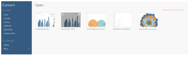
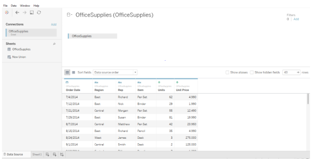
3. I am using office supplies dataset which has six attributes and includes both numeric and categorical values. The below screenshot shows how it looks in tableau once you connect to your sheet. If you look closely there are two attributes (Units and Unit Price) in the measurement region and four (Region, Rep, Item, Date) in the dimension region.
4. Click on sheet1 shown with the tooltip ”Go to Worksheet”. This is where you will prepare your visualizations. The below screenshot shows how it looks.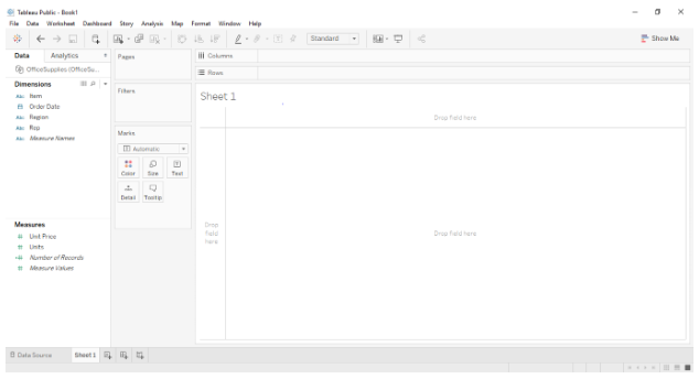
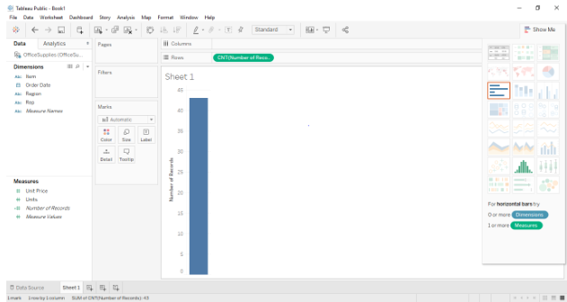
5. As we have to now prepare a funnel chart so for that we need to drag and drop any measured value in the rows. Remember one thing that before you do that you should have selected the aggregate function as “Counts” or “Counts (distinct)”. Once you drag and drop in the rows you will see a single bar reflecting the counts as shown in the below screenshot.
6. Now, after that, we can drag the dimensional field into the “color” region in the “marks” card of the tableau worksheet which in this case region as it will allow us the bar to be divided into groups. Here we have three groups in the data source which are east, central and west. The same is shown in the below Screenshot.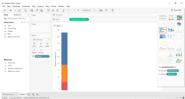
7. Now, the next step is to just press ctrl and drag the measured value present in rows to size section in marks card. Remember to press and hold the ctrl while dragging the number of records present in rows section as it will create a new copy of the measured value and will distinguish the sections in the bar as further into size. So, the bar graph has now been further split based on region and size. The below screenshot shows the same.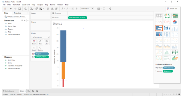
8. Now to convert the above into funnel chart. Just change the view bar present in the toolbar from “standard” to “Entire View” and it will be converted into a funnel chart as shown in the below screenshot.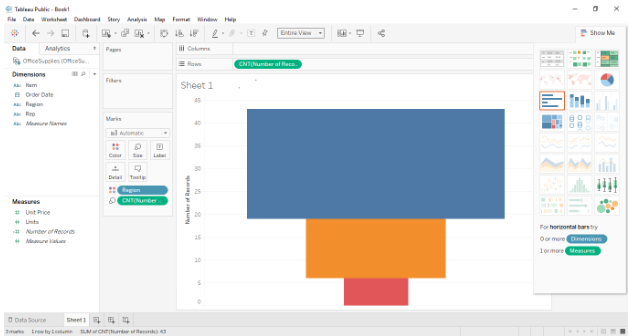
Approach 2 – (Smooth Funnel Chart)
1. The first four steps will remain the same and from step 5 the approach will change. For this approach we have to first sort the region from the dimension field by right-clicking the region >default properties> sort and then the drag and drop the dimension field region into rows shelf. The below screenshot illustrates the same.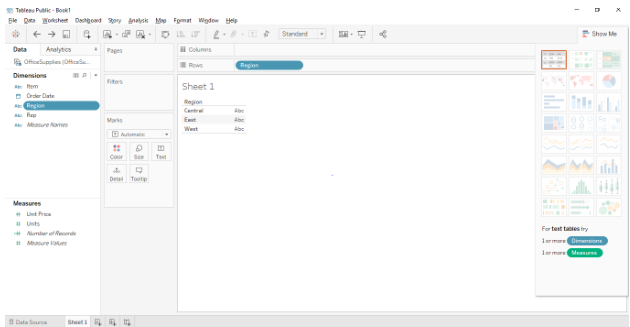
2. The next step will be to drag and drop the measure field “Number of Records” into the Column shelf. Remember to change the default properties to counts or counts (distinct). Below Screenshot shows the same.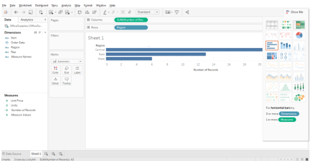
3. Once you have done this, now change the Marks shelf to “Area” from “Automatic” using the drop-down present. Below Screenshot shows the same.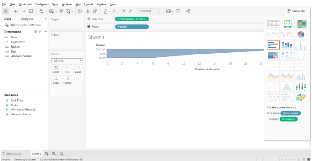
4. The next step is to create a calculated field or inverse of the count field (Number of Records) and drag and drop the calculated field in the column shelf. To create a calculated field: Right-click the field (Number of Records)>create>calculated field. Below screenshots shows the calculated field dialog box.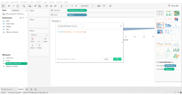
5. The final step is to drag and drop the file in the column shelf. Below screenshot shows the same.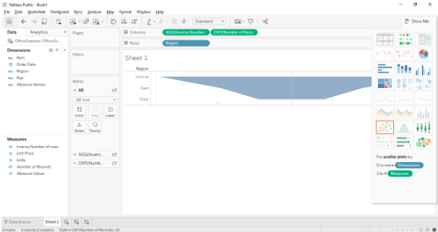
Conclusion
Funnel charts are generally used when we show something decreasing in size. Below are some areas where they can be used.
- To visualize the order fulfillment process.
- To visualize the sales process from start to finish.
- To visualize the flow of information based on priority.
Recommended Articles
This has been a guide to Funnel Chart In Tableau. Here we discussed the different approaches to build the funnel charts in tableau. You may also look at the following articles to learn more –
