Updated March 23, 2023
Introduction to Power BI Waterfall Chart
In general, the Waterfall Chart is a kind of Column Chart that is used to show the data is increasing or decreasing from the starting point through the series of changes. In reality, we all have seen waterfalls, where waterfalls step on creating a series of iteration at different levels. Similarly, the Waterfall chart in any tool shows an increase and decrease in the data and iteration begins from the endpoint of the previous data set. This means if my first data point is 100 and the next data point is -50, so in the chart, my second data point will start from the end of the first data point giving +50 jump in the waterfall step. We will be seeing more in the upcoming examples.
How to Use the Power BI Waterfall Chart?
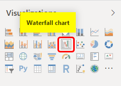
The waterfall chart in Power BI shows any positive or negative variance (or difference) in the data with the help of up and down the rise in columns. The waterfall chart in Power BI is readily available under the visualization section as highlighted below.
There are certain limitations of using the Power BI Waterfall Chart. For this, we should be having 2 numerical values from which we can calculate variance or difference to plot on the chart.
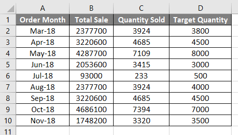
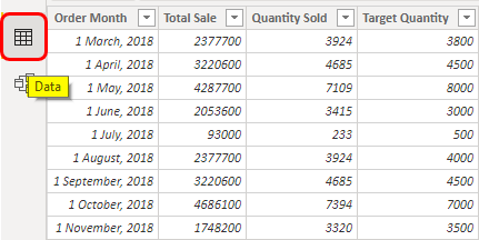
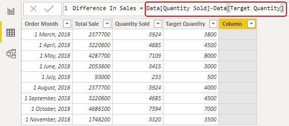
Below we have summarized sales data of around 8 months. We have Total Sale (Currency), Quantity sold and Target column. We can use the same data by uploading in Power BI and then calculate variance using DAX or else we can get the difference of number here itself first then upload it.
How to Create a Waterfall Chart in Power BI?
For creating the waterfall chart in Power BI consider the below data that we are going to use. So you can download the excel workbook from the below link which is used for this example.
Let’s do the variance calculation in Power BI only.
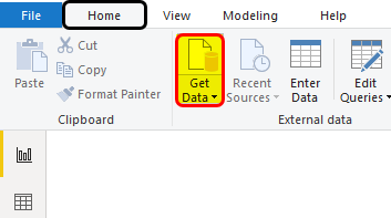
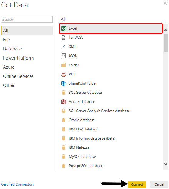
- As we have data, so we will upload it to Power BI. For this, click on Get Data option under the Home menu tab.
- Select the source of a file that has data. As we can see, our data is in an Excel file so we will select the same.
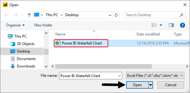
- Browse the file location and click on Open.
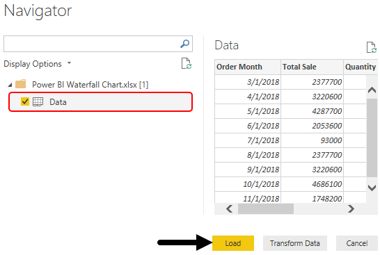
- Select the sheet with data from the Navigator window. Once we check the box, then click on Load to upload the data in Power BI.
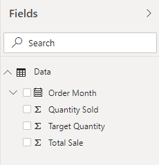
- We will be able to see the uploaded data fields under the Fields section.
- This is the uploaded data under the Data tab.
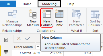
- We will create a column to find the variance or difference between the Target quantity and Actual quantity sold. For this, under the Modeling tab, click on New Column.
- Once we do that, we will get a new dummy column with no data as shown below.
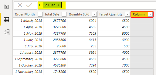
- Change the name of a column as per need.
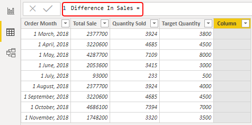
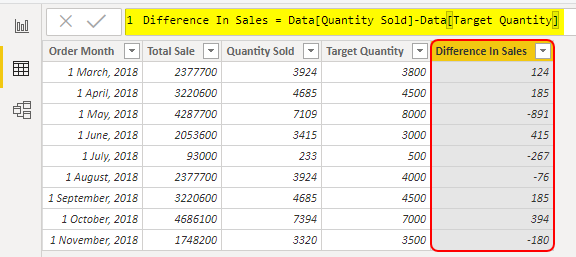
- To get the difference or variance, we will subtract the Target quantity sold from Quantity sold column as shown below.
- Press the Enter key to continue. We will get a new column with a calculated field of Difference in Sale.
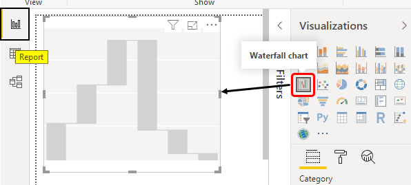
- Now go to Report view, and select Waterfall chart from the visualization section as shown below.
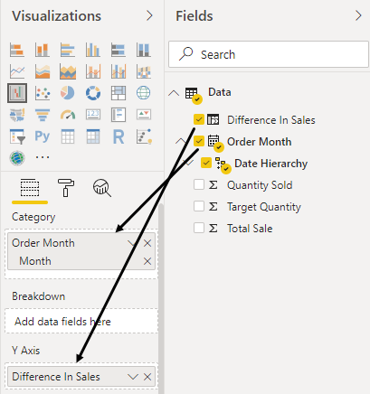
- Now to plot the waterfall, drag Month into Category and Difference in Sale into Y-Axis just like creating the graph in a normal axis.
- After that, we will get a waterfall chart with the data we used.
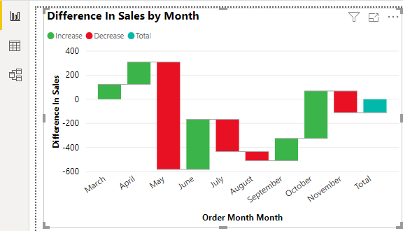
- Now to make the chart a little more attractive and easy to understand for the users, we will add data labels here.
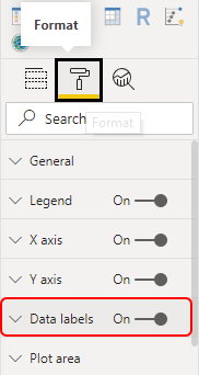
- We can do further formatting from the Format section.
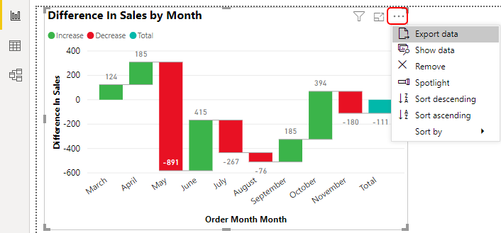
- We have a few more options if we click on 3 Dots (…) as highlighted below. This will give the list which has Export Date, Show data, Spotlight, Sorting.
- Let’s sort the data by month and see what changes.
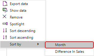
- We will see the data has been sorted the way it should be in the Waterfall Chart.
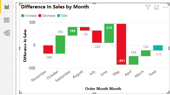
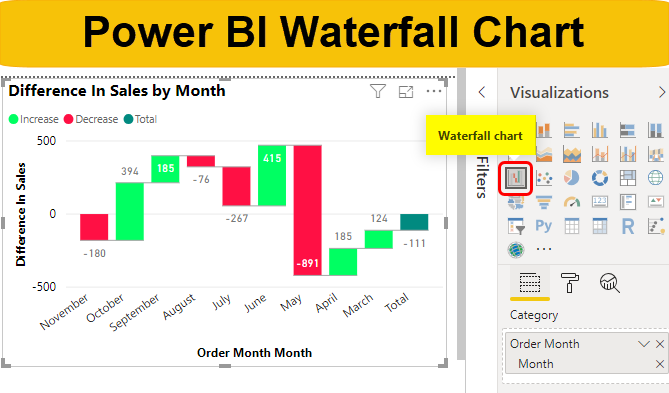
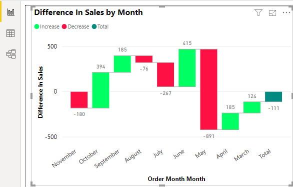
As we can see in the created waterfall chart, when there is a positive change in data, it is shown with Green color up columns where negative change is shown as Red color fall columns. And the final total sum is shown in Blue color.
Now if we want to further format the chart that can be done using the Format section.
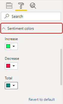
- We can change the color of column from Sentiment Colors section by which we can define any of the color which we want.
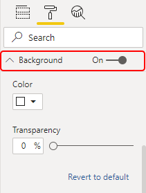
- We can even change the Background color of the chart as per our choice and need.
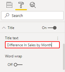
- Then we have Title. It helps us to see the name of the chart. We can even customize the name here as shown below.
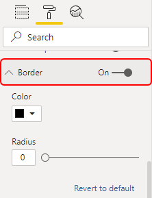
- Under the format, we have a Border option. By which we can change the color border if we want.
- If we try to sum up the data which we used. We can see, out of 8 months, 4 months the sale is below the target. And there is a major fall in May month with 891 quantities.
Pros of Power BI Waterfall Chart
- It gives a comparison between the target and actual data values.
- We can easily analyze the data and see where we need to work on for improvement.
- We can create a Power BI Waterfall Chart with any data even after creating a column chart as well.
Things to Remember
- We can use DAX to create different calculated fields.
- We need to calculate or have a variance to get the difference in each iteration.
- Always try to show the gain in data with Greenish color and fall in the data with Red or dark color.
- Power BI automatically inserts the variance column if we don’t have it.
Recommended Articles
This is a guide to Power BI Waterfall Chart. Here we discuss how to use, create and format Waterfall Chart in Power BI along with a practical example. You may also look at the following articles to learn more –
