Updated March 22, 2023
Introduction to Tableau Bullet Chart
Amongst the special types of visualizations provided by Tableau, the Bullet Chart is one. The chart essentially works with two measures and represents data in the form of a thermometer style of visualization. Tableau’s capability to generate such exquisite visualization gives it a unique place amongst most of the BI tools. The bullet chart is slightly complex and suitable for situations where we want to analyze two measures for various categories. It can also be considered an advanced variant of a bar graph, where one measure represents the bars, while the other measure represents the black line across the bars.
Building Bullet Chart in Tableau
Now, we shall look into the step-by-step procedure to build the bullet chart. For the demonstration, we are using Daily Precipitation and Temperature dataset. This dataset contains daily temperature (in Celsius) and precipitation (in percentage) for ten major Indian cities over the period of the month of September. We want to understand if temperature and precipitation patterns are the same across the cities, and derive other insights.
Let’s proceed to build a bullet chart using the above steps as follow:
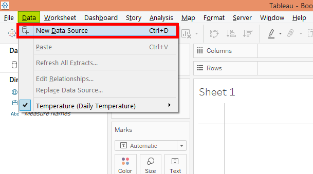
Step 1: First, load the dataset into Tableau. For this click on “New Data Source” under the Data menu. Alternatively, click on “Connect to Data”.
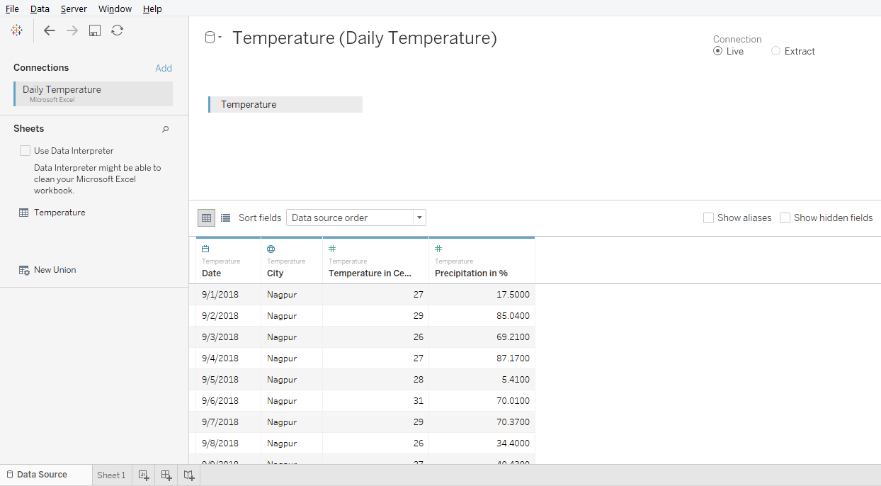
Step 2: The data gets loaded as can be seen in the “Data Source” tab as shown in the following screenshot.
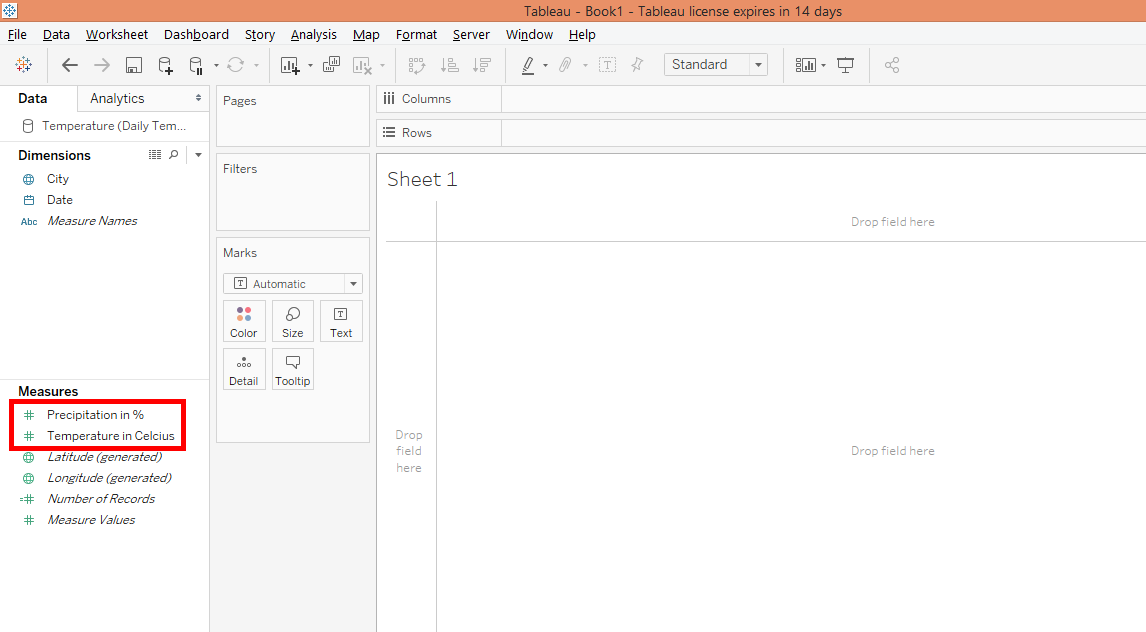
Step 3: Moving to the sheet tab, we can find the measures “Precipitation in %” and “Temperature in Celsius” and dimensions City and Date present in the respective sections.
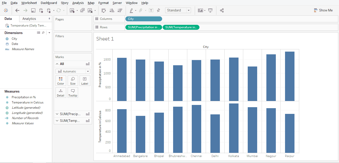
Step 4: Initially, drag measures “Precipitation in %” and “Temperature in Celsius” into Rows region. Then drag dimension City into columns region. We get a simple bar graph visualization as shown by the following screenshot.
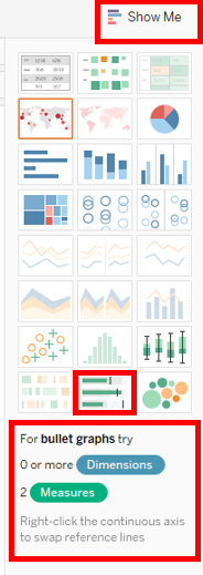
Step 5: The next step is to proceed with converting the bar graph into a bullet chart. This can be done as shown below. Just click on “Show Me”, and then click on the bullet chart symbol which is located in the last row of symbols in the Show Me options. Hovering mouse over the bullet chart symbols gives the details of conditions pertaining to the requirement of dimensions and measures for producing the graph. Note, for bullet chart, two measures are required, while there’s no requirement of any dimension.
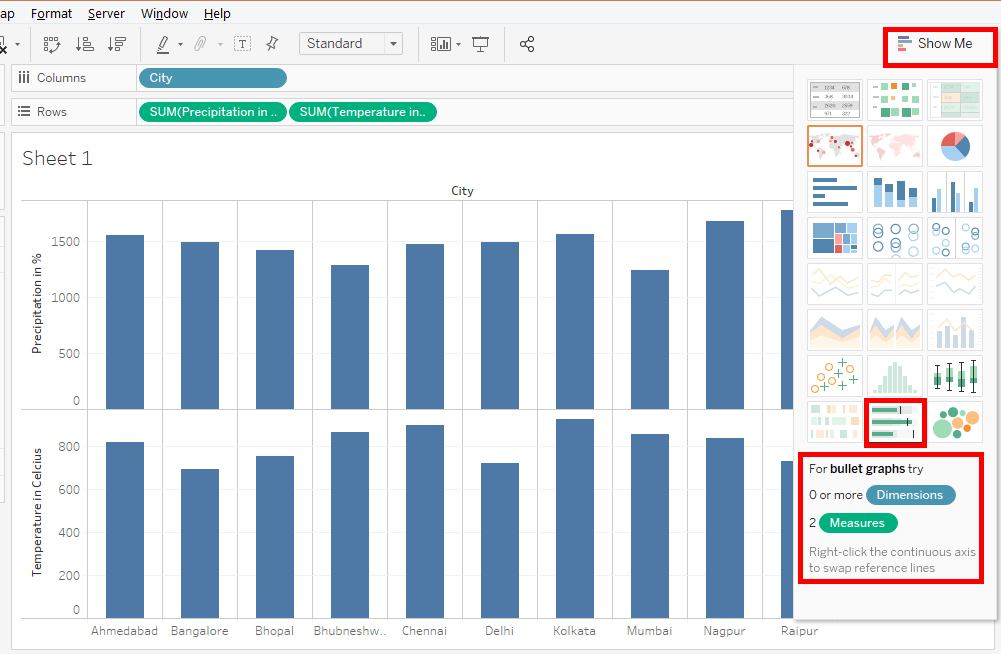
Step 6: The following screenshot gives a closer look into the Show Me options and selection of Bullet Chart type.
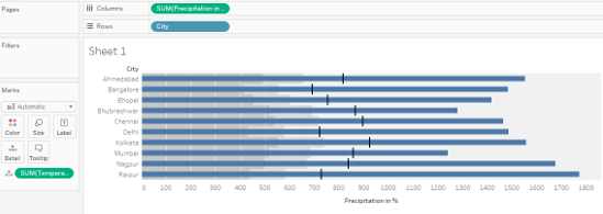
Step 7: Clicking over bullet chart type in Show Me gives the bullet chart which is as shown in the below screenshot. By default, the chart is present in a horizontal form. We can have it either horizontal or vertical. To make it vertical use Ctrl + W command.
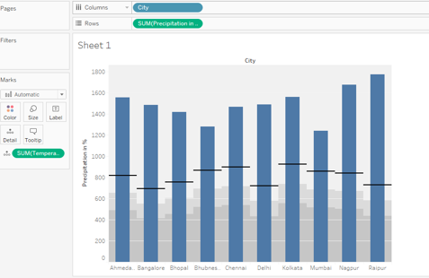
Step 8: The below screenshot shows us the bullet chart built on two weather measures viz. temperature and precipitation. We can see that automatically, Temperature in Celsius measure has been considered over Detail in the Marks Card, while Precipitation in % measure continues to remain in the rows region. Here, it must be noted that the application of a bullet chart is to explore insights from two closely related measures and to interpret the results to come up with a conclusion based on the correlation and correspondence trends that the chart beautifully explains.
However, the graph shown in the below screenshot doesn’t give the right insights. Because, though trends have been depicted properly by the graph, it is based on total values of the measures Precipitation in % and Temperature in Celsius. Total values for the entire month doesn’t make a sense, as we intend to analyze average daily temperature and precipitation for a month.
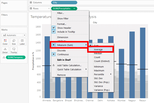
Step 9: To overcome the above issue, we will change the function applied over the measures “Temperature in Celsius” and “Precipitation in %” from SUM (summation or total) to AVG (average) using the steps, as shown in the below screenshot. Click on the drop-down menu of a measure. Then in Measure (SUM) select Average. Do this for both measures.
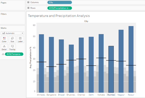
Step 10: Performing the above steps properly would lead us to get the right bullet chart which is shown in the below screenshot. Note, we have named the sheet appropriately. This is essential so as to better understand the meaning conveyed through insights by two measures. The importance of bullet chart lies not just in its ability to present the data as a beautiful visualization but in its ability to explore important insights which are otherwise tough to obtain.
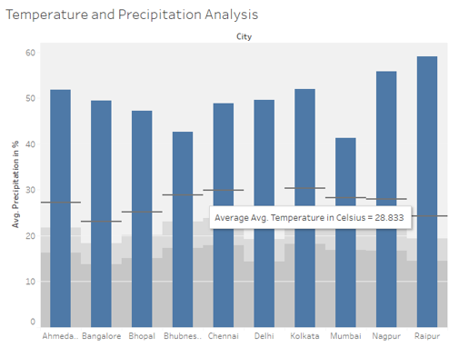
Step 11: Let’s have a closer into the analysis through bullet chart visualization. Just hover the mouse over a bar, and we find that details represented by that bar appear. In the following screenshot, we can see find details pertaining to temperature and precipitation for the city of Chennai. The bullet chart helps us understand how precipitation and temperature are varying across the cities. We can compare the measure for multiple cities at a time and validate certain hypotheses. Like, let’s assume that we consider if average temperature conditions are different then precipitation will also differ. Now, if we compare the cities of Delhi and Raipur, we can find that though temperatures are different, the precipitation levels are the same. Like this, we can perform an extensive analysis using two measures in a particular context.
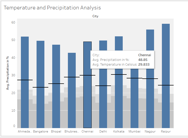
Step 12: When we hover the mouse over the black line, we get to know the average temperature for that city. The black line represents the temperature. Also, we can find the grey shady filling around the bars. These grey shades are associated with the measure that represents the black line, like Temperature in Celsius in this case. The height of the shady filling is governed by the value of the measure and corresponds with the level at which the black line is located.
In case, if we remove Temperature in Celsius measure from the analysis, we will only have the bars left. We can have them back into the analysis by dragging the measure over Detail in Marks card.
Conclusion
The Bullet charts are similar to in-cell charts in MS EXCEL. However, unlike the Excel in-cell charts, the Tableau Bullet charts are quite robust with the ability to handle complex problems. The easy-to-leverage mechanism in Tableau, allow building the visualization fast. It best suits the context that involves two related measures.
Recommended Articles
This is a guide to Tableau Bullet Chart. Here we discuss how to build a bullet chart in the step by step process. You can also go through our other related articles to learn more –
