Updated March 20, 2023
Introduction to Stacked Bar Chart in Tableau
Stacked Bar Chart in Tableau is a tool that is used for visualization. It is used for visually analyzing the data. A person can create an interactive sharable dashboard using Stacked Bar Chart in Tableau, and that dashboard can be used to depict trends, variations in data using graphs and charts. It is not open source, but a student version is available. The interesting part about it is that it allows real-time data analysis. It can be used to connect to files, big data sources. Its demand for growth is being used in academics, business, and many government organizations.
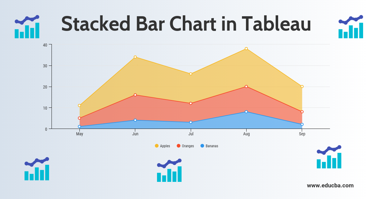
Now let’s discuss what a stacked bar chart is? So, a Stacked Bar Chart is a bar chart that not only compares different categories of data in a graphical fashion but it also has the capability to break down the whole and compare parts of the whole. Thus, each segment in the bar represents different categories of the whole.
Now let’s begin the process of preparing a Stacked Bar Chart using Tableau. Before we begin let’s first know the difference between dimension and measures in a tableau dashboard as it is very important and will help us to understand easily.
So what is a measure and dimension in tableau?
The answer is Tableau divides the data into two parts. Dimensions are fields that cannot be aggregated or contain qualitative values (name, geographical data, dates) while measures are fields that can be aggregated and can be used for mathematical operations.
Stacked Bar Chart in Tableau
Below are the different approach to create a stacked bar chart in tableau:
Approach 1
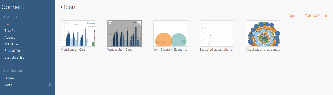
- Open Tableau and you will find the below screen.
- Connect to a file using the connect option present in the Tableau landing page. In my case, I have an excel file to connect. Select the excel option and browse your file to connect.
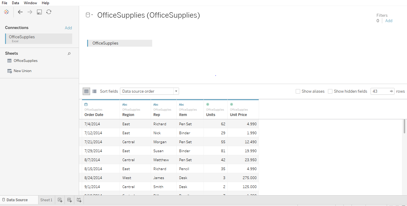
- I am using office supplies dataset which has six attributes and includes both numeric and categorical values. The below screenshot shows how it looks in tableau once you connect to your sheet. If you look closely there are two attributes (Units and Unit Price) in the measurement region and four (Region, Rep, Item, Date) in the dimension region.
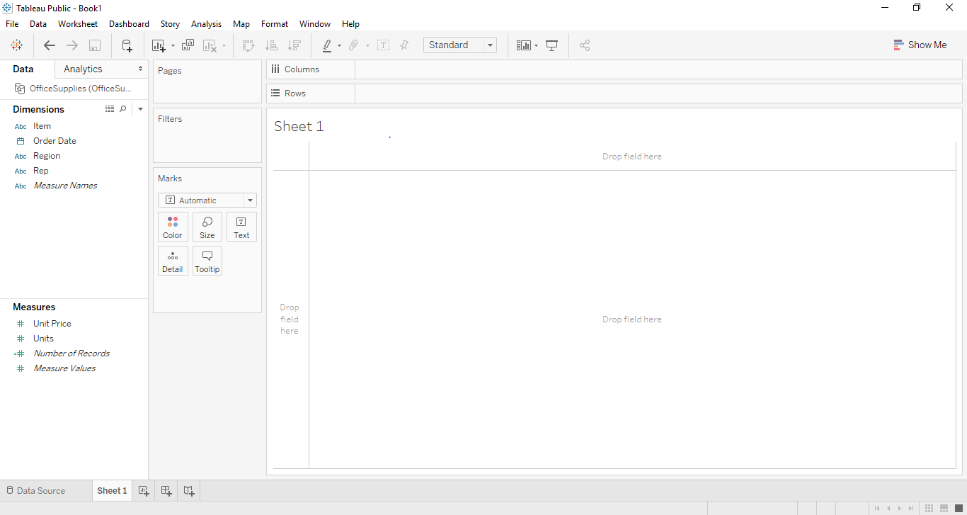
- Click on sheet1 shown with the tooltip ”Go to Worksheet”. This is where you will prepare your visualizations. The below screenshot shows how it looks.
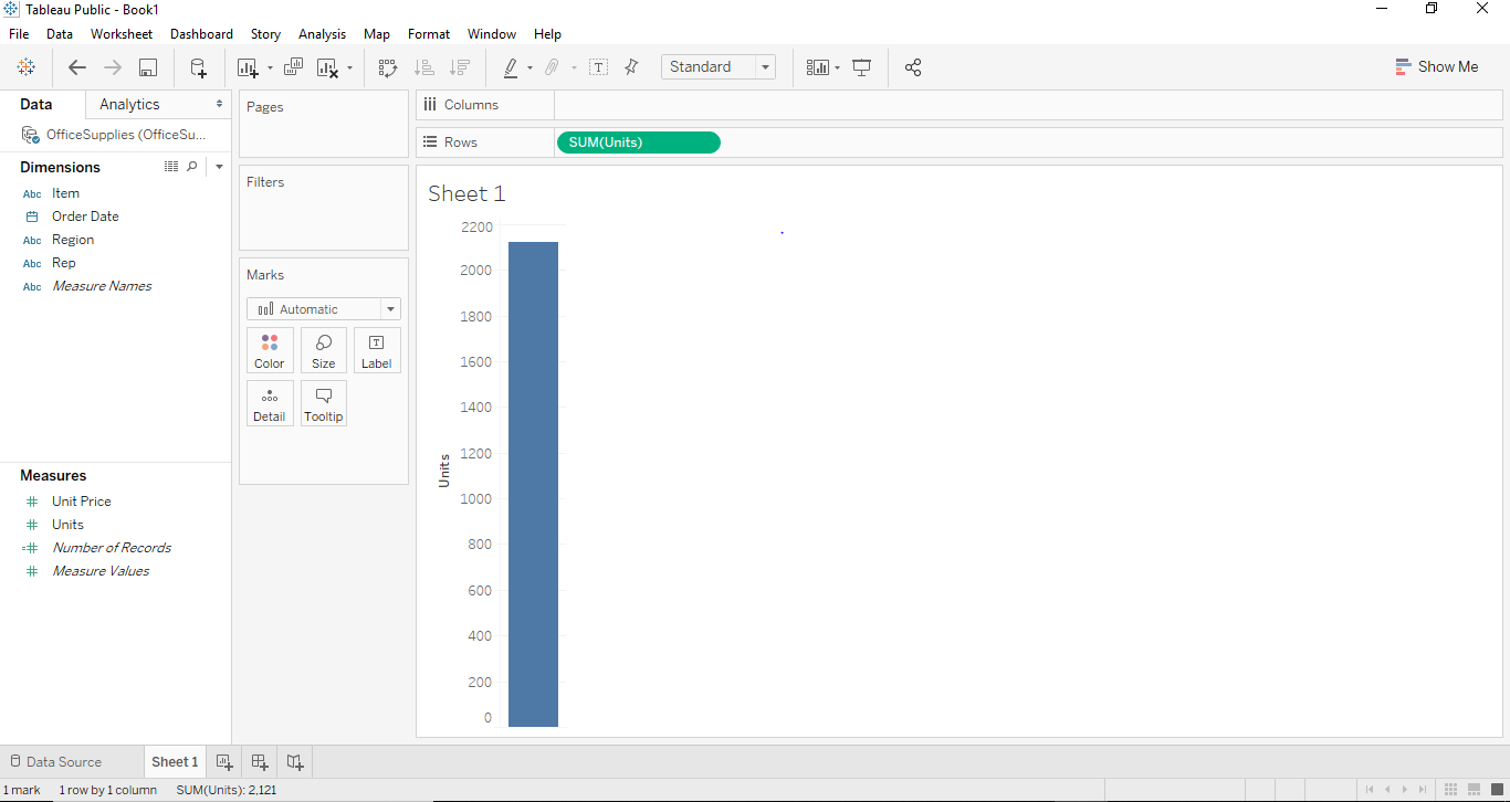
- If we drag and drop one of the variables from measure region for example Units in our case. It will aggregate to the default sum and once you drag and drop them a bar chart will be created. The below screenshot illustrates this.
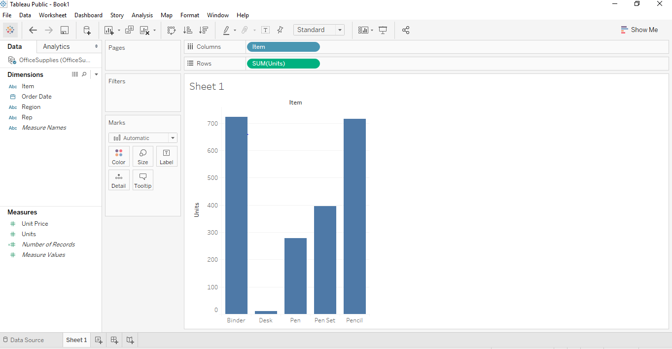
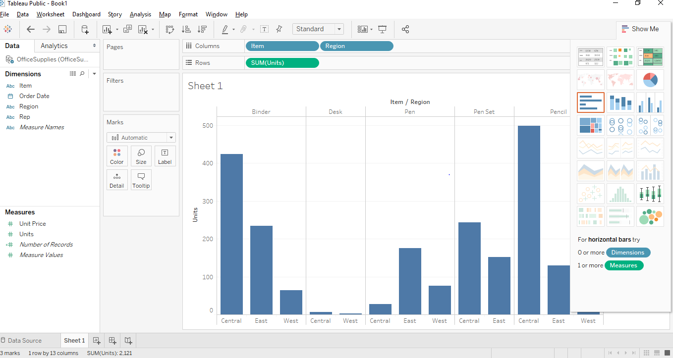
- Now, if we want to create a proper bar chart we can create that by dragging and dropping one of the dimension regions into the column region. In our case, we can use the dimension “Item” for that purpose. Once we drag and drop the Item dimension into the column section. We will see a bar graph where each bar will represent a particular name/brand of the item and the height of the bar will represent sum (aggregate) of Units for that class of the car. In this below Screenshot, we can see the same has been illustrated.
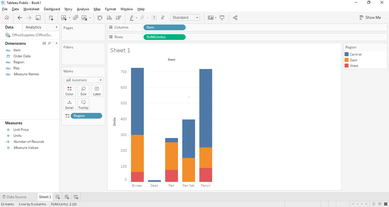
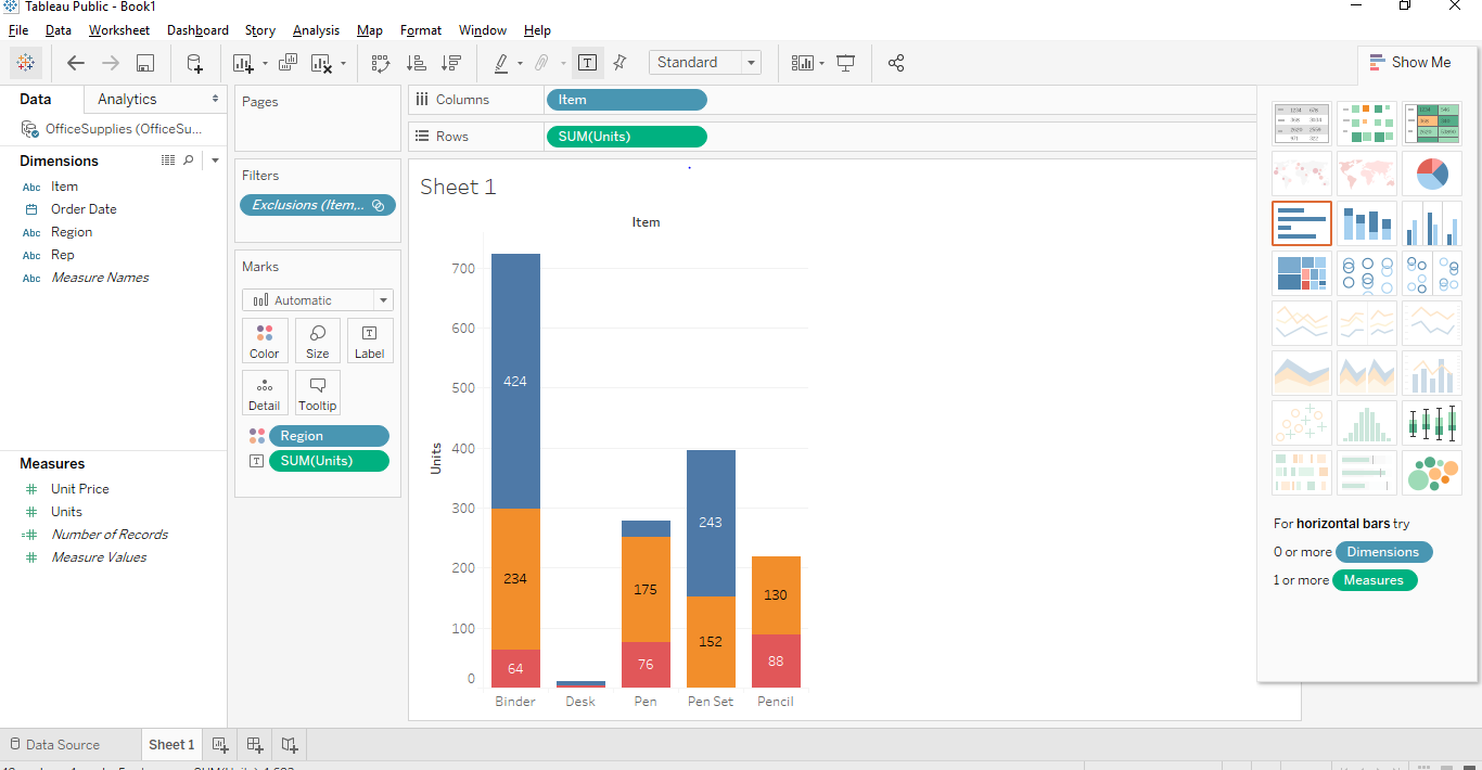
- Now to create a properly stacked bar graph, we would need a segment. In our case, we can use the Region as a proper segment. So what region will do is it will divide the names of items based on the region from where it belongs. In our dataset, we have three regions namely East, West and central. To make these fairly attractive and recognizable, we are going to drag “Region” from dimension region to marks card. Once we drag the “Region” to marks card, we will get to see the stacked Tableau chart.
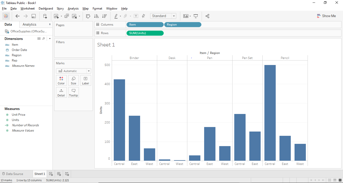
Now let’s try to create a Stacked Bar Chart using a second approach. This approach will be a little different at the end but will give the same result.
Approach 2
- All steps from step 1 to step 6 will remain the same in the second approach as well. The step will change from step 7.
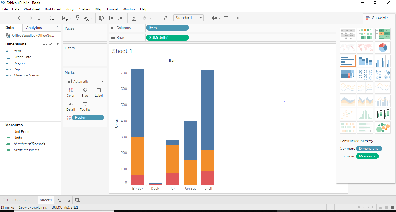
- In this case, let us first remove the segment “Region” from a color shelf and place the “Region” in the column section right beside “Item” from dimension region. So once we drag and drop “region” from the color shelf to the Column section. We will see the below bar graph in Tableau.
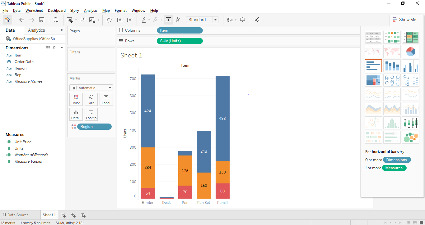
- Now after getting the above graph, we have to convert the bar graph to Stacked Bar Graph and for that, we need to see the previous screenshot above where there is a button called show me button in the top right corner. The show-me button provides various graphs and charts and a user can choose any of the applicable graphs. The applicable graphs will be highlighted. The below screenshot shows the “Show Me” button.
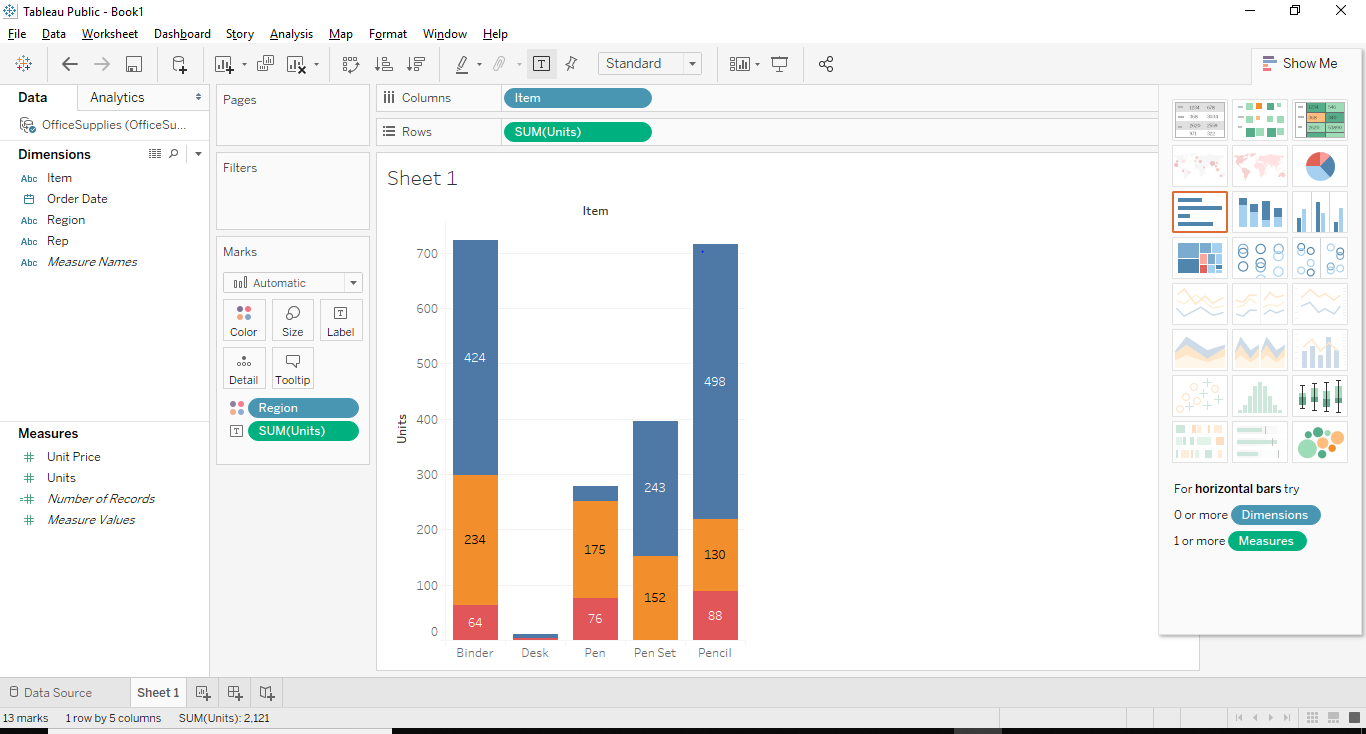
- As you can see above the Stacked Bar Graph is highlighted and we just have to click on the stacked bar graph and a stacked bar graph similar to approach 1 will be created as shown below.
Interesting Points
- We can add labels to the stacked bar graph by clicking on the “Show Mark Labels” button situated in the toolbar. Once we click on that we will be able to add mark labels on our graph as shown below.
- Another way of bringing the levels would be to drag and drop one of the data labels from measures or dimensions pane to level shelf present in marks card. In our case, we wanted to set the number of units as labels. So, we drag and dropped the “Unit” label from measures pane into the labels shelf.
- The interesting feature in Tableau is that if you select any specific stack, it shows you the details of that particular stack.
- We can also remove any particular stack from the stacked bar graph. For that just select the stack you want to remove and press exclude on the dialog box that appears and that stack gets removed from the graph. In our case, we removed the top right corner stack from our graph.
Recommended Articles
This is a guide to Stacked Bar Chart in Tableau. Here we have discussed the basic concept and different approach to create a stacked bar chart in tableau with Screenshots. You can also go through our other suggested articles to learn more –
