Updated March 20, 2023
Introduction to Waterfall Chart in Tableau
The Waterfall Chart is one kind of chart among several others in Tableau. A Waterfall chart visually demonstrates how positive and negative values affect an initial value. Users employ it to analyze part-to-whole relationships and commonly use it for tracking financial data.
Before we begin the process of making a Waterfall Chart in Tableau, we would like to present a scenario to our readers. This problem statement will help us understand the applicability of the Waterfall Chart.
Scenario: An individual owns a merchandising business that has been doing well over time. The person needs to analyze the business data to obtain an accurate profit and loss statement. The time period can vary from week to month or even on a yearly basis.
Process of Waterfall Chart in Tableau
1. Get ready with the data. In this article, we created a sample dataset. Pull the data into the Tableau application via Open >> Data Source.
Note: In this article, we use ‘Items vs. Profit’ for Waterfall Chart. Thus, we will be measuring profit in relation to the given items.
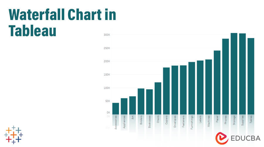
2. Once the data set is fed into the Tableau application, select the ‘SUM’ category and drag and drop in the ‘Rows’ section as mentioned below:
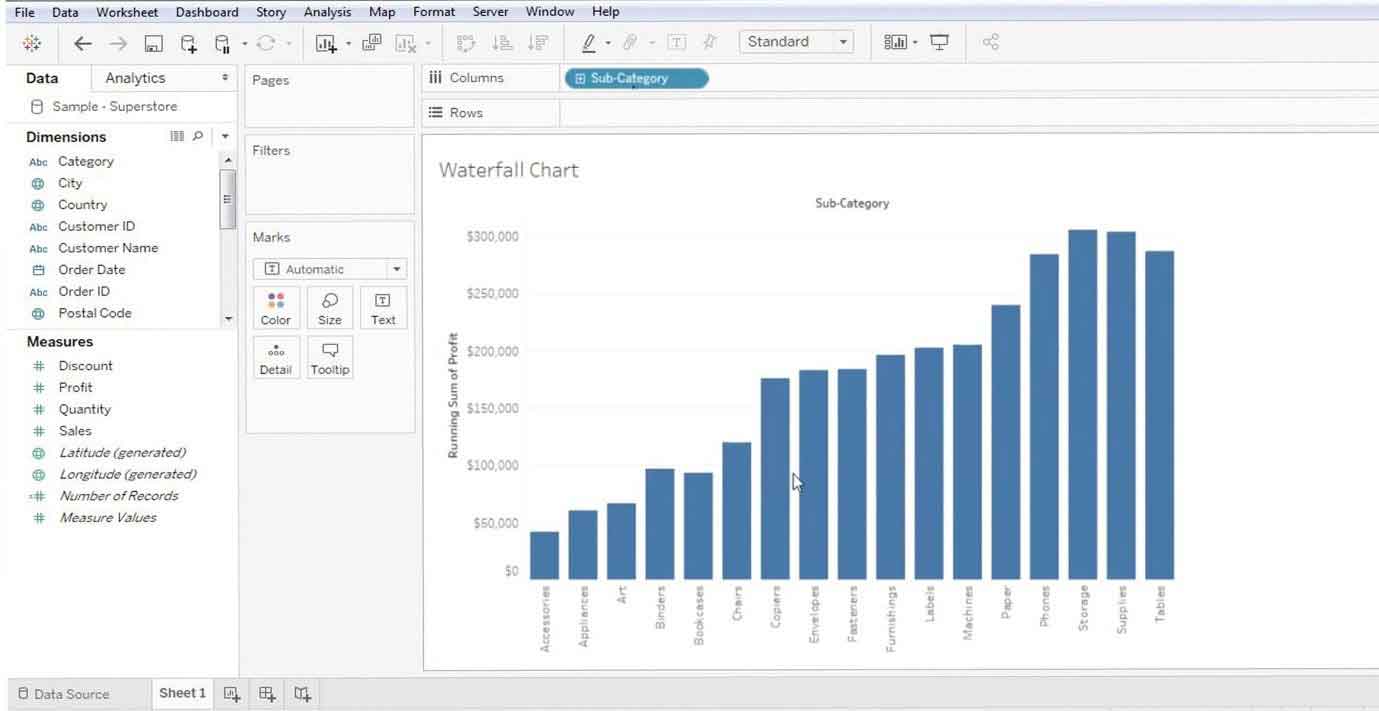
3. Once done, one can see the bar chart for ‘Profit’ (blue bar).
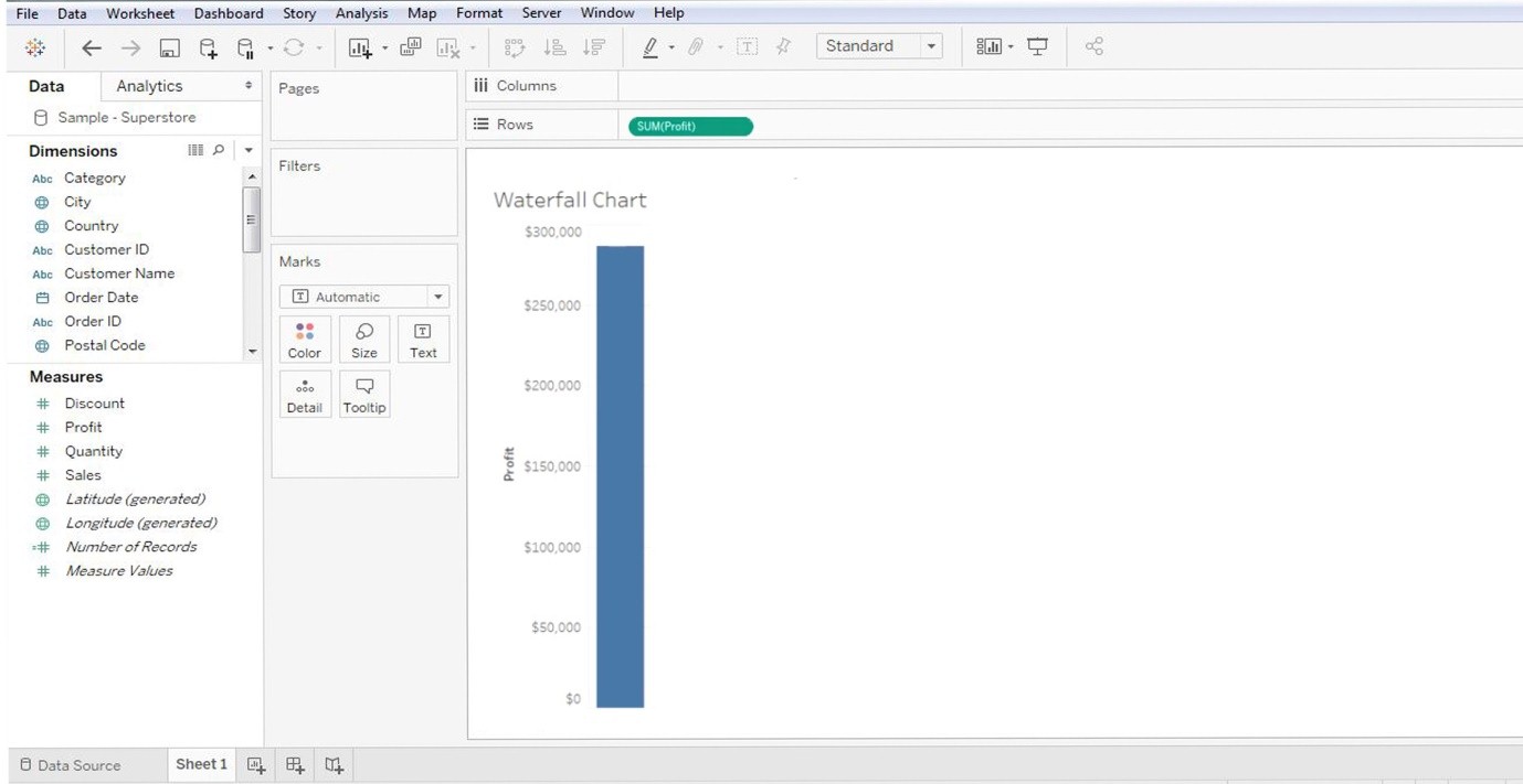
4. Drag and drop the sub-category (or the items’ name) in the ‘Column’ section of the dashboard (please see the below image). The subcategory is a measuring dimension, i.e., a list of items.
5. Now the basic layout of the graph is ready; however, this is not a Waterfall Chart in Tableau but a bar chart. Its form must be manipulated from here on.
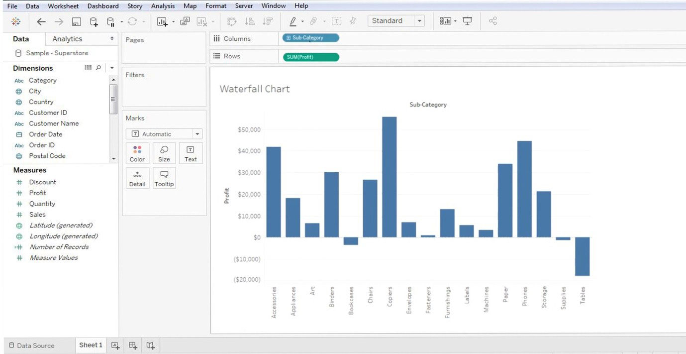
6. Make certain changes in the graph to display the ‘Running Total’ details. As one right-clicks on the ‘SUM’ present in the ‘Rows’ section, one will get ‘Quick Table Calculation’ and ‘Running Total.’
Hence, SUM >> QUICK TABLE CALCULATION >> RUNNING TOTAL
Refer to the below image:
7. After making changes to the graph, it will result in something as below:
8. The above image shows the ‘Running Total’ for the selected list of items.
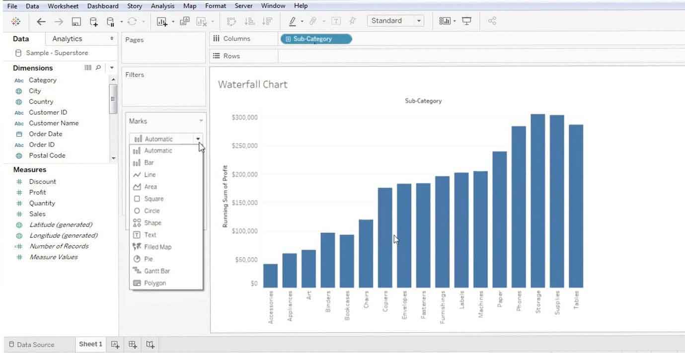
9. Next step is to convert the chart into Waterfall Chart in Tableau. To achieve this, we will navigate to the ‘MARKS’ section (on the left-hand side) of the dashboard. It contains all the data enhancement techniques.
- Color
- Size
- Text
- Detail
- Tooltip
10. Click on the ‘Marks’ drop-down menu and select the ‘Gantt’ chart. Refer to the below image:
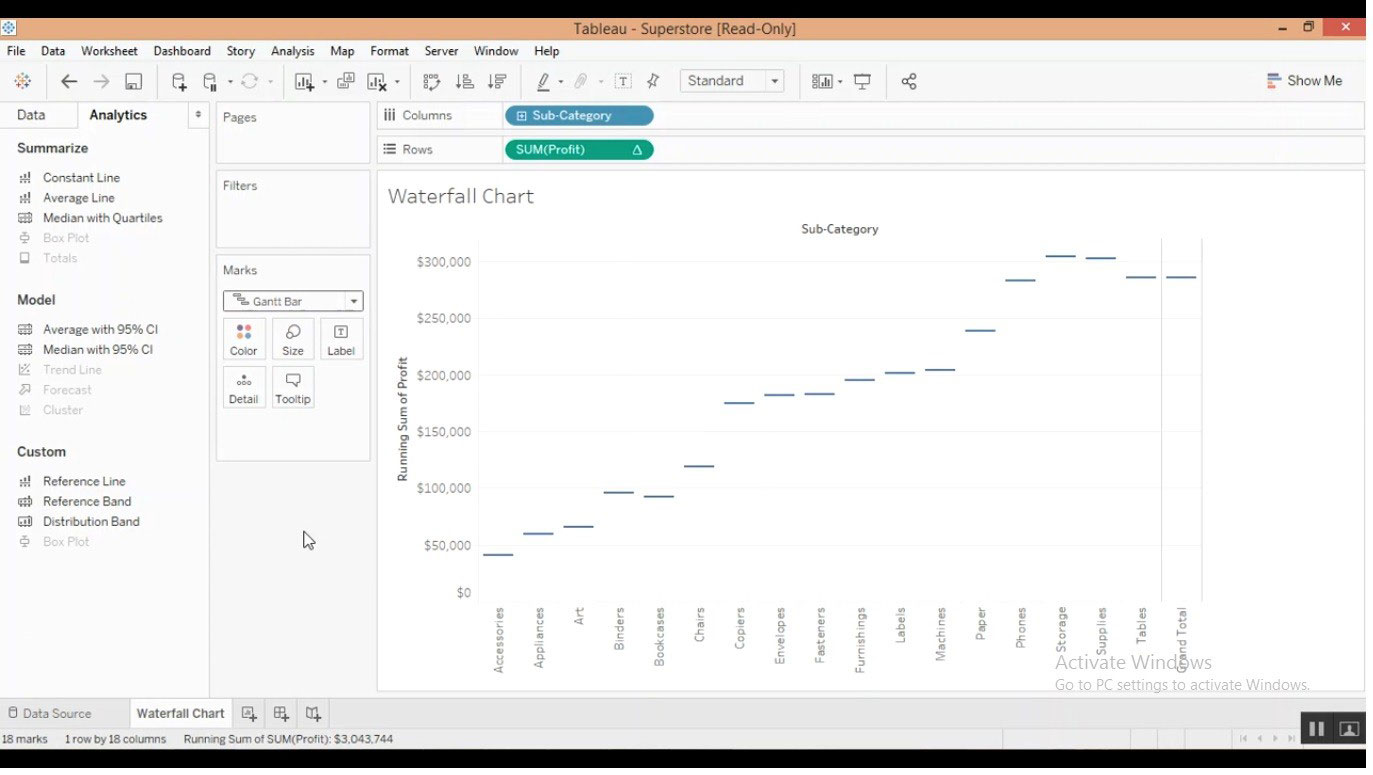
11. Now one can view the data’s Gantt chart; however, it requires several corrections.
Refer to the Gantt chart below:
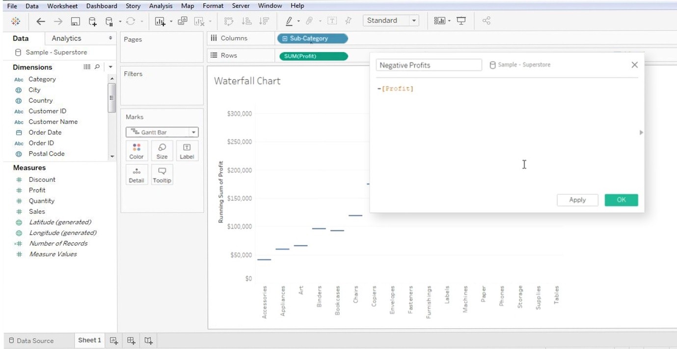
12. The bars (or the data) on top of this Gantt chart are required. To do this, one makes a simple adjustment: create a calculated measure by right-clicking anywhere on the ‘DATA’ field. Now proceed to select the ‘CREATE CALCULATED FIELD.’ Refer to the below image:
Note: We can see the ‘DATA’ and ‘ANALYTICS’ sections in the red box.
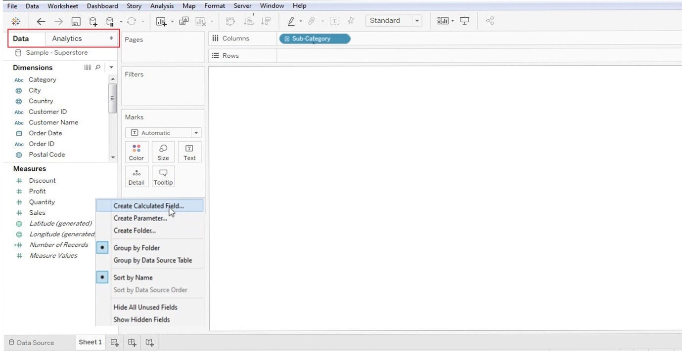
Now right-click on the ‘Data’ column.
13. After one selects the ‘Calculated Fields,’ there will be a dialogue box to rename them (generally choose a relevant name like “Negative Profit”). It is in response to the actual value. Proceed to click on the ‘OK’ button.
Refer to the below image:
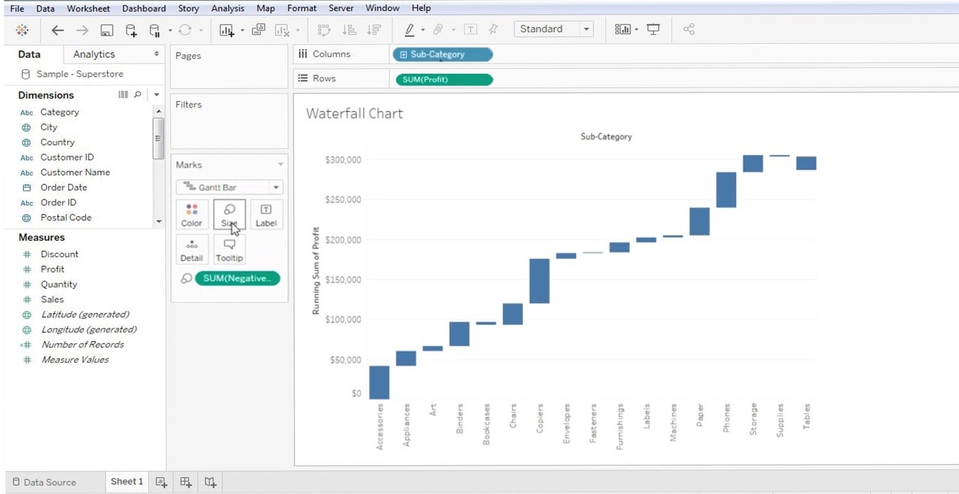
14. Now one must pull the ‘Negative Value’ parameter (the one just created; refer to the above image) in the ‘SIZE’ (present in the MARKS section). This newly created ‘Negative value’ will be present in the ‘DATA’ section.
Note: Drag and drop this newly created ‘Negative Value’ to the ‘Size’ section (present in Marks).
Refer to the below image:
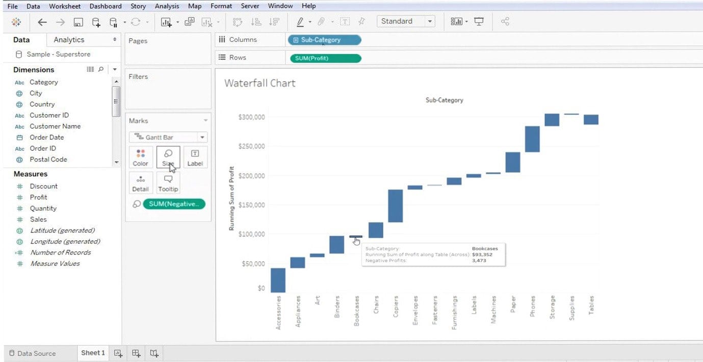
15. The data visualized above is a Gantt chart view. When one hovers the cursor over the Gantt bars, one can see the ‘Positive/Negative’ values associated with each of them. The chart itself explains why it is termed Waterfall (as the data represent one single value − +ve/=ve). Refer to the below image for data marking:
These are the basics of the Waterfall chart. No two charts can be similar, and chart customization varies from person to person.
Importance of Waterfall Chart in Tableau
1. A medium of information within the concerned party.
2. Functions as a means of communication within the team
3. Provides improved insights into business data
4. Possesses data visualization techniques
5. Helps to get net, cumulative, profit, and loss values
6. These charts have varying applicability in several streams, like population control, birth rate, death rate, business profit and loss, supermarkets, etc.
Conclusion
The above method explains how to create a Waterfall Chart in Tableau, which some also refer to as a ‘Flying Chart’ or ‘Bridge Chart.’ Waterfall Charts offer an effective way to analyze the upswings and downturns of a business.
Recommended Articles
For further understanding related to this subject, please click on the following links:
