Updated July 28, 2023
Introduction to Tableau Chart Types
Tableau is a powerful tool to create different types of charts. It is done automatically using visual query language. There are 24 different types of chart available in tableau. Charts are created by using measures and dimensions we choose.
Not all chart works in one way. When we select geography like state, country, etc show me will prompt for Map chart. When we work with Dates, the Lines chart will be suggested.
If we select Dimension first then Measure, Bar char will appear by default.
If we select Measure First then dimension, we get a textual representation of the data.
Types of Tableau Chart
Here are the 12 different types of Tableau Chart Types given below.
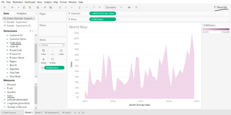
1. Area Chart
Steps to Create
- Open Tableau public and connect to the data source.
- Go to the new worksheet.
- Under Dimension select Order Date ->Ctrl->Under Measure select Sales.
- Go to the Show Me (user can see chart)->select chart.
- Go to the Marks Card and click the Mark Type drop-down and select Area.
- Go to the Columns->select Year(Order Date)->drop-down->select Month.
2. Bar Chart
Steps to Create
- Open Tableau public and connect to the data source.
- Go to the new worksheet.
- Under Dimension select Category ->Drag to column->Under Measure select Profit->Drag to rows.
- Under Marks type ->Select Marks ->Select Bar.
- Under Dimension select Region->Drag to left side of the Profit.
- Under Dimension select Ship Mode->Drag to color, we will get different ship mode in each region.
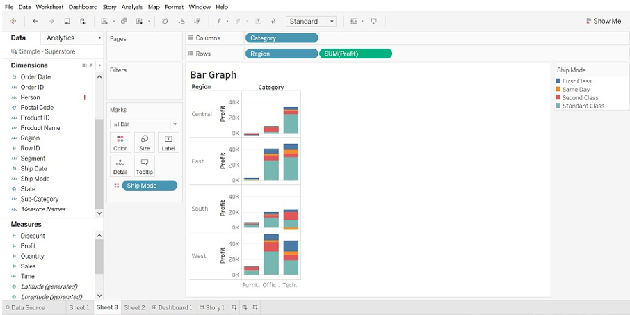
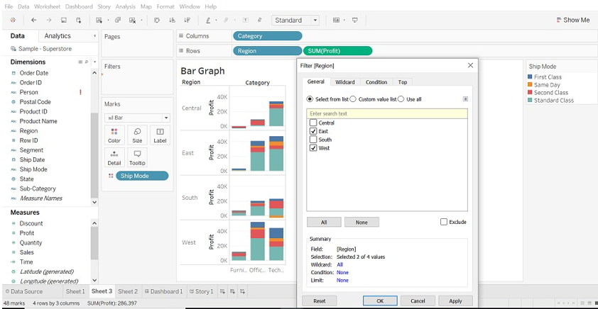
- We can view data as per region, Drag Region to Filters->select region we wish.
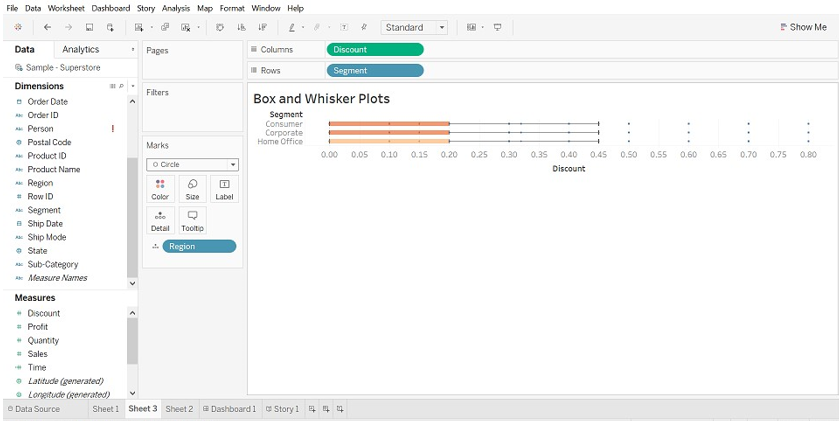
3. Box and Whisker Plots
Steps to Create
- Open Tableau public and connect to the data source.
- Go to the new worksheet.
- Drag Segment dimensions to columns.
- Drag the Discount measure to rows.
Hint: -Tableau creates a Bar Graph by default because we have drag dimension to columns and measure to rows.
- Drag the Region dimension to columns and drop it to the right of the segment.
- Click Show Me (right side of the toolbar), select the box-and-whisker plot chart.
- Drag Region from the Marks back to columns, to the right of the segment.
- To disaggregate data, select Analysis-> Aggregate Measures. (data is aggregated by default in tableau).
- Click the Swap button to swap the axes.
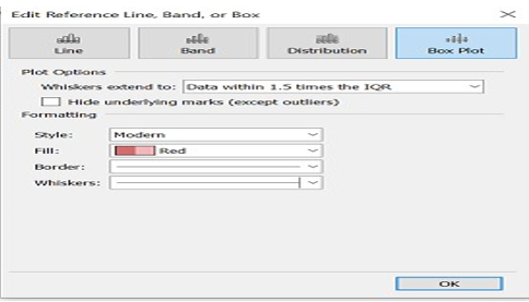
- Right-click on the bottom axis and select Edit Reference Line.
- In the edit reference line, fill the drop-down list, select an interesting color scheme.
Edit Reference Line
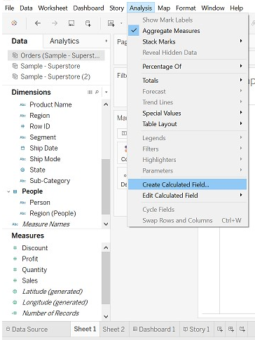
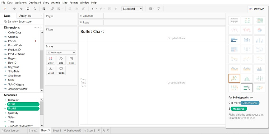
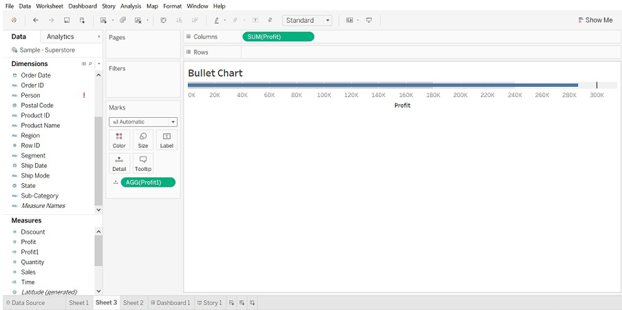
4. Bullet Chart
(we can use bullet charts to show the performance between measures.
Two measures can be compared.)
Steps to Create
- Open Tableau public and connect to the data source.
- Go to the new worksheet.
- Select “Analysis” present in the menu bar.
- Select “Create Calculated Field” from the list.
- The calculated Field window will open. Name it.
- Type the estimated value of the measure.
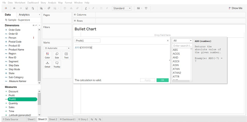
- Select Profit and Profit1(calculated field). Then select show me, it will show you a bullet graph.
- Select a bullet graph.
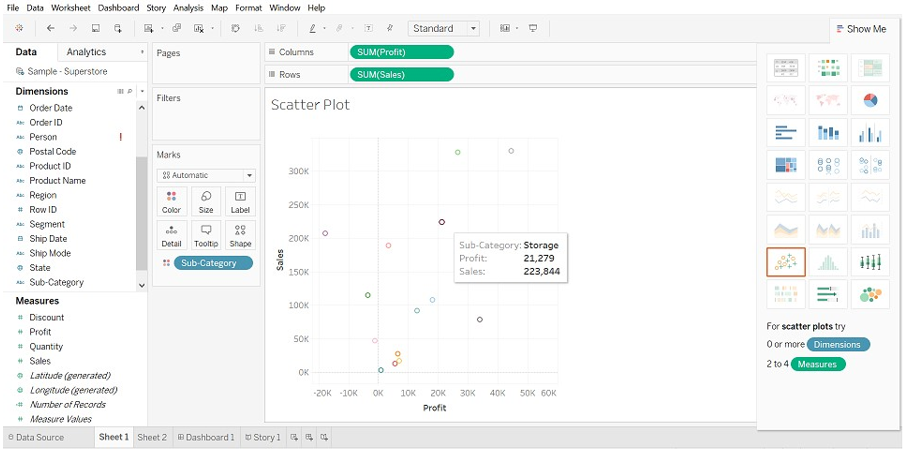
5. Scatter Plot
(when we add two Measures in both x and y-axis, scatter plot gets created)
Steps to Create
- Open Tableau public and connect to the data source.
- Go to the new worksheet.
- Drag Profit into columns and Sales into Rows. This will create a scatter plot by default.
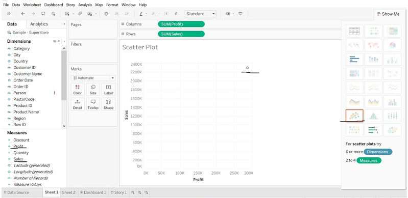
- Drag “Sub-category” into color (Marks card), It creates a scatter plot which will show a relationship between sales and profit for each subcategory.
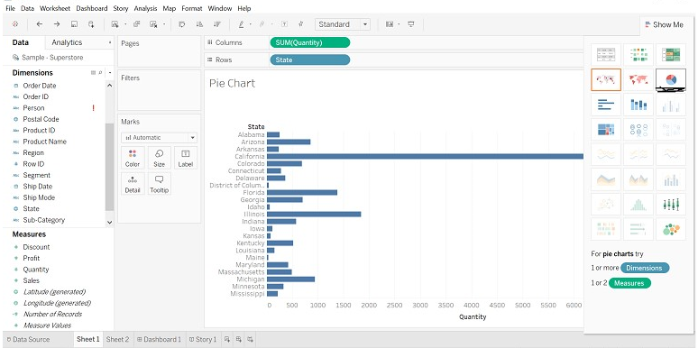
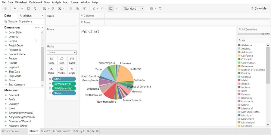
6. Pie Chart
(Chart shows a proportion of whole)
Steps to Create
- Open Tableau public and connect to the data source.
- Go to the new worksheet.
- Drag Quantity measure to columns and State dimension to rows.
The bar chart will be displayed by default.
- Click on “show me”, select Pie chart.
- Before selecting the Pie chart.
- After selecting a Pie chart, Drag Region dimension to Label (we can see details).
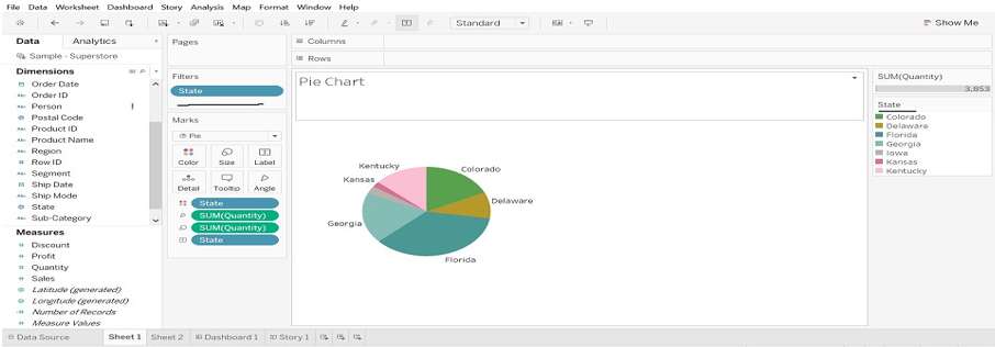
- Drag State into Filter, select only states you want.
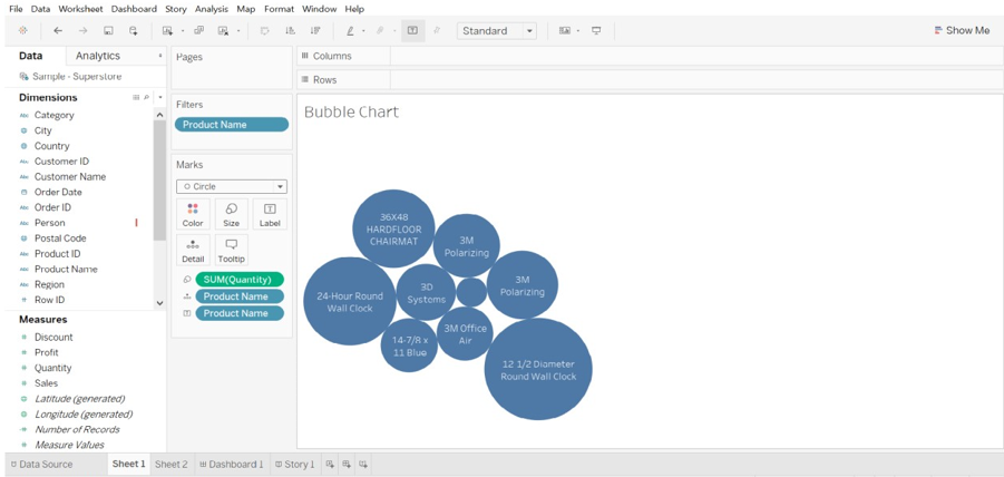
7. Bubble Chart
(visualizes dimensions and measures in the form of bubbles. Size of bubble visualizes the size of dimension and color of bubble determine as per measures)
Steps to Create
- Open Tableau public and connect to the data source.
- Go to the new worksheet.
- Select Product Name(dimension), press Ctrl select Quantity (measures) and select “Show Me” and click “Bubble chart “.
Due to the large volume of product name, I have dragged the product name to filter and selected product name as per my requirement.
8. Line Chart
(This chart is useful when we want to see trends over time.)
Steps to Create
- Open Tableau public and connect to the data source.
- Go to the new worksheet.
- Drag Order Date dimension to columns, Sales and Quantity measure to rows. Sales for two years is different. (image is shown below).
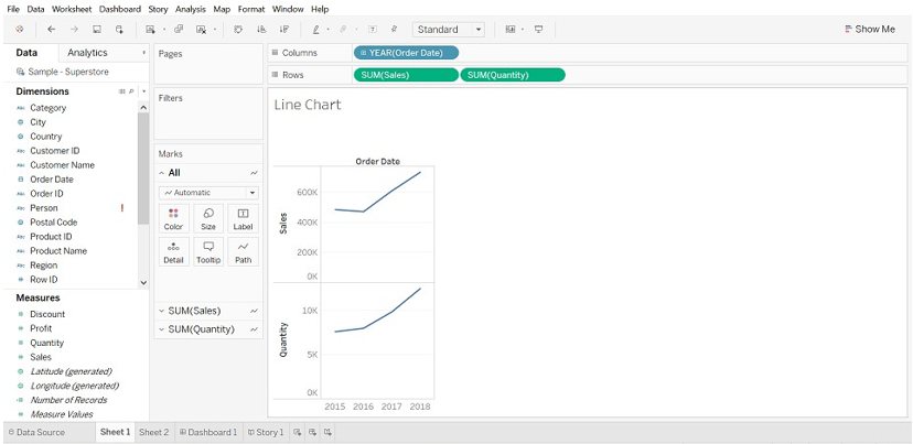
- When there are multiple measures in rows, it is difficult to measure. Drag measure(quantity) onto the sales in a horizontal bar.
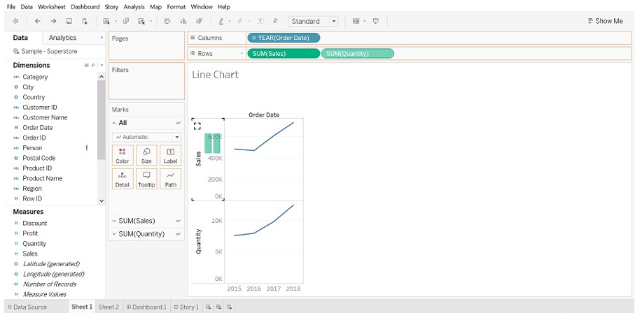
- The result will be changed. Have a look at the Right Side of the worksheet “Measure Names”.
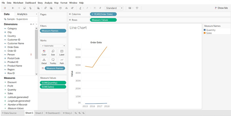
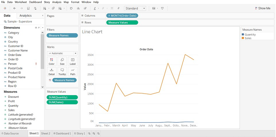
- Click on YEAR(Order Date) and from the drop-down, select Month.
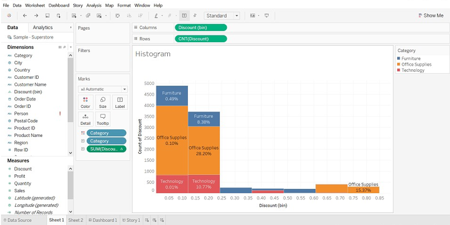
9. Histogram
(It shows the distribution of numerical data. Frequency and Measures are shown by default.)
Steps to Create
- Open Tableau public and connect to the data source.
- Go to the new worksheet
- Drag Discount measure into columns, click on “Show Me” and select Histogram
- Drag Category into color and label.
- Drag Discount into the label.
- Select Discount into marks card and click on drop-down->select Quick table calculation->select Percent of Total
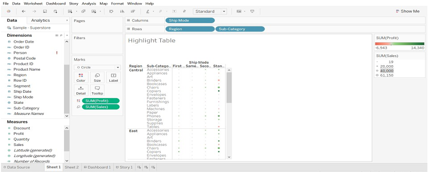
10. Highlight Table
(Compare categorial data using color)
Steps to Create
- Open Tableau public and connect to the data source.
- Go to the new worksheet.
- Drop Ship Mode dimension to columns, Region and Sub-Category to rows.
- Drag Profit dimension to color and Sales to size (Marks).
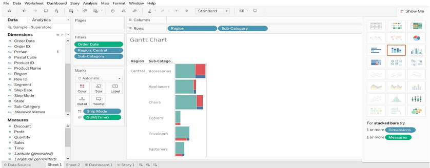
11. Gantt Chart
(It is used to identify the time taken for each process)
Steps to Create
- Open Tableau public and connect to the data source.
- Go to the new worksheet.
- Drag Order Date dimension to columns, Region and Sub-category dimension to rows.
- Click on Analysis ->select Create calculated Field (Time)->Create formula DATEDIFF (‘day’,[Order Date],[Ship Date]) -> Drag Time to Size(Marks).
- Drag Ship Mode dimension to the color.
- Drag Order Date, Region, and Sub-Category to Filters and select data you want.
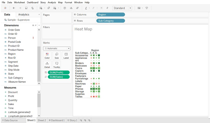
12. Heat Map
(It visualizes the data in the form of size as well as color on different measures)
- Select Sub-Category, press Cntrl and select profit then select Heat map (Show Me)
- Drag Region into columns, sales into size (Marks).
Conclusion
The graph plays an important role to represent the data. We can modify data the way we want. The more exposure we give to graph, filter, marks, etc the better visualization we can do.
Recommended Articles
This is a guide to Tableau Chart Types. Here we discuss the best 12 Different Types of Tableau Charts and we have also explained how to create them step by step with the screenshots provided. You may also have a look at the following articles to learn more –
