• Skip to primary navigation
  • Skip to content
  • Skip to primary sidebar
  • Skip to footer
EDUCBA

EDUCBA

MENUMENU
  • Resources
        • Data & Analytics Career

          • Big Data Analytics Jobs
          • Hadoop developer interview Questions
          • Big Data Vs Machine Learning
        • Data and Analytics Career
        • Interview Questions

          • Career in Cloud Computing Technology
          • Big Data interview questions
          • Data Scientist vs Machine Learning
        • Interview Questions
        • Machine Learning

          • What is Machine Learning
          • Machine Learning Tools
          • Neural Network Algorithms
        • Head to Head Differences
        • Others

          • Resources (A-Z)
          • Data and Analytics Basics
          • Business Analytics
          • View All
  • Free Courses
  • All Courses
        • Certification Courses

          Data Science Course
        • All in One Bundle

          All-in-One-Data-Science-Bundle
        • Machine Learning Course

          Machine-Learning-Training
        • Others

          • Hadoop Certification Training
          • Cloud Computing Training Course
          • R Programming Course
          • AWS Training Course
          • SAS Training Course
          • View All
  • 360+ Courses All in One Bundle
  • Login

Case Statement in Tableau

Home » Data Science » Blog » Data Visualization » Case Statement in Tableau

Case Statement in Tableau

Introduction to Case Statement in Tableau

The CASE statement or CASE function in Tableau is a part of logical functions. It is similar to the IF statement in a way that it goes on checking the condition one by one. However, the difference between the two lies in the fact that a CASE statement considers conditions as cases and hence the name. The central element to the CASE function is the expression which the function needs to evaluate. Further, the function compares the expression to a sequence of values one by one. When the expression matches any value then the corresponding value is returned as the result.

Using CASE statement – A step-by-step approach

The syntax of the CASE function in Tableau is as shown below.

Start Your Free Data Science Course

Hadoop, Data Science, Statistics & others

CASE
<expression>
WHEN <value 1> THEN <return result 1>
WHEN <value 2> THEN <return result 2>
WHEN <value 3> THEN <return result 3>
ELSE <default return>
END

The above syntax is the standard one and here default return means a value that should be returned if no match is found. Remember, suitable values should be returned, based on the context, in case of no match.

Illustration

We will now demonstrate the use of the CASE function through an illustration. The dataset contains distribution volume by distribution units. Here, the important dimensions are Region and Distribution unit and Distribution Volume is a measure. Our goal is to categorize distribution units based on distribution volume. To facilitate our analysis, we will create a single field that combines region and distribution unit names. Let’s proceed with the steps.

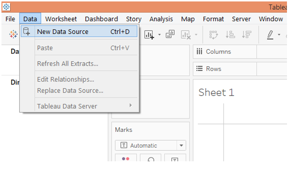
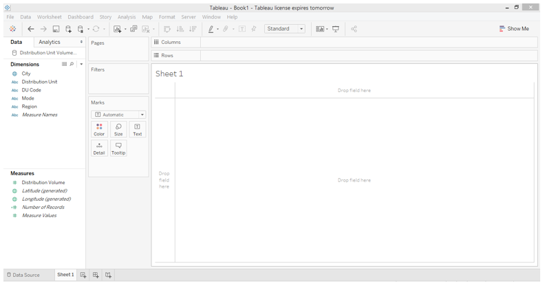
  1. Load the data into Tableau. For that click on “New Data Source” in the Data menu or alternatively click on “Connect to Data”.

Case Statement in Tableau

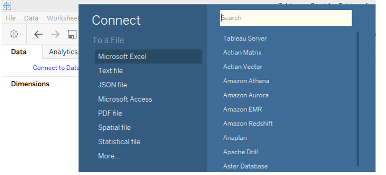
2. In “Connect”, select the requisite data source type. In this case, the data source type is Microsoft Excel.

Case Statement in Tableau

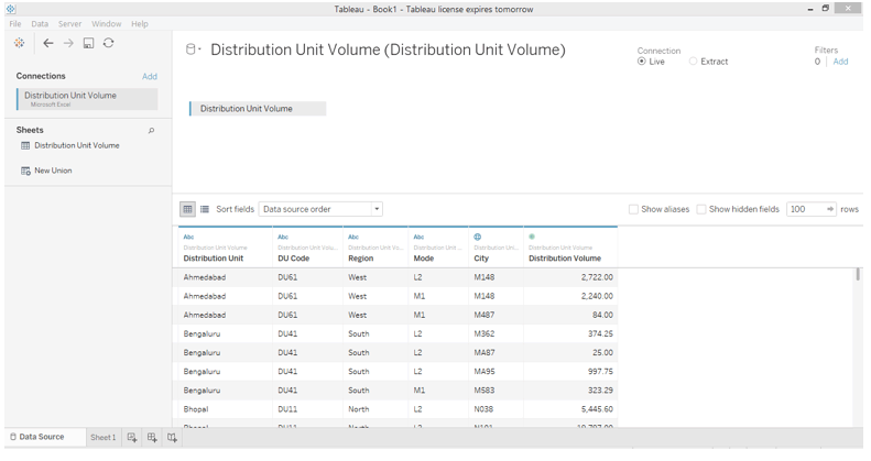
3. The data gets loaded and can be viewed in the “Data Source” tab as shown below.

Case Statement in Tableau

4. Moving to the sheet tab, we can find the dimensions and the measure in the dataset present in the respective sections.

Case Statement in Tableau

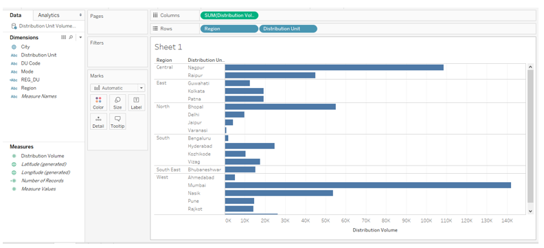
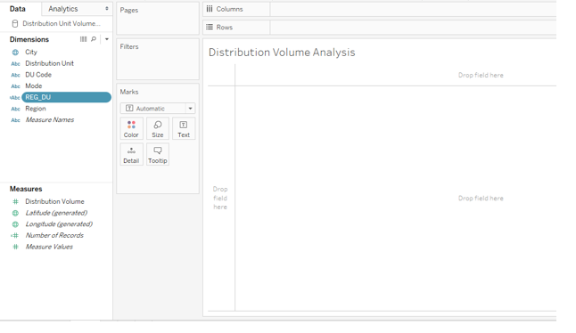
5. To begin with, just drag dimensions Region and Distribution Units into Rows region and measure Distribution Volume into the Columns region. We get a horizontal bar chart as can be seen in the following screenshot. If the default chart type is not a bar chart, then select it from Show Me. The next steps will create a combined field using the CASE statement which will combine the region and distribution unit names.

create calculated field

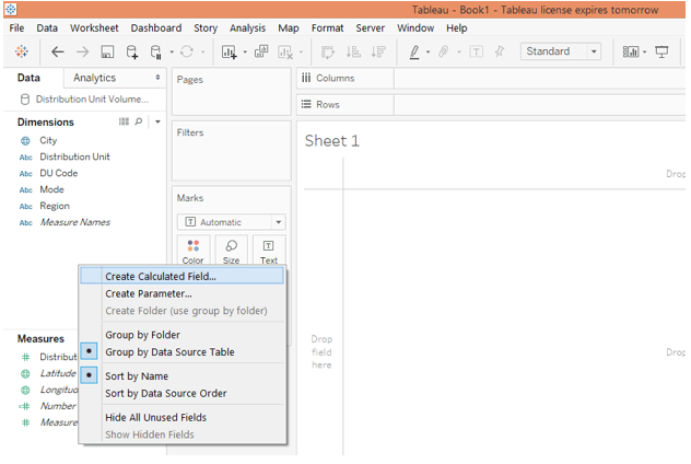
6. To create a combined field right-click anywhere in the blank space in the Data section and click on the option “Create Calculated Field…” as shown below.

Popular Course in this category
Cyber Week Sale
Data Visualization Training (15 Courses, 5+ Projects) 15 Online Courses | 5 Hands-on Projects | 105+ Hours | Verifiable Certificate of Completion | Lifetime Access
4.5 (2,324 ratings)
Course Price

View Course

Related Courses
QlikView Training (2 Courses)MatPlotLib Tutorials (3 Courses, 1 Project)

case statement.6

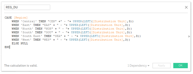
7. The calculated field that we created looks as shown in the below screenshot. As can be seen, the combined field has been created using the CASE function. Here, the expression used is dimension Region. Based on the region name, the combined field will be created by combining the first three letters from the name of the region with the first three letters of the distribution unit name. In order to extract the first three letters from the distribution unit, we used the LEFT function. Not all the letters of distribution unit are in the upper case, so in order to convert them to an upper case, we passed the result to the UPPER function. The CASE function thus offered us a systematic approach to create a combined field.

distribution volume analysis

8. The newly created field REG_DU can be seen in the Dimensions section as below.

case statement.8

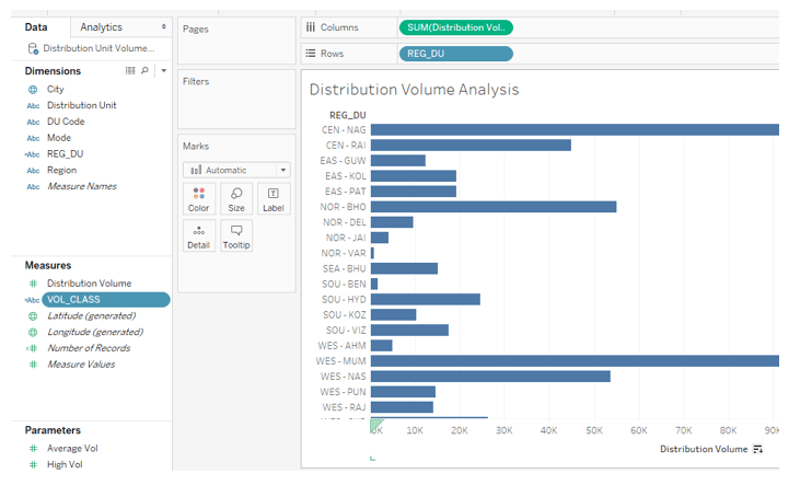
9. Now, just drag the newly created field REG_DU into rows region and distribution volume into columns region as shown below.

reg UV

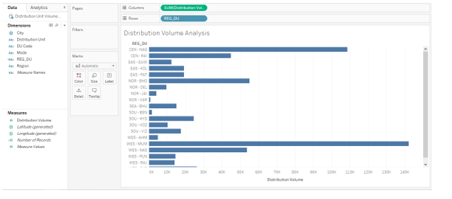
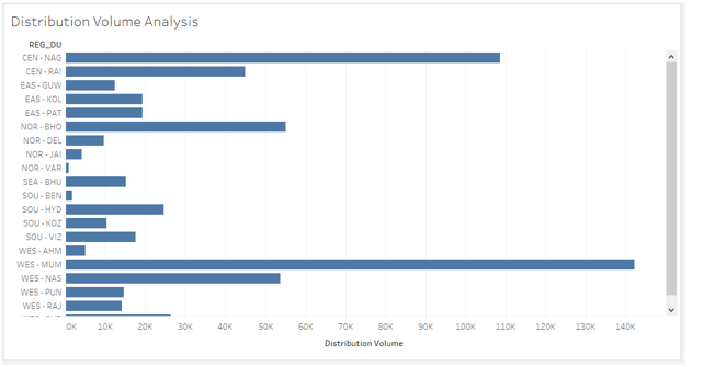
10. Let’s have a closer look at the visualization. We can see the names from region and distribution units combined. This will help in quick analysis and easy insight capturing. However, the analysis is incomplete until we categorize the distribution units based on distribution volume. To achieve the objective, we will follow the steps as illustrated by the screenshots subsequent to the below one.

create parameter

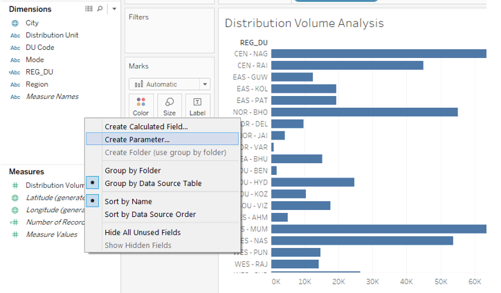
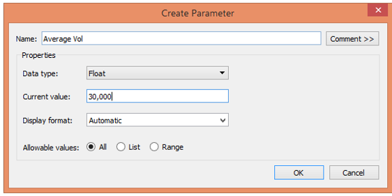
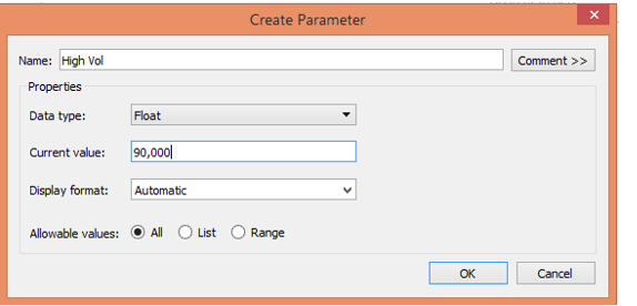
  1. We will create two parameters representing average volume and high volume. The average volume for all the distribution units is 30000 and we are considering high volume as 90000. To create a parameter, right-click anywhere in the blank space in the Data section and click on “Create Parameter…”.

case statement.11

12. Create the parameters with appropriate names and mentioned values as shown by the following two screenshots.

Case Statement in Tableau

two parameters

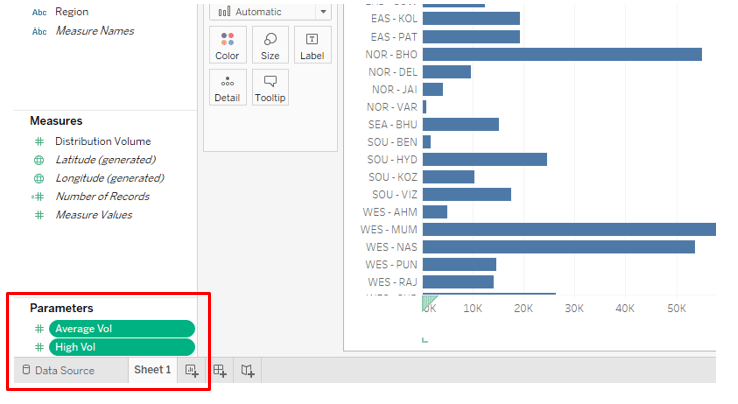
13. The two parameters can be seen in the “Parameters” section below.

case statement.13

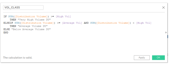
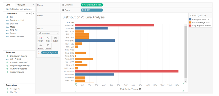
14. Next, create a calculated field for classification. We have named it VOL_CLASS. Going through the code in the field, it can be seen that distribution units having a volume over or equal to 90000 have been classified as “Very High Volume DU”, those with the volume between 30000 and 90000 are “Average Volume DU”, and rest is “Below Average” DUs.

created field

15. The newly created field can be seen in the measures section as can be seen in the below screenshot. Remember, this field uses measure Distribution Volume and so automatically gets categorized as a measure.

case statement.15

16. Now, drag the field REG_DU in the Rows region and measure Distribution Volume in the Columns region. Further drag field VOL_CLASS over Color in Marks card. We get the following visualization, where we can see the Distribution Units classified in different volume categories.

dimension measured

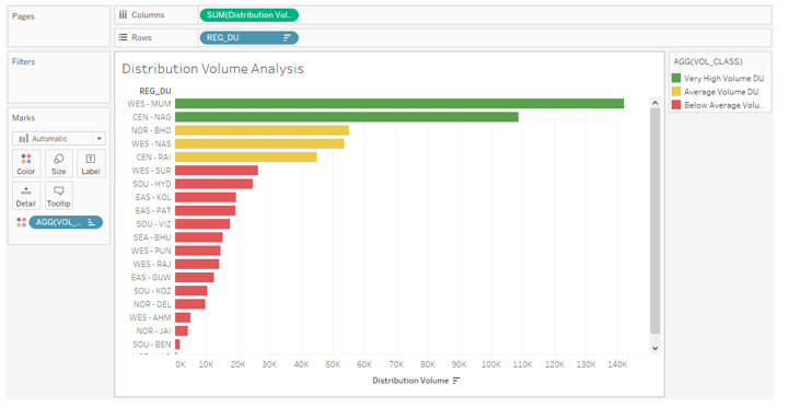
17. The following screenshot offers a closer look into the analysis. Here we have arranged the legend in proper order as against what it was in the preceding screenshot. Also, appropriate colors have been assigned to the categories, with results arranged in descending order.

case statement.17

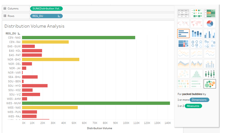
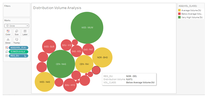
18. While analyzing distribution unit volume contribution, the above chart gives good insight. However, a bubble chart is more insightful in such an analysis. So, next, sort the result in alphabetical order of the REG_DU names and click over “packed bubbles” in Show Me as can be seen below.

reg DU

19. As can be seen below, we get a bubble chart that proves to be the right tool for our task as it represents the categories through color and size combinations.

case statement.19

Conclusion – Case Statement in Tableau

Tableau being a typical visual analytics tool, it employs every feature to come up with interactive and insightful analysis through visualizations. The CASE function in Tableau is employed to deal with conditional situations the result obtained from which is utilized based on the context and it affects the visual output.

Recommended Articles

This is a guide to the Case Statement in Tableau. Here we discuss the introduction of the Case Statement in Tableau, Using Case statement along with Illustration. You can also go through our other suggested articles to learn more –

  1. Benefits of Data Visualization
  2. Tableau Visualization
  3. Rank Function in Tableau
  4. What is Tableau?
  5. AWS Databases
  6. Pivot in Tableau
  7. Tableau Context Filter
  8. Tableau Bullet Chart

All in One Data Science Bundle (360+ Courses, 50+ projects)

360+ Online Courses

50+ projects

1500+ Hours

Verifiable Certificates

Lifetime Access

Learn More

0 Shares
Share
Tweet
Share
Reader Interactions
Leave a Reply Cancel reply

Your email address will not be published. Required fields are marked *

Primary Sidebar
Data Analytics Tutorials Tutorials
  • Data Visualization
    • QlikView Set Analysis
    • Pareto Chart in Tableau
    • Tableau Dynamic Parameters
    • QlikView Functions
    • Tableau Context Filter
    • Tableau Versions
    • Tableau Bullet Chart
    • Tableau Aggregate Functions
    • Conditional Formatting in Tableau
    • Rank Function in Tableau
    • Trend Lines in Tableau
    • Pivot in Tableau
    • Tableau Drill Down
    • Adding Filters in Tableau Dashboard
    • Tableau Data Sets
    • Types of Filters in Tableau
    • CrossTab in Tableau
    • Case Statement in Tableau
    • Sankey Chart In Tableau
    • Benefits of Data Visualization
    • Donut Chart in Tableau
    • Histogram in Tableau
    • Creating Set in Tableau
    • What is Tableau Dashboard?
    • Types of Data Visualization
    • Tableau Chart Types
    • Tableau Dashboard Creation
    • Tableau Table Calculation
    • Tableau Storyline
    • Tableau Reference Lines
    • Tableau Visualization
    • Tableau Competitors
    • Sorting in Tableau
    • Parameters in Tableau
    • Tableau String Functions
    • Line Chart in Tableau
    • Data Blending in Tableau
    • Tableau Charts
    • Tableau Functions
    • Forecast in Tableau
    • Tableau Joins
    • How to Use Tableau?
    • Data Warehouse Modeling
    • Bubble Chart in Tableau
    • Filters in Tableau
    • Best Data Visualization Tools
    • Tableau Architecture
    • Funnel Chart in Tableau
    • Tableau Alternatives
    • Stacked Bar Chart in Tableau
    • Visual Analytics vs Tableau
    • Treemap in Tableau
    • Gantt chart in Tableau
    • Data Visualization With Tableau
    • Data visualisation vs Data analytics
    • Data Visualization vs Business Intelligence
    • Tableau vs Microstrategy
    • Data Mining Vs Data Visualization
    • Tableau vs QlikView
    • Tableau vs Spotfire
    • QlikView vs QlikSense
    • Power BI Dashboard vs Report
    • Power BI vs Tableau
    • Power BI vs SSRS
    • Data Science vs Data Visualization
    • Tableau vs Domo
    • Looker vs Tableau
    • Splunk vs Tableau
    • Power BI vs QlikView
    • Uses of Tableau
    • Tableau Commands
    • What is Tableau Server
    • Power BI vs Excel
    • Power BI vs Tableau vs Qlik
    • Is Tableau Free
    • What is Data Visualization
    • How To Install Tableau
    • Is Power BI Free
    • What is Microsoft Power BI
    • Data Visualization Tools
    • What is QlikView
    • How to create a Set in Tableau
    • What is Tableau
    • QlikView Tools
    • Tableau Date Functions
    • Tableau IF Statement
    • Heat Map in Tableau
    • Waterfall Chart in Tableau
  • Big Data (151+)
  • Business Analytics (40+)
  • Cloud Computing (82+)
  • Data Analytics Basics (202+)
  • Data Analytics Careers (36+)
  • Data Mining (30+)
  • Interview Questions (50+)
  • Machine Learning (141+)
  • Statistical Analysis (36+)
  • Data Commands (4+)
  • Power Bi (6+)
Data Analytics Tutorials Courses
  • Data Visualization Training
  • QlikView Training
  • MatPlotLib Tutorials
Footer
About Us
  • Who is EDUCBA?
  • Sign Up
  •  
Free Courses
  • Free Course on Data Science
  • Free Course on Machine Learning
  • Free Coruse on Statistics
  • Free Course on Data Analytics
Certification Courses
  • All Courses
  • Data Science Course - All in One Bundle
  • Machine Learning Course
  • Hadoop Certification Training
  • Cloud Computing Training Course
  • R Programming Course
  • AWS Training Course
  • SAS Training Course
  • Tableau Training
  • Azure Training Course
  • IoT Course
  • Minitab Training
  • SPSS Certification Course
  • Data Science with Python Course
Resources
  • Resources (A To Z)
  • Data & Analytics Career
  • Interview Questions
  • Data Visualization
  • Data and Analytics Basics
  • Cloud Computing
Apps
  • iPhone & iPad
  • Android
Support
  • Contact Us
  • Verifiable Certificate
  • Reviews
  • Terms and Conditions

© 2019 - EDUCBA. ALL RIGHTS RESERVED. THE CERTIFICATION NAMES ARE THE TRADEMARKS OF THEIR RESPECTIVE OWNERS.

EDUCBA
Free Data Science Course

Hadoop, Data Science, Statistics & others

By continuing above step, you agree to our Terms of Use and Privacy Policy.
*Please provide your correct email id. Login details for this Free course will be emailed to you
EDUCBA
Free Data Science Course

Hadoop, Data Science, Statistics & others

By continuing above step, you agree to our Terms of Use and Privacy Policy.
*Please provide your correct email id. Login details for this Free course will be emailed to you
EDUCBA
Free Data Science Course

Hadoop, Data Science, Statistics & others

By continuing above step, you agree to our Terms of Use and Privacy Policy.
*Please provide your correct email id. Login details for this Free course will be emailed to you
EDUCBA
Free Data Science Course

Hadoop, Data Science, Statistics & others

By continuing above step, you agree to our Terms of Use and Privacy Policy.
*Please provide your correct email id. Login details for this Free course will be emailed to you
EDUCBA

By continuing above step, you agree to our Terms of Use and Privacy Policy.
*Please provide your correct email id. Login details for this Free course will be emailed to you
EDUCBA Login

Forgot Password?

Let’s Get Started
Please provide your Email ID
Email ID is incorrect

Cyber Week Offer - All in One Data Science Bundle (360+ Courses, 50+ projects) View More

Cyber Week Offer - Cyber Week Offer - All in One Data Science Bundle (360+ Courses, 50+ projects) View More