EDUCBA

EDUCBA

MENUMENU
  • Free Tutorials
  • Free Courses
  • Certification Courses
  • 360+ Courses All in One Bundle
  • Login
Home Data Science Data Science Tutorials Tableau Tutorial Treemap in Tableau
Secondary Sidebar
Tableau Tutorial
  • Charts
    • Tableau Charts
    • Tableau Bar Chart
    • Tableau Chart Types
    • Donut Chart in Tableau
    • Tableau Gauge Chart
    • Funnel Chart in Tableau
    • Gantt Chart in Tableau
    • Bubble Chart in Tableau
    • Pareto Chart in Tableau
    • Sankey Chart In Tableau
    • Stacked Bar Chart in Tableau
    • Tableau Bullet Chart
    • Waterfall Chart in Tableau
    • Line Chart in Tableau
    • Heat Map in Tableau
    • Histogram in Tableau
    • CrossTab in Tableau
    • Treemap in Tableau
    • Trend Lines in Tableau
    • Tableau Reference Lines
    • Tableau Dual Axis
    • Legend in Tableau
    • Pie Chart in Tableau
    • Tableau Storyline
  • Basic
    • What is Tableau
    • What is Tableau Dashboard
    • What is Tableau Server
    • Uses of Tableau
    • Tableau Versions
    • Tableau Architecture
    • Is Tableau Free
    • Tableau New Features
    • How To Install Tableau
    • How to Use Tableau?
    • Install Tableau Server
    • Tableau Commands
  • Statement
    • Tableau IF Statement
    • Case Statement in Tableau
  • Functions
    • Tableau Functions
    • Tableau String Functions
    • Concatenate in Tableau
    • Rank Function in Tableau
    • Tableau Aggregate Functions
    • Window Sum Tableau
    • LOD Expressions in Tableau
    • LOOKUP Function in Tableau
    • Tableau Fixed Function
    • Tableau Count Distinct
    • Tableau Window Functions
  • Sort/Filters
    • Sorting in Tableau
    • Filters in Tableau
    • Types of Filters in Tableau
    • Tableau Action Filter
    • Context Filter in Tableau
    • Tableau Parameter Filter
    • Adding Filters in Tableau Dashboard
    • Tableau Context Filter
  • Tableau Dashboard
    • Dashboard in Tableau
    • Tableau Dashboard Examples
    • Tableau Dashboard Creation
    • Tableau Dashboard Design
    • Tableau Workbook
  • Advanced
    • Tableau Bins
    • Tableau 3D
    • Tableau Export to Excel
    • Tableau Reporting
    • Tableau Reader
    • Tableau Map
    • Tableau Viewer
    • Tableau Prep Builder
    • Tableau Bridge
    • Tableau Tooltip
    • Tableau Hyper
    • Tableau Zen Master
    • Tableau Union
    • Tableau Templates
    • Tableau Alerts
    • Tableau Reporting Tool
    • Conditional Formatting in Tableau
    • Tableau Web Data Connector
    • Tableau BI Tool
    • Data Blending in Tableau
    • Parameters in Tableau
    • Tableau Data Sets
    • Creating Set in Tableau
    • Tableau Drill Down
    • Tableau Dynamic Parameters
    • Tableau Table Calculation
    • Tableau Visualization
    • Tableau Joins
    • Pivot in Tableau
    • Data Visualization With Tableau
    • Forecast in Tableau
    • Map Layers in Tableau
    • Group in Tableau
    • Tableau Group by
    • Hierarchy in Tableau
    • Sets in Tableau
    • How to create a Set in Tableau
    • Tableau Order of Operations
    • Tableau User Group
    • Tableau Calculated Field
    • Custom SQL in Tableau
  • Interview Questions
    • Tableau Interview Questions

Related Courses

Tableau Certification Course

Business Intelligence Courses

Data Visualization Courses

Treemap in Tableau

By Priya PedamkarPriya Pedamkar

Treemap in Tableau

Introduction to Treemap in Tableau

Treemap in Tableau is a basic chart type that is represented by nested rectangular boxes. This chart can be useful for large datasets for visualization. Treemap is the graph that can mark the hierarchical data for comparative analysis. Treemap is an important chart to analyze the anomalies in the data set. There are some limitations to the tree Map such as it provides very limited customization features to the user and it is not efficient in representing the data ranges. It is a good practice to add proper labels, color, size and naming conventions to the treemap in Tableau that creates more meaningful visualizations.

Benefits of Treemap in Tableau

The benefits are as follows:

Start Your Free Data Science Course

Hadoop, Data Science, Statistics & others

All in One Data Science Bundle(360+ Courses, 50+ projects)
Python TutorialMachine LearningAWSArtificial Intelligence
TableauR ProgrammingPowerBIDeep Learning
Price
View Courses
360+ Online Courses | 50+ projects | 1500+ Hours | Verifiable Certificates | Lifetime Access
4.7 (86,060 ratings)
  • This chart works really well for big amount of data. When the data increases it also increases the problem of understanding it. There is no such problem with Treemap charts as the related labels are associated with the data it represents.
  • Treemap charts are really effective practice when you want to communicate and consume a good number of marks on a single view. With this crucial behavior, a user can easily spot patterns and relationships between them otherwise not possible.
  • The hierarchical data representation technique nested on a tree-like structure.

Use Case of Treemap in Tableau

A tool/practice/technique holds its importance in a similar sense when to use it is equally important to know. Since very chart has a working range, let us see where a Treemap chart holds their importance and how –

  • Only when you have to work on any two quantitative values.
  • Only when you have a very huge hierarchical data with space to decide.
  • If you are looking to obtain a quick and high-level summary for the anomalies and similarities within one and multiple categories of working data.

Process in Treemap in Tableau

We will construct a treemap chart that will depict no profit and no sales that happen in certain years With related profit Rations.

For this, we need the following data

  • Region
  • Year of Order
  • No of sales
  • Profit ratios

This is how a blank tableau dashboard looks like, as a user we have to connect the tableau application to a dataset. Refer to the below-mentioned screens.

Treemap in Tableau 1.00

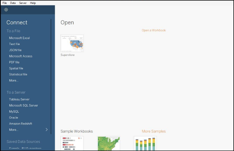
You can see in the main section (black area) that has a ‘Superstore’ dataset which comes preinstalled with the application. We will work on this dataset to construct a Treemap chart.

Click on the Sample Superstore dataset, and you will get a screen like shown below –

Treemap in Tableau 2

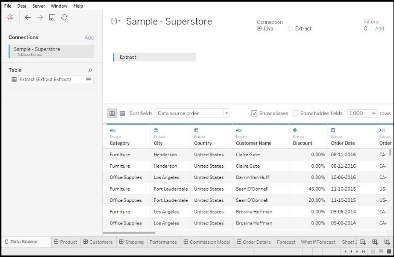
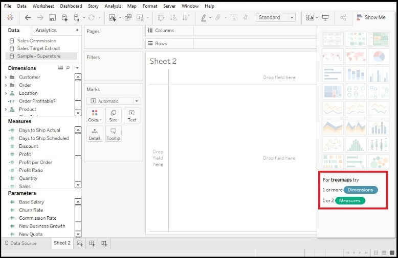
Sample Superstore is loaded completely, at the bottom of the screen we can see multiple tabs are listed which are the content of the data set. These are a kind of reference charts for working data. Now, we will make our own Treemap chart, once we make a fresh worksheet on the dashboard you will get a screen like below –

Treemap in Tableau 3

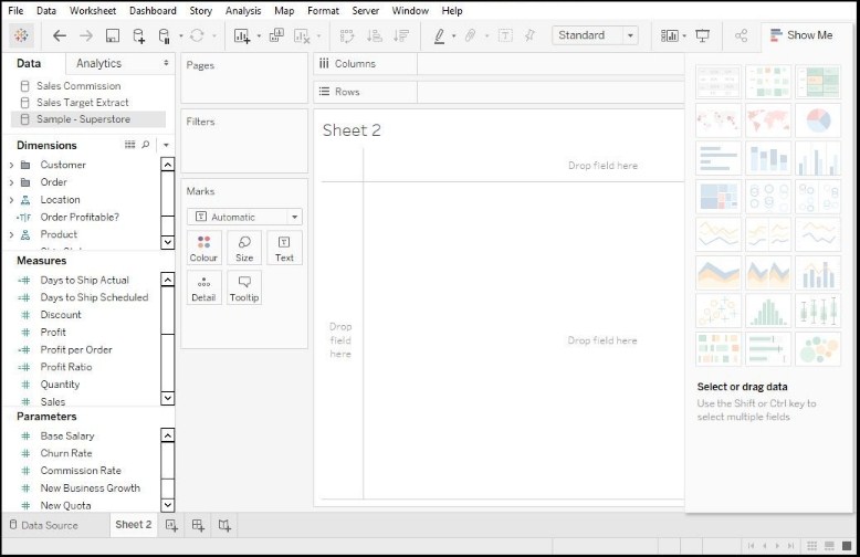
Note – A Treemap chart considers and works only on two-dimensional data. We can see in the above screen on the left-hand side there is ‘Dimension’, ‘Measures’ and ‘Parameters’ sections. All these hold different forms of data or data measuring techniques. If you see the below screen, you will get to know for a Treemap chart we need at least 1 dimension and at least 2 measures.

Treemap in Tableau 4

Our next task is to drag and drop data from the Dimension and Measure section. From here the actual chart creation begins.

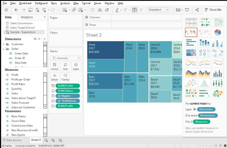
We want our chart to have YEAR and REGIONAL details at base. So, we drag and drop the Region and Year of Order date to ‘Text’. Once we do this we will get the below screen.

Treemap in Tableau 5

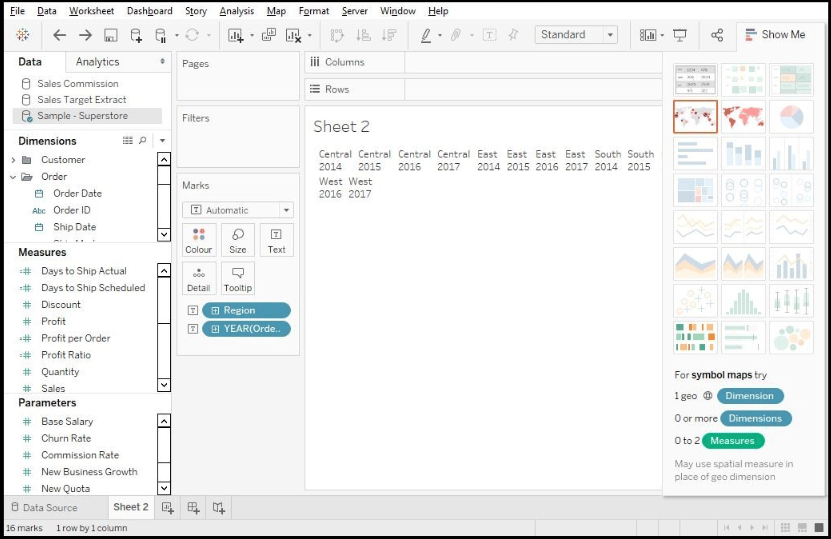
In the above image of Treemap in Tableau, we can clearly see the Regional details (like Central/East/South/West) and Year of order details (like 2014, 2015….2017).

Now we will add the Sales details to the chart by drag and drop ‘Sales’ to the ‘Size’ section (present under the Marks). Refer to the below mentioned screen.

Treemap in Tableau 6

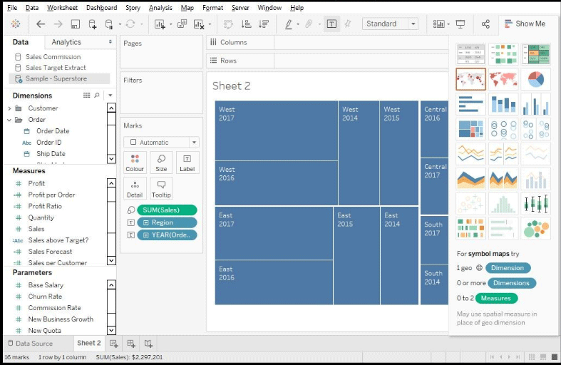
With this we will now add the ‘Profit’ into the chart, the chart will then show the profits earned forgiven no of sales in a particular region over a certain period of time.

profits earned forgiven no of sales

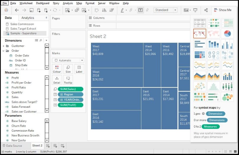
This is the foundation of a Treemap chart, but we want to sort the profit as per the colors. For this, we have to drag and drop the ‘Profit’ to the ‘Color’ marks section. Have a look at the below-mentioned screen.

Foundation of chart

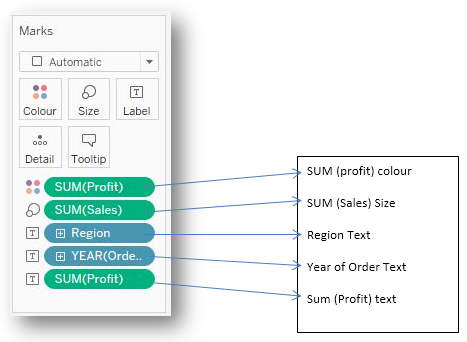
The data in the Marks section says the kind of details they will reflect. Have a look –

Data in mark section

This is how we make a Treemap chart in tableau, there can be some customization as per the need but the overall process is the same, drag and drops the working data.

Limitations of Treemap in Tableau

The following are some of the limitations:

  • The Treemap chart fails to display data with varying ranges.
  • We have seen the two quantitative variables which we used in our case (i.e. country and GDP) here the limitation for the Treemap chart is cannot tolerate a negative value or parameters.
  • No sorting options regarding the chart are provided to users.
  • Not suitable for prints as it contains a large set of data points.
  • Very fewer customization options for users.

Conclusion

So, the Treemap chart is preferred when you have to show the cumulative totals for the working data. You can also include labels like date, time, name, and budget while creating the chart.

Recommended Articles

This has been a guide to Treemap in Tableau. Here we discussed its Concept and Process, Use cases, Benefits and Limitations of Treemap in Tableau. You may also look at the following articles to learn more –

  1. Tableau vs QlikView
  2. Heat Map in Tableau
  3. HashMap vs TreeMap | Top Differences
  4. Guide to Hashmap in Java
  5. What is TreeMap in Java? | Constructor and Methods
Popular Course in this category
Data Visualization Training (15 Courses, 5+ Projects)
  15 Online Courses |  5 Hands-on Projects |  105+ Hours |  Verifiable Certificate of Completion
4.5
Price

View Course

Related Courses

Tableau Training (8 Courses, 8+ Projects)4.9
Business Intelligence Training (12 Courses, 6+ Projects)4.8
0 Shares
Share
Tweet
Share
Primary Sidebar
Footer
About Us
  • Blog
  • Who is EDUCBA?
  • Sign Up
  • Live Classes
  • Corporate Training
  • Certificate from Top Institutions
  • Contact Us
  • Verifiable Certificate
  • Reviews
  • Terms and Conditions
  • Privacy Policy
  •  
Apps
  • iPhone & iPad
  • Android
Resources
  • Free Courses
  • Database Management
  • Machine Learning
  • All Tutorials
Certification Courses
  • All Courses
  • Data Science Course - All in One Bundle
  • Machine Learning Course
  • Hadoop Certification Training
  • Cloud Computing Training Course
  • R Programming Course
  • AWS Training Course
  • SAS Training Course

ISO 10004:2018 & ISO 9001:2015 Certified

© 2022 - EDUCBA. ALL RIGHTS RESERVED. THE CERTIFICATION NAMES ARE THE TRADEMARKS OF THEIR RESPECTIVE OWNERS.

EDUCBA
Free Data Science Course

SPSS, Data visualization with Python, Matplotlib Library, Seaborn Package

*Please provide your correct email id. Login details for this Free course will be emailed to you

By signing up, you agree to our Terms of Use and Privacy Policy.

EDUCBA Login

Forgot Password?

By signing up, you agree to our Terms of Use and Privacy Policy.

EDUCBA
Free Data Science Course

Hadoop, Data Science, Statistics & others

*Please provide your correct email id. Login details for this Free course will be emailed to you

By signing up, you agree to our Terms of Use and Privacy Policy.

EDUCBA

*Please provide your correct email id. Login details for this Free course will be emailed to you

By signing up, you agree to our Terms of Use and Privacy Policy.

Let’s Get Started

By signing up, you agree to our Terms of Use and Privacy Policy.

This website or its third-party tools use cookies, which are necessary to its functioning and required to achieve the purposes illustrated in the cookie policy. By closing this banner, scrolling this page, clicking a link or continuing to browse otherwise, you agree to our Privacy Policy

Loading . . .
Quiz
Question:

Answer:

Quiz Result
Total QuestionsCorrect AnswersWrong AnswersPercentage

Explore 1000+ varieties of Mock tests View more