Updated March 20, 2023
Introduction to Tableau Charts
Tableau being a visual analytics tool, it comes with a range of graphical analysis features. Based on the context, the user can employ suitable charts over data and generate insights as required. Each of the Charts in Tableau has an application. Click on Show Me and hover the mouse over a graph symbol, it tells how many measures or dimensions are needed to generate the chart.
Various Types of Charts available in Tableau are as follows:
- Bar Charts
- Line Charts
- Area Charts
- Pie Charts
- Tree Maps
- Bubble Charts
- Heat Maps
- Bullet Charts
- Box and Whisker Plots
- Pareto Charts
- Histograms
- Gantt Chart
Types of Charts in Tableau
We shall see, the Types of Charts in Tableau, one-by-one, and the mechanism to generate them.
1. Bar Charts
- This chart helps to visualize measures against a dimension. Various categories are represented in the form of bars. The height of bars corresponds to the value of the measure (Distribution Volume).
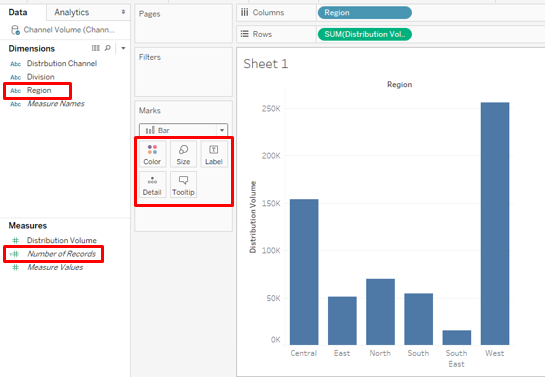
- As seen above, Drag the region into the Columns region and Distribution Volume into Rows region. It generates the vertical Bar Chart showing Region-wise Distribution Volume for a product.
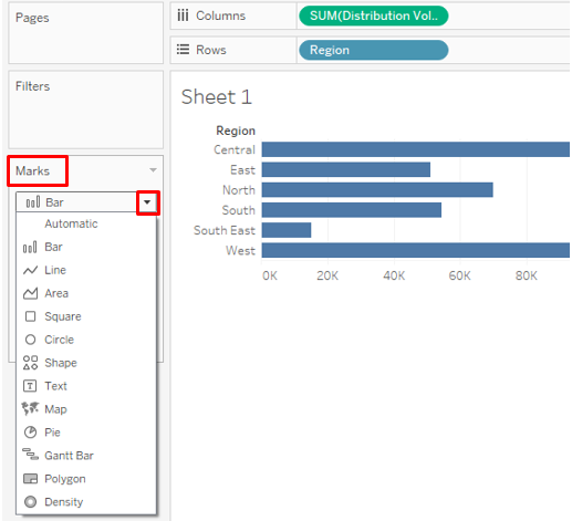
- Bringing Distribution Volume into Columns and Region into rows has changed the bar graph into horizontal form. Graph type can be changed from the drop-down menu in the Marks card.
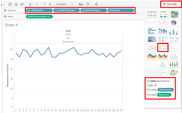
2. Line Charts
- It displays the data in the form of the line which is a series of points. Line charts depict a pattern or trend that we may like to visualize for analysis. The following line chart shows the daily temperature pattern.
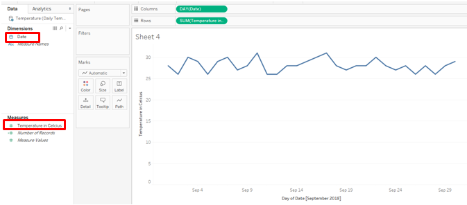
- There are multiple options for charts. For the Line chart, select lines (discrete) option. As we can see in the Columns region, Tableau automatically applied various periodic functions over-dimension Date.
3. Area Charts
- These charts work on quantitative data which is present period wise i.e. daily, monthly, etc. If we want to compare categories against a measure over a period of time, the area chart helps understand the difference in terms of the magnitude represented by the area in the graph.
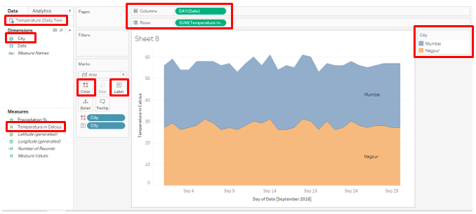
- The data source for the above Area Chart contains daily temperature data for two cities for September 2018. Drag Date into Columns region and Temperature in Celsius into Rows region. Drag City over Color and Label in Marks card.
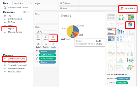
4. Pie Charts
- These are useful when we want to visualize the proportion of total contribution, e.g. we may like to see each region’s contribution to total sales. The contributions are represented by sectors of the circle. To generate the below pie chart, drag Region into Columns and Distribution Volume into Rows and click on Pie Charts in Show Me. Drag Region over Label.
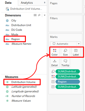
- Keep the above pie chart intact, and just drag Mode into Columns region, it gives details about quantity distributed to various regions by two different modes as seen below:

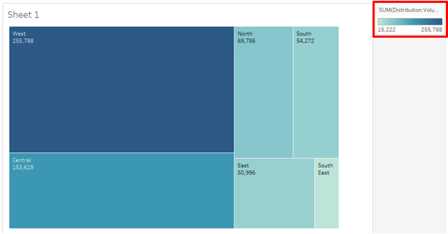
5. Tree Maps
- These visualizations apply size and color considerations over data. Based on the proportion of the data, the intensity of color and size varies. We’ll use the data that we used in the previous example. To generate a treemap, drag Region over Label. Drag Distribution Volume over Color, Size, and Label one at a time.
- As we can see the value of the measure governs the intensity of the color and size. Here, the West region has the highest sales represented by the darkest shade and the biggest rectangle. The color intensity varies based on the value.
6. Bubble Charts
- As the name goes, the chart presents the data in bubble form. It becomes handy when we have multiple dimensions over which we want to generate useful insights against a certain measure.
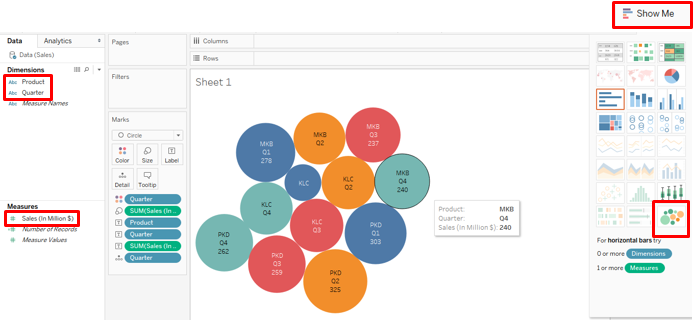
- To generate the above Bubble Chart, follow the below steps:
- First Drag Product into Columns and then drag Sales into Rows
- Click on Bubble Chart option in Show Me
- Drag Quarter over Color
- Drag Product over Label
- Drag Sales over Label
- Drag Quarter over Label
Here, the size of the bubble represents the magnitude of the measure. Note, different quarters have been represented by different colors.
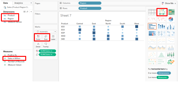
7. Heat Maps
- Heat maps are used when we have numerous categories that need to be compared over a measure. The intensity of the color shows the contribution of the category. They can act as a powerful tool that incorporates the heat-intensity concept for visualization.
- The following heat map has been generated for Product-wise regional sales data. To generate the map, drag Sales in Million over Color and Size and Region and Product into Columns and Rows regions respectively.
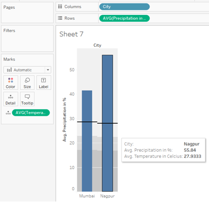
8. Bullet Charts
- The Bullet Chart is useful when we have two measures which we want to visualize for two different categories. They resemble thermometers. The two measures are superimposed over each other, while one is represented as a bar, the other is displayed as a line.
- Our data for generating a bullet chart contains city-wise temperature and precipitation data. First, drag City into Columns and Temperature and Precipitation into Rows. The default function over a measure is Sum. Change it to Average. In Show Me, click on Bullet Graphs.
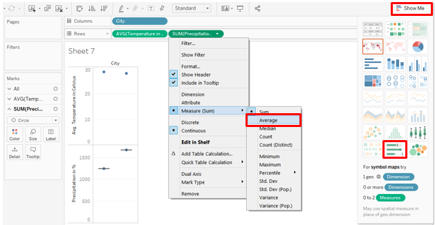
- As below, the Bullet Graph requires two measures. In this case, we have Precipitation and Temperature as measures. We have generated the Bullet Graph over-dimension City.

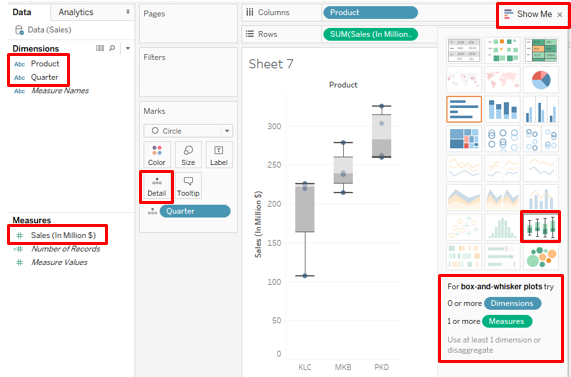
9. Box and Whiskers Plot
- It is a statistical plot that provides visual insight into the spread of data. Technically, it presents the data taking into consideration certain statistical factors: median, quartiles, inter-quartile-range, and outliers. To generate the Box and Whiskers plot, drag Product into Columns, Sales into Rows, and Quarter over Detail. Click on box-and-whisker plots in Show Me.

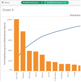
10. Pareto Charts
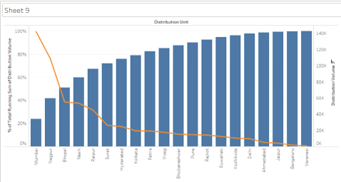
- This chart is used for ABC and 80-20 Analysis. It is a special type of chart which is not directly available in Tableau but can be created. It combines bar and line charts to generate the Pareto Analysis. E.g. management uses Pareto Chart to know what product categories contribute 80% in total sales.
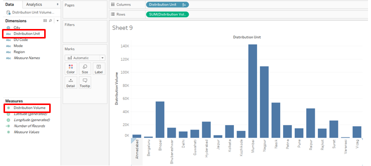
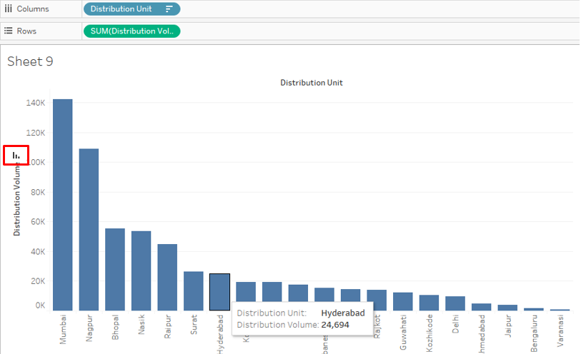
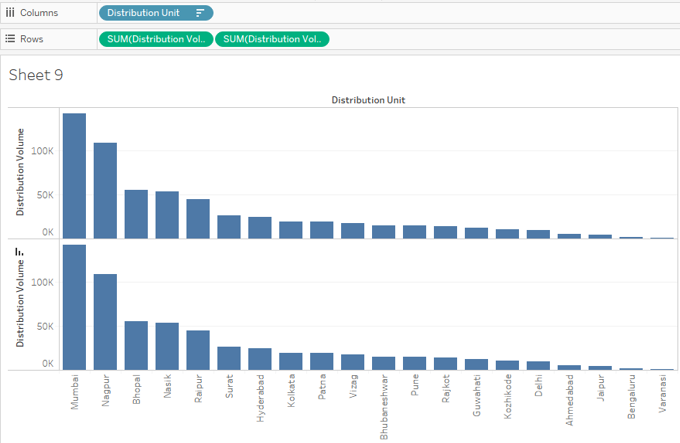
- For our example, we are using the Distribution Unit Volume data source. Initially, Drag Distribution Unit into Columns and Distribution Volume into Rows, and sort the result in descending order. We get the below graph.
- Now, drag Distribution Volume into Rows region for the second time as below:
- For the second Distribution Volume, create a Dual Axis.
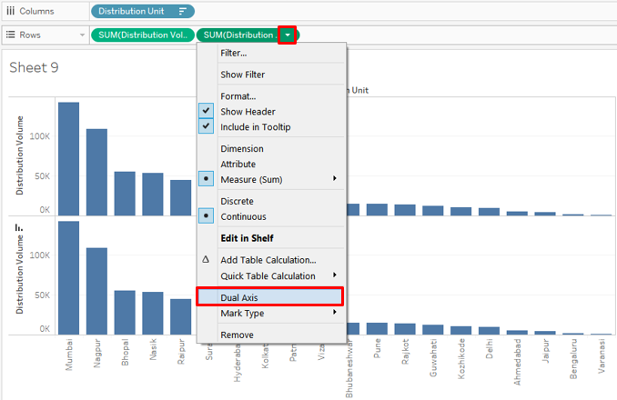
- As above, creating dual-axis has mapped both the charts over the same frame.
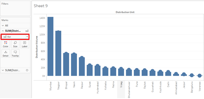
- The type chart can be changed from the drop-down menu. We changed the chart type to line as below. And also the dual-axis now appears on the right side.
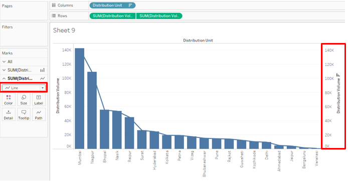
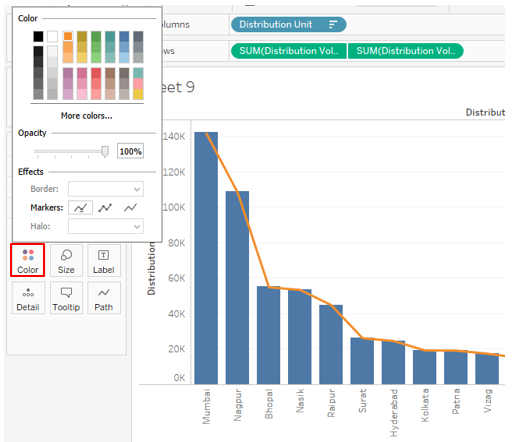
- Colour and other properties for the graph can be changed by clicking over Color in Marks card. We have changed the line color to orange.
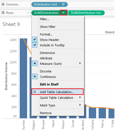
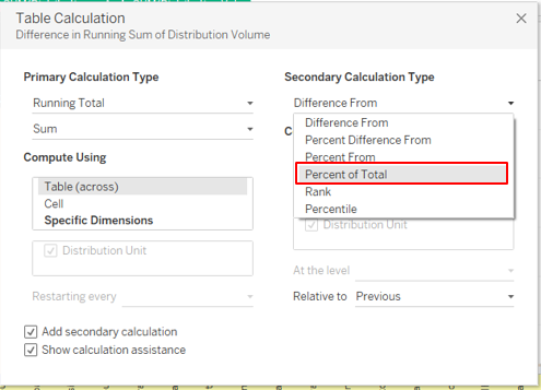
- Now from Filter select the option Add Table Calculation.
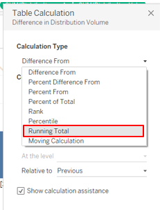
- Under Calculation Type click on Running Total.
- It will open up with Table Calculation box, checkmark on Add secondary calculation.
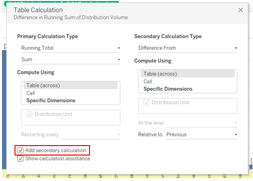
- And select the option, Percent of Total.
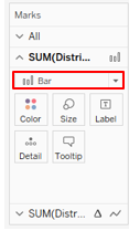
- Now you can see the Bar chart.
- Change the Bar chart to the Line and Line chart to the bar.
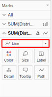
- You will see the Bar chart with Lines below.
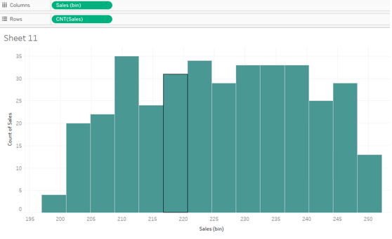
11. Histograms
- This graph divides the data into bins and then based on the frequency generates visual insight.
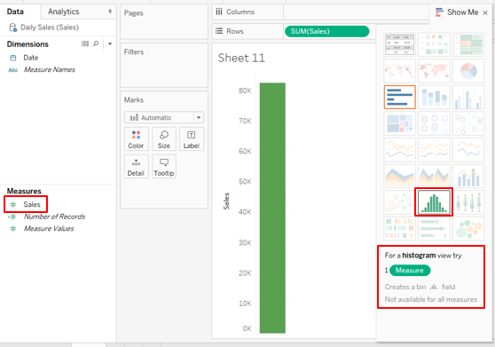
- Drag Sales into Rows and then click on Histogram. The histogram in Tableau requires only a single measure.
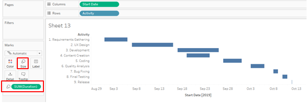
12. Gantt Chart
- The chart is used especially to monitor projects. Activities are represented in terms of horizontal bars based on the duration. We will generate a Gantt chart for a software development project.
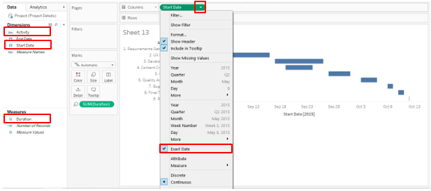
- Drag Start Date into Columns and Activity into Rows. For Start Date, click on Extract Date to present the data date wise. Drag Duration over Size
Conclusion
In visual analytics, a chart is an important unit of analysis. Tableau offers extensive capabilities for visual analytics. The tool comes with a range of Charts that have to be used based on the context. These charts are easy-to-use elements that help us dig deeper into data and generate detailed insights.
Recommended Articles
This has been a guide to Tableau Charts. Here we discussed 12 Different Types of Charts in Tableau with brief explanations and illustrations. You can also go through our given articles to learn more –
- Bubble Chart in Tableau
- What is Tableau?
- Tableau Commands
- Guide to Tableau Chart Types
