Updated May 3, 2023
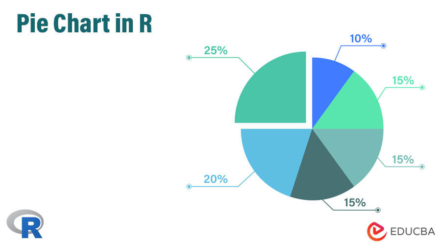
Introduction to Pie Chart in R
R offers a basic chart feature known as the Pie Chart, which displays data value proportions in a circular chart symbol. Labeling the sections of the chart representing different data values with meaningful names is possible. Pie charts are generally preferred for small-size vector variables. Based on the R packages, pie charts can have two-dimensional or three-dimensional views. Pie is the function in R language which supports two-dimensional pie charts. Pie charts are handy for data analysis. The pie function in R allows users to assign a meaningful title to pie charts using the “main” parameter.
Pie charts facilitate an easy understanding of patterns in data, compared to numeric figures, which often require more time for comprehension. For example, if we plot the above example as a pie chart, we can understand the amount and proportion of production within a minute.
There are various packages for plotting pie charts in R, and among those many options, we shall focus on two methods in this article.
Syntax
The above section briefly explains the pie chart and its use. In this section, we shall learn about pie charts in R specifically. For those new to R, it is a programming language mainly used for data analysis and machine learning. R is exceptionally rich in functionality and provides hundreds of libraries for various use cases.
A simple in-built function in R can create it, and the syntax for creating it is as follows:
pie(x, labels, radius, main, col, clockwise)Where,
- Here x is a vector containing the numeric values present in the pie chart, such as those production figures in the above example.
- Labels take a name for those values in X, such as the name of chemicals.
- The radius argument is for the radius of the circle of the pie chart. Its typical value lies between −1 and +1.
- The main argument presents the title of the chart.
- col argument can describe the colors on the chart.
- Clockwise is a logical value that takes either True or False, indicating if the slices of charts are present clockwise or anti-clockwise.
How to create a pie chart in R?
Now that we understand the syntax of the pie chart let’s build a pie chart. We will again use the same example in the introduction section above.
First of all, let’s convert the example above into the form of a table for easy understanding.
| Name of chemical | Amount produced (in MT) |
| AB1 | 90 |
| AB2 | 50 |
| AB3 | 100 |
| AB4 | 40 |
| AB5 | 20 |
| Total | 300 |
First, we use the following two lines of R code to convert the table above into two vectors, one for the name of the chemical and the other for the volume of the chemical.
Now, we plot a simple pie chart by only providing the x value in the syntax above:
- chem <- c(“AB1″,”AB2″,”AB3″,”AB4″,”AB5”)
- vol <- c(90,50,100,40,20)
- pie(vol)
Its output is the figure below:
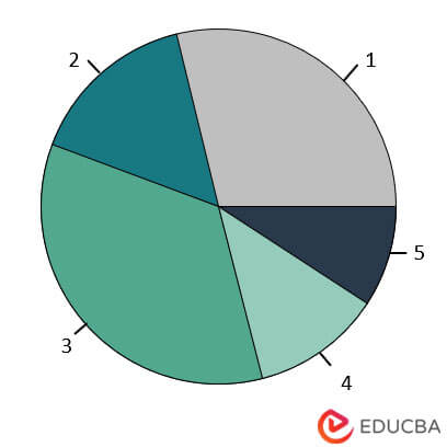
If you observe the output, it is not very clear as to what exactly is what. So to make it more intuitive, we input a few more arguments in the pie function and run again.
- chem <- c(“AB1″,”AB2″,”AB3″,”AB4″,”AB5”)
- vol <- c(90,50,100,40,20)
- pie(x=vol, labels = chem, radius = 1,main = “Pie chart for chemical production”, clockwise = T)
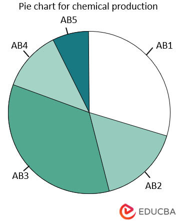
This picture is better to understand as it contains the name of the chemicals and a title. Please note that the color scheme in both charts is coming by default, which we can change as per our need or wish. We will do that in the section below.
How to change pie charts and fill color?
In this section, let’s learn how to change pie charts.
First, let’s show the number of chemicals in the chart instead of the name of the chemicals.
- pie(x=vol, labels = vol, radius = 1,main = “Pie chart for chemical production”, clockwise = T)
- Run it yourself and see the output.
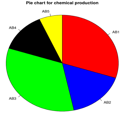
Next, let’s change the color of the charts.
- chem <- c(“AB1″,”AB2″,”AB3″,”AB4″,”AB5”)
- vol <- c(90,50,100,40,20)
- pie(x=vol, labels = chem, radius = 1,main = “Pie chart for chemical production”, col=c(“red”,” blue”,” green”,” black”,” yellow”),clockwise = T)
Here we specified the colors that we wanted. The output is as below:
How to create a 3D pie chart?
In this section, we will learn how to build a 3D pie chart in R. for creating a 3d pie chart; we need to install a library first as it differs from an essential inbuilt function.
You should install the library plotrix before running the code for the pie chart. To install the library, run the following command in R.
- packages(“plotrix”)
After that, run the following two lines to get a 3d plot.
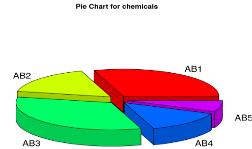
- chem <- c(“AB1″,”AB2″,”AB3″,”AB4″,”AB5”)
- vol <- c(90,50,100,40,20)
- library(plotrix)
- pie3D(vol,labels = chem,explode = 0.1, main = “Pie Chart for chemicals “)
The output is as below:
Conclusion
Pie charts are used a lot and are intuitive and informative, which I believe is very clear now. In financial domains and many other sectors, pie charts are the basic visualization where almost all analysis begins. It is simple yet very powerful.
In this article, we provided enough details to help anyone start building pie charts with great confidence and ease. Students and learners are also advised to look into the help menu of R, where they can learn more details and additional functionalities of pie charts. There is a great visualization package called ggplot2 in R, which provides many customization options to pie charts and all other visualization in general; candidates are advised to look into that as well. Finally, if there is any question or further doubt, you can always comment on this article and get in touch for more explanations, examples, and theoretical discussions.
Frequently Asked Questions (FAQs)
Q1 How to create a pie chart in R?
Answer: One can generate a pie chart in R using the pie() function. First, you need to provide the data in the form of a vector or a table. Then, you can customize the pie chart by specifying various options such as colors, labels, and titles.
Q2 How to add labels to a pie chart in R?
Answer: For adding labels to a pie chart in R using the labels parameter in the pie() function. You can also customize the appearance of the labels using various options such as font size, color, and position.
Q3 How to save a pie chart as an image in R?
Answer: To save a pie chart as an image in R using the png(), jpeg(), or pdf() functions. These functions allow you to specify the filename, width, height, resolution, and other options for the output image.
Recommended Articles
We hope that this EDUCBA information on “Pie Chart in R” was beneficial to you. You can view EDUCBA’s recommended articles for more information.
