Updated May 8, 2023
Introduction to Histogram in R
The histogram in R is one of the preferred plots for graphical data representation and data analysis. Histograms are generally viewed as vertical rectangles aligned in the two-dimensional axis, showing the comparison of the data categories or groups. The height of the bars or rectangular boxes shows the data counts in the y-axis, and the data categories values are maintained on the x-axis. Histograms help in exploratory data analysis. The histogram in R can be created for a particular variable of the dataset, which is useful for variable selection and feature engineering implementation in data science projects. R language supports out of the box packages to create histograms
What is Histogram?
The histogram is a pictorial representation of a dataset distribution with which we could easily analyze which factor has a higher amount of data and the least data. In other words, the histogram allows doing cumulative frequency plots in the x-axis and y-axis. Actually, histograms take both grouped and ungrouped data. For a grouped data histogram are constructed by considering class boundaries, whereas ungrouped data it is necessary to form the grouped frequency distribution. They help to analyze the range and location of the data effectively. Some common structure of histograms is applied like normal, skewed, cliff during data distribution.
Unlike a bar, chart histogram doesn’t have gaps between the bars and the bars here are named as bins with which data are represented in equal intervals. Histogram Takes continuous variable and splits into intervals it is necessary to choose the correct bin width. The major difference between the bar chart and histogram is the former uses nominal data sets to plot while histogram plots the continuous data sets. R uses hist () function to create histograms. This hist () function uses a vector of values to plot the histogram. Histogram comprises of an x-axis range of continuous values, y-axis plots frequent values of data in the x-axis with bars of variations of heights.
Syntax:
The syntax for creating histogram is
hist (v, main, xlab, xlim, ylim, breaks,col,border)

where v – vector with numeric values

main – denotes title of the chart

col – sets color

border -sets border color to the bar

xlab - description of x-axis

xlim - denotes to specify range of values on x-axis

ylim – specifies range values on y-axis

break – specifies the width of each bar.
Creating a Histogram in R
For analysis, the purpose histogram requires some built-in dataset to import in R. R and its libraries have a variety of graphical packages and functions. Here we use swiss and Air Passengers data set. To compute a histogram for a given data value hist () function is used along with a $ sign to select a certain column of a data from the dataset to create a histogram.
The following example computes a histogram of the data value in the column Examination of the dataset named Swiss.
Example #1 – Create a Simple Histogram
Code:
hist (swiss $Examination)
Output:
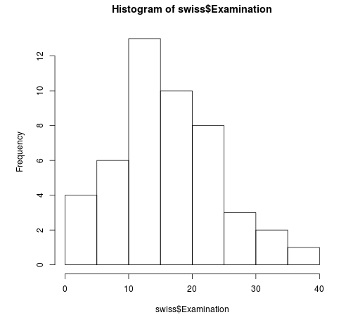
Hist is created for a dataset swiss with a column examination. this simply plots a bin with frequency and x-axis.
Example #2 – Histogram with More Arguments
To reach a better understanding of histograms, we need to add more arguments to the hist function to optimize the visualization of the chart. Changing x and y labels to a range of values xlim and ylim arguments are added to the function.
Example:
hist (Air Passengers, xlim=c (150,600), ylim=c (0,35))

In the above example x limit varies from 150 to 600 and Y – 0 to 35.

// Adding breaks

hist (AirPassengers,

main="Histogram with more Arg",

xlab="Name List",

border="Green",

col="Orange",

xlim=c (100,600),

ylim=c(0,40),

breaks=5)
Output:
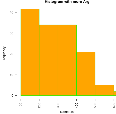
Above code plots, a histogram for the values from the dataset Air Passengers, gives the title as “Histogram for more arg” , the x-axis label as “Name List”, with a green border and a Yellow color to the bars, by limiting the value as 100 to 600, the values printed on the y-axis by 2 and making the bin-width to 5.
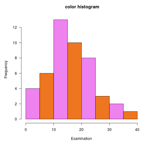
Adding Two Different Colors to the Bar
hist (swiss$Examination, col=c ("violet”, "Chocolate2"), xlab="Examination”, las =1, main=" color histogram")
Output:
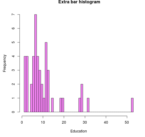
Adding more bars to the histogram
hist (swiss$Education, breaks=40, col="violet", xlab="Education", main=" Extra bar histogram")
Output:
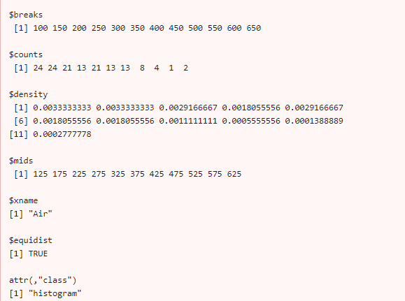
Example #3 – Histogram in R Its Returns a Value
Air <- AirPassengers

hist (Air)

h <- hist (Air)

h

$breaks
Output:
Example #4 – Using Break Argument to Change the Bin Width
To have More breakpoints between the width, it is preferred to use the value in c() function.
hist (AirPassengers, breaks=c (100, seq (200,700, 150)))
Output:
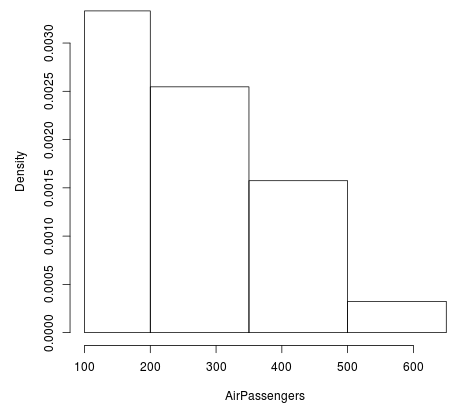
The above graph takes the width of the bar through sequence values.
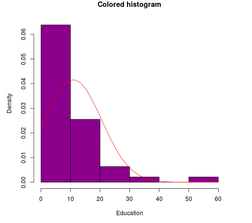
Example #5 – Implementing the Normal Distribution Curve in Histogram
We shall use the data set ‘swiss’ for the data values to draw a graph. Here the function curve () is used to display the distribution line.
Code:
curve (dnorm(x, mean=mean(swiss$Education), sd=sd(swiss$Education)), add=TRUE, col="red")
Output:
Example #6 – Plotting Probability Distribution
hist (AirPassengers,

main="Histogram ",

xlab="Passengers",

border="Yellow",

col="pink",

xlim=c(100,600),

las=2,

breaks=6,

prob = TRUE)
Creating Density Plots in Histogram in R
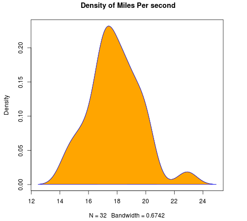
The distribution of a variable is created using function density (). Below is the example with the dataset mtcars. Density plots help in the distribution of the shape.
density () // this function returns the density of the data

library(ggplot2)

d <- density (mtcars $qsec)

plot (d, main=" Density of Miles Per second")

polygon (d, col="orange", border="blue")
Output:
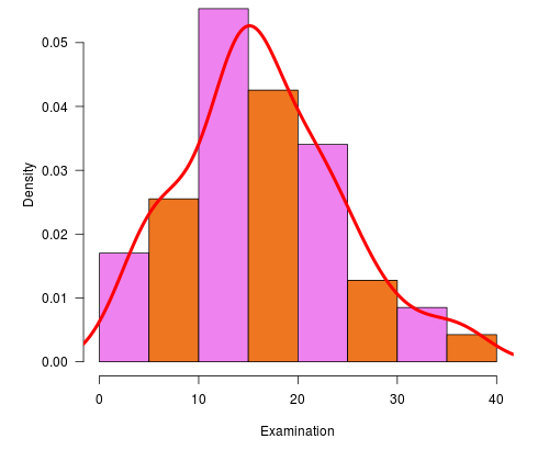
Using Line () function

hist (swiss$Examination, freq = FALSE, col=c ("violet”, "Chocolate2"),

xlab="Examination”, las =1, main=" Line Histogram")

lines(density(swiss$Examination), lwd = 4, col = "red")
The following histogram in R displays the height as an examination on x-axis and density is plotted on the y-axis.
Output:
Conclusion
That’s all about the histogram and precisely histogram is the easiest way to understand the data. As we have seen with a histogram, we could draw single, multiple charts, using bin width, axis correction, changing colors, etc. The histogram helps to visualize the different shapes of the data. Finally, we have seen how the histogram allows analyzing data sets, and midpoints are used as labels of the class. The histogram helps in changing intervals to produce an enhanced description of the data and works, particularly with numeric data. histograms are more preferred in the analysis due to their advantage of displaying a large set of data. Based on the output we could visually skew the data and easy to make some assumptions.
Recommended Articles
This has been a guide on Histogram in R. Here we have discussed the basic concept, and how to create a Histogram in R with Examples. You may also look at the following articles to learn more –
