Updated March 20, 2023
Introduction to Line Graph in R
Line Graph in R is a basic chart in R language which forms lines by connecting the data points of the data set. Line charts can be used for exploratory data analysis to check the data trends by observing the line pattern of the line graph. Line Graph is plotted using plot function in the R language. The line graph can be associated with meaningful labels and titles using the function parameters. The line graphs can be colored using the color parameter to signify the multi-line graphs for better graph representation. The line graphs in R are useful for time-series data analysis.
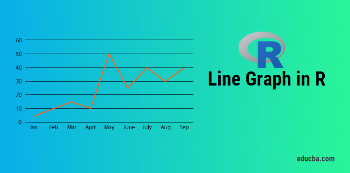
Fig 1. Shows the basic line graph, where value is the “event count” over a year. The x-axis depicts the time, whereas the y-axis depicts the “event count”.
 Fig 1 -Line graph
One can get to know trend, seasonality related to data by plotting line graph.
The basic syntax to draw a line chart in R:
plot(vec,type,xlabel,ylabel)

vec: This is the vector, which has numeric values to be plotted

type: Its of three “p”, ”l” and “o”

p: It draws only points

l:It draws only line

o:It draws point as well as line

xlabel: Its label to the x axis

ylabel: Its label to the y-axis
How to create a Line graph in R?
Now let’s start our journey by creating a line graph step by step. Slowly and steadily it will give you a good grip over the line graph plotting with multiple tunings in it.
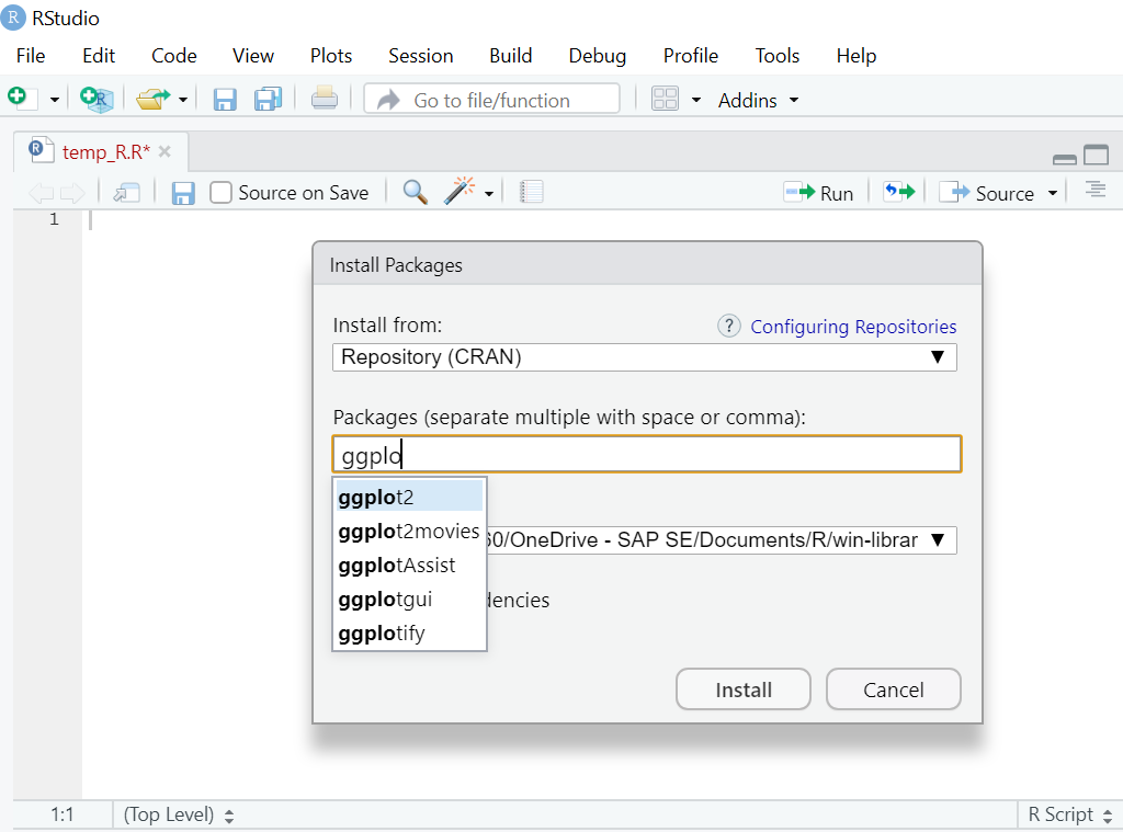
Before plotting the line graph, one needs to know whether the function one going to use is available in the R environment or has to be installed.
The first function we will learn is plot() and another one would be ggplot. For plot(), one need not install any library. However, for ggplot, the library “ggplot2” needs to be installed and read that library like: “library(ggplot2)” in the R environment.
For installation in RStudio. Go to Tools -> Install packages
1. Simple Line Graph in R code (with Plot function):
Vec <- c(7,12,28,3,41) #Create the data for the chart

plot(Vec,type = "o")  # Plot the bar chart.
Output:
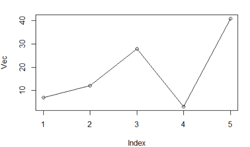
Fig 2: Vector plot
Here you will notice x label, y label has not been assigned, so the default names as came.
Let’s say now R code is:
Vec <- c(7,12,28,3,41) #Create the data for the chart.

plot(Vec,type = "o",xlab = "Month", ylab = "Event Count", main = "Event Count by Month")
Output:
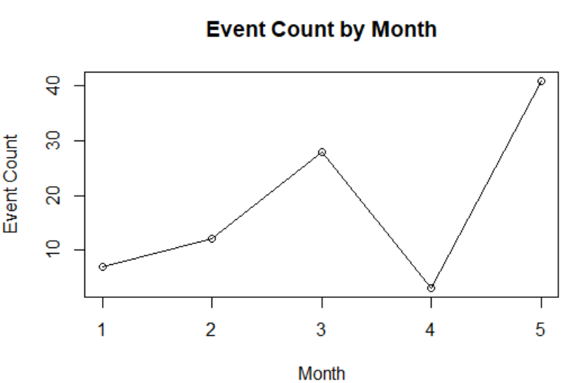
Fig 3: Vector plot with customized labels
2. Saving Line graph in the PNG file.
The line graph drawn till now is in Rstudio pane. However, there come to the cases when you need to save it in the local system in the form of png files.
R code:
#Create the data for chart.

Vec <- c(17,12,22,30,4)

# Name on PNG image.

png(file = "First_chart.jpg")

# Plot the line chart.

plot(Vec,type = "o",xlab = "Month", ylab = "Event Count", main = "Event Count by Month")

# Save the file.

dev.off()
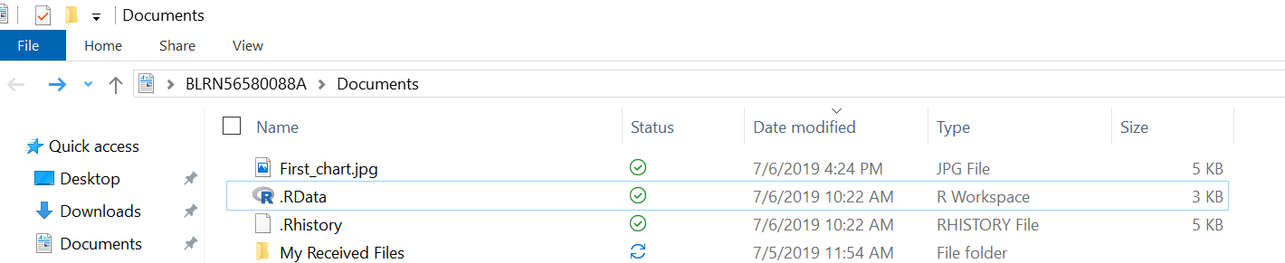
Here the png file will be saved in your current working directory, which you always check and change as per your requirement. Function: getwd() and setwd() can help you do so.
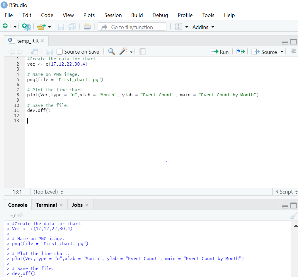
See the location, and you will find “Line_chart.png” will be created.
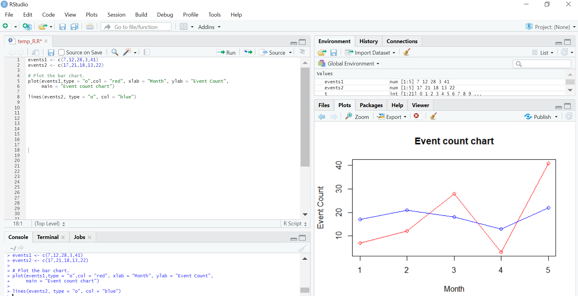
3. Multiple Lines in Line Chart
In a real-world scenario, there is always a comparison between various line charts. In order to plot multiple lines in a single line chart, below is the R code for that:
R Code:
events1 <- c(7,12,28,3,41)

events2 <- c(17,21,18,13,22)

# Plot the bar chart.

plot(events1,type = "o",col = "red", xlab = "Month", ylab = "Event Count",

main = "Event count chart")

lines(events2, type = "o", col = "blue")
Output:
4. Add a legend to Line Graph
We saw how to plot multiple lines in a single line chart. When there are more than two lines in the same line graph, it becomes clumsy to read. Legend plays a crucial factor there in order to understand plotted data in a lucid way.
R code:
events1 <- c(7,12,28,3,41)

events2 <- c(17,21,18,13,22)

# Plot the bar chart.

plot(events1,type = "o",col = "red", xlab = "Month", ylab = "Event Count",

main = "Event count chart")

lines(events2, type = "o", col = "blue")

# Add a legend

legend(3.5, 38, legend=c("Event 1", "Event 2"),

col=c("red", "blue"), lty=1:2, cex=0.8)
Output:
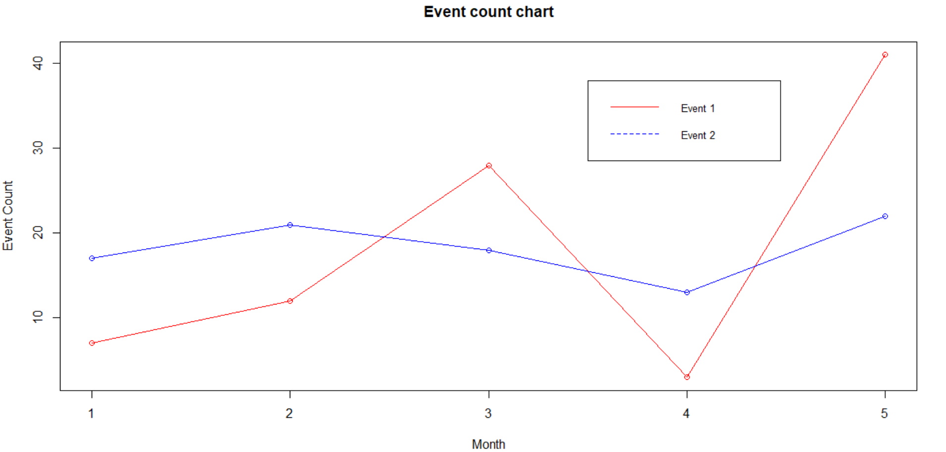
The legend is usually placed on the top right-hand side corner. However, from a readability perspective, it could be placed as per one’s own comfortability. The first two parameters in the legend function show the x and y-axis where legend needs are placed.
If some doesn’t want to deal with coordinates, one specify legend position in terms of keywords like: “bottom”,”bottomright”, “bottomleft”, “left”, “topleft”, “top”, “right”, “topright” and “center”.
One can also customize legend, see below:
R Code:
events1 <- c(7,12,28,3,41)

events2 <- c(17,21,18,13,22)

# Plot the bar chart.

plot(events1,type = "o",col = "red", xlab = "Month", ylab = "Event Count",

main = "Event count chart")

lines(events2, type = "o", col = "blue")

# Add a legend

legend(3.5, 38, legend=c("Event 1", "Event 2"),

col=c("red", "blue"), lty=1:2, cex=0.8,

title="Event types", text.font=3, bg='lightblue')
Output:

Note: All the line graphs plotted above were through the function plot(). However, there are other libraries/functions also available which help us draw the line graph. One such library is “ggplot2”.
GGplot2 Library
below is the ggplot2 library which helps to draw line graph in R are as follows:
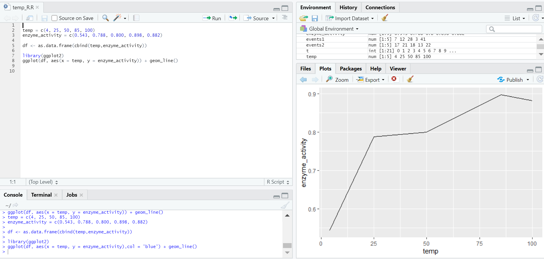
1. Simple Line Graph
R Code:
temp = c(4, 25, 50, 85, 100)

enzyme_activity = c(0.543, 0.788, 0.800, 0.898, 0.882)

df <- as.data.frame(cbind(temp,enzyme_activity))

library(ggplot2)

ggplot(df, aes(x = temp, y = enzyme_activity)) + geom_line()
Output:
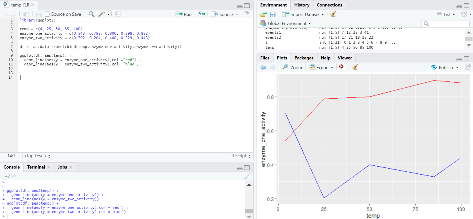
2. Multiple Lines in Line Graph
R Code:
library(ggplot2)

temp = c(4, 25, 50, 85, 100)

enzyme_one_activity = c(0.543, 0.788, 0.800, 0.898, 0.882)

enzyme_two_activity = c(0.702, 0.204, 0.400, 0.329, 0.443)

df <- as.data.frame(cbind(temp,enzyme_one_activity,enzyme_two_activity))

ggplot(df, aes(temp)) +

geom_line(aes(y = enzyme_one_activity),col ="red") +

geom_line(aes(y = enzyme_two_activity),col ="blue")
Output:
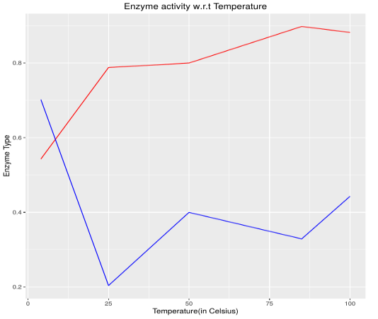
3. More Details to Graph
R Code:
library(ggplot2)

temp = c(4, 25, 50, 85, 100)

enzyme_one_activity = c(0.543, 0.788, 0.800, 0.898, 0.882)

enzyme_two_activity = c(0.702, 0.204, 0.400, 0.329, 0.443)

df <- as.data.frame(cbind(temp,enzyme_one_activity,enzyme_two_activity))

ggplot(df, aes(temp)) +

geom_line(aes(y = enzyme_one_activity),col ="red") +

geom_line(aes(y = enzyme_two_activity),col ="blue")+

labs(title = "Enzyme activity w.r.t Temperature", x = "Temperature(in Celsius)", y = "Enzyme Type")
Output:
Conclusion
A line graph is a basic yet very powerful chart to describe events over a certain time. R being a popular statistical tool, one must know how to plotline chart and how to customize its parameters to get the view as per one’s requirement. Once one gets comfortable with line graphs, other graphs should also be explored, to get a good grip over data visualization.
Recommended Articles
This is a guide to Line Graph in R. Here we discuss what is line graph in R, The basic syntax to draw a line chart in R, etc. You can also go through our other suggested articles to learn more –
