Updated July 12, 2023
Pie Chart Examples (Table of Contents)
- 2-D Pie Chart
- Pie of Pie Chart
- Bar of Pie Chart
- 3-D Pie Chart
- Doughnut Pie Chart
- Advanced Formatting
Definition of Pie Chart
Pie charts in Excel represent data in circular form by categorizing it into divisions or slices. Each slice represents a specific category or data point and highlights its contribution to the total value (usually 100%).
Pie charts are useful for effectively categorizing data and comparing its proportions. Pie charts examples are 2-D, Pie of Pie, Bar of Pie, 3-D, and Doughnut. These Pie Chart Examples teach you how to create different Excel pie charts and customize their appearance.
How to Make a Pie Chart in Excel?
To create a pie chart in Excel, follow the below steps:
Step 1: Select the data
Step 2: On the “Insert” tab, click on the pie symbol under the “Charts” group.
Step 3: Select the desired pie chart.
The pie chart is ready.
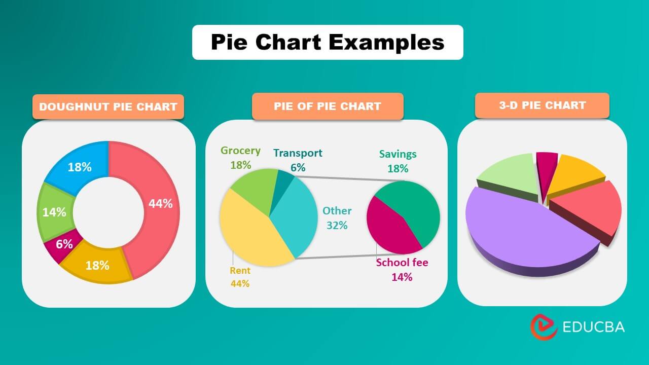
Excel has several pie chart examples, including 2-D, Pie on Pie, Bar of Pie, 3-D, and Doughnut.
Examples of Types of Pie Charts
Example #1: 2-D Chart
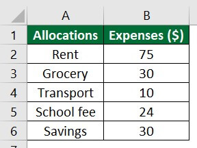
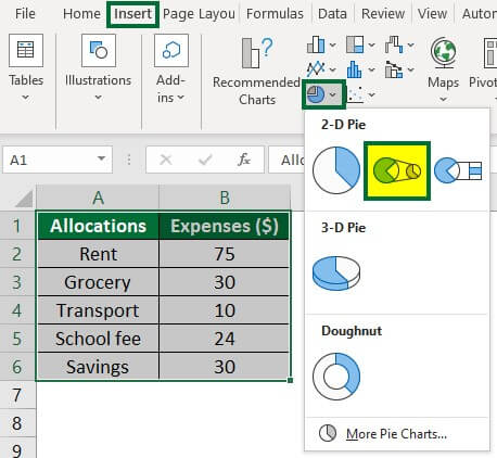
Consider the following data on employee salary usage. We will create different types of pie charts for the below data. Let’s first learn how to create a 2D pie chart.
Solution:
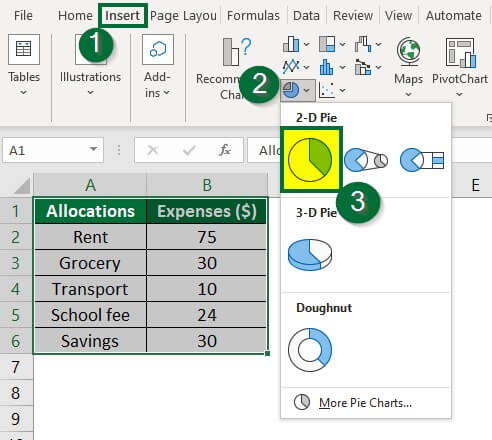
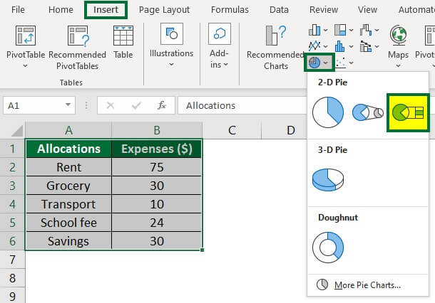
- Select the data A1:B6
- Go to the “Insert” tab, click on the drop-down arrow of the pie chart symbol, and select the first diagram, as shown below.
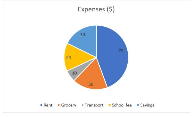
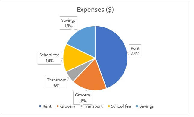
After selecting the option, Excel will display the pie chart below.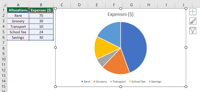
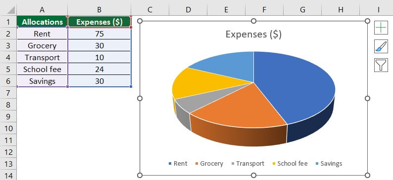
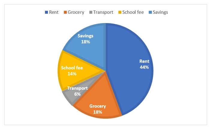
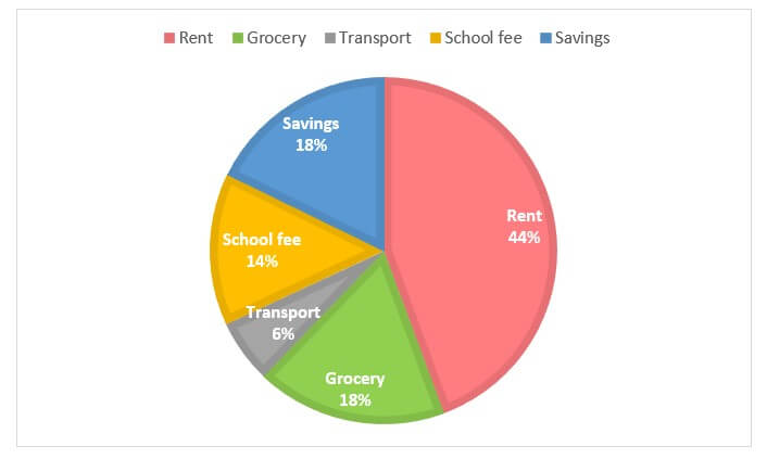
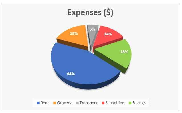
We can see that the above pie chart has divided each allocation category into different divisions and colors. Also, colors representing the division or allocation are shown at the bottom of the chart. It is known as the legend. Excel has also titled “Expenses ($) to the chart.
Now, let us learn how to customize the pie chart to enhance its readability.
1. Adding labels to the pie chart:
- Right-click on the pie chart, choose “Add Data Labels,” and select “Add Data Labels” under the drop-down option, as shown below.
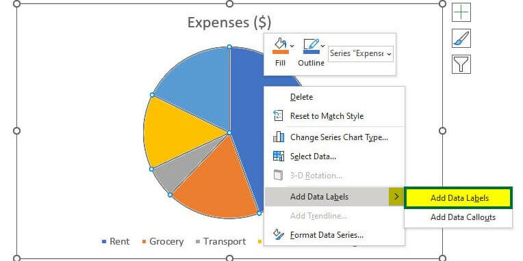
Labels are inserted into the chart.
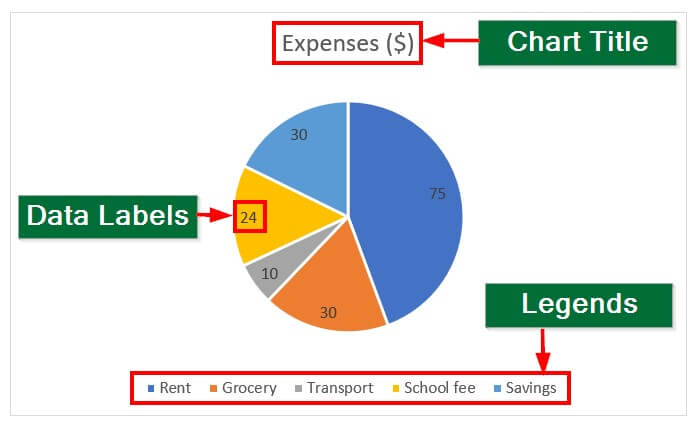
The below image illustrates the chart elements.
2. Displaying the contribution of a particular category in the data:
- Click “Add Data Callouts” under the “Add Data Labels” option to display subcategories and percentages.
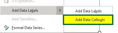
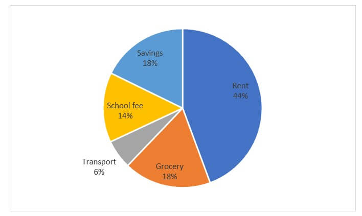
The pie chart displays the allocation category and the percentage share of the corresponding categories. See the below image.
3. Removing the chart title and legends from the chart:
- Select the chart and click on the “+ “symbol in the upper-right corner, as shown below,
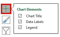
The above image shows all the chart elements are marked ticked.
- Deselect chart title and legend.
In the below image, only data labels are present.
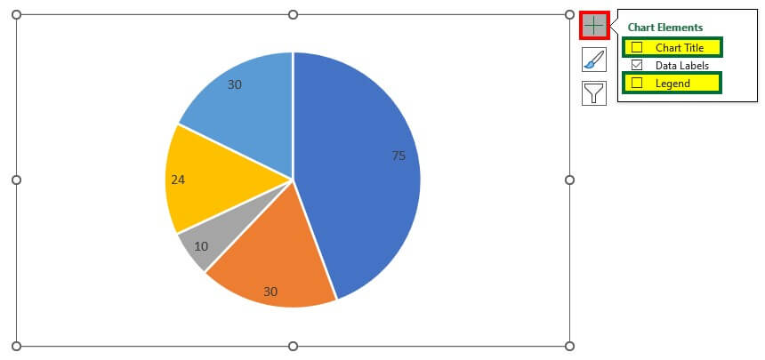
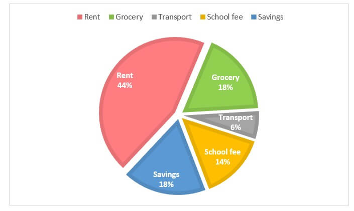
4. Adding the category name and percentage inside the division section:
- Right-click on the pie chart and select “Format Data Labels”.
The Format Data Labels menu will open on the right side.
- Select or tick on the “Category Name“, “Percentage“, and “Show Leader Lines“.
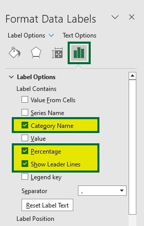
The category name and percentage are added inside the division section, as shown below.
Advanced formatting of this pie chart is given below in the Advanced Formatting – 2-D Pie Chart section.
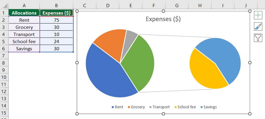
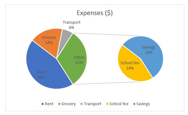
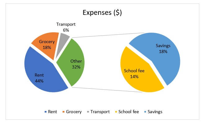
Example #2: Pie of Pie Chart
In this example, we will learn to create a pie of pie chart using the same data that we used for example 1.
The Pie of Pie chart highlights a small proportion of the whole data. It enhances the readability of the data.
- Select the data.
- Go to the “Insert” tab, and click on the pie symbol under the “Charts” group.
- Select the 2nd option of 2-D Pie, as shown below.
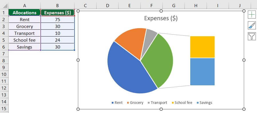
A pie to Pie chart will appear, as shown below.
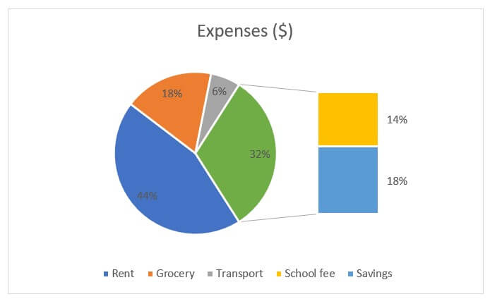
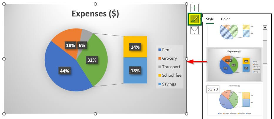
- Right-click on the pie chart and select “Format Data Labels“.
- Select “Category Name” and “Percentage” under the Label options.

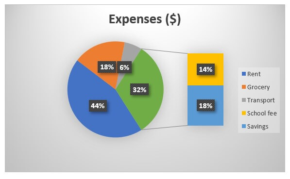
The pie of pie chart will look like this,
Advanced formatting of this pie chart is given below in the Advanced Formatting – Pie of Pie Chart section.
Example #3: Bar of Pie Chart
The Bar of a Pie chart is useful to highlight a small percentage of the data in stacked bars. Let’s learn how to create a Bar of Pie chart.
- Select the data and click on the 3rd option of the 2-D pie chart, as shown below.
The Bar of the Pie chart will appear, as shown in the below image.
Repeat the procedure of previous examples for adding percentages and categories.
Advanced formatting of this pie chart is given below in the Advanced Formatting – Bar of Pie Chart section.
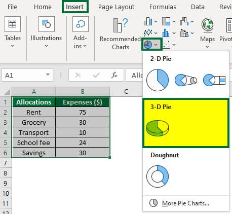
Example #4: 3-D Pie Chart
To create a 3-D Pie chart,
- Select the data and click on the 3-D option, as shown below.
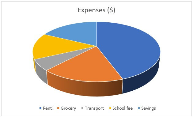
A 3-D pie chart will appear. See the below image.
Advanced formatting of this pie chart is given below in Advanced Formatting – 3-D Pie Chart section.
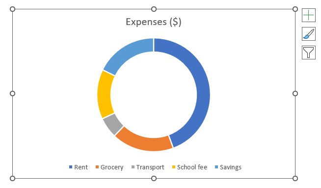
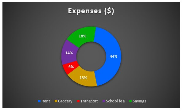
Example #5: Doughnut Chart
A doughnut chart is useful when multiple series are related to a larger sum.
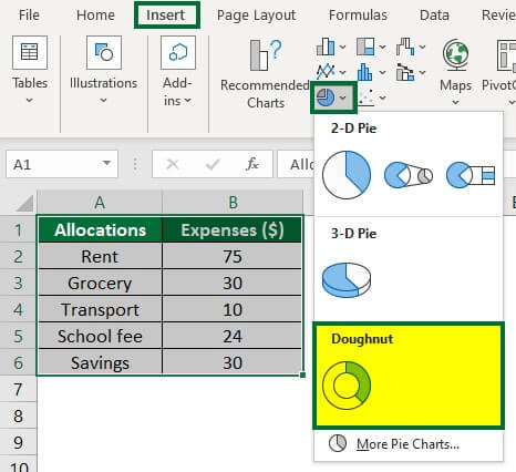
For creating the Doughnut pie chart,
- Select the data and click on the Doughnut option, as shown below.
A doughnut chart representing our data is shown below.
Now, add the percentage to the pie chart.
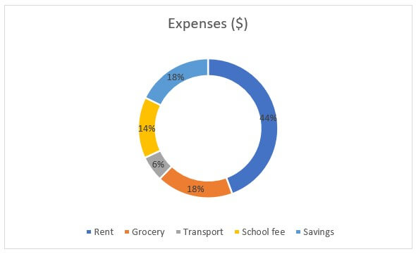
Advanced formatting of this pie chart is given below in the Advanced Formatting – Doughnut Pie section.
Advanced Formatting
Advanced Formatting: 2-D Pie Chart
Please note that this section considers the final result of all the above pie charts.
1. How do you Separate Slices in a Pie Chart?
Here, we will separate the grey slice or transport category.
- Select the grey slice and drag it away from the pie chart with the mouse. See the below image.
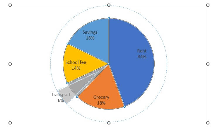
The slice or transport category is separated from the pie chart.
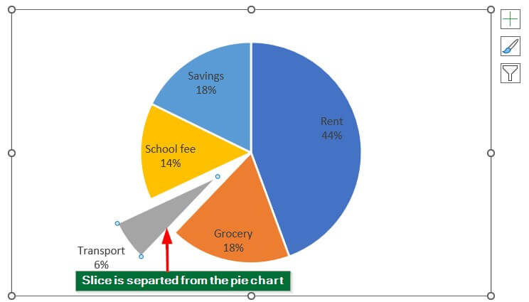
We can again move the slice to its position in the pie chart.
2. How to Change the Format and Color of the Pie Chart?
- Click on the pie chart.
- A “Chart Design” will open next to the “Help” tab
- Select any design from the Chart Design. We have selected Style 8.
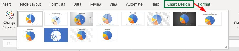
The pie chart will appear in the following design format.
We can also change the format from the below option.
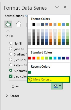
3. How do you Change Pie Chart Colors in Excel?
Click on the pie chart.
A Format Data Series menu will open up on the right side.
- Select the “Color” option under the “Fill & Line” (green border in the below image) tab, as shown below.
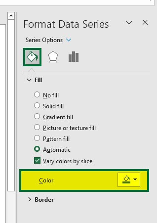
The theme colors menu will open up. We can select colors from here or go to “More Colors” and select the desired colors.
The below pie chart is with new color format and style.
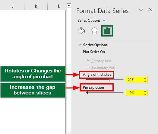
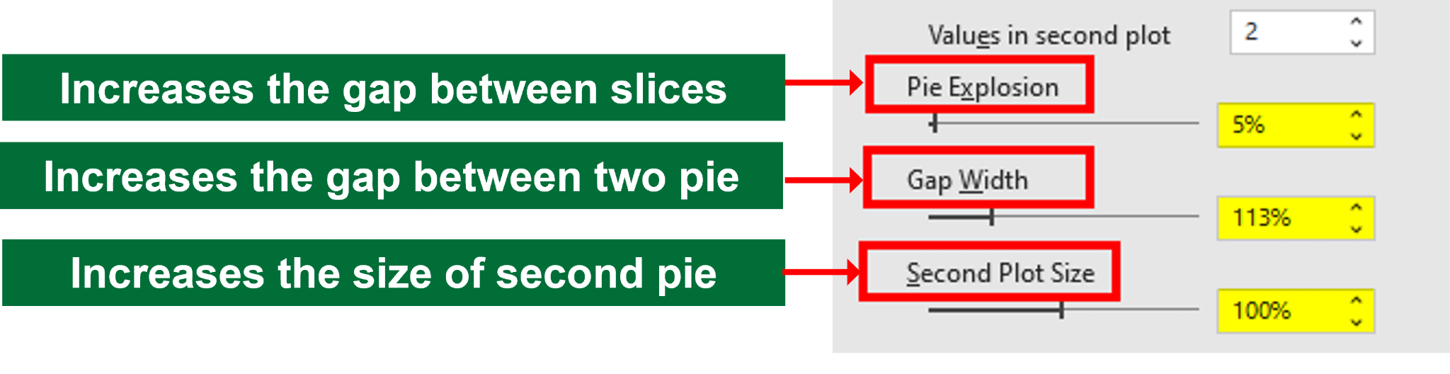
4. How do you Rotate a Slice and Increase the Space Between a Pie Chart?
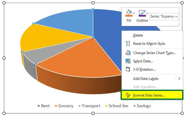
- Right-click on the pie chart and select Format Data Series.
The Format Data Series menu will open up on the right side.
- Select “223°” under “Angle of first Slice” and “10%” under “Pie Explosion” to increase the gap between slices.
The pie chart will look like this,
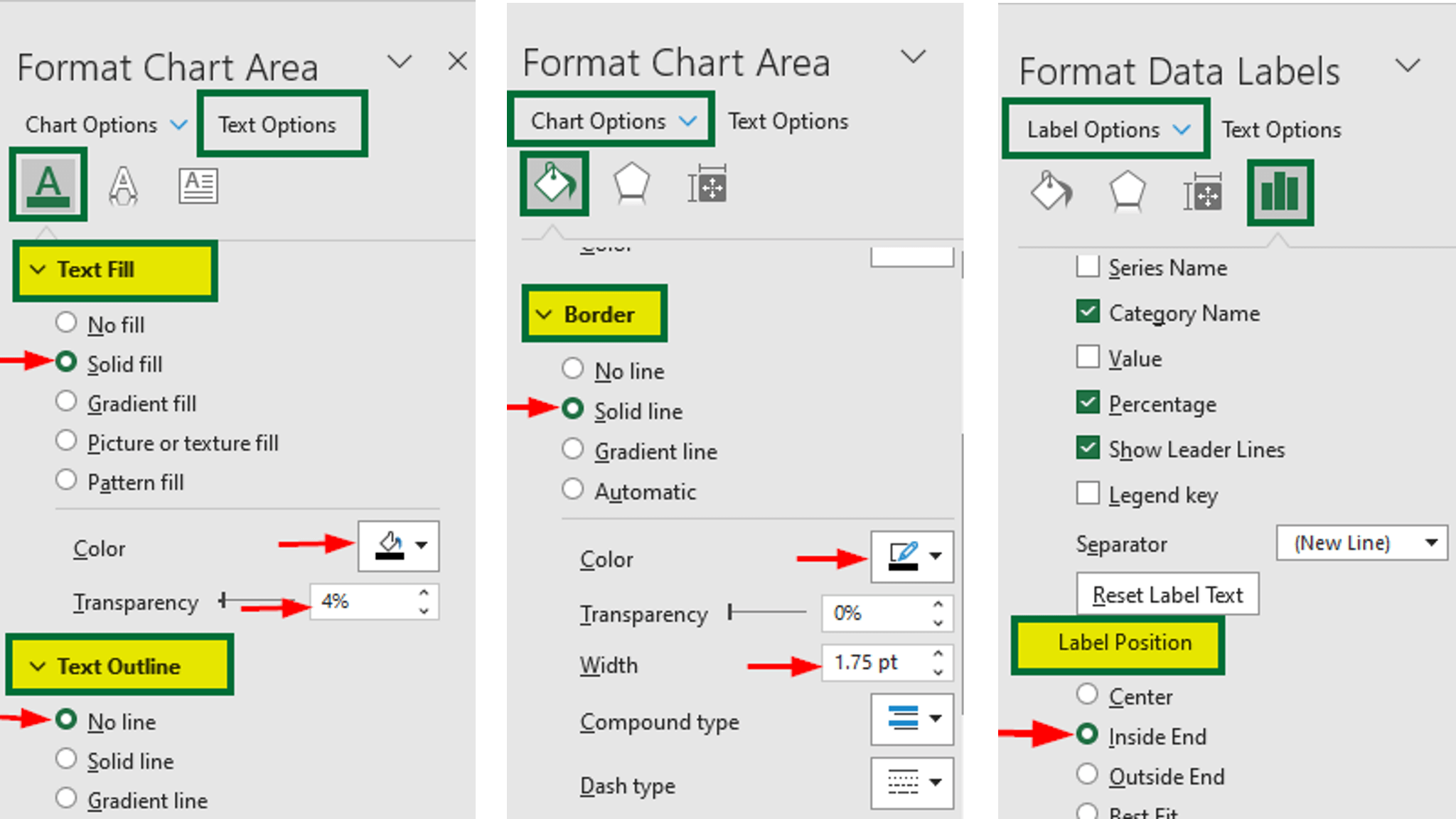
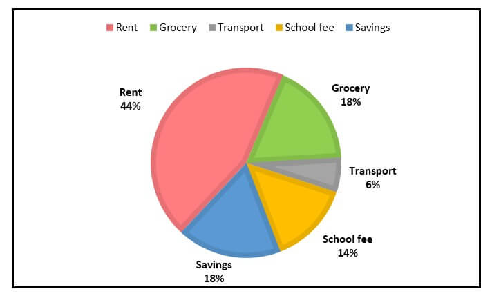
5. How to Change the Font and Border Color?
- Select the pie chart image.
A Format Chart Area menu will open.
You can try various styles combinations to make the pie chart more attractive. The options selected by us are given in the following image.
The pie chart will look like this,
Advanced Formatting: Pie of Pie Chart
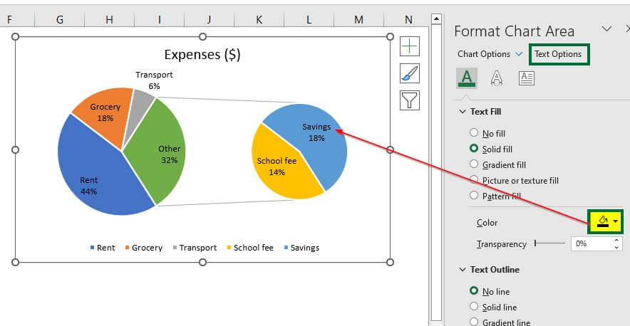
1. How does changing the Pie of the Pie Chart change the font color?
- Select the pie chart.
A Format Chart Area menu will appear on the right side.
- Select the desired color under the “Text Fill” group of the “Text Options” tab.
2. How to Change the Format of the Pie of Pie Chart?
- Right-click on the pie chart and select “Format Data Series“.
A Format Data series menu will appear.
Select the following options under “Series Options“.
After selecting the above option, the pie of pie chart will look like this,
Advanced Formatting: Bar of Pie Chart
To make the bar of pie more attractive
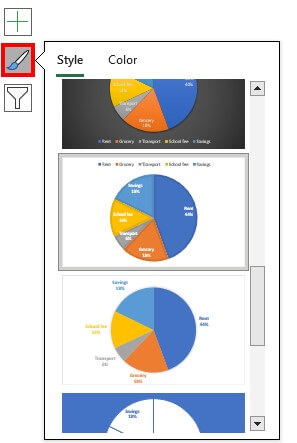
- Select the chart and click on the Paintbrush symbol, which appears on the right side of the chart. See the below image.
You can select any format. We have chosen the below design.
The bar of Pie with the selected style format will look like this,
Advanced Formatting: 3-D Pie Chart
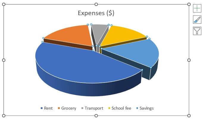
1. How to Rotate the Pie Chart and Increase the Gap Between the Slices?
- Right click on the chart and select “Format Data Series“.
A Format Data Series menu will appear on the right side.
- Change the value of the “Angle of first slice” and “Pie Explosion” to the below condition.
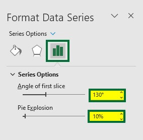
The 3-D pie chart will appear as,
2. How to Change the Style Format/Design?
- Select the desired style format, as shown below.
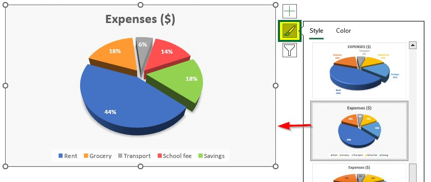
3-D pie with a new style format is ready.
Advanced Formatting: Doughnut Pie
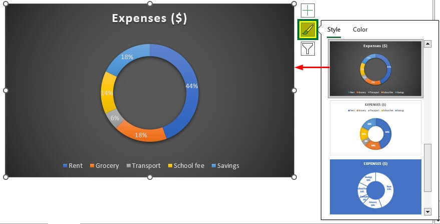
1. How to Change the Style Format of the Doughnut Pie chart?
- Select the desired style format, as shown below.
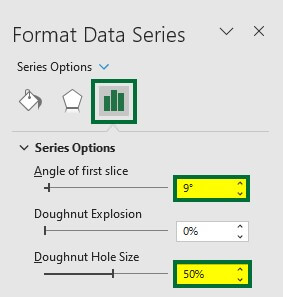
2. How to Decrease the Inside Gap of the Doughnut Chart.
Right-click on the pie chart and select Format Data Series.
- Set “9° for the “Angle of the first slice” and “50%” for “Doughnut Hole Size.
The inside gap of the Dougnut pie chart decreased. See the below image.
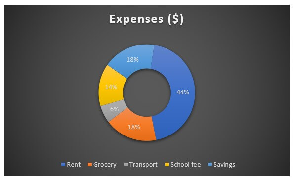
Let’s change the color of the slices of the doughnut pie chart.
The final result after changing the colors is given below,
Things to Remember About Pie Chart Examples
- Select data with proper categories or data points for creating a pie chart.
- Pie charts are useful for representing the nominal and ordinal data categories.
- Do not use negative or zero values data to create a pie chart. The pie chart will display the negative value as the positive value. So, there is no difference between the representation of positive and negative values.
- Use data with a maximum of 7 categories or divisions to create a clutter-free pie chart.
Recommended Articles
This article is a step-by-step guide to Pie Chart Examples. Here we discuss how to create different pie charts in Excel and their customization with examples. You can also go through our other suggested articles:
