Updated August 24, 2023
Introduction to Gantt Chart in Excel
Gantt Chart in Excel is the most valuable tool or chart type by which we can create a complete project schedule, and also, we can create a schedule for any part of the project or process with tasks to be performed in that. The Gantt chart shows the duration of each activity and task, when a task or activity will start and be scheduled to complete, and other subsequent tasks after those shown with horizontal bars with start and end dates. This also shows the milestones reached in any project with dates and remaining work.
Below is an Image of the Gantt Chart in Excel.
How to Make a Gantt Chart in Excel?
Gantt Chart in Excel is very simple and easy to create. Let us understand the working of the Gantt Chart in Excel with some examples.
Steps to Make Gantt Chart in Excel
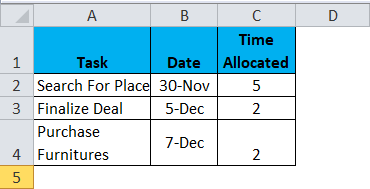
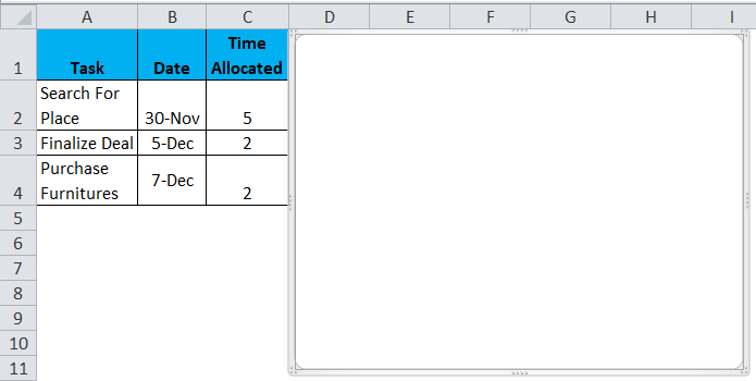
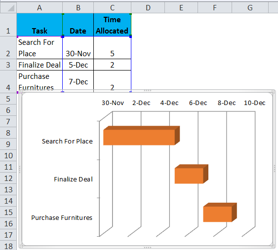
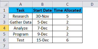
For a Gantt Chart to illustrate a timespan for the project task, we need a table for the tasks and time defined. For Example, I need to start a new classroom for teaching.
Below are the steps which we will follow:
- Please search for a place to open a class (Time allotted to me: 5 Days)
- Finalize the deal for the place (Time allotted: 2 Days)
- Purchase Furniture (Time Allotted: 2 Days)
After going through the three above steps, I can start teaching to students. Assume the start date for the first task is today, i.e. 30th Nov. Let’s make the table in Excel.
The table looks like this:
From the above table, it is clear that I can start teaching from the 9th of Dec after completing all the tasks. Now how do we show the above table in the Gantt Chart?
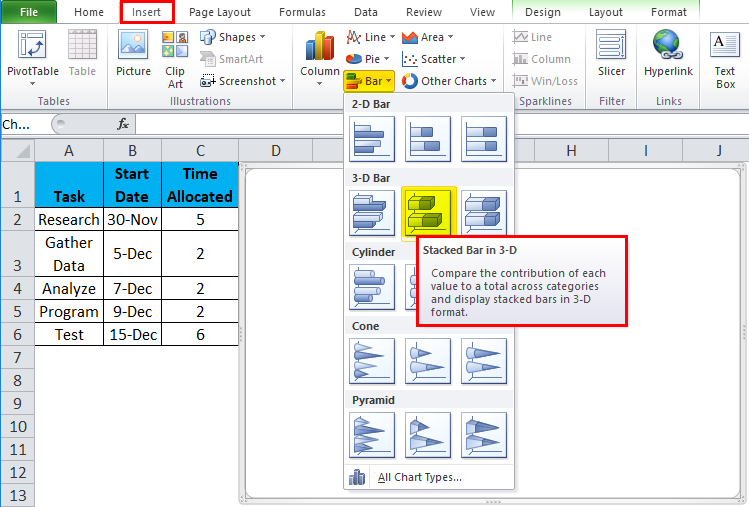
Let us name these steps of making the Gantt Chart process as “PROCESS” and bifurcate them in different steps:
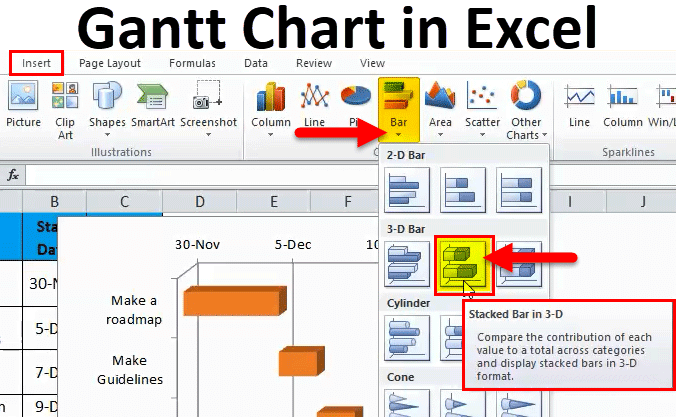
- Go to Insert Tab.
- In the charts group, Go to Bar Charts and select a 3-D stacked bar chart(we can choose either 2-D or 3-D, but 3-D gives better illustration, so let us stick with it).
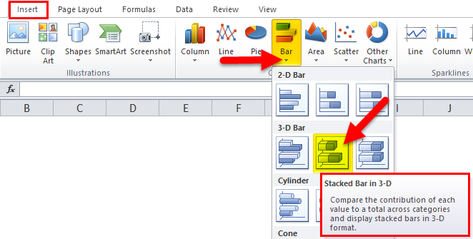
- We see a blank chart, and we need to input values in it.
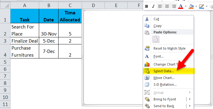
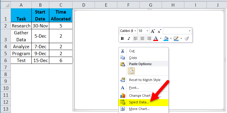
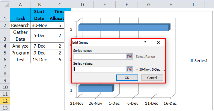
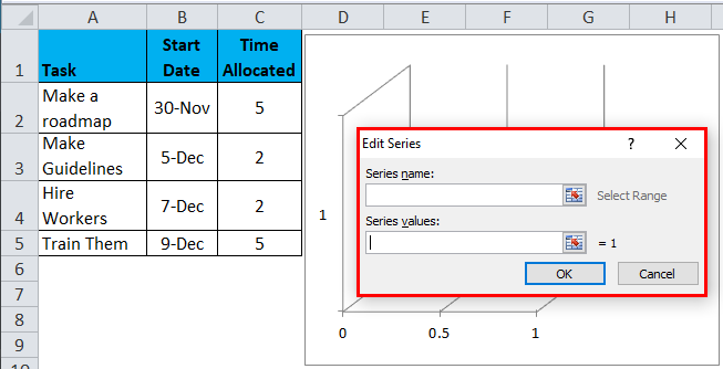
Right-click on the chart and select “Select Data”.
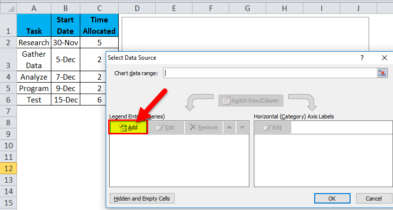
- In the legend entries(Legend Entries means data located on the right-hand side of the chart), we can see an add button.
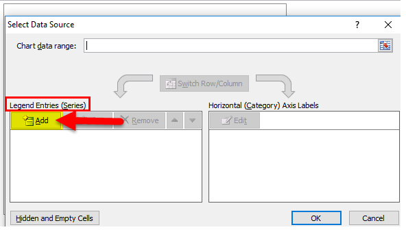
- Click on it, and an Edit series pops out.
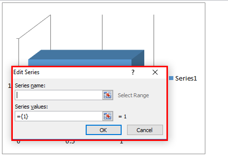
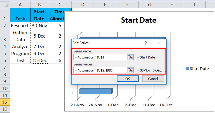
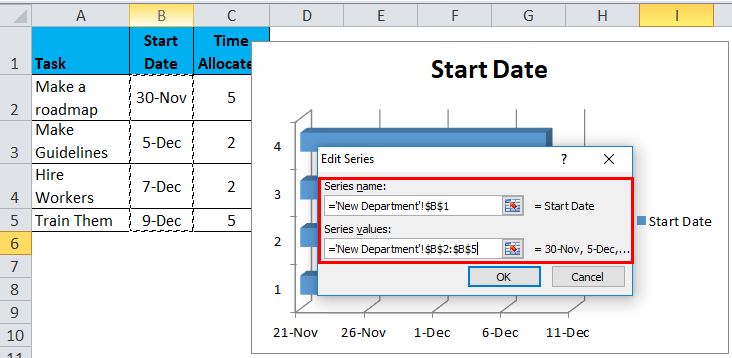
- In the series name, select the date cell & in series values, remove the default value and select the date range.
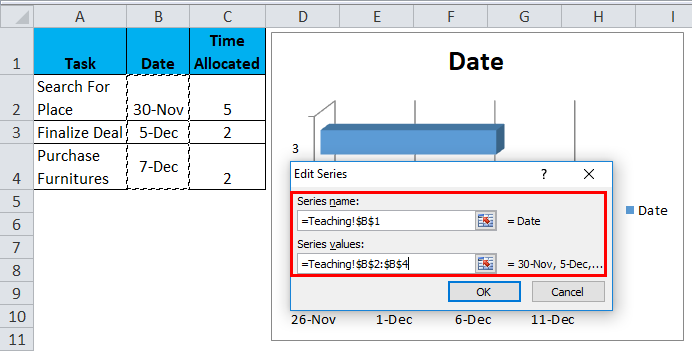
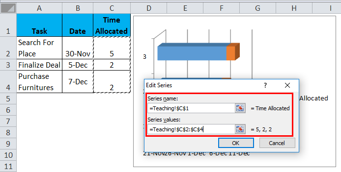
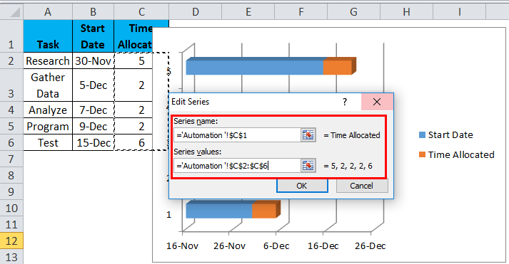
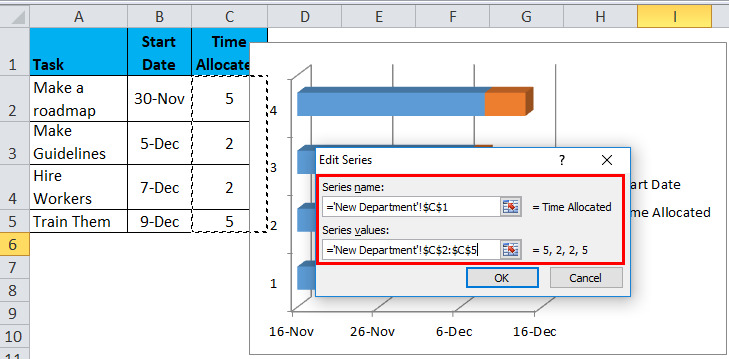
- We need to add a new series so we again go to add button, and in the series name, we will select “Time allocated”, & in the series, value the range of Time allocated.
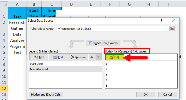
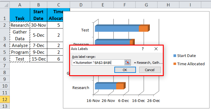
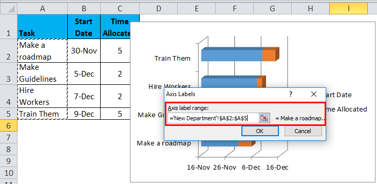
- After clicking ok, we return to our select data dialog box again. In the horizontal axis, label clicks on an edit button.
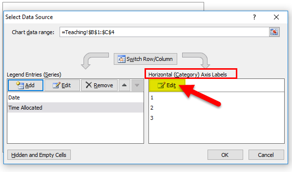
- In the axis label range, select all the tasks.
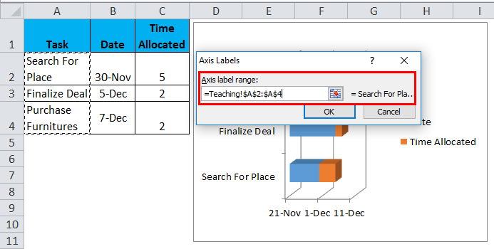
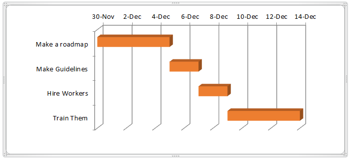
- We have all our data to select ok in the select data source tab, and the chart looks like this.
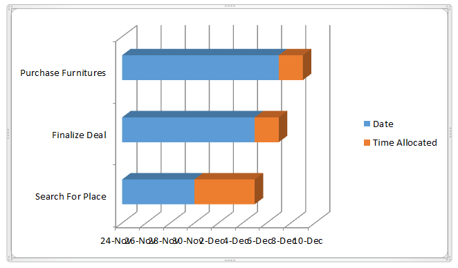
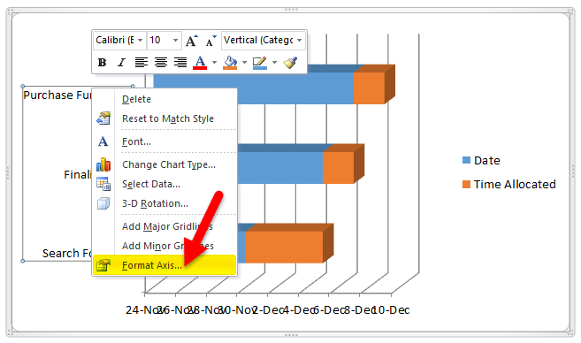
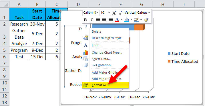
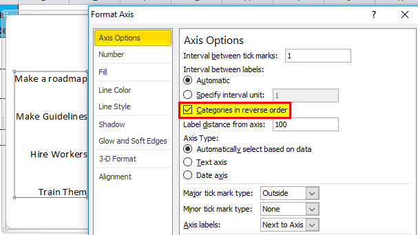
- The chart has a problem: our tasks are not in order, and our tasks start from 30-Nov, not from 24-Nov. To Fix this, click Tasks, right-click, and select “Format Axis”.
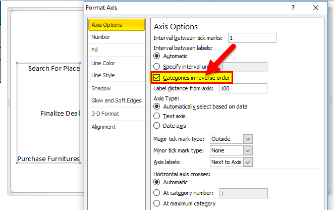
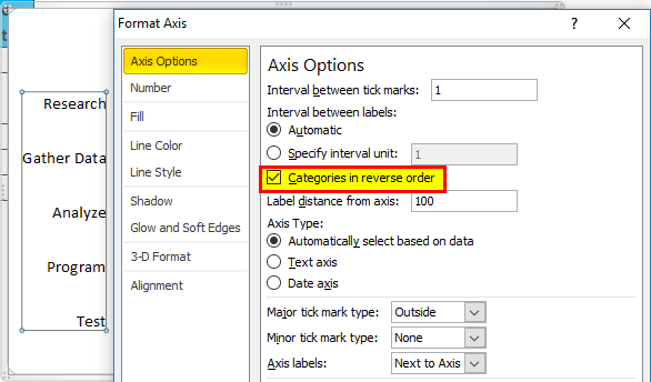
- On the right-hand side, a dialog box appears. Click on Categories in the reverse order highlighted. This will arrange the tasks in the right order.
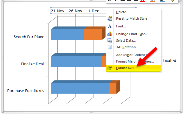
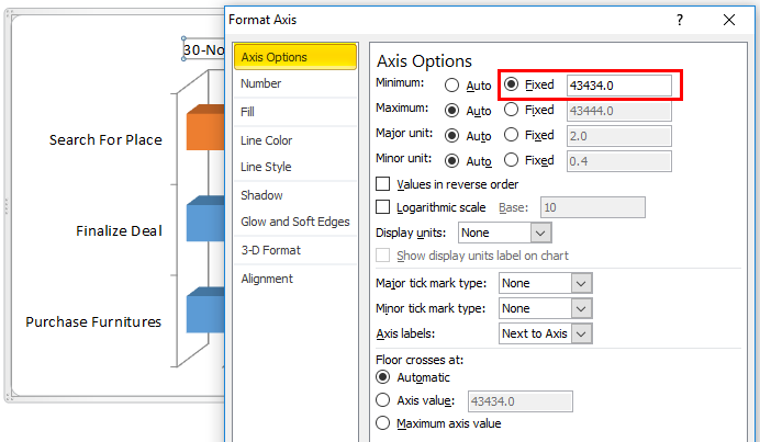
- Now the date isn’t the date we wanted. In Excel, the Date is in number format. In any blank cell, type our start date, and in the home tab in the numbers group, it is by default selected as custom. Select a number, and we will see the number for our start date. Now right-click on a date in the chart and select the format axis.
- There is a section of Minimum Bound Values on the right-hand side of the dialog box, which is the start point of our dataset by default. Change it with the number format of the date we want.
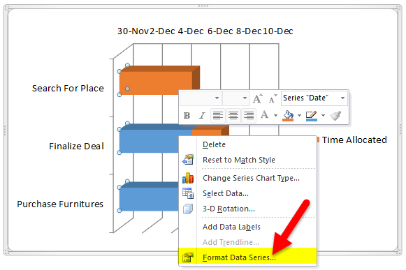
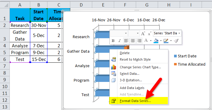
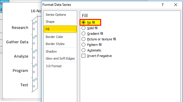
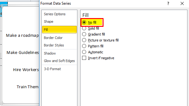
- Now our project has not yet been started, but the blue bar shows the completion of the task, so to remove that right, click on the blue bar and go to format data series.
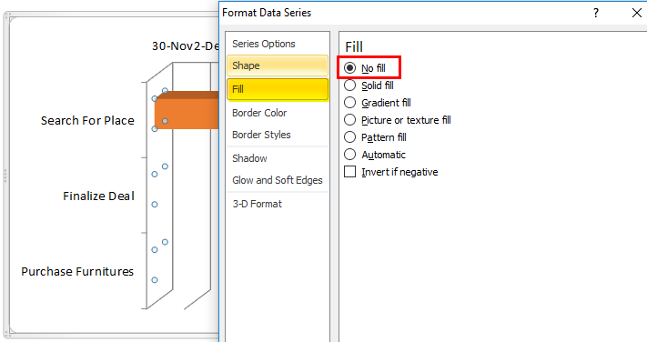
- In the Fill section, select “No Fill”.
- Now we have prepared our first Gantt Chart.
Examples of Gantt Chart
Let’s understand more about Gantt Charts in Excel with some examples.
Example #1
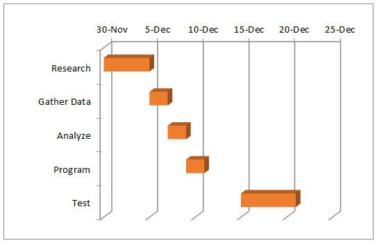
A developer needs to automate a program or make software for a client. He needs to research first the needs of software for the client and then gather the data; after that, he analyzes it to make the code and test it, and finally, it will be ready. The software is to be delivered by the 21st of Dec.
Below is the data table for the developer.
Now we follow the “Process of making Gantt charts in Excel”.
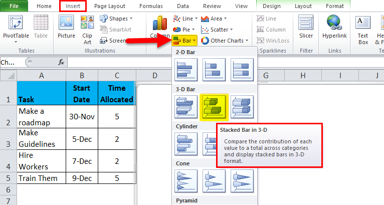
- Go to Insert Tab & In the charts group, Go to Bar Charts and select 3-D stacked bar chart(we can choose either 2-D or 3-D.
- In the legend entries(Legend Entries means data located on the right-hand side of the chart), right-click on the Chart and see a “Select Data” option.
Click on “Select Data”, and a pop-up menu will appear that goes to Legend Series> Add.
- Click on it, and an Edit series pops out.
- The name selects the date cell & in series value in the series, removes the default value, and selects the range of date.
- We need to add a new series, so we again go to add button, and in the series name, we will select “Time allocated”, & in the series, value the range of Time allocated.
- After clicking ok, we return to our select data dialog box again. In the horizontal axis, the label clicks on the edit button.
- In the axis label range, select all the tasks.
- Click on Tasks and then right-click and select “Format Axis”.
- On the right-hand side, a dialog box appears. Click on Categories in the reverse order highlighted.
- Click on the blue bar and go to format data series.
- In the Fill section, select “No Fill”.
- Below is the Gantt Chart for the developer.
Example #2
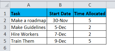
A boss needs to start a new department for his company. He will first make a flowchart for the initial steps to show his partners, then make the guidelines; after that, he can hire and train workers.
Below is the data table for the company’s boss.
Let us follow the same process of making Gantt Charts in Excel:
- Go to Insert Tab & In the charts group, Go to Bar Charts and select 3-D stacked bar chart(we can choose either 2-D or 3-D.
- We can see an add button in the legend entries(Legend Entries means data located on the right-hand side of the chart). Click on it, and an Edit series pops out.
- The name selects the date cell & in series value in the series, removes the default value, and selects the date range.
- We need to add a new series, so we again go to add button, and in the series name, we will select “Time allocated”, & in the series, value the range of Time allocated.
- After clicking ok, we return to our select data dialog box again. In the horizontal axis, the label clicks on the edit button and selects all the tasks in the axis label range.
- Click on Tasks and then right-click and select “Format Axis”. On the right-hand side, a dialog box appears. Click on Categories in the reverse order highlighted.
- Click on the blue bar and go to format data series. In the Fill section, select “No Fill”.
- Below is the Gantt Chart for the company Boss.
Along with the various uses of the Gantt Chart, it has pros and cons.
Pros and Cons of Gantt Chart in Excel
Given below are the pros and cons mentioned:
Pros
- Gantt Chart Gives a clear illustration of project status.
- It helps to plan, and coordinate.
- It is highly visible.
Cons
- Gantt Chart does not show task dependencies. If one task is incomplete, a person cannot assume how it will affect the other tasks.
- The size of the bar does not indicate the amount of work; it depicts the time period.
- They need to be constantly updated.
Things to Remember
- A data table needs to be made for a Gantt Chart.
- Tasks need to be in ascending order.
- The start date needs to be the first task start date.
Recommended Articles
This has been a guide to a Gantt Chart in Excel. Here we discuss its uses and how to create Gantt Charts in Excel with Excel examples and downloadable Excel templates. You may also look at these useful functions in Excel –
