Updated August 24, 2023
Excel Surface Charts ( Table of Contents)
What is a Surface Chart?
Surface charts are those charting tools provided by Excel that enhance Excel’s ability to be a visual analytics tool. These types of charts are common for temperature analysis. The chart works on numbers and requires at least two series for a generation. The chart allows easy visualization-based analysis as it rests on three dimensions. The crucial elements of a surface chart include representing dimension values or categories on the x-axis, representing the measure in the context on the y-axis, and representing different series in the given context on the third axis, i.e., the z-axis.
How to Create a Surface Chart in Excel?
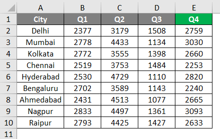
For this demonstration, we are considering sales data for nine major cities in India. As we can see through the following dataset, the data for the nine cities have been given quarter-wise. We will build a surface chart visualization to analyze the sales and compare the sales figures across the cities.
Let’s go through a step-by-step procedure to build a surface chart on the above dataset using the steps described below.
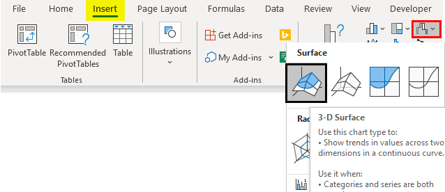
- The entire dataset selected goes to the “Other Charts” option in the Insert menu, as shown in the below screenshot. In “Other Charts”, many chart options are available, from which we select the first symbol in the “Surface” option. This is illustrated below.
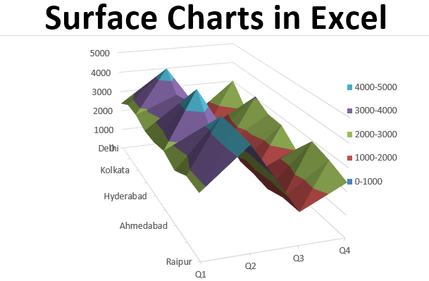
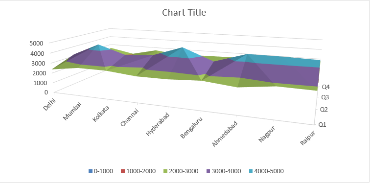
- In the following screenshot, the x-axis represents the categories or dimensions in the dataset, the y-axis represents the measure (in this case, Sales), and in this case, the z-axis is represented by quarters. Remember, the surface chart requires at least two series for its building. Notice the legend carefully. Usually, in charts, we find legends representing categories. However, here a legend represents a particular range of Sales values. This is how surface charts are distinguished from other charts because this chart necessarily represents a measure in terms of depth parameters.
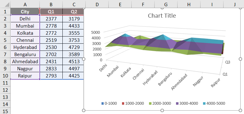
- The generated chart may not necessarily be of the required size; we can expand it as required. The following screenshot shows the chart that has been expanded sufficiently to make every element visible.
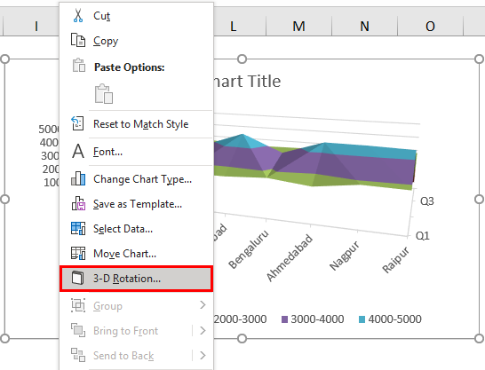
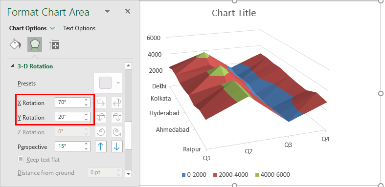
- The default generated chart may not be present in the desired form, and by editing its properties, we can change it to the required form. For this, right-click on the chart and select the requisite one from various options. In this case, we cannot interpret the chart properly so we will rotate it slightly. For that, click on the “3-D Rotation” option. This is illustrated in the following screenshot. Once we do this, the “Format Chart Area” dialog box pops up, as shown in the screenshot after below one.
- In the “Format Chart Area” dialog box, we can set the values of the required variable as needed. Various options in the Format Chart Area are shown below. We can set the required axis value as needed, and the chart will rotate based on the value.
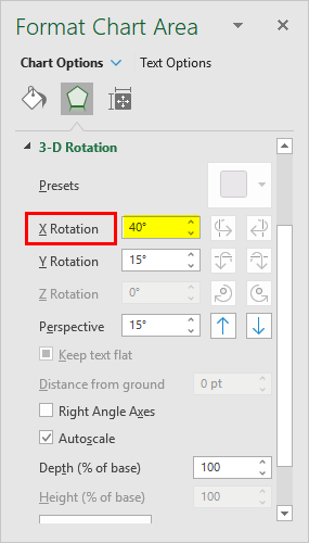
The following screenshot shows how the chart is rotated clockwise after we increased the x-axis value to 40 degrees.
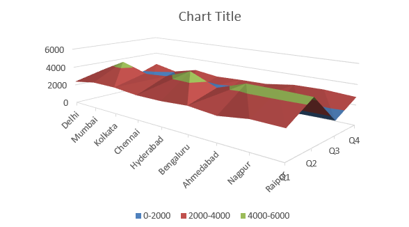
- Now, we increased the value of the x-axis further, setting it to 70 degrees and slightly increasing the value for the y-axis by setting it to 20 degrees. Just observe the chart we get, as shown in the following screenshot.
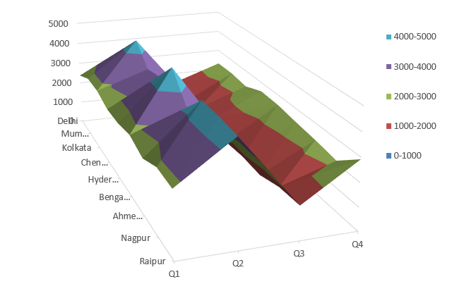
As mentioned above, the chart must be expanded until it represents each element. We expanded the chart in the above step until we got a sufficiently big size chart. The chart is shown in the following screenshot. Observe the following chart. As we can see, different colors represent different categories.
Moreover, the data has been represented as a surface but still not, making it difficult for a stakeholder to interpret requisite insights from it. From the chart, we can infer that Q3 sales are much less than in other quarters. Ranges represented by colors assist us in understanding what range is depicted by sales maximum or minimum time.
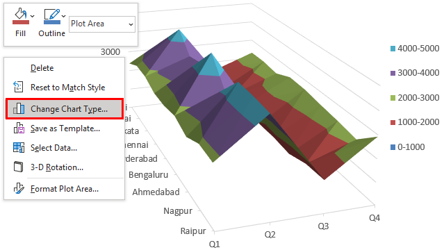
As we can see, the chart now looks much more insightful than it was before. We can change every aspect of the visualization until we get the one that we find suitable based on the problem. We can explore other types in the “Surface” category. For this, right-click on the chart, and select the “Change Chart Type” option. This is as illustrated in the below screenshot.
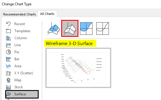
- As shown in the screenshot below, we selected the second option, i.e., “Wireframe 3-D Surface”, as shown in the following screenshot, and the chart type changed. Here, the chart looks like that of a wireframe.
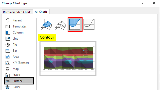
- When we change the surface chart type to the “Contour” type, we get the following screenshot, as shown in the following screenshot.
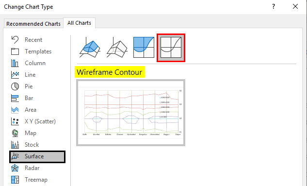
- We have the fourth option in the Surface chart, “Wireframe Contour”. We get the contour chart that looks like a wireframe when we select it. This is as illustrated in the below screenshot. Go through the following visualization.
Things to Remember about Surface Charts in Excel
- The surface chart proves to be handy when we want to analyze situations involving three-dimensional analyses with complexity(s). However, it is important to remember that one must apply the surface chart only after thoroughly studying the context to ensure that the chart is not mistakenly applied.
- Amongst the various options available in the surface chart, one must select the appropriate one only after identifying the chart’s suitability based on the context. Each option offers some uniqueness, suits a, and is applicable in a particular situation.
- It is essential to study each of the components of the surface chart. Understanding the chart is the most important thing.
Recommended Articles
This is a guide to Surface Charts in Excel. Here we discuss How to create Surface Charts in Excel, practical examples, and a downloadable Excel template. You can also go through our other suggested articles –
