Updated August 24, 2023

What is Comparison Chart in Excel?
A comparison chart is a graphical representation of different informational values associated with the same categories, making it easy to compare values. It shows how different things are performing relative to each other.
For example, to compare the profits of Tesla for the years 2021–2022, use a comparison chart to display information. Additionally, a comparison chart can help compare sales figures for a particular product in different regions or compare how much profit a business is making in two different regions for the same product. Therefore, by using a comparison chart, you can better understand the data and make informed decisions about your business strategy. In this article, we will see the process of creating a comparison chart in Excel step by step.
How to Create a Comparison Chart in Excel?
To create a comparison chart, follow these basic steps:
- Select the data for comparison.
- Click on the “Insert” tab.
- Choose a chart type like a column or bar chart.
- Customize the chart with titles, legends, labels, design, colors, and layout.
- Save your Excel workbook.
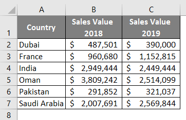
Now, let’s explore how to create a comparison chart in Excel using sales data associated with different regions, as depicted in the screenshot below.
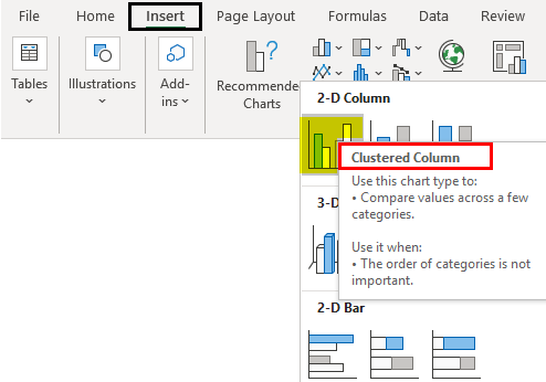
Step 1: Select the Insert tab through the Excel ribbon and then navigate to the Charts section. Under the Charts section, click Insert Column or Bar Chart dropdown and select the Clustered Column Chart option under the 2-D Column Chart section. See the screenshot below:
This step will allow you to add a blank chart layout, as shown in the screenshot below.

Now, we need to add Data to this blank chart to see the sales values for countries in a comparative manner. Follow the steps below:
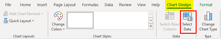
Step 2: Select the graph by clicking on it and navigate to the Design tab; click on the Select Data option under the Data section.
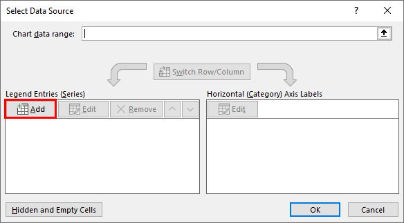
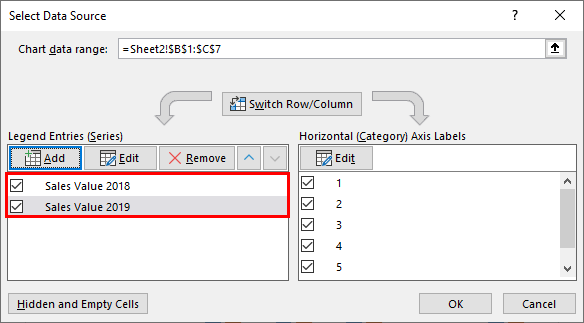
Step 3: Once you click on the Select Data option, a new window, “Select Data Source,” opens in Excel:
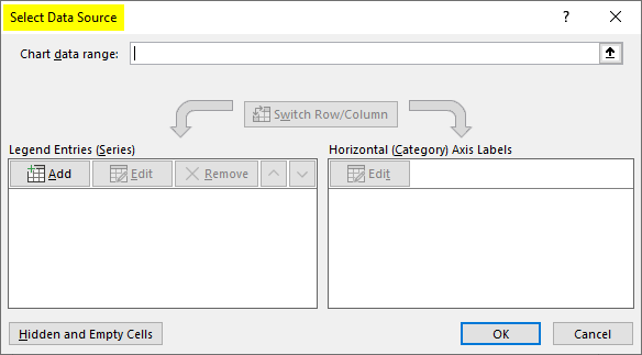
This window helps you modify the chart by allowing you to add the series (Y-Values) and Category labels (X-Axis) to configure the chart as per your need. Under Legend Entries (Series), inside the Select Data Source window, select the sales values for 2018–2019. Follow the step below to get this done.
Step 4: Click on the Add button placed on the left-hand side of the Select Data Source window.
Step 5: When you click the Add button, a new “Edit Series” window will appear. Under Series Name: select B1 as an input (since B1 contains the name for sales value 2018.
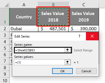
Step 6: Under the Series Values: section, delete “={1},” which is a default value for a series, and then select the range of cells that contain the sales values for 2018 associated with different countries. It varies from B2:B7. Click on OK once done.
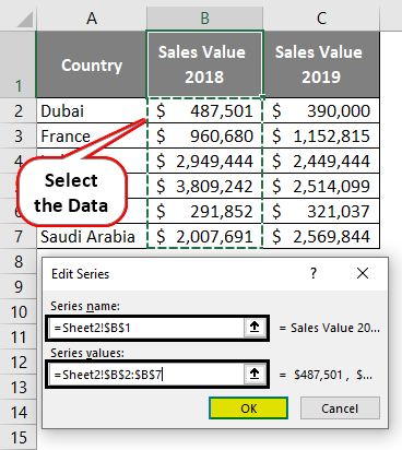
When you click OK, you can see behind the Select Data Source window; the bars are being added for the Sales Value 2018 column.
Step 7: Click the Add button again to add the values associated with Sales 2019. Follow the same procedure as in the previous step. Use C1 as a reference for the Series name and C2:C7 for Series values. It should look as shown in the screenshot below:
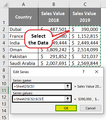
You can see these two series get added under the Select Data Source window:
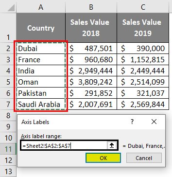
Now, on the right-hand side, there is a Horizontal (Category) Axis Labels section. Here you must edit the default labels to segregate the sales values column Country wise.
Step 8: Click the Edit button under the Horizontal (Category) Axis Labels section. A new window will pop up with the name Axis Labels. Under the Axis label range: select the cells that contain the country labels (i.e., A2:A7). Click on the OK button after you select the ranges.
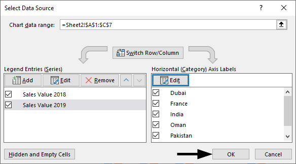
Step 9: Click the OK button again to close the Select Source Data window, and you are through.
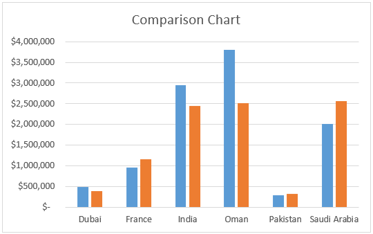
You can see the chart as shown in the screenshot below:
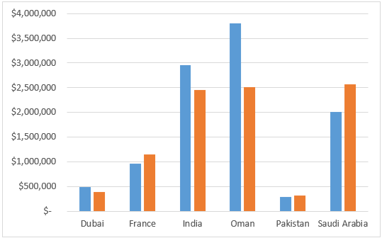
Please note that there is no such option as Comparison Chart under Excel to proceed with. We added a bar/column chart with multiple series values (2018 and 2019). However, adding two series under the same graph automatically makes it look like a comparison since each series value has a separate bar/column associated with it.
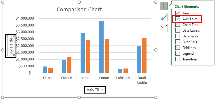
Step 10: Select the chart area and click on the + button that pops up at its right once you click it. In the list of options, select Chart Title by ticking it, and you can see a chart title text box that appears on the upper side of the chart.

Under the Chart Title text box, you can add a title of your choice for this chart. I have added it as a “Comparison Chart” for the one I have created. See the screenshot below:
Step 11: Select the chart and click the + button to add the Axis Titles for the X and Y-axis, respectively.
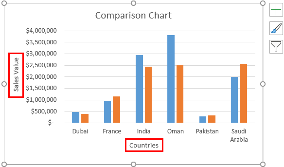
I have added Axis Titles as Sales Values for Y-Axis and Countries for X-Axis. You can use any suitable name for your choice. Ensure the names you add for the chart and axis titles are relevant to your chart data. Usually, chart headers are used as axis labels/titles.
Examples of Comparison Charts in Excel
#1 Sales Comparison Chart
A sales comparison chart in Excel typically displays data in a column or line chart format, with different periods along the horizontal axis and sales figures along the vertical axis. This chart allows comparing sales data over time, making it easy to spot trends and changes in sales patterns. For example, a sales comparison chart can identify whether sales are increasing or decreasing over time and compare sales figures for different products or regions.
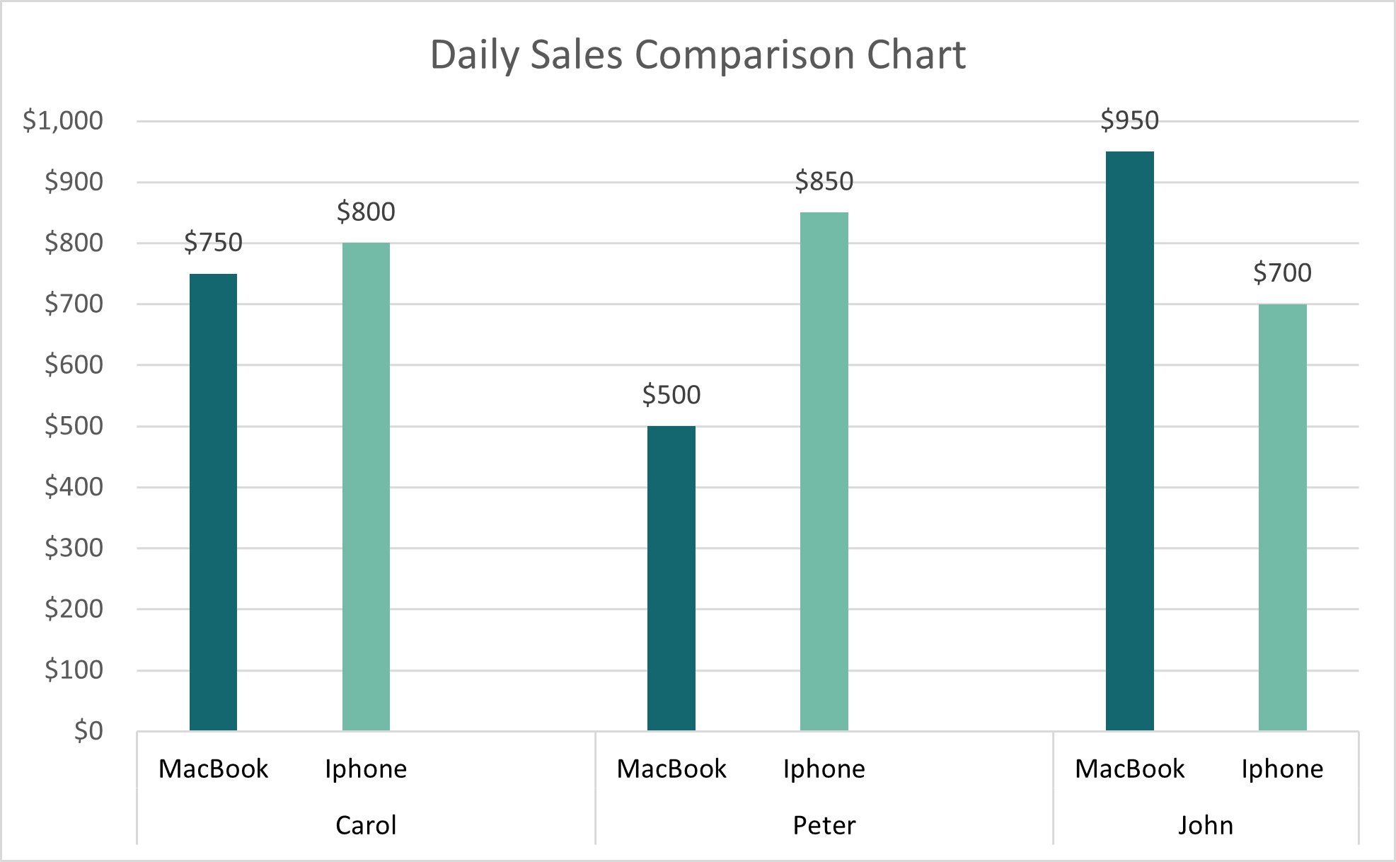
In this example, a sales comparison chart displays the sales figures of MacBook and iPhone products by three different sales executives in a firm. It helps identify the top-performing sales executive for each product and the overall sales. For instance, the chart shows that Peter sold the most iPhones, while John sold the most MacBooks.
#2 Budget Comparison Chart
A budget comparison chart in Excel typically displays actual expenses and budgeted amounts in a column or bar chart format. This chart allows one to compare actual costs against budgeted amounts, making it easy to recognize areas where expenses are higher or lower than anticipated. For example, a budget comparison chart can be useful to determine whether certain departments or costs are over or under budget and to make adjustments to the budget as necessary.
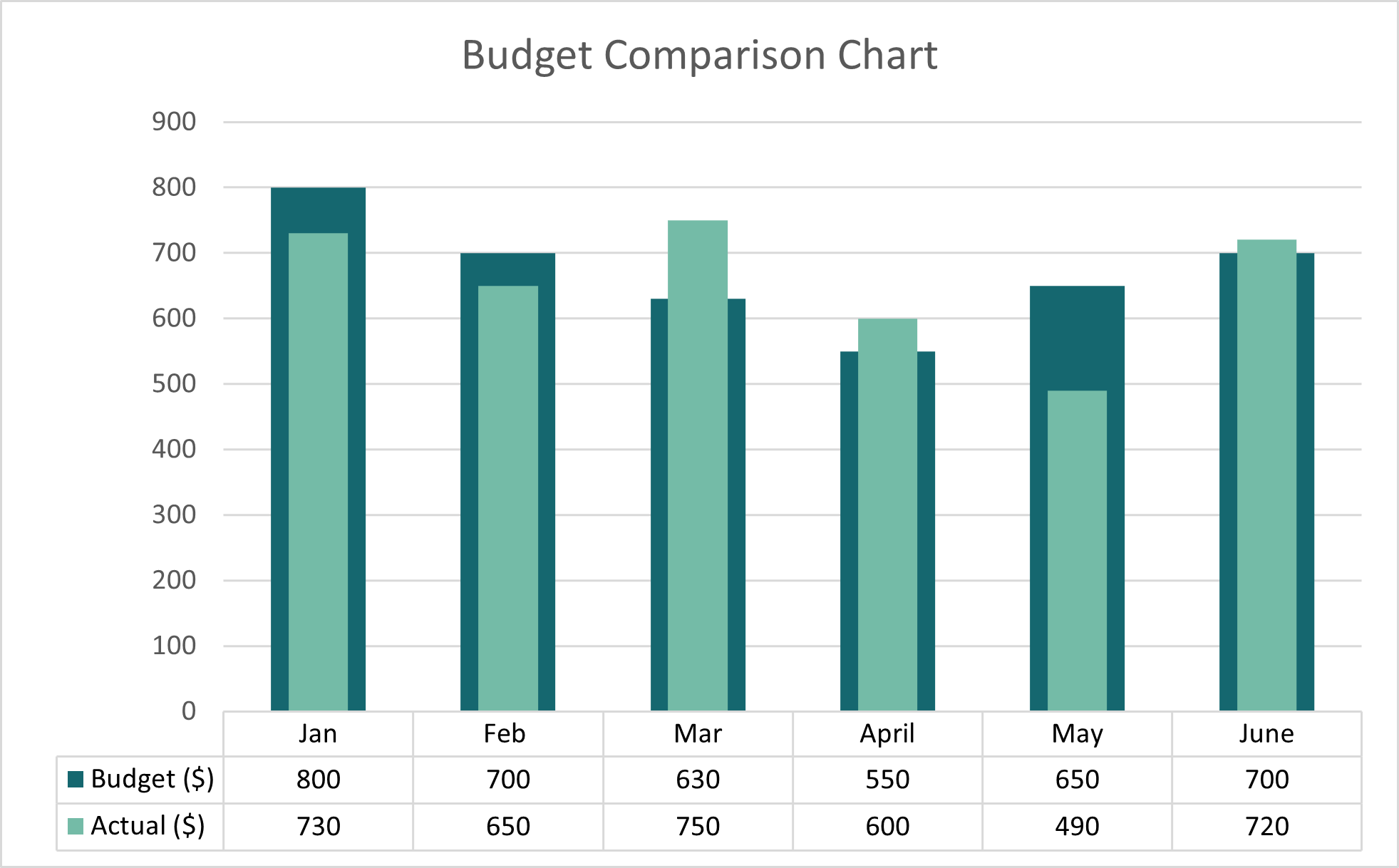
For example, in a monthly budget comparison chart, each column would represent a different month, with the budgeted amount represented by a dark-shaded column and the actual expenses represented by a light-shaded column.
The chart helps quickly identify areas where actual expenses are higher or lower than the budgeted amount for each month. In the above example, the actual expenses in March, April, and June exceed the budgeted expenses by $120 (750-630), $50 (600-550), and $20 (720-700), respectively.
#3 Market Share Comparison Chart
A market share comparison chart in Excel typically displays the market share of different companies or products in a particular industry in a pie or column chart format. This type of chart also allows us to compare the relative position of each company or product in the market, making it easy to identify market leaders and laggards. For example, a market share comparison chart can be useful to determine whether a particular company or product is gaining or losing market share and to compare market share figures for different periods.
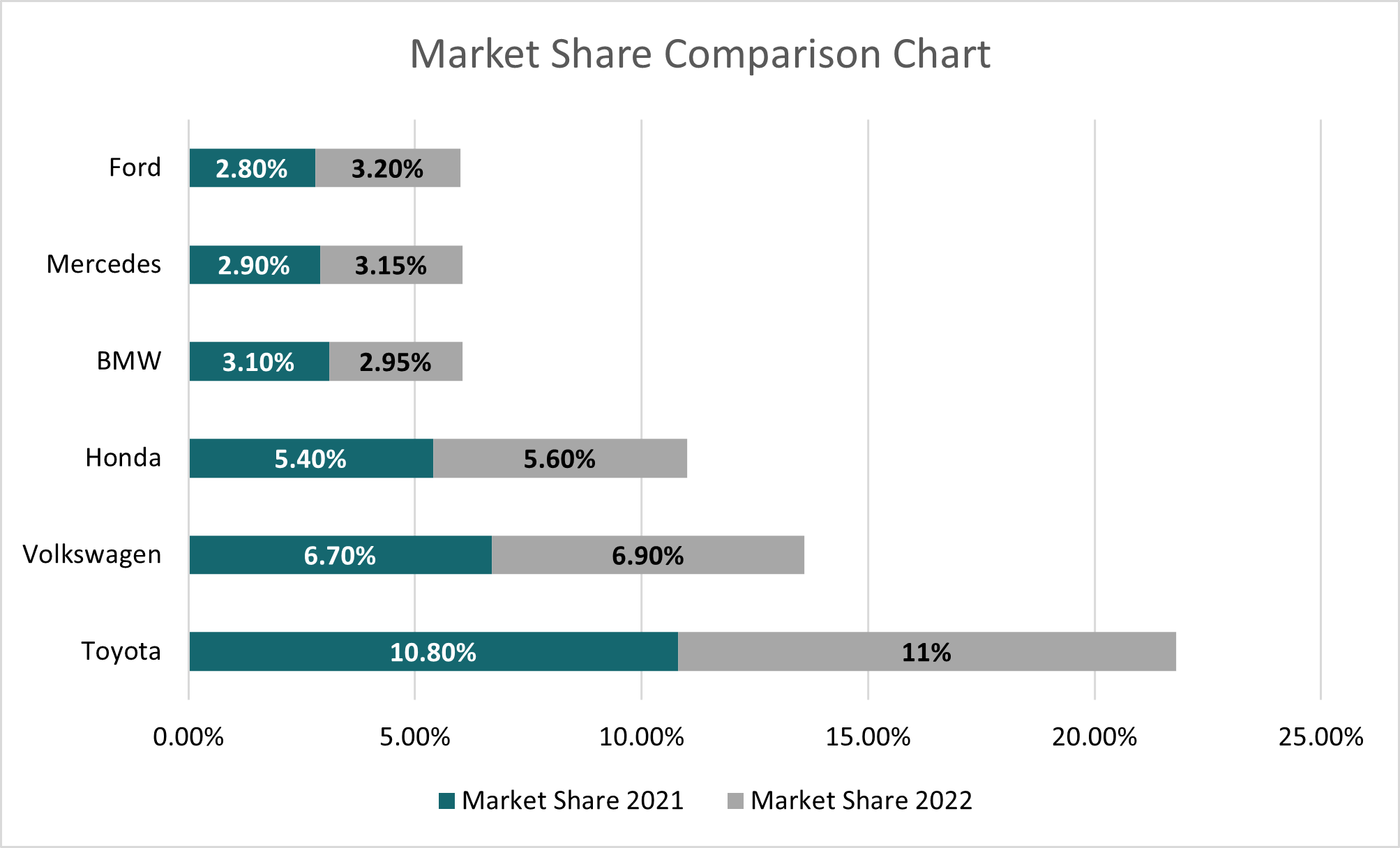
For example, a market share comparison chart for automobile companies may show the market share of different companies for 2021 and 2022, with dark-shaded bars representing the market share for 2021 and light-shaded bars representing the market share for 2022.
In the above example, the market share of BMW reduced to 2.95% from 3.10%, and the market share of Toyota increased from 10.80% to 11%.
#4 Product Comparison Chart
A product comparison chart in Excel displays the features and specifications of different products in a table or matrix format. This type of chart helps compare the strengths and weaknesses of each product, enabling informed purchasing decisions. For example, a product comparison chart can be useful to compare the features, pricing, and customer reviews of different laptops or smartphones and identify which product best fits the needs.
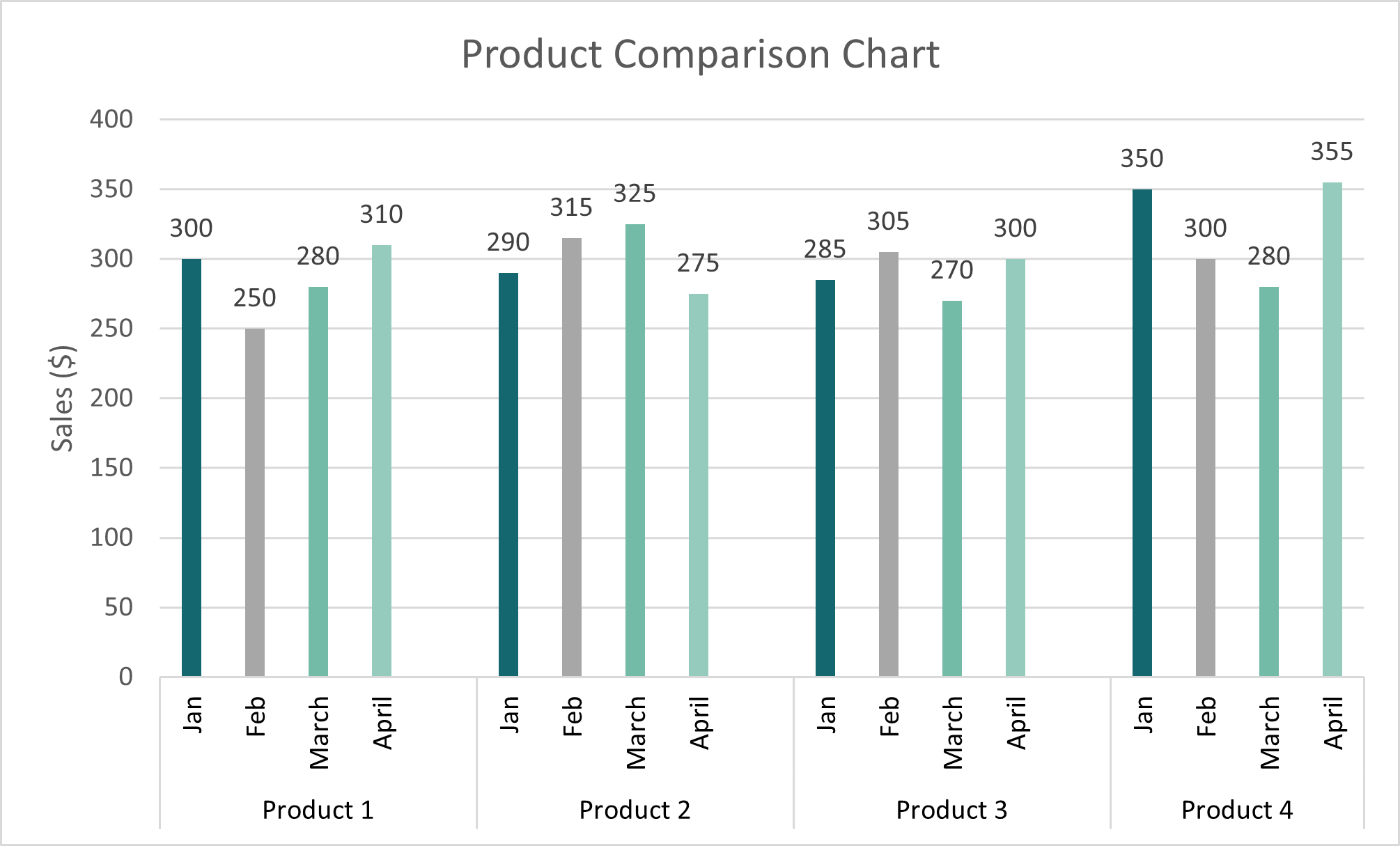
In this example, the product comparison chart shows the sales of four different products over four months, from January to April. We can easily see which product had the highest sales in a particular month and which had the lowest. For instance, in April, Product 4 had the highest sales of $355, while in March, it had the lowest sales of $280.
Types of Comparison Chart in Excel
1. Column Chart
A column chart is a type of chart used to display data in columns, where the height of each column represents the value of the data shown. It is identical to a bar chart but with the bars oriented vertically. Column charts are also useful for comparing values across different categories or periods.
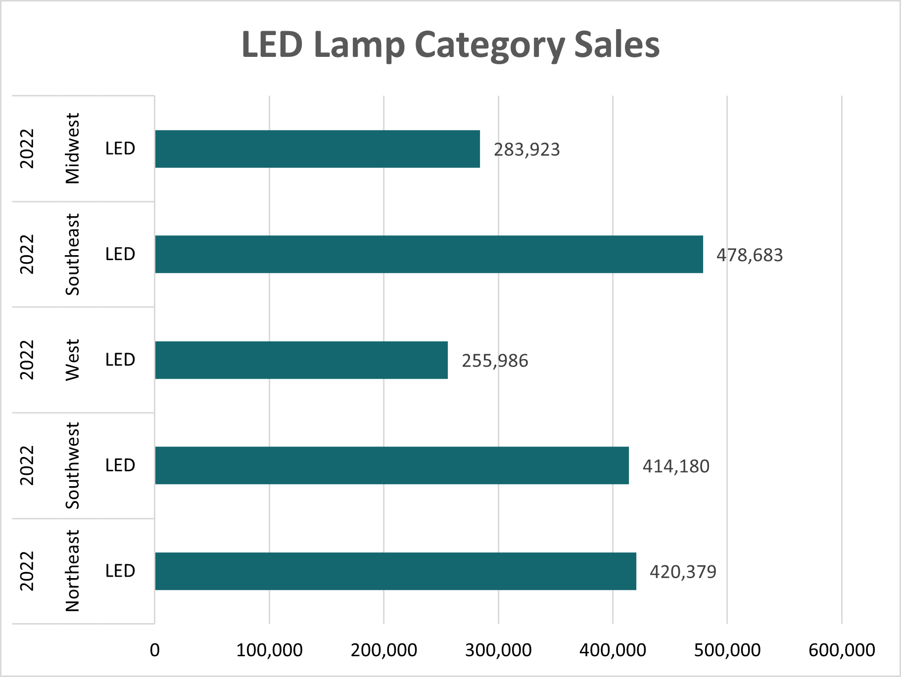
The image below shows an example of a simple column chart:
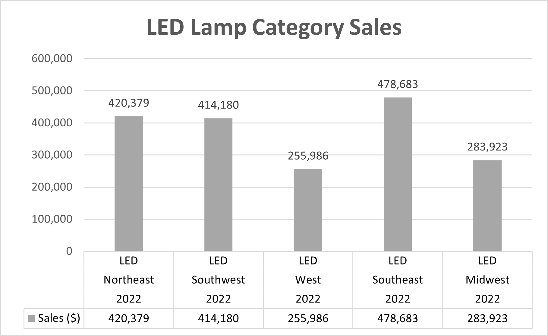
In this example, the horizontal axis represents LED Lamp Sales in different locations in 2022, and the vertical axis represents the number of sales made by each area. The columns show the number of sales for each site, with the height of the column corresponding to the number of sales made. Thus, by comparing the sizes of the columns, it is easy to understand that the location “Southeast” had the most sales ($478,683), and West had the least ($255,986).
2. Bar Chart
A bar chart shows data in horizontal bars, making it easy to compare values between categories. It is also useful for showing changes over time.
In this example, the horizontal axis represents the number of sales made by each area, and the vertical axis represents LED Lamp Sales in different locations 2022. Further, the bars show the number of sales for each region, with the length of the bar corresponding to the number of sales made. Therefore, comparing the bar measurements makes it easy to see which location had the most and the least sales.
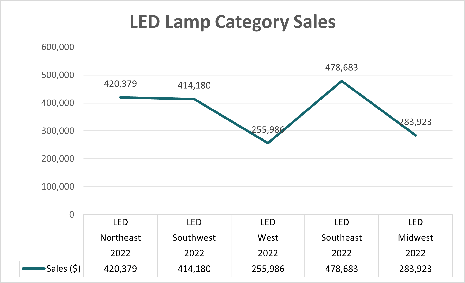
3. Line Chart
A line chart is a powerful tool for visualizing trends and changes over time. It displays data as a series of points connected by straight lines, making it easy to see trends over time. It is also useful for showing changes over time or comparing multiple data sets.
The image below shows an example of a simple line chart:
4. Pie Chart
A pie chart is an easy way to show how each category contributes to the aggregate. Moreover, it is useful for showing data distribution or the relative size of different categories. It displays data as a proportion of a whole, making it easy to see the relative size of each type.
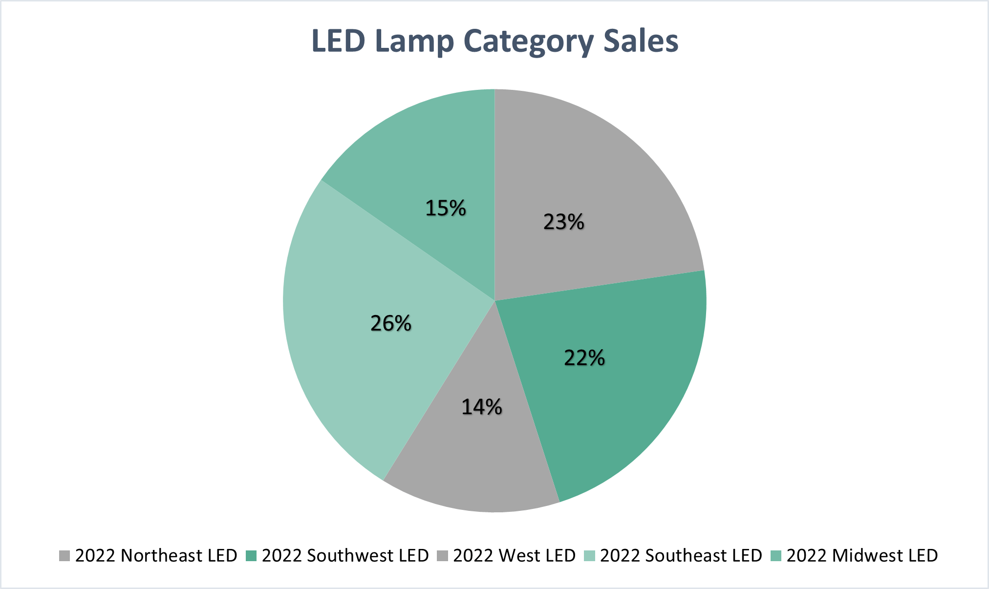
In this example, each slice of the pie represents a different location, and the size of each portion corresponds to the percentage of total sales made by that area. The chart shows that the biggest share of sales comes from the Southeast area, i.e., 26%.
5. Scatter Chart
A scatter chart is useful for visualizing the relationship between two variables. Further, it displays data as a collection of points, with one variable on the vertical axis and another on the horizontal axis. Hence, it is useful for showing the correlation or lack of correlation between two variables.
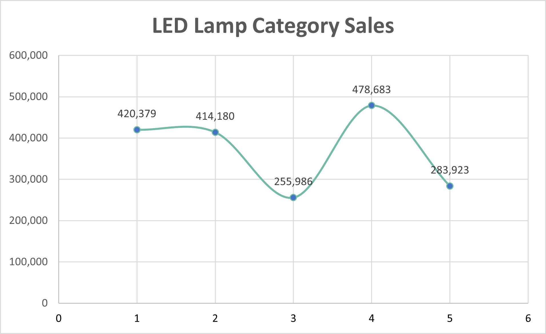
In this example, the scatter chart represents the relationship between LED Lamp sales by different locations in 2022 and the number of sales made by each area. Each point on the graph represents one region, and the position of the point shows the number of sales made by a particular site. Therefore, the chart facilitates the correlation between the aggregate LED Lamp sales and the number of sales in each location.
When to Use it?
You can use comparison charts to visually display and compare various data types, as seen in the table below.
| Type of Data | Examples |
| Financial | Monthly revenue, stock prices, sales figures |
| Academic | Student grades in exams |
| Sports | Performance of sports teams over the years |
| Web Analytics | Monthly website traffic |
| Business | Number of employees for different businesses |
| Technology | Market share of different software over the years |
Things to Remember
- Although there is no “Comparison Chart” chart in Excel, you can create one by adding multiple series under a bar/column chart to achieve a comparison view.
- A comparison chart is best suited for situations where you have different/multiple values against the same/different categories and want a comparative visualization.
- Comparison Charts are also known as Multiple Column Charts or Multiple Bar Charts.
- Although there is no “Comparison Chart” chart in Excel, you can create one by adding multiple series under a bar/column chart to achieve a comparison view.
- Choose the right type of chart for the data you want to display. Also, ensure the data is easy to understand, accurate, and complete.
- Further, use formatting options like labels, legends, and colors to make the chart visually appealing.
- Add a chart title and axis titles to help the audience understand the chart’s purpose.
- Lastly, update your chart regularly to keep it relevant and up-to-date with the latest data.
Recommended Articles
This is our guide to Comparison Chart in Excel. Here are some further articles for expanding understanding:
