Updated August 24, 2023
Stacked Bar Chart in Excel
A stacked bar chart is a type of bar chart used in Excel for the graphical representation of part-to-whole comparison over time. This helps to represent data in a stacked manner. This type of graph is suitable for representing data in different parts and one whole. It picturizes the gradual variation of different variables.
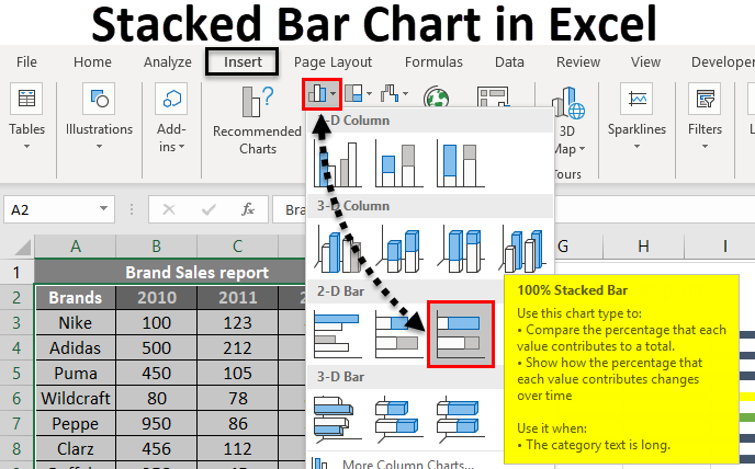
One can implement the stacked bar graph in either 2D or 3D format. From the Insert menu, the chart option will provide different types of charts. The stacked bar chart comes under the bar chart. Two stacked bar charts are available- a stacked bar chart and a 100% stacked bar chart. The stacked bar chart represents the given data directly. Still, a 100% stacked bar chart represents the given data as the percentage of data that contributes to a total volume in a different category.
Various bar charts are available, and the suitable one can select according to the data you want to represent. 2D and 3D stacked bar charts are given below. The 100% stacked bar chart is also available in 2D and 3D styles.
How to Create a Stacked Bar Chart in Excel?
The stacked Bar Chart in Excel is very simple and easy to create. Let us now see how to create a Stacked Bar Chart in Excel with the help of some examples.
Example #1 – Stacked Chart Displayed Graphically
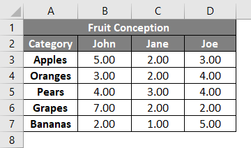
A dietitian gives fruit conception to three different patients. Different fruits and their conception are given below. Since the data consist of three different persons and five different fruits, a stacked bar chart will be suitable to represent the data. Let’s see how this can be graphically represented as a stacked bar chart.
- John, Joe, and Jane are the 3 different patients, and the fruits conception is given below.
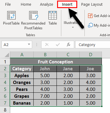
- Select the column Category and 3 patient’s quantity of conception. And select Insert from the menu.
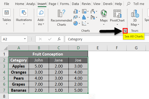
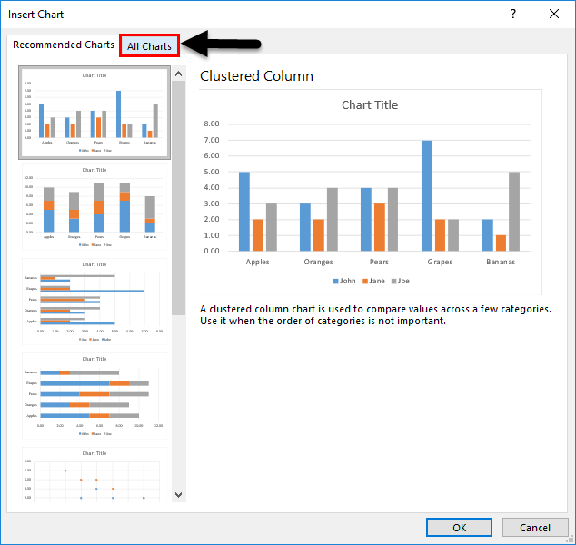
- Select the See All Charts option and get more chart types. Click on the small down arrow icon.
- You will get a new window to select the type of graph. The recommended charts and All Charts tab will be shown. Click on the All Charts tab.
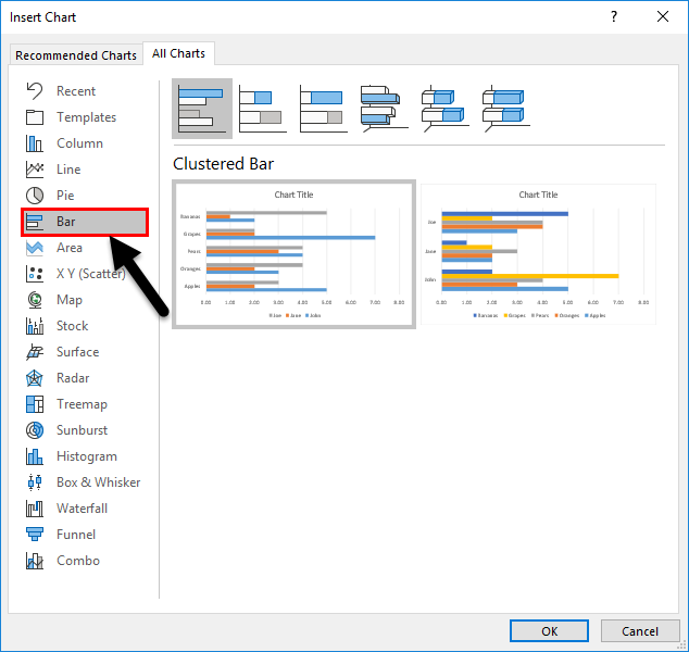
- You can see a different type of graph listed below it. Select the Bar graph since we will create a stacked bar chart.
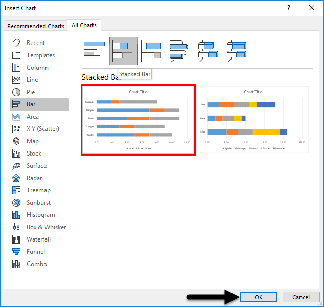
- Select the Stacked Bar graph from the list.
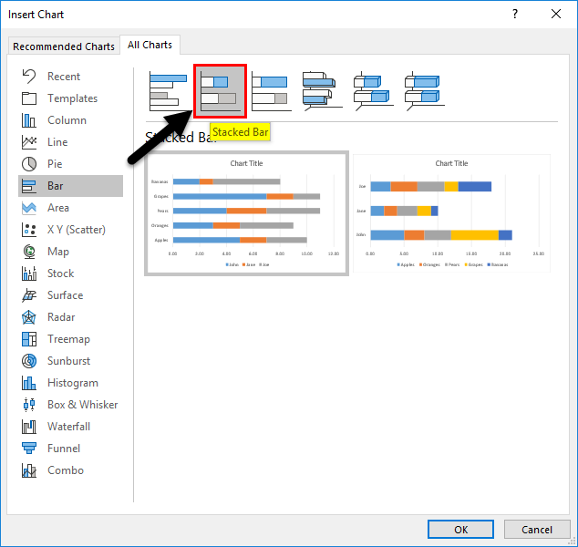
- Below are the two format styles for the stacked bar chart. Click on any one of the given styles. Here we have selected the first one. Press the OK button.
- The graph will insert into the worksheet. And it is given below.
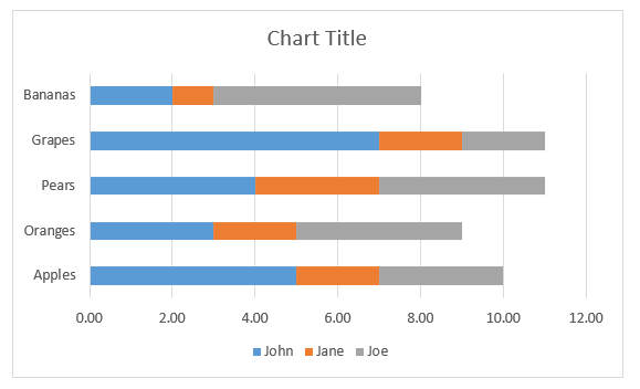
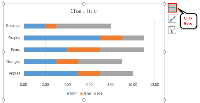
- You can press the “+” symbol next to the chart for more settings. You can insert the axis name, heading, change color, etc.
- The chart will finally look as given below.
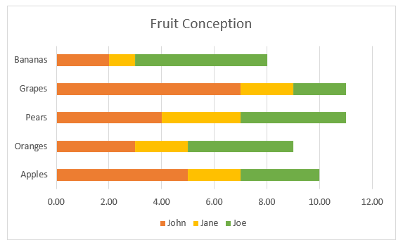
Three different colors represent three persons. The bar next to each fruit shows its conception by different patients. The graph makes it easy to find who used a particular fruit more, who consumes more fruits, and which fruit consumes more apart from the given five.
Example #2 – Create a 3-D Stacked Bar Chart
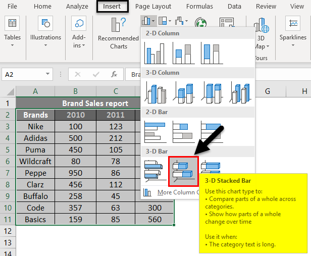
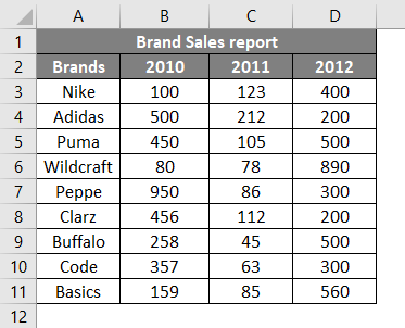
Sales report of different brands is given. Brand names and sales are made for 3 years 2010, 2011, and 2012. Let’s try to create a 3-D stacked bar chart using this.
- Sales done for different brands and years are given below.

- Select the data and go to the chart option from the Insert menu. Click on the bar chart and select a 3-D Stacked Bar chart from the given styles.
- The chart will insert the selected data as below.
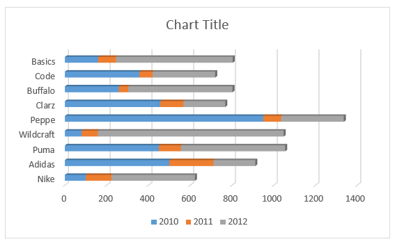
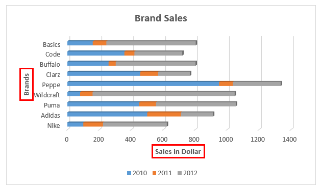
- By clicking on the title, you can change the tile.
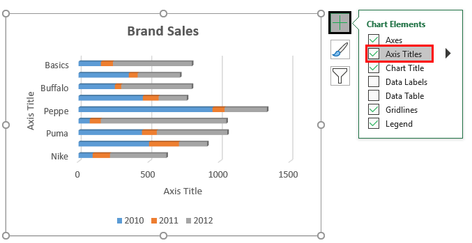
- Use the extra settings to change the color and X, Y-axis names, etc.
- The axis name can be set by clicking on the “+” symbol and selecting Axis Titles.
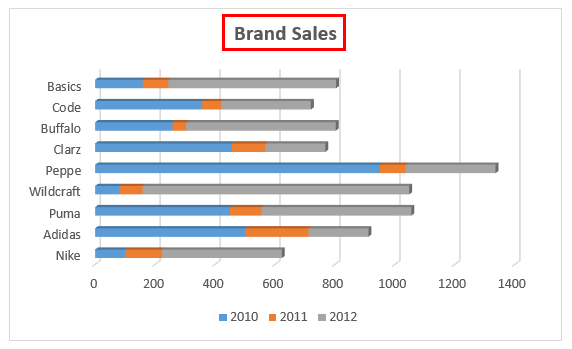
- The chart for the sales report will finally look as below.
The sales in different years are shown in 3 different colors. The bar corresponding to each brand shows sales done for a particular one.
Example #3 – Create a 100% Stacked Bar Chart
In this example, we are trying to graphically represent the same data given above in a 3-D stacked bar chart.
- The data table below shows brand names and sales done for different periods.
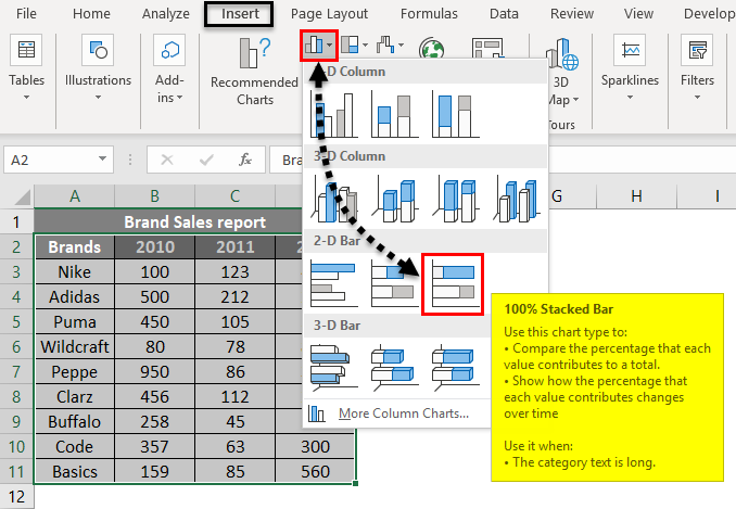
- By selecting the cell from B2: E11, go to the Insert menu. Click on the Chart option. Select the 100% Stacked Bar Chart from 2-D or 3-D style from Bar Charts. Here we have selected the 2-D style.
- The graph will insert into the worksheet. And it is given below.
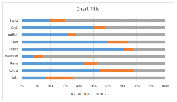
- The color variations can also be set by right-clicking on the inserted graph. The color fill options will be available. The final output will be as below.
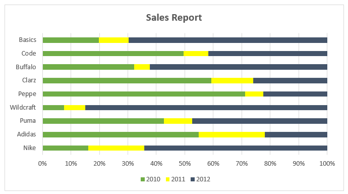
The Y-axis values are given in percentage. And the values are represented in a percentage of 100 as a cumulative.
Things to Remember About Stacked Bar Charts in Excel
- A stacked bar chart can easily represent the data as different parts and cumulated volumes.
- Multiple data of gradual variation of data for a single variable can effectively visualize by this type of graph.
- Stacked bar charts are helpful when you want to compare the total and one part.
- According to the data set, select the suitable graph type.
Recommended Articles
This has been a guide to Stacked Bar Chart in Excel. Here we discuss how to create a Stacked Bar Chart in Excel, Excel examples, and a downloadable Excel template. You may also look at these suggested articles –
