Updated August 24, 2023
Excel Bullet Chart (Table of Contents)
Introduction to Excel Bullet Chart
We all have seen dashboards at some point in time. Whether in our office or while working for different clients with different technologies. We always come up with dashboards. The dashboard’s main challenge is that we have limited space to present all our analytical insights (maybe only one page sometimes). Most of the dashboards consist of visuals that can use to give a simple and crisp idea about things the user. If you have seen any dashboards, you must agree with the statement, “Visuals consume a lot of space as well”. Because of this issue, we have to be very smart while choosing the visuals for the dashboard. Choosing the right, crisp, and compact visual is a need of the dashboard, and this is where bullet charts have the upper hand over other visuals.
Bullet Chart was introduced to this world by one of the dashboard experts, Stephan Few, and since its inclusion, it is one of the widely used charts when you have to measure performance over the target. This chart can be used as a KPI speedometer under the Dashboard and can compare all the necessary KPI values against the target value in a crisp solo chart that consumes less space than the other charts.
We will see through an example how to create a bullet chart in Excel.
How to Create Bullet Chart in Excel?
Let’s understand how to Create a Bullet Chart in Excel with Some Steps. Suppose we have data on Employee Performance, as shown in the screenshot below:
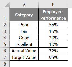
We have segregated employee performance into four categories: Poor, Fair, Good, and Excellent. Of all our employees, 55% have been performing Poorly, 15% are fair performance, 20% performing Well, and 10% are Excellent performers. The actual performance value for one particular employee is 72%, and Target Value for Employee Performance is 95%, which management expects to achieve.
Let’s use this information to create a decent bullet chart under Excel.
There is no direct inclusion of a Bullet Chart under Excel, and hence we need to modify the general bar chart we create. Follow the steps below:
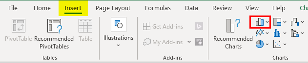
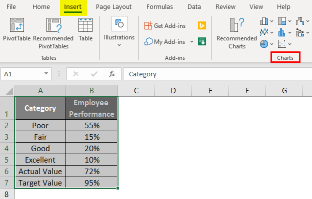
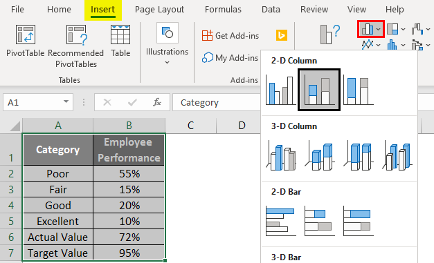
Step 1: Select Data from A1:B7 and click the Insert tab on the Excel ribbon. Navigate towards the Charts group inside the Insert menu.
Step 2: Inside the Charts group, select the Insert Column or Bar Chart dropdown and select the Stacked Column Chart under the 2D-Column Charts section.
You should see a column chart as shown in the screenshot below:
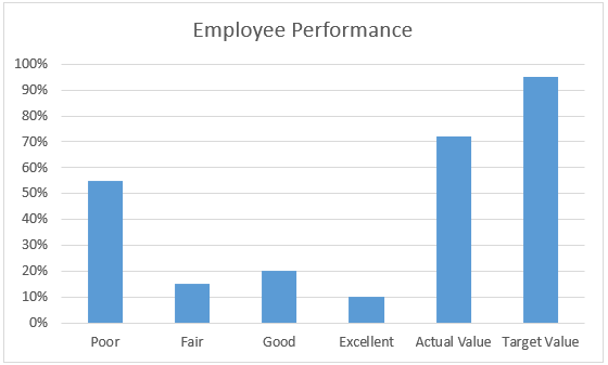
We can see that the chart is plotted with each category as a separate data point. We don’t want it that way. We wanted those categories to be stacked within each other. Therefore, we will follow the step below to make it a stacked bar chart.
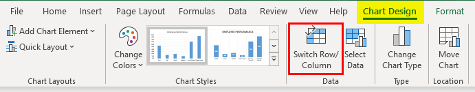
Step 3: Click on the Chart. You will get new tabs active on the Design and Format Excel ribbon as soon as you click them. Navigate to the Design tab and click on Switch Row/Column option under Data Group.
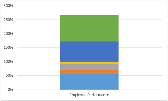
This will switch the data rows and columns, and the graph layout will look like the one below:
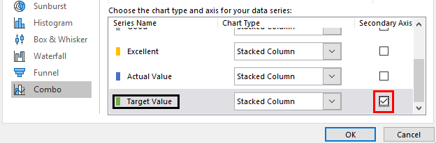
Step 4: Now, right-click on the bar colored in green, which is associated with the Target Value, and select the Change Series Chart Type… option. It will open up a change chart-type window.
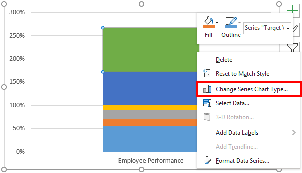
Step 5: Change the Chart Type for Target Value as Stacked Line with Market and tick the Secondary Axis option.
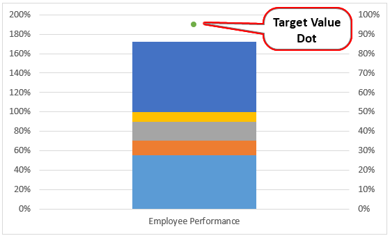
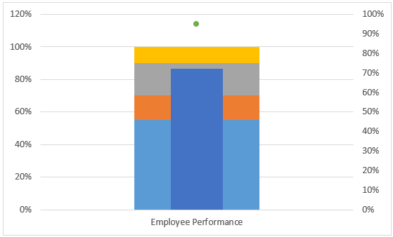
Now you can see a green dot representing the Target Value instead of a bar.
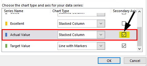
Step 6: Now, right-click the Average Value bar to select the Change Series Chart Type… option.
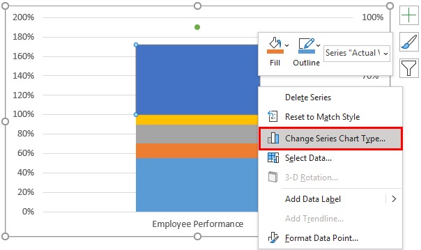
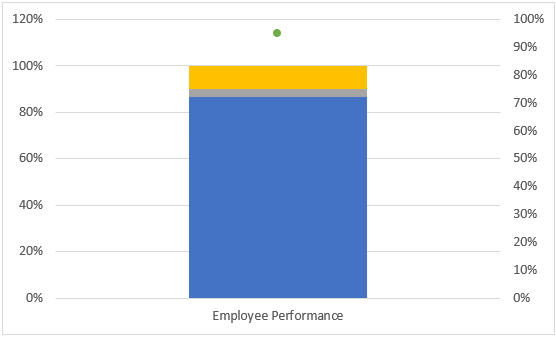
Step 7: On the Change Chart Type window, just check the Secondary Axis box for the Actual Value series as shown below:
You should now see a chart in the below screenshot:
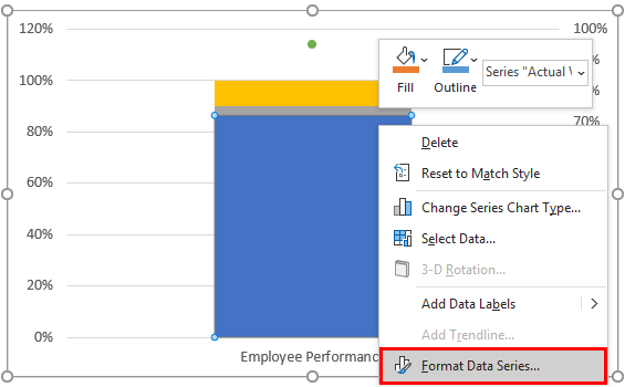
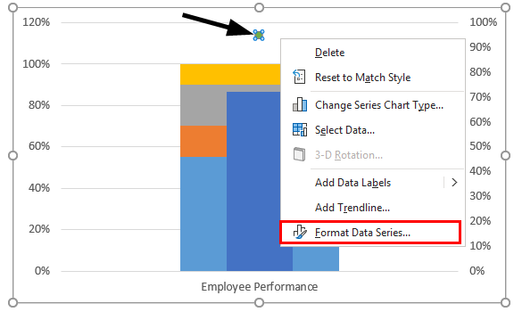
Step 8: Right-click on the Actual Value series’s blue bar and select the Format Data Series option.
Step 9: Under the Format Data Series window at the rightmost corner of the Excel sheet, change the Gap Width to its maximum value (i.e., 500).
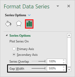
You will see that the Actual Value Series is overlapped under the entire Stacked bar chart, as shown below:
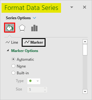
Step 10: Now, select the Target Value dot and right-click on it to select the Format Data Series option.
Step 11: In the Format Data Series pane at the rightmost corner, click on Fill & Line > Marker > Marker Options.
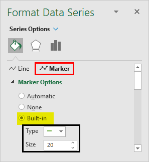
Step 12: Change the Marker Option as Built-in, and inside it, change the Type as dash from the dropdown and make the size 20.
Step 13: Navigate toward the Fill section and change the color to Red instead of Green.
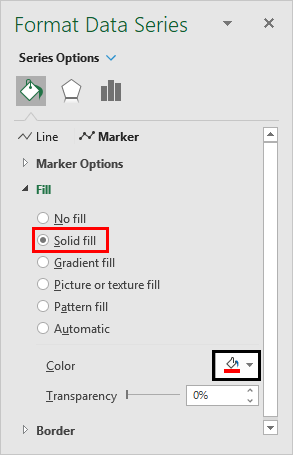
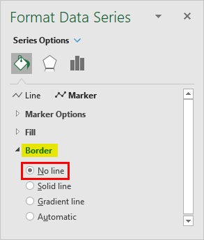
Step 14: Under the Border section, change the border to No Line instead of the preselected called Automatic.
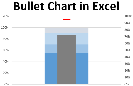
I will change the color for each bar to make it look nicer and more vibrant in this case. The final bullet chart should look like the one below:
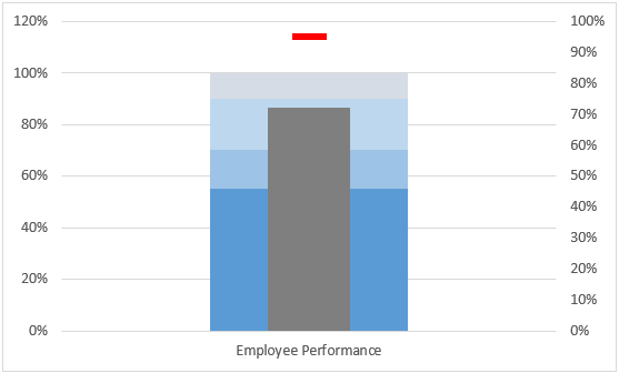
You can add the Chart Title for this chart to make it look nicer. This is by far the Single -KPI bullet chart. Using the same technique, you also can produce a Multi-KPI bullet chart and make it a permanent member of your dashboard instead of the Speedometer, which consumes a lot of space. Just keep an eye on the formatting of the bullets (bars within). We need to have uniformity throughout the chart for different KPI parameters.
This article ends here and lets us wrap the things for this article with some points associated with bullet charts to be remembered.
Things to Remember About Excel Bullet Chart
- Bullet chart is not already present under Microsoft Excel and is just a need of the hour, due to which it came into the picture.
- We need to combine multiple charts (Ex. Stacked Bar Chart, Marker, and Line Chart) to complete the expected bullet chart.
- This chart is a need of hour chart. Since conventional speedometers consume a lot of space while creating a dashboard, this chart was introduced to reduce that space and make the dashboard more compact.
Recommended Articles
This is a guide to Bullet Chart in Excel. Here we discuss How to use Bullet Chart in Excel, practical examples, and a downloadable Excel template. You can also go through our other suggested articles –
