Updated August 24, 2023
Stacked Area Chart
A stacked Area Chart is a type of Area Chart available under the Insert menu tab with the name 100% Stacked Area. This chart shows the actual covered data from the total selected area. For example, we have 3 types of population data for 5 years, which is for Infants, Kids, and Teens, so if we used the Stacked Area Chart here, we would be able to see how much area of the population is covered by each of the categories for each year.
It can represent Ranking, Distribution, Comparisons, Part-to-whole, etc.
A Stacked Column Excel has below components:
- The title (Describes the column)
- The X-axis(For which the data are to be charted)
- Y-axis (Intervals lowest and highest value)
- Bars (Sum of the values)
- Legend (Category of the dataset)
Area charts are primarily used when the magnitude of the trend is to be communicated (rather than individual data values). Data in a stacked area chart is plotted on the x-axis and y-axis; data values are plotted using data points connected using line segments. The area between the line segments and the axes is highlighted by filling it with color to showcase this magnitude.
How to Make Excel Stacked Area Chart?
Excel Stacked Area Chart is very simple and easy to use. Let us now see how to make Excel Stacked Area Chart with the help of some examples.
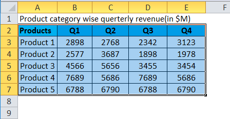
Example #1
Steps to make a stacked area chart in Excel:
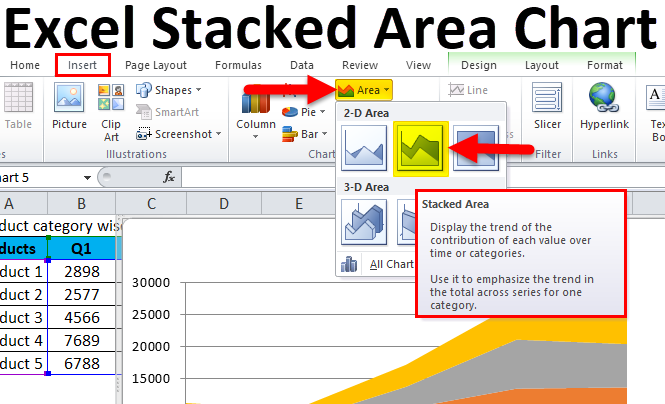
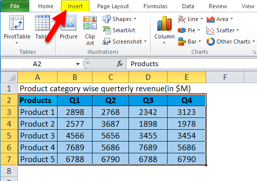
- Select the entire dataset.
- Click the Insert tab.
- In the Chart group, click on the Area Chart icon. Click on Stacked Area under the 2-D Area icon.
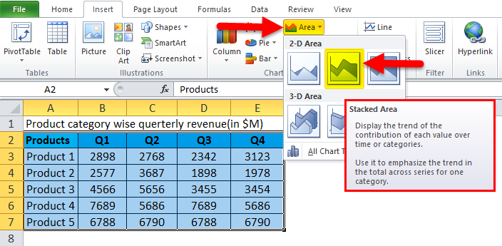
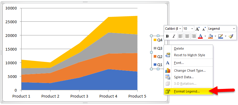
- This will give you an area chart, as shown below.

- Right-click on Legend and select Format Legend.
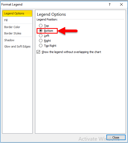
- Go to Legend Options and select Bottom.
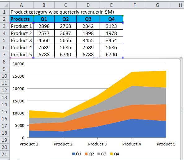
- After that, our Chart looks like this.
- For Adding chart title. We have to click on Layout > Chart Title > Above Chart.

- Our Final Chart looks like this.
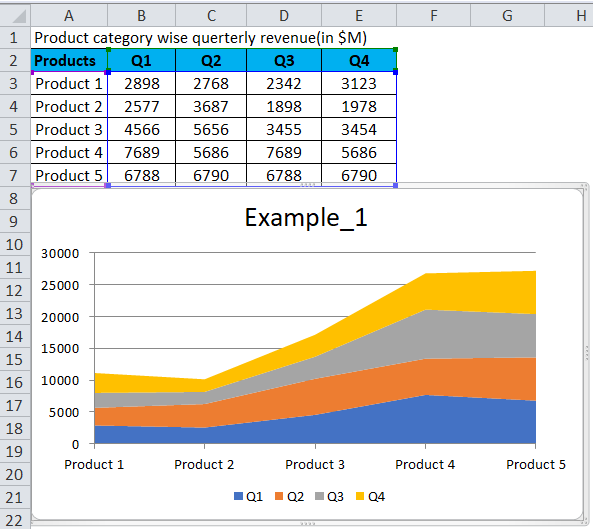
In a glance at this chart, it is easy to summarize the following:
- Product 1: sales are less than the other quarter’s sales.
- Q2: sales slightly dip to the other quarter’s sales.
- Q3: sales show a slight dip from the Q1 sales, and Q3 sales show an increase from the Q2 and Q4 sales.
- Q3: for product 4, sales show significant growth over the other quarter’s sales.
- Q4: Product 5 sales show a slight increase for a product; the Q3 sales show a comparatively higher increase.
Example #2
Steps to make a stacked area in Excel:
- Select the entire dataset.
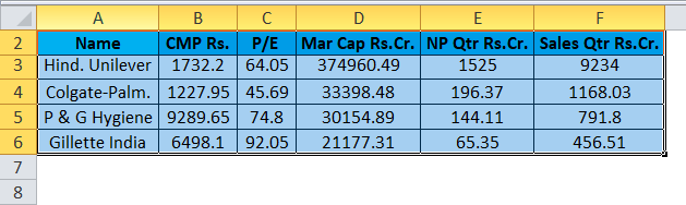
- Click the Insert tab.

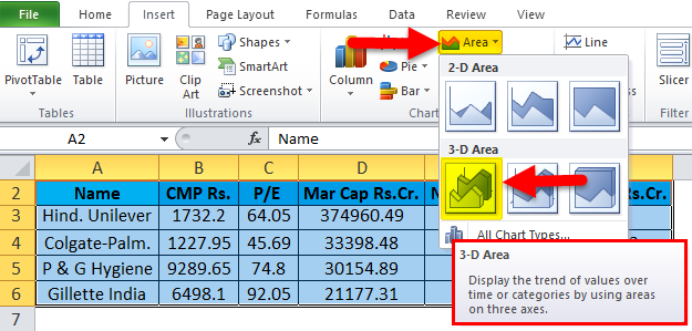
- In the Chart group, click on the Area Chart icon. Click on the 3-D Area icon.
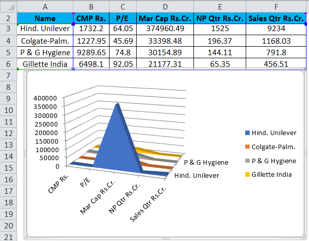
- This will give you an area chart, as shown below.
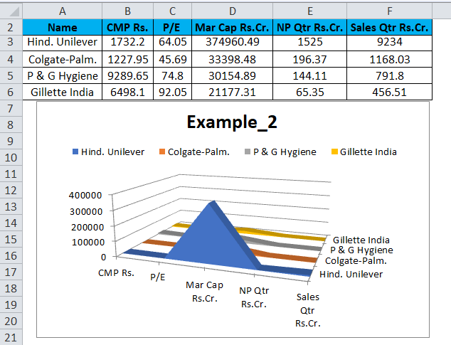
- After adding the chart title and adjusting the legend, as we discussed in the previous example, our chart will look like this.
There is an option to create a chart in 2D and 3D variations. Try them out and choose the one that presents your data in the easiest and clearest style so that it will be easy to be understood data from the chart without putting in less effort.
Information in an area chart is plotted on the x- and y-axis; data values are plotted using data points connected using line segments. Area charts are primarily used when the magnitude of the trend is to be communicated (rather than individual data values). The area between the line segments and the axes is highlighted by filling it with color to showcase this magnitude.
Before we talk about the strengths and limitations of an area chart, we’ll look at the variants of this chart; this will come in handy when we discuss the strengths and limitations.
The area chart can be visualized in two ways:
- Data plots overlap each other.
- Data plots are stacked on top of each other.
Where can we use Excel Stacked Area Chart?
- Re-presentation can be read at a glance.
- Stacked Area Graphs work best when we have multiple data series.
- When we need to point out each data series from the total.
- The entire graph represents the total of all the data plotted.
- It can show part to whole changes over time.
- Stacked Area Graphs also use the areas to convey whole numbers.
- Useful for comparing multiple variables changing over an interval.
- 100% shows how the constituent parts of a whole have changed over time.
- Each area of color represents one part of the whole.
- Best for comparing the sub-segments of results.
Limitation
- A stacked area chart will not work for negative values.
- It may be drawn to the upward and downward slopes of the colored area, but this can be misleading.
- Difficult to add data labels since there is less white space available.
- Area charts can imply more data than available.
- The shapes of the middle series – those not attached to a bottom or top baseline – will be influenced by the values above and below, as well as their own.
- In the case of deep drive Analysis, we cannot go for Excel.
- If there is huge data for different sets, then it will be very complex to understand the chart in a stacked area chart.
Things to Remember About Excel Stacked Area Chart
An area chart’s distinctive feature is the filling between the line segments and the x-axis to emphasize the magnitude. This is generally used when we need to display some changes in time. When rendered with stacked data plots, the area chart serves well for a part-to-whole analysis of each category. Stacked charts help to compare the quantitative values each series brings to the whole category. In the chart with overlapped data plots, the more the number of categories, the more the overlapping, and consequently, the lesser the visibility.
Recommended Articles
This has been a guide to Stacked Area Chart. Here we discuss How to make Excel Stacked Area Chart along with Excel examples and a downloadable Excel template. You may also look at these suggested articles –
