Updated August 24, 2023
Excel Interactive Chart ( Table of Contents)
Introduction to Interactive Chart in Excel
Visualizations in graphical form tell the story better than any other form. But an interactive chart is even better. The interactive chart makes visualization better and more user-friendly. When a user clicks on a value, then the result is shown. For example, if the chart is showing “Sales” on the chart and a user wants to see the “Profit”, then by clicking on the “Profit” shows the “Profit” chart accordingly. In this way, the interactive chart works. Charts can fill with different colors for eye-catching. Every organization needs this chart, and a data analyst works on such charts to make it more interactive and visually friendly. This chart type is mostly used in finance models where a business needs to understand its loss and profits. This type of chart can be plotted in many visualization software, including MS Excel. Charts in Excel is comparatively easier.
Methods to Build an Interactive Chart
Let’s discuss some methods of building an Interactive chart in Excel.
Method #1
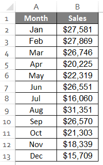
- Plotting a chart needs tabular data. Data is mostly vertically by default. We can convert it into a horizontal form, as shown below. Below is the table.
- The table can copy and paste in transpose form, as shown below.
The data is in the horizontal form now. Below the same, we can create a similar template with sales values as blank.
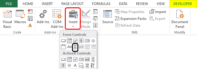
- Now, we can insert a scrollbar by going to Developer options >
We’ll have to draw the scrollbar in this way.
- The next step is to right-click the scrollbar and select “Format options”, as shown below.
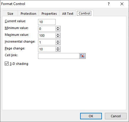
Then we’ll have to choose “Control”, and the window will open.
- The “Maximum value” is to be set at 12 as we have 12 months in the table. Leave the “Current and Minimum value” as 0. “Increment change” should remain 1, as when we click, it should change by 1. Next, the “Page change” should be set to 0. Cell Link is A9 is for us. After all, is set, we can press “Ok”.
- The scrollbar is ready now. When we click the forward button number of times, it will increase by the same number of times, and the result can be seen on cell A9, as shown below.
Similarly, if we press the backward button, we can see that it reduces by 1, and the result is seen in cell A9 accordingly.
- Now in cell B5, we can apply the formula as shown below.
The formula says that the A9 value increases or decreases by 1 when we click the scrollbar. So, we’ll have a value from cell B2, or it will show an error as “#N/A”. The first month is January, written as “>=1”. Similarly, for February, the cell value will be C2, the condition will be $A$9>=2, and the rest will be the same. In this way, all the month’s sales value can be entered. For convenience, we can also drag the cursor till the last month to get the values.
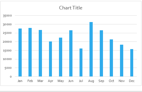
- Now, we can plot a column chart for the table. We’ll first select the table and then go to Insert > Column chart as shown below.
The column chart is ready, as shown below.
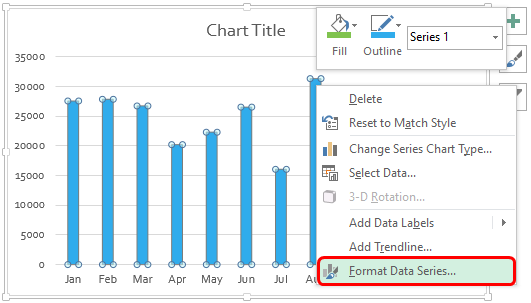
- We’ll now select the points, right-click, and go to “Format data series”, as shown below.
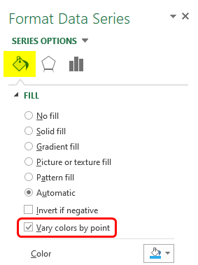
Now we must go to “Fill” and select “Vary colors by point”.
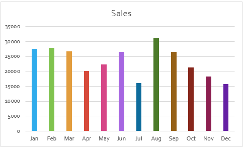
Finally, the chart is a colorful one now.
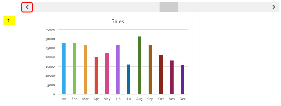
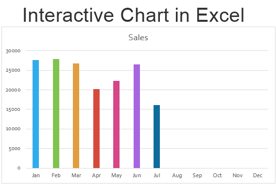
- The value and chart will change when we scroll the scrollbar, as shown below.
If we want the data for 7 months, it will show as above. For convenience, we can hide the original table, i.e., the first two rows. This is one of the methods for interactive charts.
Method #2
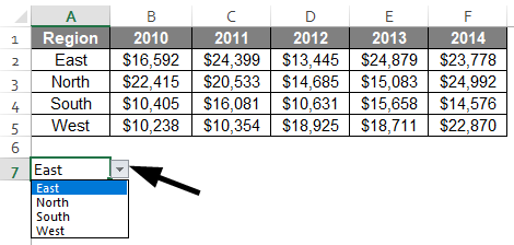
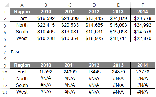
- This is another way to pot an interactive chart. Let us suppose we have region-wise sales data as shown below.
- Now we can simply create a drop-down list for the same by going into developer options as we applied for the scrollbar above.
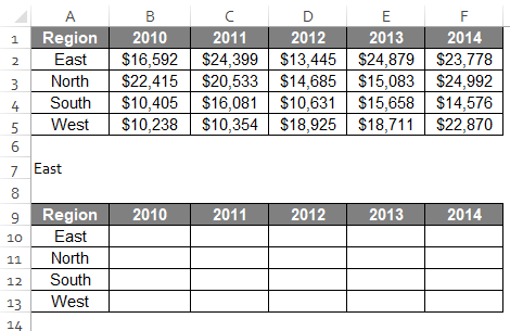
- We can create a duplicate table without numbers just below the drop-down list.
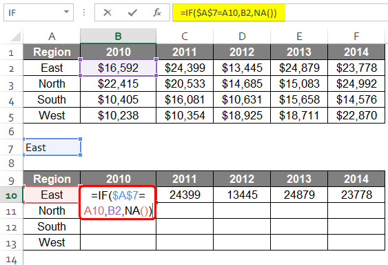
- Now, we can apply the formula on cell B10 as shown below. East has been selected in the drop-down. So the formula says $A$7=A10.
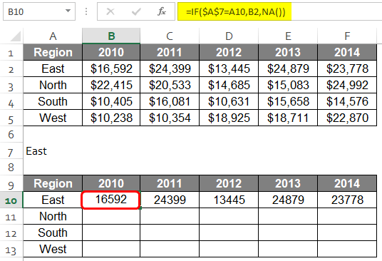
The result is now shown below.
This way, we can enter all the regional sales in the table.
As we have selected the “East” region from the drop-down menu, it only shows the “East” region.
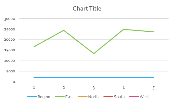
- We can create a line chart for this chart by going to Insert > Line & Area chart and selecting the first one.
Now, the chart is created as shown below.
This chart shows only the “East” region’s data because we have selected “East” from the drop-down menu.
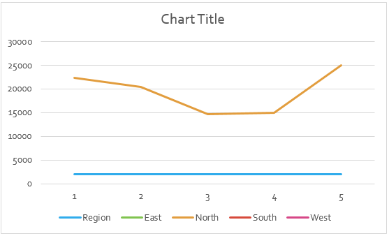
- Similarly, if we select “North” from the drop-down menu, the sales amount of the “North” region will be shown in the chart below.
These are a few ways in which we can plot interactive charts. There are other ways too to plot the same.
Things to Remember
- Advanced Excel skills are a prerequisite.
- Data restructuring and form controls are needed for interactive charts.
- We can make use of pivots and slicers for interactive charts as well.
Recommended Articles
This is a guide to Interactive Chart in Excel. Here we discuss How to create Interactive Chart in Excel, practical examples, and a downloadable Excel template. You can also go through our other suggested articles –
