Updated March 21, 2023
Introduction to CrossTab in Tableau
CrossTab in Tableau is a type of chat that is also known as the text table or pivot table. Cross tab includes one or more measures along with the dimensions for the visualization. It also supports calculated fields for dynamic value representation.CrossTab in Tableau can be used for various types of reports and charts such as sales and profit of a range of products for a particular time period. CrossTab is very meaningful for business users. Some of the best practices to crossTab in Tableau are adding proper naming conventions and forming proper data hierarchy while developing the reports and visualizations.
Tableau by default divides the entire data into two categories
- Dimension: Contains qualitative values Such as Name, Date, Location, etc. They affect the level of detail of your data.
- Measures: Contains the quantitative values / Numeric values. Calculations can be performed on measures.
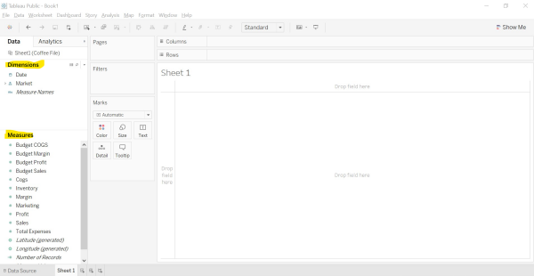
Image – 1 The part which is highlighted in yellow shows the Dimensions and measures.
Problem Statement
Suppose you are the manager of the Restaurant and wanted to prepare for a meeting with the stakeholders who are interested to know about the Restaurant’s performance over the period of time. As a manager, you can display the sales of the products over a period of time or the Profit of the restaurant over the period of time.
Let us progress with building a strong insightful report using Tableau’s Crosstab.
Forming a CrossTab in Tableau
We have the data available with us about the Restaurant. We are going to use the Excel file as our data source. Please find the file attached.
Let us do it together to have a better understanding of the crosstabs/text tables.
Step 1: Connect to the “Microsoft Excel” file.
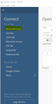
Image – 2 showing the data source to be connected.
Step 2: Select the file from the location where the file exists In this case, we have to select the file ‘Coffee File.xlsx’. The below screen appears once the data is retrieved from the excel sheet.
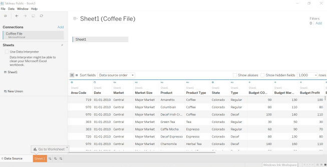
Image – 3 shows Coffee File Data.
Step 3: Open a new worksheet. The top right corner displays the variety of charts available in Tableau. One of them is the Text Table also knows as CrossTab. As highlighted in the box it requires one or more dimensions and one or more measures for forming a text table.
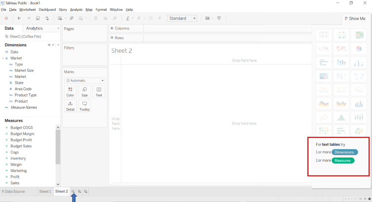
Image – 4 shows along with the required Dimension & Measures for the particular chart type.
Step 4: Drag and drop the dimensions “Product Type” and “Products” in the row shelf.
Step 5: Drag and drop the dimensions “Date” in the column shelf.
Step 6: Drag and drop the measures “Sales” under the Marks Shelf.
The outcome of the above action forms a “Crosstab”.
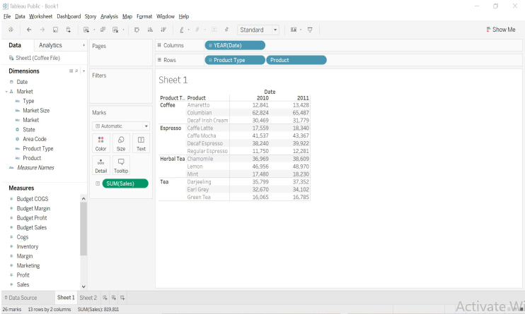
Image – 5 shows the outcome after steps 4,5 and 6.
Step 7: Color-Coded Text Table
Make the chart even more attractive and insightful by adding colors to the measures. Just drag and drop the Measure “Sales” in the color Mark card and your values will be color-coded.
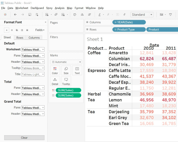
Image – 6 shows the Color Coded Crosstab
The darker shade represents a higher sale while a lighter shade represents a lower sale.
Now your chart has started narrating its own story and this is what you might have aimed for.
Step 8: Row Calculations – As already mentioned, we can also perform calculations on the measures. Follow the below steps.
- Click on the down arrow of the Sales field on the Mark card.
- Chose the Option Add Table Calculation.
- From the calculation type, select the “Percent of total” and selectTable(down) option from “compute using the field”.
- The Chart now shows the percentage of values.
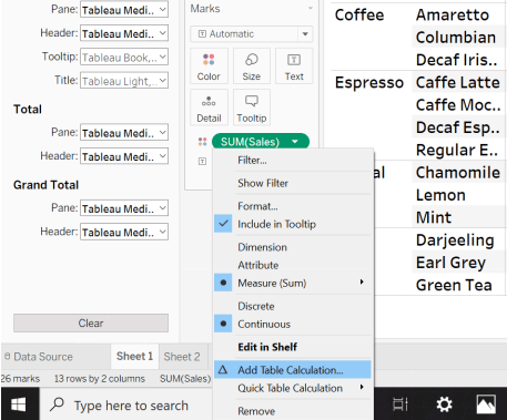
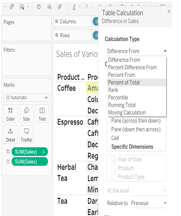
Image – 8
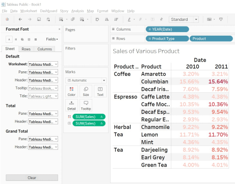
Image – 9
Step 9: We can also form more reports using Profit as a measure and showcase in which the Product has the maximum profit over the given period of time.
Limitation of CrossTab in Tableau
There is some limitation in CrossTab in Tableau:
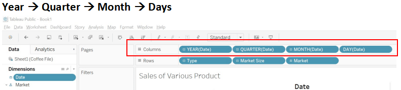
1. Fixed Rows & Columns: By default, we have Six rows and columns in tableau. You can increase the number of rows and columns to a maximum of 16 by following the below-mentioned steps.
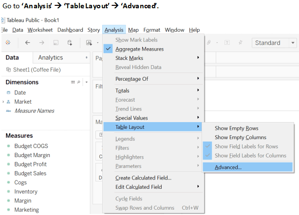
Image – 10 resize the number of Rows and Columns.
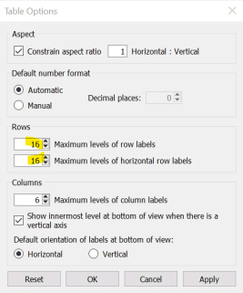
Image – 11 shows rows and columns size.
2. Difficult Interpretation: The Crosstab is the representation of data in a textual form which is comparatively little difficult to interpret than the other graphical forms of representation. You need to focus on reading and comparing the numbers for deriving any pattern or insights.
Where to Use the CrossTab in Tableau?
It is mostly preferred in the area where you want to display the relationship between two or more dimensions.
Good Practices while working with Tableau
- Naming convention: Give the valid name to everything from your Data source sheet or SQL query to your worksheet, Dashboard, or Story. Following this practice from the very beginning will help you in the long run while building a huge dashboard having multiple sheets as well as data sources.
- Form Hierarchy: Spend the initial few minutes just looking at the data and see if we can form any kind of hierarchies. In the case of Coffee File Data Product type and Product can form a Hierarchy. Also, Market Size, Market, state and Area Code can for another hierarchy
Conclusion
Crosstab /Text Table because of its high resemblance with the Pivot table of excel is also known as Pivot tables. Crosstab being one of the most basic and popularly used forms of the chart in tableau. Adding the color and calculation can enhance the storytelling experience with your data.
Recommended Articles
This is a guide to CrossTab in Tableau. Here we discuss the problem statement, where to use and the formation of crosstab with its limitation. You may also look at the following articles to learn more-
