Updated July 28, 2023

Introduction to Forecast in Tableau
Forecasting in general means predicting the value for a measure for the future period. The prediction can be for a certain number of coming days, months, or years. The process of forecasting is a mathematical process that involves multiple elements. For forecasting, the measure is represented as a series of values over the period. The different values of the measure are present at different points of time and when visualized they appear as a time series. Tableau offers correct predictions using forecasting that employs the exponential smoothening technique. Along with predictions, Tableau also offers insights into the forecasts generated that enable detailed analysis.
Creating Forecasts in Tableau
Now, we will see the step-by-step process to create a forecast in Tableau. Our data source for this demonstration is month-wise revenue data for the years 2000 to 2011. There is a dimension Year and a measure of Revenue.
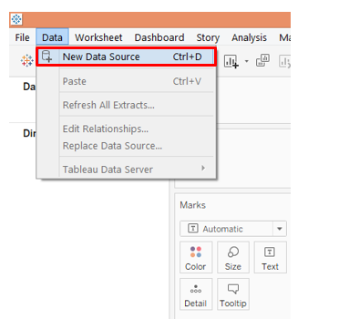
1. Load the data source into Tableau. Click on “New Data Source” under the “Data” tab.
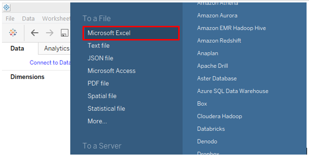
Click on the appropriate data source type as in the below screenshot, as our data source consists of Microsoft Excel file, we will click on “Microsoft Excel”.
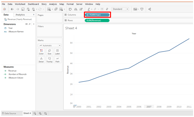
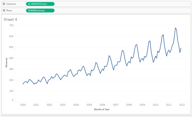
2. Once the data source is loaded, drag the Year dimension into the Columns region and Revenue measure into Rows region. The line chart gets generated as below.
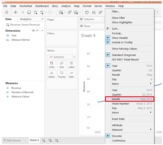
3. As can be seen above, the Year function has got applied over the dimension Year. We want the chart to be displayed month-wise. So we will select the Month function from the dimension drop-down menu as below.
4. Once we select Month, we get a proper line chart that correctly displays the time series. The times series for Revenue shows that it has an increasing trend and also the seasonality component is there.
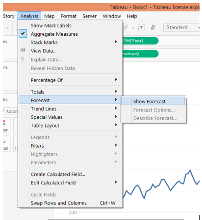
5. To generate the forecast, go to the “Analysis” menu. In the “Forecast” option, click on “Show Forecast”. Following screenshot illustrates this.
6. Following the above steps will create a forecast as below. Forecast measure gets created applied over Color in the Marks card. On the right side, the Forecast Indicator can be seen. There are two indicators Actual and Estimate. The actual indicator is the point prediction while in the case of Estimate lower and upper bounds are calculated by the algorithm based on the confidence interval e.g. 95%, 90%, etc.
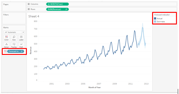
7. As can be seen in the above screenshot, forecasts appear for the next months. The Actual is represented as a dark line, while the Estimate appears in the form of blue shade around the Actual forecast. To explore various aspects pertaining to forecast, we will go through the below steps:
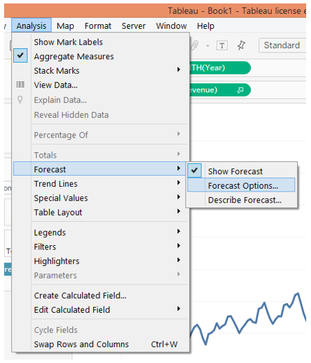
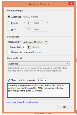
8. In the Forecast option, click on “Forecast Options…”. It will pop-up the Forecast Option dialogue box as below. There are various sections and options under those sections in the dialogue box. We shall see them one-by-one.
In the “Forecast Length” section, “Automatic” is by default selected. It generates a forecast for the next 12 months. “Exactly” allows us to extend the forecast for the specified number of time units, and “Until” extends the forecast to the specified point in the future. The two options Exactly and Until should be experimented by passing different values. Whenever the forecasts are generated, the description under “Show prediction” interval changes.
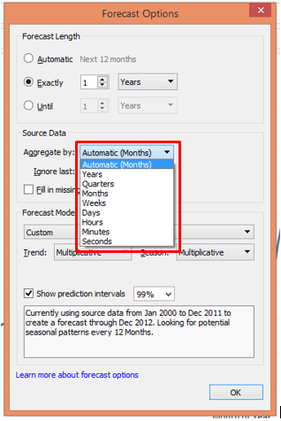
In the Source Data section, there is an option, Aggregate by followed by a drop-down menu. We can aggregate by Years, Quarters, Months, Weeks Days, Hours, Minutes, and Seconds.
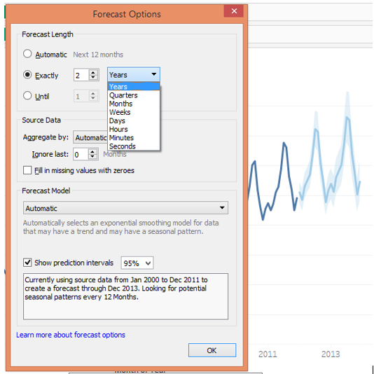
As the above screenshot shows, selecting 2 in Exactly has generated forecasts for the next two years. Also, the description has changed. Remember in Exactly and Until we can select the Forecast length for any unit of time from Years to Seconds.
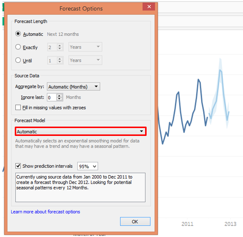
Coming to the next i.e. “Forecast Model”, it can be seen in the following screenshot that it has three options viz. Automatic, Automatic with Seasonality and Custom.
- In the Automatic option, Tableau itself selects the appropriate model taking into consideration trend and seasonality components
- In the “Automatic without Seasonality” option, the Seasonality component is ignored though it may be present in the time series. It may give wrong results.
- The custom option allows the user to select Trend and Seasonality components.
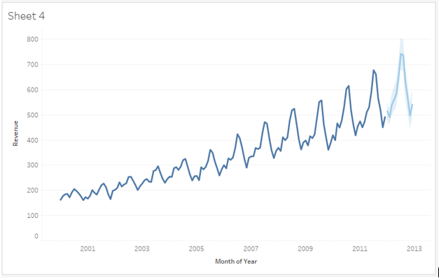
As seen above, when the Automatic option is selected, we get the correct forecast
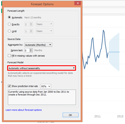
As seen in the above screenshot, when we selected the “Automatic without seasonality” option, the forecast went wrong. Because the seasonality component is actually present in the time series and we have deliberately ignored it. This option is not suitable in this case.
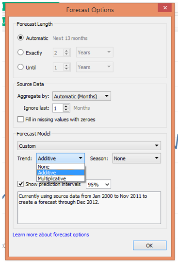
As seen above, the Custom option allows us to specify “Trend” and “Season” options. In both, there are further three options viz. None, Additive and Multiplicative. If we look at the time series, we can see that it has an increasing trend. Moreover, with time, the peaks are getting bigger and bigger that showing the amplitude of the seasonality component is increasing. So, this is a multiplicative time series in which the components multiply. Hence, we select in both Trend and Season sections, “Multiplicative”.
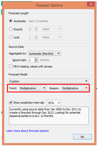
As we can see above, this is much the same forecast that the “Automatic” option in the “Forecast Model” gave us.
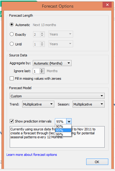
9. The above screenshot throws light on prediction intervals. It means with what percentage of confidence we want the algorithm to determine forecast values.
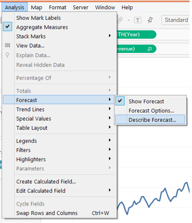
10. The very important part after generating a forecast is to understand the results. For that click on “Describe Forecast” as shown above.
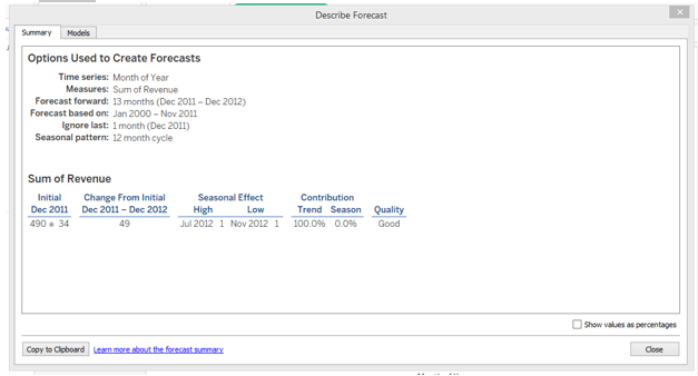
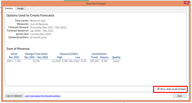
“Describe Forecast” gives us detailed insight into the forecast. Click on the Summary tab to view the summary of the forecast as shown above. The summary shows that the Quality of the model is “Good”. We can also view the summary in percentage form as shown below.
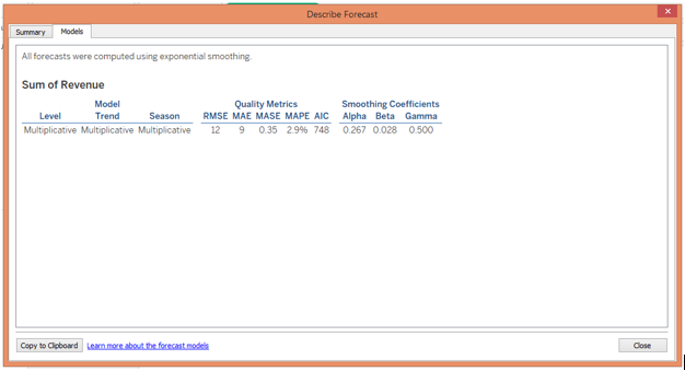
- Click on the “Model” tab, it will give insight into various technical components of the mathematical model.
Conclusion
Time series modeling a technique for forecasting is widely used in predictive analytics. Forecasting doesn’t mean deriving exact values but it essentially means obtaining possible accurate values. Tableau employs a powerful exponential smoothening technique that assigns more weight to the values located closest to the prediction period and calculates the forecast. Tableau allows us to change the options pertaining to forecasts as required, and also offers a summary of the results like it gives values of metrics Root Mean Square Error, Mean Absolute Error, Mean Absolute Squared Error, Mean Absolute Percentage Error, and Akaike Information Criterion, and smoothening coefficients alpha, beta and gamma.
Recommended Articles
This is a guide to Forecast in Tableau. Here we discuss the basic concepts with a step-by-step process to create a forecast in Tableau with given snapshots. You may also look at the following article to learn more –
