Updated May 24, 2023
Introduction to Histogram in Tableau
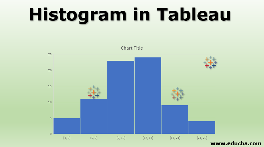
A histogram is a visualization tool that plots the frequency distribution for a variable. It resembles a bar graph except that unlike the bar graph, which requires two variables, the histogram requires only one variable. It creates bins that represent ranges and calculates the number of occurrences of variable values in those ranges. The frequency of a bin determines the height of the bar for the bin. Histograms are pretty popular in field studies as they offer quick insights into a frequency distribution. In statistical terms, a histogram is a potent tool as it helps understand the distribution of a variable and validate the normality assumptions.
Creating Histogram in Tableau
Now, we’ll see how to build an insightful histogram in Tableau. For the demonstration, we are considering annual sales by region data. It contains daily sales for one year by region for four different regions. East, West, North, and South. We intend to analyze the sales performance in these regions using a histogram. Let’s proceed with a step-by-step approach as below.
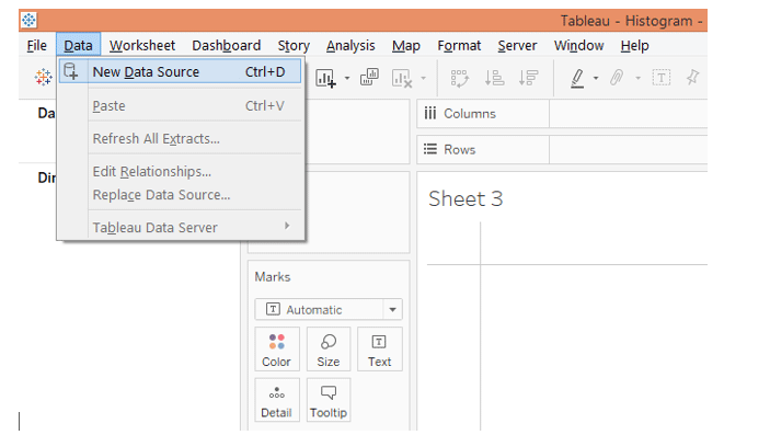
1. Load the data into Tableau. Click “New Data Source” in the Data menu for that. Alternatively, click on “Connect to Data.”
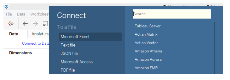
2. In “Connect,” click on the requisite data source type. In this case, the data source type is Microsoft Excel, so click over it.
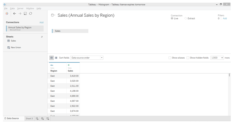
3. The data gets loaded and can be seen in the “Data Source” tab below.
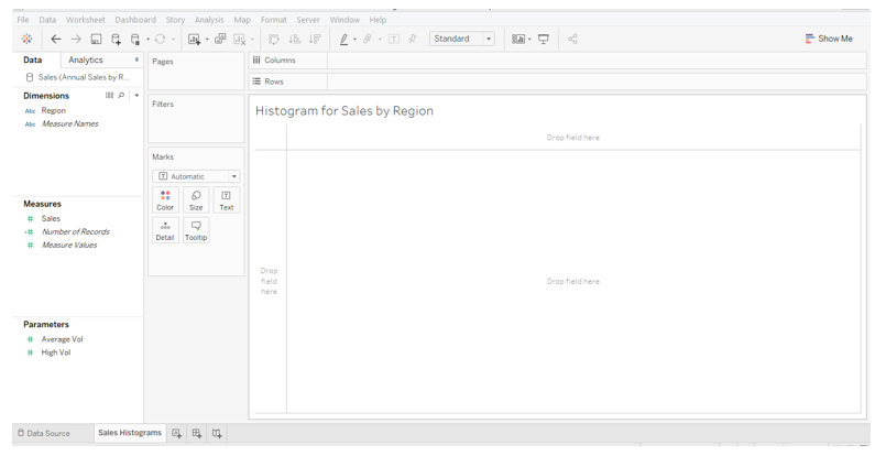
 4. Moving to the sheet tab, we can see the dimension Region and measure Sales in the respective sections.
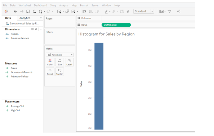
5. Now, drag measure Sales into the Rows region. We get a single bar for measuring Sales, as shown below. The bar, as such, doesn’t offer any insight.
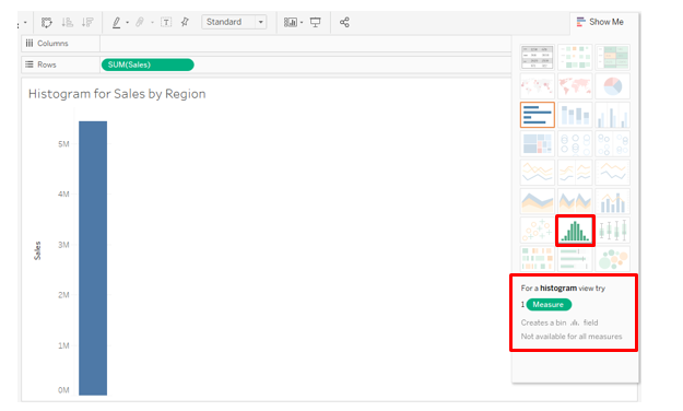
6. To create a histogram on measure Sales, click on the histogram in Show Me as illustrated below. Hovering mouse over the histogram symbol gives us the detail that it requires only a single measure.
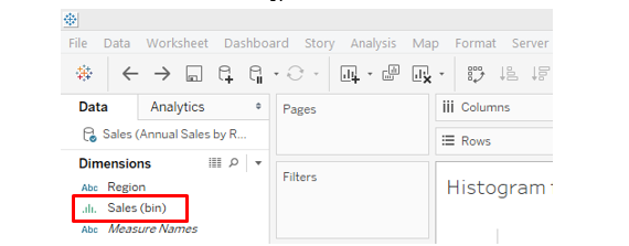
7. Following the above steps results in the histogram, shown in the screenshot below. We also see an automatically created dimension Sales (bin), which will be used as a bin for histogram creation.
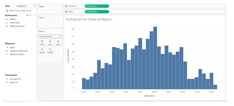
8. The following screenshot shows the automatically created dimension Sales (bin) highlighted.
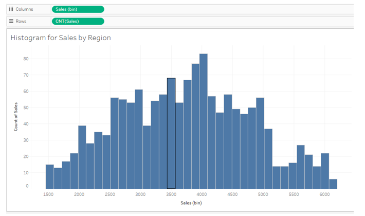
9. The following screenshot gives a closer look into the visualization. The histogram is for all four regions. In the Columns region, we have dimension Sales (bin); in the Rows region, automatically CNT, i.e., Count function, got applied over measure Sales. CNT function counts the number of values of measured Sales in a bin. Our goal is to obtain four different histograms for four other regions.
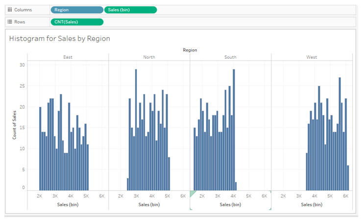
10. To have histograms by region, drag the dimension Region into the Column region as shown below, and we get four different histograms for four regions. However, the following visualization is crude. We will refine it by distinguishing the regions by different colors and setting proper ranges for the horizontal axis of each region. Let’s see how we accomplish that.
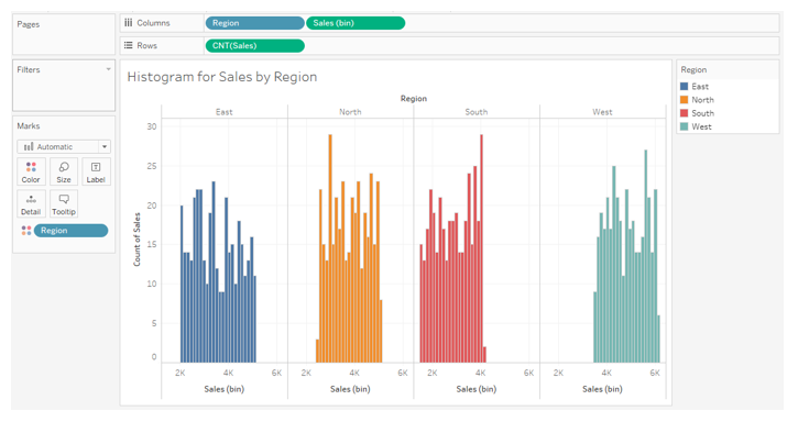
11. Drag Region over Color in Marks card as shown in the below screenshot. We can see four regions represented by four different colors that help us visualize and distinguish between them better.
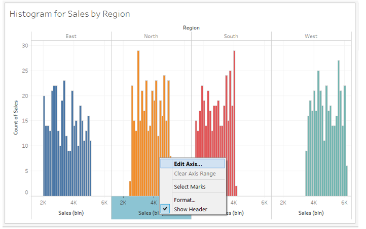
12. The following screenshot gives a closer look into the histograms. Now, we want to have different horizontal axis ranges for other regions. This is essential as the four regions have the same horizontal axis range. If, for a region, no values are present for a range, then the histogram gets pushed either to the left or right, which gives the visualization an awkward appearance, as can be seen below for the South and West regions. To have different axis ranges for different dimension (Region) values, i.e., right-click on the horizontal axis as shown in the screenshot below and click “Edit Axis…”.
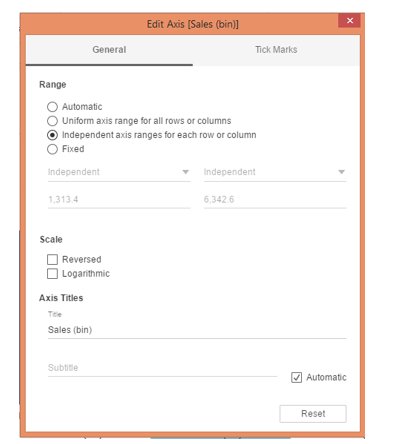
13. Clicking on “Edit Axis…” generates the dialogue box, as seen below. In the “Range” section, the default selection is “Automatic,” which keeps the same range for all the dimension values. Select “Independent axis ranges for each row or column,” as shown below. This option will create different horizontal axis ranges for dimension (Region) values. So, it essentially establishes the range based on the lowest and highest value of the measure for that dimension, which is used in histogram creation.
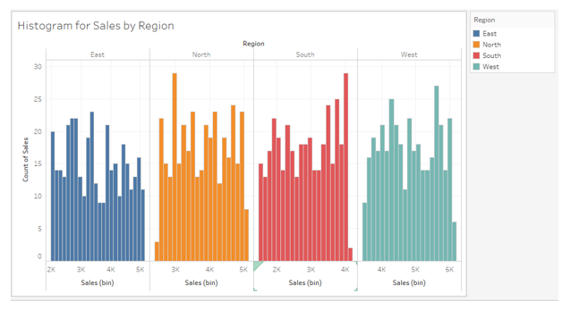
14. As we can see in the screenshot below, following the above procedure has set different ranges for each region. Unlike the earlier visualization, the histograms are now properly centered along the horizontal axis.
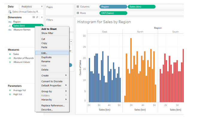
15. If we study the histograms, we can see that many bins have been created. It means the range of values for bin creation is small. Remember, the smaller the size of the bin, the more the number of bins, and vice versa. Tableau automatically selects bin size before creating the histogram. However, we can manually specify the bin range. This we can do by clicking on the dropdown menu of dimension Sales (bin) and selecting “Edit…”.
16. Once we click on “Edit…” as mentioned above, the Edit Bins [Sales] dialogue box pops up. Here, we can see that the default size of the bin considered is 132. In the screenshot after the below one, we can see that bin size can be specified manually or through a parameter.
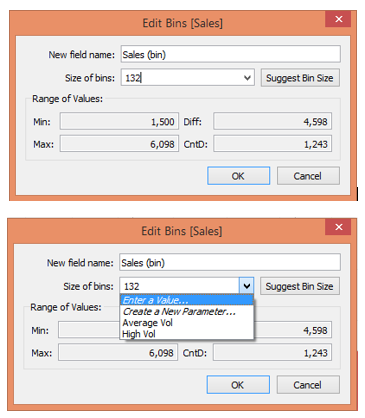
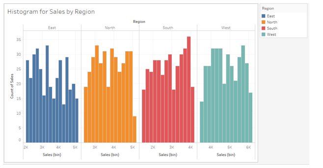
17. We specified the value of 200 in the “Size of bins” option in the above dialogue box. As can be seen below, we got histograms with a lesser number of bins as compared to the earlier version. Having too many bins may not always be helpful for insight derivation.
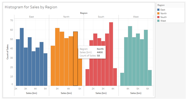
18. The following screenshot shows histograms with a bin size of 400. Hovering the mouse over any bin gives details about the bin.
Conclusion
An essential and powerful tool for exploratory analysis, a histogram is commonly used for variable distribution analysis. Tableau is a user-friendly visual analytics tool for creating and analyzing histograms. In a way, Tableau offers a self-guided approach to creating histograms by providing valuable tips to the user. However, certain intricacies must be understood. These are usually related to specific visualization settings, which must be modified to obtain more insightful results. Moreover, histograms must be created considering the context and conveying valuable insights.
Recommended Articles
This is a guide to the Histogram in Tableau. Here we discuss the introduction and creation of a Histogram in Tableau. You can also go through our other suggested articles to learn more–
