EDUCBA

EDUCBA

MENUMENU
  • Explore
    • Lifetime Membership
    • All in One Bundles
    • Fresh Entries
    • Finance
    • Data Science
    • Programming and Dev
    • Excel
    • Marketing
    • HR
    • PDP
    • VFX and Design
    • Project Management
    • Exam Prep
    • All Courses
  • Blog
  • Enterprise
  • Free Courses
  • Log in
  • Sign up
Home Excel Excel Resources Excel Charts Excel Clustered Bar Chart

Excel Clustered Bar Chart

Jeevan A Y
Article byJeevan A Y
Madhuri Thakur
Reviewed byMadhuri Thakur

Updated June 12, 2023

Clustered Bar Chart Excel

Excel Clustered Bar Chart (Tables of Contents)

Start Your Free Excel Course

Excel functions, formula, charts, formatting creating excel dashboard & others

  • What is Clustered Bar Chart in Excel?
  • Types of Bar Chart in Excel
  • How to Create Clustered Bar Chart in Excel?

Clustered Bar Chart in Excel

Clustered Bar Chart in Excel is shown as horizontal bars parallel to X-Axis, also used for comparing the values across different categories. We can access It from the Insert menu under the Charts section in the Bar Chart Section, available in both 2D and 3D types of charts. To create Clustered Bar, we must have 2 values for a one-parameter to compare those values before and after or in a different time frame.

The below image shows the difference between the COLUMN & BAR charts.

difference between clustered column and bar chart

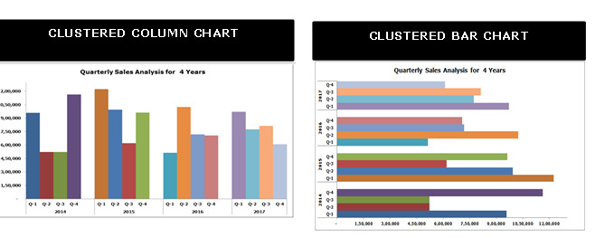
The main difference is showing the values horizontally and vertically at an interchanged axis.

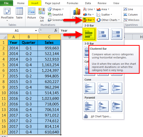
Types of Bar Charts in Excel

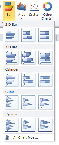
A total of 5 types of bar charts available in Excel 2010.

  • 2-D Bar and 2-D stacked Bar chart
  • 3-D Bar and 3-d stacked Bar chart
  • Cylinder Bar chart
  • Cone Bar chart
  • Pyramid Bar chart

Types of BAR Chart

How to Create a Clustered Bar Chart in Excel?

It is very simple and easy to use. Let us now see how to create a Clustered Bar Chart with the help of some examples.

You can download this Clustered Bar Chart Excel Template here – Clustered Bar Chart Excel Template

Example #1

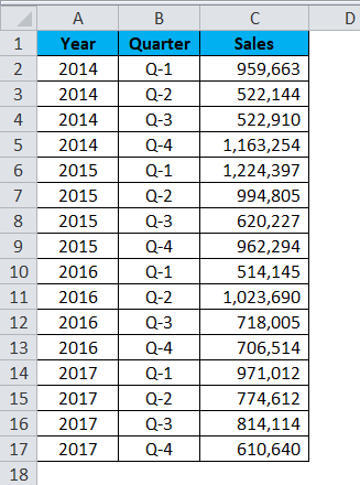
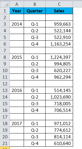
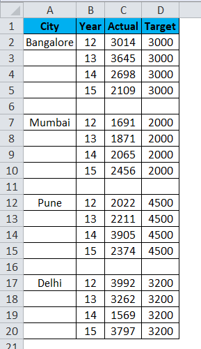
In this example, I have 4 years of data with a break-up each quarter each year.

Step 1: The dataset should look like this.

Clustered Bar Chart Example 1-1

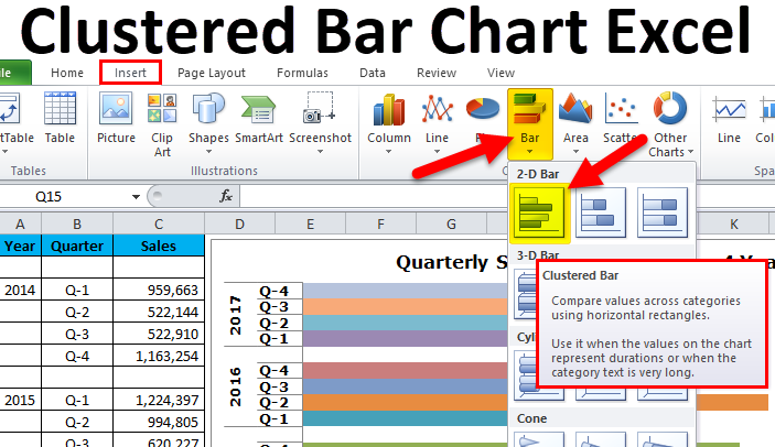
Step 2: Select Data > Go to Insert > Bar Chart > Clustered Bar Chart. 

Clustered Bar Chart Example 1-2

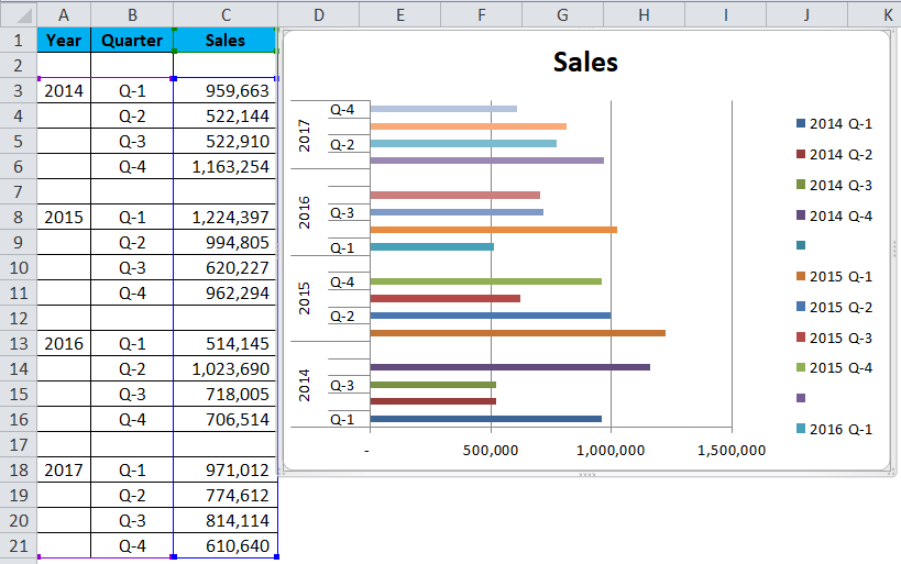
As soon as you insert the chart, it will look like this.

Clustered Bar Chart Example 1-3

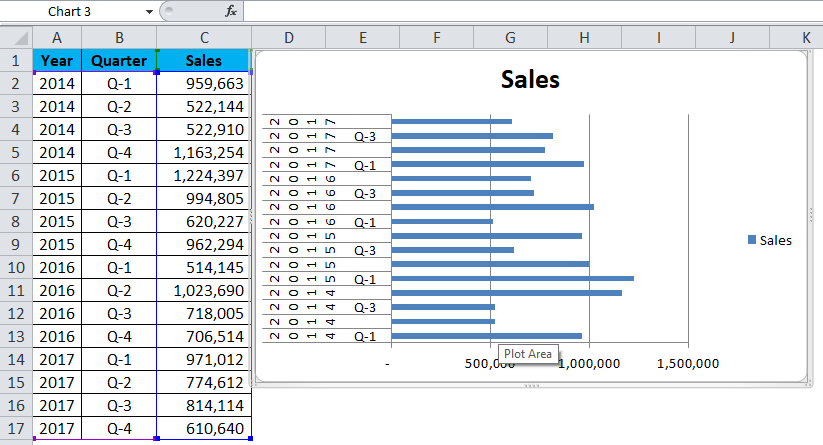
Oh! This looks ugly, man. We need to beautify it.

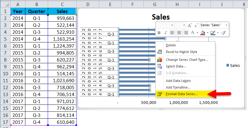
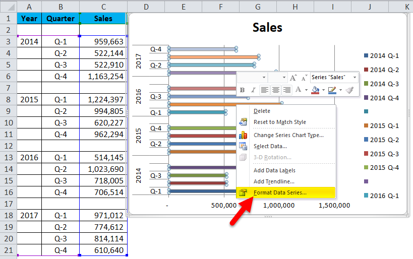
Step 3: Right-click on the bar and select format data series.

Clustered Bar Chart Example 1-4

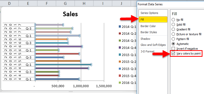
Go to fill and select Vary colors by point.

Clustered Bar Chart Example 1-5

Step 4: As of now, it looks better than the previous one. We need to format our vertical axis. We need to rearrange the data as shown in the below image.

Clustered Bar Chart Example 1-6

Step 5: Once the data has been rearranged, your chart looks like this.

Clustered Bar Chart Example 1-7

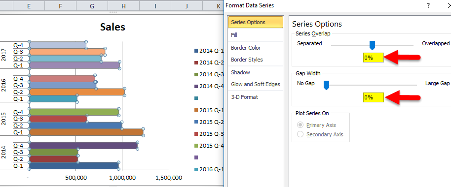
Step 6: Right-click on the bar and select format data series.

Clustered Bar Chart Example 1-8

Make the Gap Width 0%. Series Overlap to 0%.

Clustered Bar Chart Example 1-9

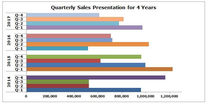
Ok, our clustered bar chart is ready, and we can just read the numbers from the graph itself.

Interpretation of the Chart:

  • Q1 of 2015 is the highest sales period, generating revenue of more than 12 lakhs.
  • Q1 of 2016 is the lowest point in revenue generation. That particular quarter generated only 5.14 lakhs.
  • In 2014 after a dismal show in Q2 & Q3, there was a steep rise in revenue. Currently, this quarter’s revenue is the second-highest revenue period.

Our final looks like this.

Clustered Bar Chart Example 1-10

Example #2

I am using Target vs Actual data for this example.

Step 1: Arrange the data in the below format.

Clustered Bar Chart Example 2-1

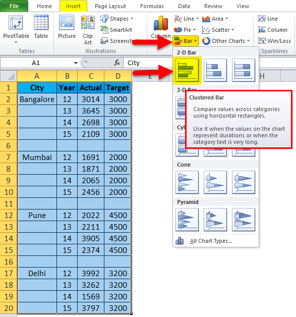
Step 2: Insert the chart from the insert section. Go to Bar Chart and then select Clustered Bar Chart. 

CBC Example 2-2

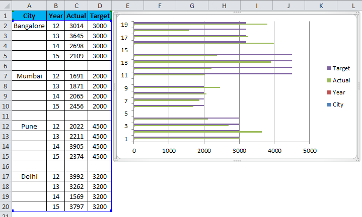
Initially, your chart looks like this.

CBC Example 2-3

Do the formatting by following the below steps.

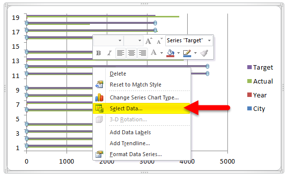
  • Right-click on the chart and choose Select Data.

CBC Example 2-4

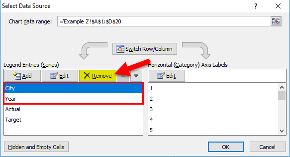
  • Remove City & Year from the list.

CBC Example 2-5

  • Click on the EDIT option.

CBC Example 2-6

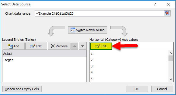
  • And select City & Year for this series.

CBC Example 2-7

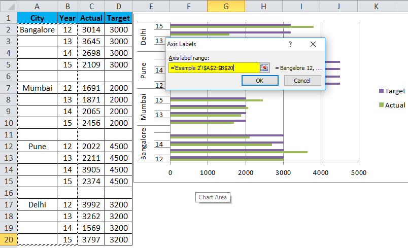
  • So now, your chart will look like this.

CBC Example 2-8

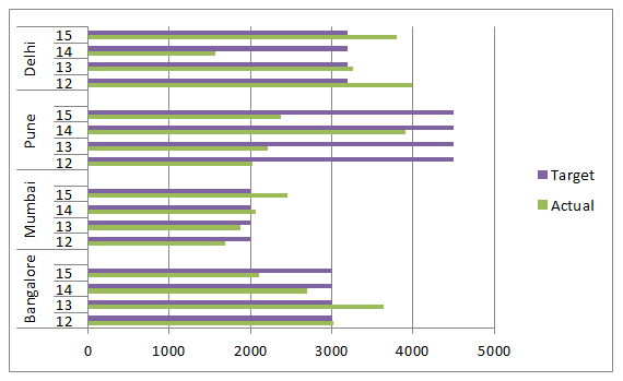
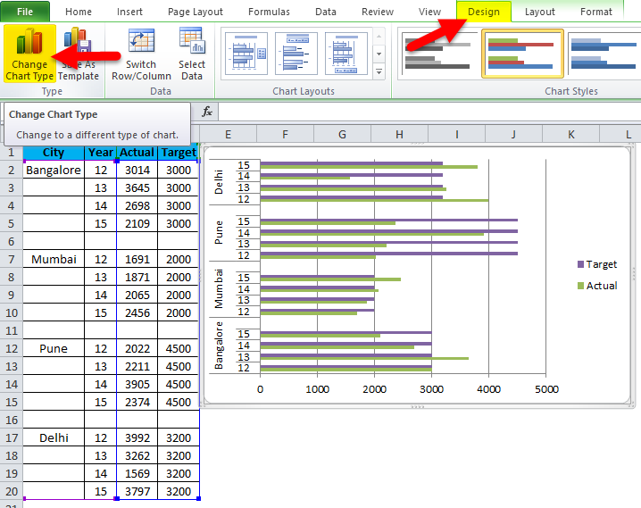
  • Apply to formate as we did in the previous one, and your chart looks like this. Change the chart type for the Target series to present better. Select the target bar, go-to design, and click on Change Chart Type.

CBC Example 2-9

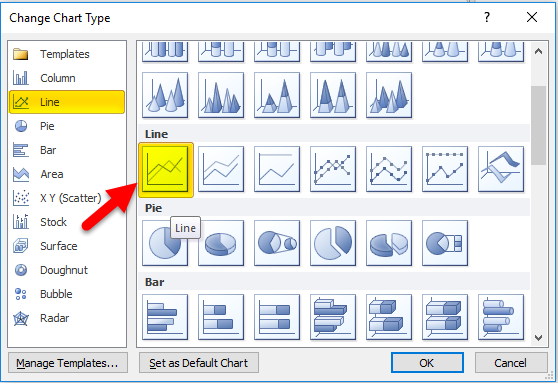
  • And select the Line Chart.

CBC Example 2-10

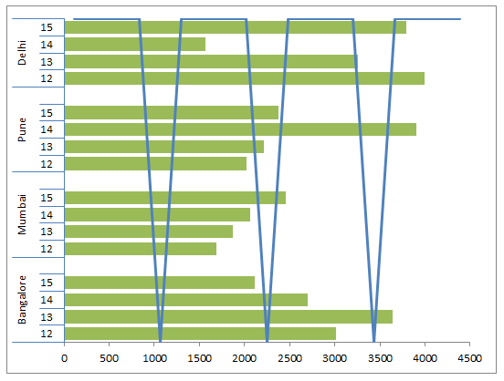
  • So our chart is ready to convey the message now, and it looks like this.

CBC Example 2-11

Advantages

  • Easy to make and understand.
  • We can compare the multiple categories subcategories easily.
  • We can spot the changes very easily.
  • Very useful if the data categories are small.

Disadvantages

  • It creates confusion if the data is too large.
  • There are chances of overlapping many subseries.
  • I May not be able to fit everything in one chart.

Things to Remember

  • Arrange the data before creating a Clustered Bar Chart.
  • If the data is too large, choose a different chart.
  • Avoid 3D effects.
  • Construct the chart carefully so that it will not overlap with other categories.

Recommended Articles

This has been a guide to Clustered Bar Charts. Here we discuss its types and how to create Excel Clustered Bar Chart, Excel examples, and a downloadable Excel template. You may also look at these useful charts in Excel –

  1. VBA Charts
  2. Grouped Bar Chart
  3. Excel Stacked Column Chart
  4. Excel Bar Chart
ADVERTISEMENT
All in One Excel VBA Bundle
500+ Hours of HD Videos
15 Learning Paths
120+ Courses
Verifiable Certificate of Completion
Lifetime Access
ADVERTISEMENT
Financial Analyst Masters Training Program
2000+ Hours of HD Videos
43 Learning Paths
550+ Courses
Verifiable Certificate of Completion
Lifetime Access
ADVERTISEMENT
All in One Data Science Bundle
2000+ Hour of HD Videos
80 Learning Paths
400+ Courses
Verifiable Certificate of Completion
Lifetime Access
ADVERTISEMENT
All in One Software Development Bundle
5000+ Hours of HD Videos
149 Learning Paths
1050+ Courses
Verifiable Certificate of Completion
Lifetime Access
Primary Sidebar
Footer
About Us
  • Blog
  • Who is EDUCBA?
  • Sign Up
  • Live Classes
  • Certificate from Top Institutions
  • Contact Us
  • Verifiable Certificate
  • Reviews
  • Terms and Conditions
  • Privacy Policy
  •  
Apps
  • iPhone & iPad
  • Android
Resources
  • Free Courses
  • Excel Charts
  • Excel Tips
  • All Tutorials
Certification Courses
  • All Courses
  • Excel VBA Course - All in One Bundle
  • VBA Course
  • Excel Data Analysis Course
  • Excel for Marketing Course
  • Excel for Finance Course
  • Excel for HR Training

ISO 10004:2018 & ISO 9001:2015 Certified

© 2023 - EDUCBA. ALL RIGHTS RESERVED. THE CERTIFICATION NAMES ARE THE TRADEMARKS OF THEIR RESPECTIVE OWNERS.

EDUCBA

*Please provide your correct email id. Login details for this Free course will be emailed to you

EDUCBA

Download Clustered Bar Chart Excel Template

Let’s Get Started

By signing up, you agree to our Terms of Use and Privacy Policy.

EDUCBA
Free Excel Course

Excel functions, formula, charts, formatting creating excel dashboard & others

By continuing above step, you agree to our Terms of Use and Privacy Policy.
*Please provide your correct email id. Login details for this Free course will be emailed to you

EDUCBA

*Please provide your correct email id. Login details for this Free course will be emailed to you
EDUCBA

*Please provide your correct email id. Login details for this Free course will be emailed to you
EDUCBA Login

Forgot Password?

EDUCBA

Download Clustered Bar Chart Excel Template

EDUCBA

डाउनलोड Clustered Bar Chart Excel Template

This website or its third-party tools use cookies, which are necessary to its functioning and required to achieve the purposes illustrated in the cookie policy. By closing this banner, scrolling this page, clicking a link or continuing to browse otherwise, you agree to our Privacy Policy

Loading . . .
Quiz
Question:

Answer:

Quiz Result
Total QuestionsCorrect AnswersWrong AnswersPercentage

Explore 1000+ varieties of Mock tests View more

🚀 Extended Cyber Monday Price Drop! All in One Universal Bundle (3700+ Courses) @ 🎁 90% OFF - Ends in ENROLL NOW