Updated August 24, 2023
Stacked Column Chart in Excel
A stacked Column Chart in Excel is used when for a single time period; we want to show the data with the coverage of each parameter over the same period, which is available in the Insert menu tab. For example, we have six months of sales data for Mobile, Laptop, and TV. Using the Stacked Column Chart, we can show the coverage of all 3 products in a single column for each six-month data. This saves space, and the chart created using this type also looks compact.
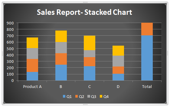
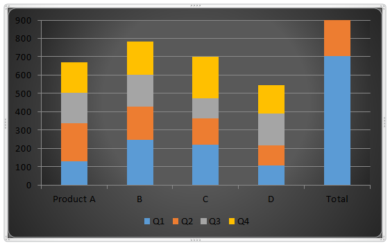
The stacked chart represents the sales of products in different quarters.
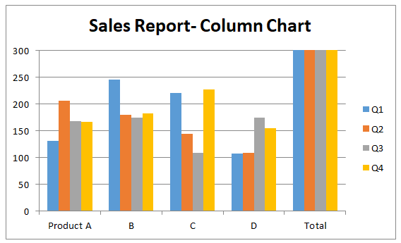
A column chart that only represents the sales of a different product but not allows us to easily know the share of different products in the total sales.
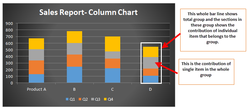
Stacked column charts are those chart options that allow a user to combine one group’s data and then show that data in different segments that correspond to different sections amongst the same group. Stacked charts make the column charts one on another, and the charts that are prepared as stacked are like fixing one bar chart on another.
How to Create a Stacked Column Chart in Excel?
Creating a stacked column chart is not as difficult as it seems; it involves only some clicks, and you will be done creating it.
Stacked Column Chart in Excel Example #1
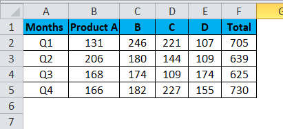
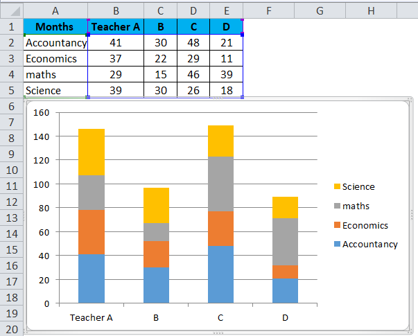
Let’s consider a case in which the company sold four types of products in a year, and we have data on the sales of these products.
Now we want to know what type of product has contributed what percentage to the total sales. We can use a stacked column chart.
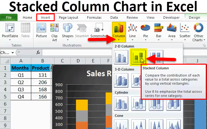
Step 1: Firstly, enter the data for which you want to create a stacked column chart and select the data.
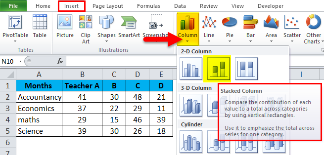
Step 2: Then go to the toolbar tab. Here, you can see the “insert” option.
Click on Insert and then click on column chart options as shown below.
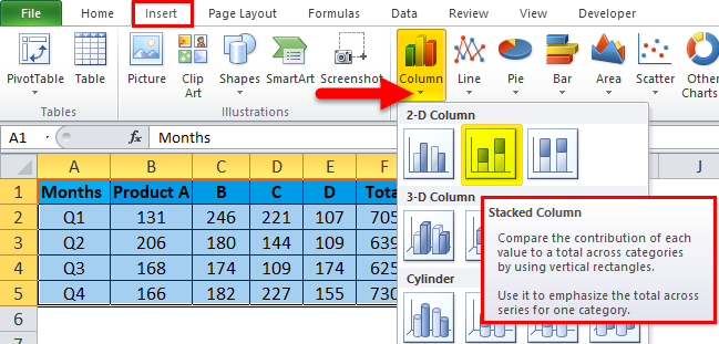
You will see several options in Column chart options; choose the stacked column stack option to create stacked column charts.
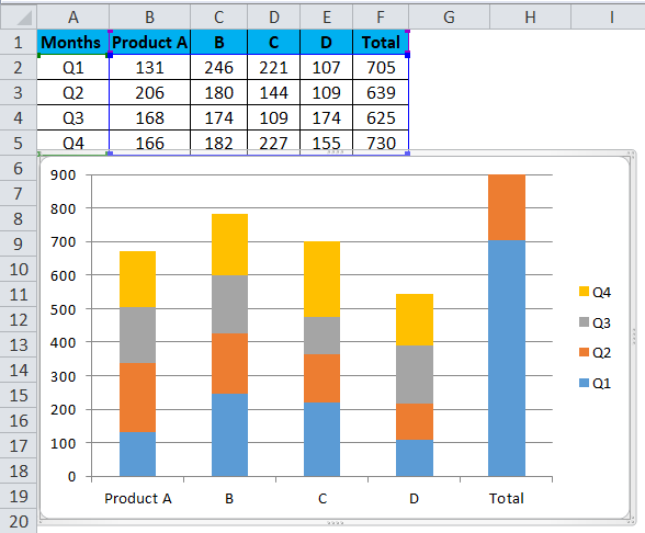
Step 3: After selecting the above data and a stacked column chart. You can see the below chart.
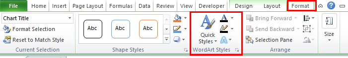
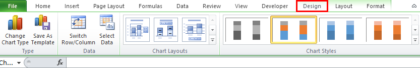
Step 4: Use the DESIGN option to make the chart more presentable.
Click on the Format option and choose the font that suits the chart.
Step 5:
By this step, a stacked column chart is already prepared, but by using this step, we can add life to the old spreadsheet charts and make them look different.
- Add chart elements
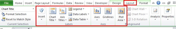
In the chart elements, we can add all the above-listed elements in our stacked column chart, adding more information to the usually stacked charts.
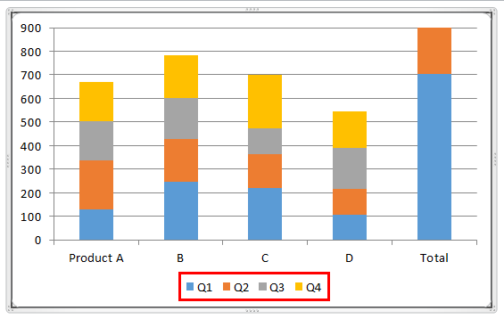
Here one of the chart elements, such as legend, is used. Click on legend. Select the legend at the bottom.

Now the Legend will look at the bottom of our Chart.
- Quick layouts.
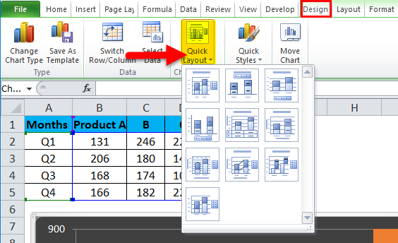
If we are confused about what elements should be in our stacked column chart, this option will be of utmost use. In this option, we can simply hover on the icons in the quick layout elements and see what elements are inserted by these options.
- Change colors
Sometimes this becomes important that color plays an important role in the graphs, especially if the data belongs to the paint industry.
Right-click on the Chart Select Format Chart Area.
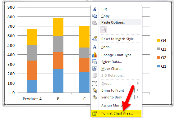
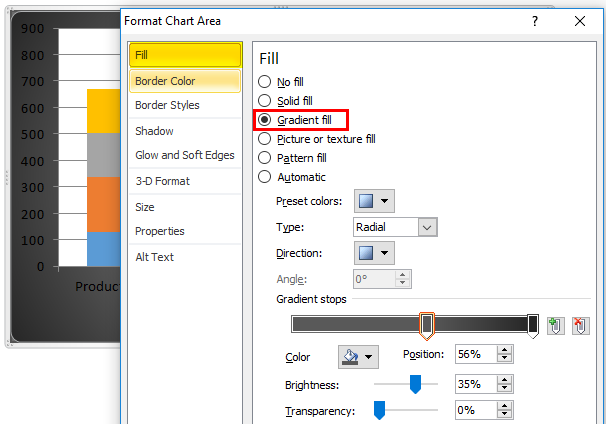
By Selecting Format Chart Area, go to Fill> Gradient Fill. Select your color.
To change the Color of the Plot Area, Right-click on Format Plot Area.
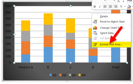
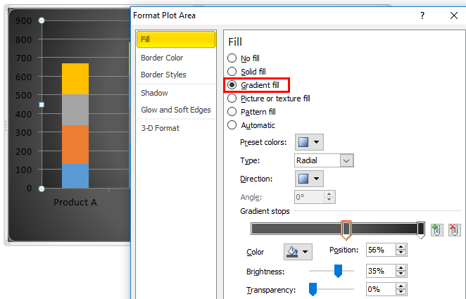
Select fill> Gradient Fill and Select your color.
Using the change color option, we can simply change the chart’s theme and choose more comfortable colors for our stacked column chart.
To add the Chart title go to Layout>Chart title>select the Above chart.
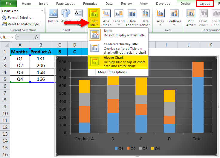
A chart tile is added to the above chart.
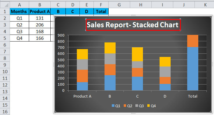
Finally, the Stacked Column Chart looks like this.
Stacked Column Chart in Excel Example #2
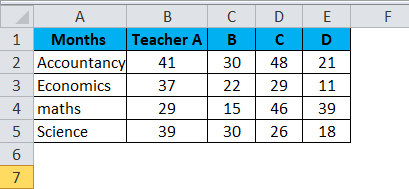
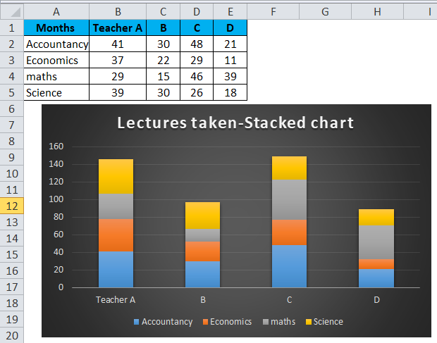
Suppose now we have a case of a college where we want to know how many lectures are taken by which lecturer. In this case, we use a stacked column chart.
Then go to the toolbar tab; here, you can see the “insert” option.
Click on Insert and then click on column chart options as shown below.
You can see the chart below after selecting the data mentioned above and selecting a stacked column chart.
Follow the steps as per the above Example, i.e., Example 1, to get the desired Stacked Column Chart.
Pros of Using Stacked Column Chart in Excel
- They help in easily knowing the contribution of a factor to the group.
- They are easy to understand.
- Easy to visualize results on bar graphs.
- Easy to depict the difference between the various inputs of the same group.
Cons of Using Stacked Column Chart in Excel
- These charts do not give good results regarding deeper data analysis.
- Stakeholders find assembled column charts useful only when small segments are in a group. If many inputs belong to the same group, the stacked column chart will be very congested, making the analysis difficult.
- Overlapping of data labels in some cases is seen in that the labels overlap each other, making the data difficult to interpret.
Things to Remember
- You can only prepare a stacked column chart in Excel if you have more than 1 data to represent in a bar chart. If we have only one data to be displayed, then we can only make a Bar chart and not a stacked column chart.
- Each column in the bar represents only the data that belongs to that group. Suppose we have to show the data of two product sales in Q1, then the bar will represent the data of product A, and the same bar will have the data of Product B.
- Only one data from one row can represent in the bar chart of the stacked column charts.
Recommended Articles
This has been a guide to Stacked Column Charts in Excel. We discuss its uses and how to create Stacked Column Chart in Excel with Excel examples and downloadable Excel templates. You may also look at these useful functions in Excel –
