Updated May 20, 2023

Grouped Bar Chart (Table of Contents)
Introduction to Grouped Bar Chart
A clustered bar chart is generally known as a grouped bar chart. This is a type of bar chart or column chart. More than a bar chart, this helps to represent data of comparison in more than one category. Where the bar chart draws the relation of two parameters, this can consider the higher version of the bar chart. A grouped chart is a group of bar charts or multiset bar charts. Instead of a single bar, you can see multiple bars in this chart. A single bar chart is easy to apply where it does not require any formatted data to form a chart. But you need the data to be organized or arranged for creating a group chart.
How to Create a Grouped Bar Chart?
We will learn how to create a Grouped Bar Chart. Let’s look at a few examples.
Example #1 – Creating Grouped Bar Chart
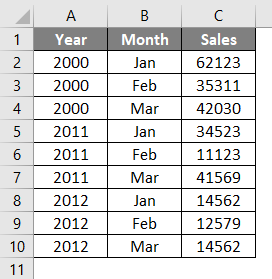
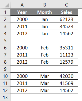
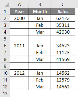
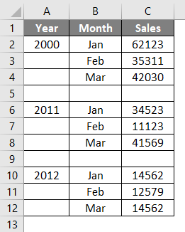
To create this, we can use the below data. Different years and the first three month’s sales amount are given. You have to plot a grouped bar chart for this.
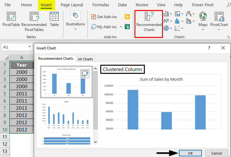
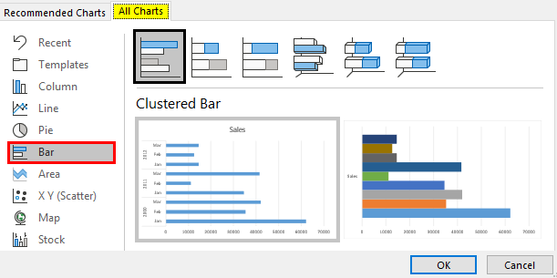
1. Select the table, go to the Insert menu, click Recommended Charts, and then select the Clustered Column Chart.
2. The selected data will be plotted as a clustered chart with different bars created for each year and every three months.
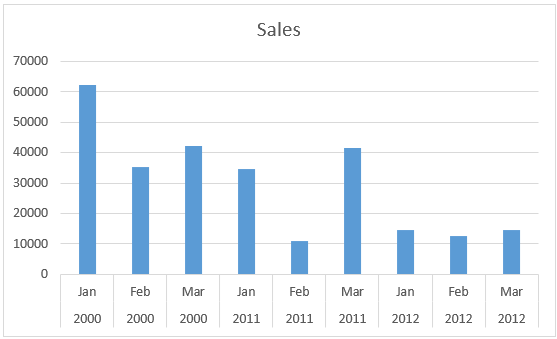
3. The created chart is correct according to the provided data. But if you want to get a clear picture from the chart, it isn’t easy. So let’s try to arrange the data.
Sorting the Column Data
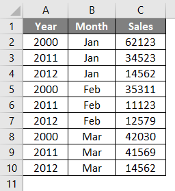
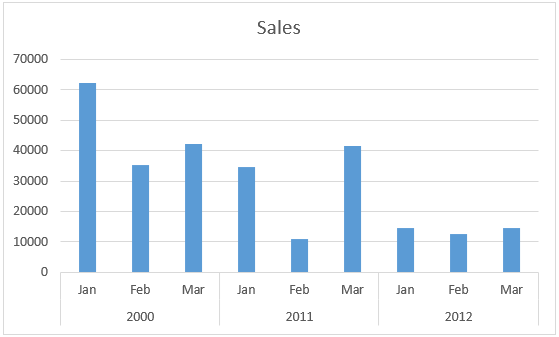
1. The data given is arranged by sorting the column per month. Now the table is changed into each month’s sales for different years is sorted together. Put a row in between each month’s data.
2. Create a clustered column chart for the above table. And it will plot the chart one after another.
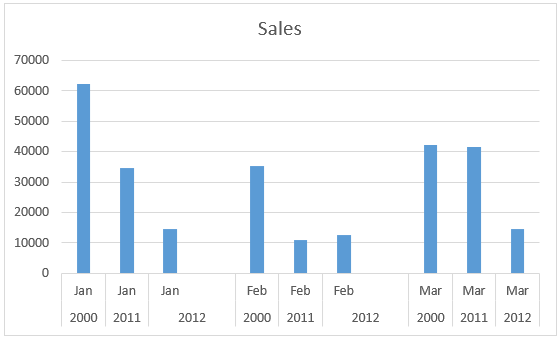
From this chart, you can understand the sales trend in each month for different years. Easy to get the sales trend as sales were high in the year 2000 for each month.
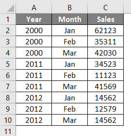
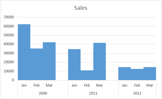
3. If you want to create a chart in such a way to know the sales trend of every year and for a particular month. Again make changes to the data. Arrange the years one after another and months accordingly.
Plotting a Graph
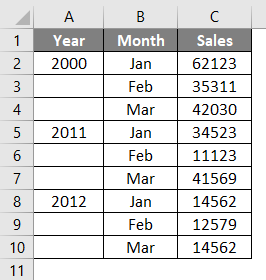
1. Plot a graph for the sorted table. Analyzing the sales done for each year for every three months is easy. To avoid the repetition of years, the table is changed as below.
2. The grouped graph is created to make conclusions quickly.
Example #2 – Formatting the Clustered Column Chart
The created grouped column chart can also be formatted on a different aspect. The style, color, width between bars, etc., can be changed. Make the chart more attractive by simply using other formatting options.
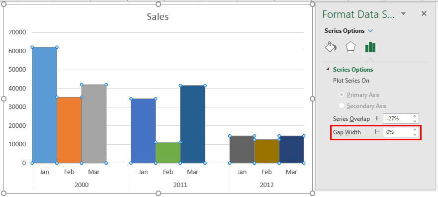
1. Right-click on the chart; it will open the window for formatting. Select the ‘Format Data Series Option’ by selecting the chart.
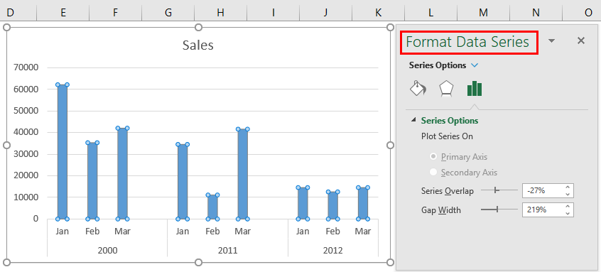
2. Change the gap width to ‘0’ to merge the bars.
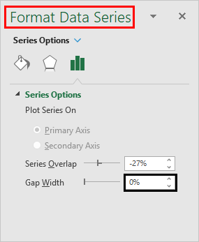
This will avoid the gap between the corresponding bars for each year. Now the space between bars is avoided and formed into a single bar with a different shape.
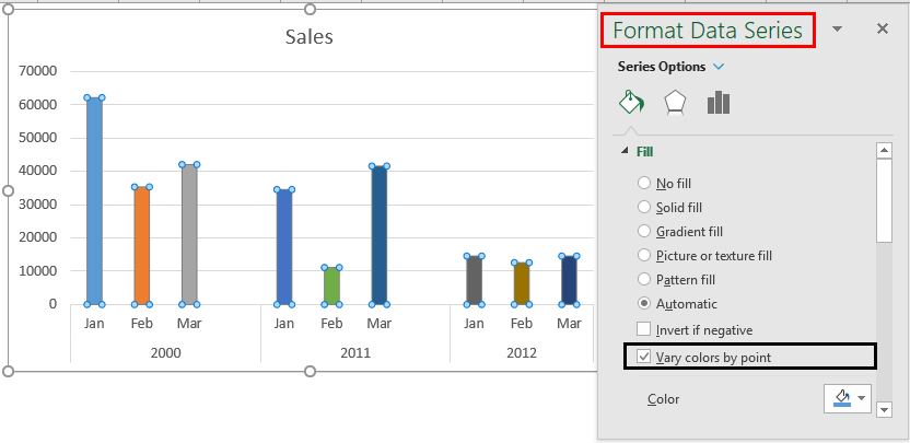
Example #3 – Change the Color
You can change the color of the bars in a grouped bar chart. This will make the chart more attractive.
1. Select the fill & line option. Go to the Fill option and select the ‘Vary Colors by point’ option to change the color of the data bars.
2. Next, select Series Options and decrease the Gap Width to 0%. When we change the color patterns, the chart will appear as follows.
You can change the color of the bars into a single color or different color by selecting each one.
Conclusion
The Clustered Column Chart and the Clustered Bar Chart represent data over a time period. You can change the chart type into a different type of group chart. You can change the group column chart to the group bar chart horizontally.
Things to Remember
- Graphs represent the data more precisely and effectively. To analyze over data plotting charts are the best way.
- It helps to analyze data for different periods from a single chart.
- This is a group of each data that represents the trend of some variable over a particular period.
- You must arrange the data to create a grouped bar chart.
- Once you created the grouped bar chart, you can change the chart type if needed.
- Use ‘Vary by color point’ to instantly change the color of the bars.
- A different chart can represent the same data differently, which will help you analyze the same data in more aspects.
- The effectiveness of the charts that you created will depend on the way you arrange the data.
- To plot the data into independent bars with a gap between each data, put a blank row while creating the table.
Recommended Articles
This is a guide to Grouped Bar Chart. Here we discuss How to create it, practical examples, and a downloadable Excel template. You can also go through our other suggested articles –
