Updated August 9, 2023
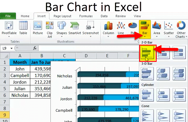
Introduction to Bar Chart in Excel
Bar Chart in Excel is one of the easiest types of chart to prepare by just selecting the parameters and values available against them. We must have at least one value for each parameter.
Bar Chart is shown horizontally, keeping their base of the bars at Y-Axis. Bar Chart can be accessed from the insert menu tab from the Charts section, which has different types of Bar Charts such as Clustered Bar, Stacked Bar, and 100% Stacked Bars available in 2D and 3D types.
In this article, I will take you through the process of creating Bar Charts.
How to Create Bar Chart in Excel?
Bar Chart in Excel is very simple and easy to create. Let us understand the working of the Bar Chart in Excel with Some Examples.
Example #1
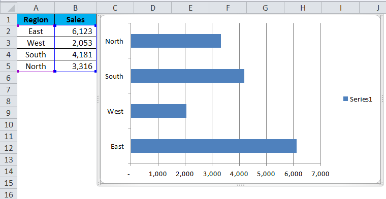
Take a simple piece of data to present the bar graph. I have sales data for 4 regions: East, West, South, and North.
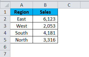
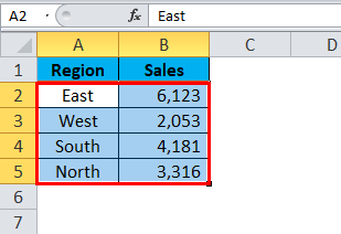
Step 1: Select the data.
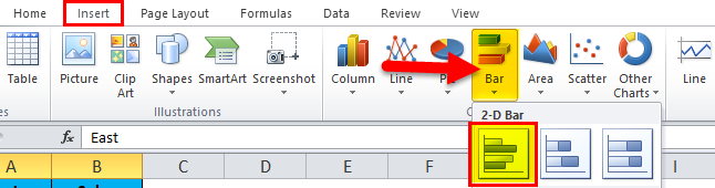
Step 2: Go to Insert and click on Bar chart and select the first chart.
Step 3: once you click on the chart, it will insert the chart as shown in the below image.
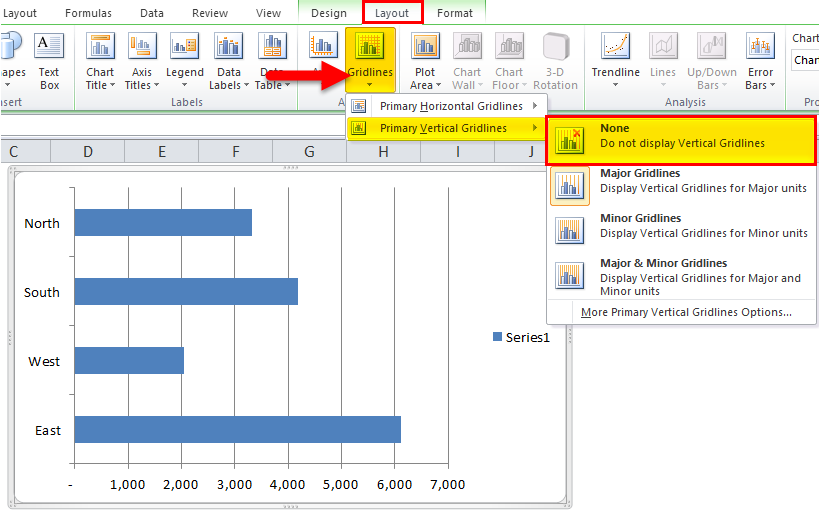
Step 4: Remove gridlines. Select the chart and go to layout > gridlines > primary vertical gridlines > none.
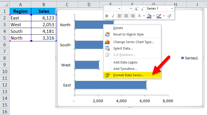
Step 5: select the bar, right-click on the bar, and select format data series.
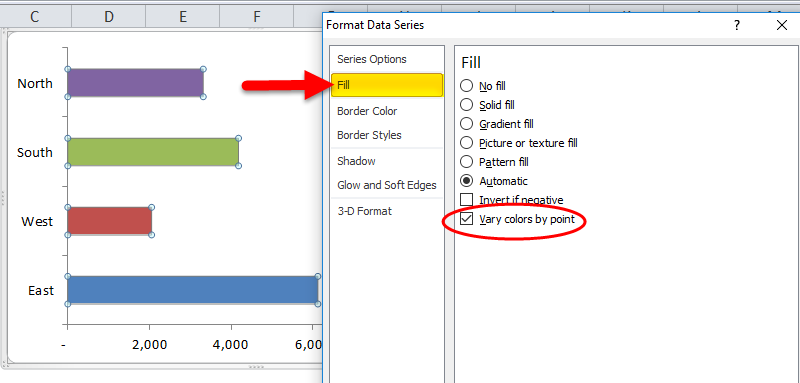
Step 6: Go to fill and select Vary Colours by Point.
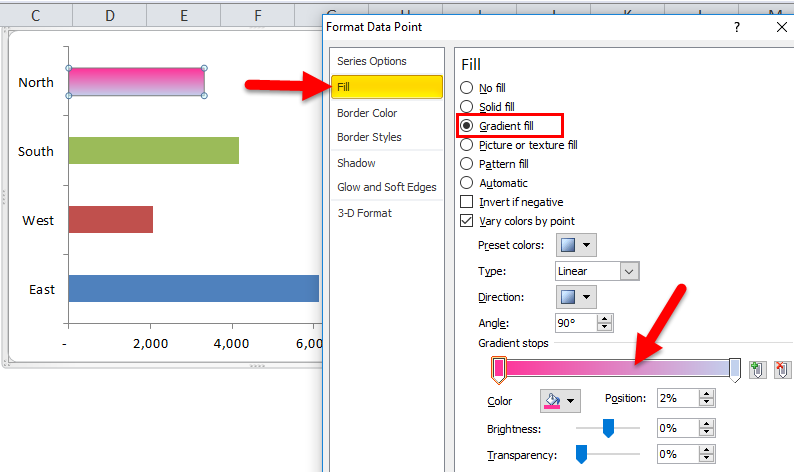
Step 7: Moreover, we can make the bar colors look attractive by right click on each bar separately.
Right, click on the first bar > go to Fill > Gradient Fill and apply the below format.
Step 8: To give the Chart Heading, go to layout>Chart Title > Select Above chart.
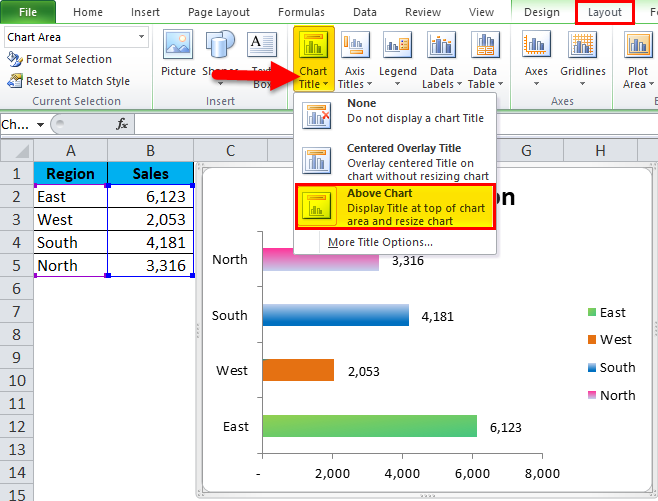
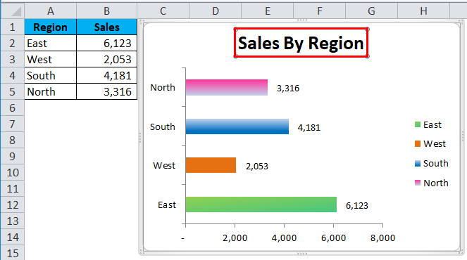
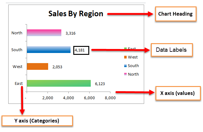
Chart Heading will be displayed as here it is Sales by Region.
Step 9: To add Labels to the bar Right-click on bar > Add Data Labels; click on it.
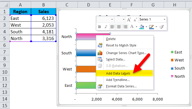
A data Label is added to each bar.
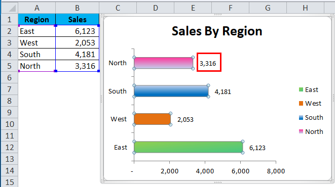
Similarly, you can choose different colors for each bar separately. I have chosen different colors, and my chart is looking like this.
Example #2
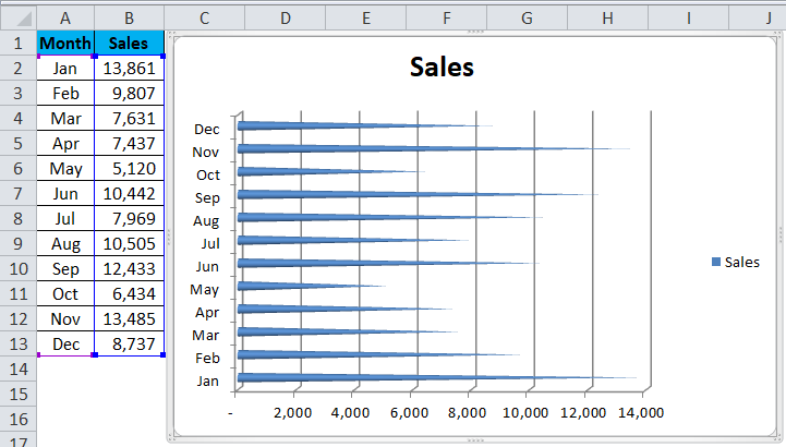
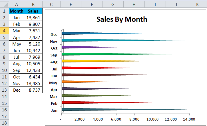
There are multiple bar graphs available. In this example, I will use the CONE type of bar chart.
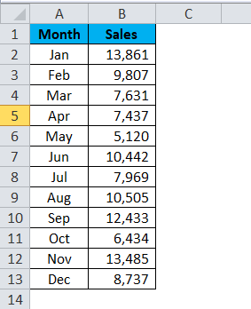
I have sales data from Jan to Dec. To present the data to the management to review the sales trend, I am applying a bar chart to visualize and present it better.
Step 1: Select the data > Go to Insert > Bar Chart > Cone Chart
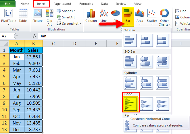
Step 2: Click on the CONE chart, and it will insert the basic chart for you.
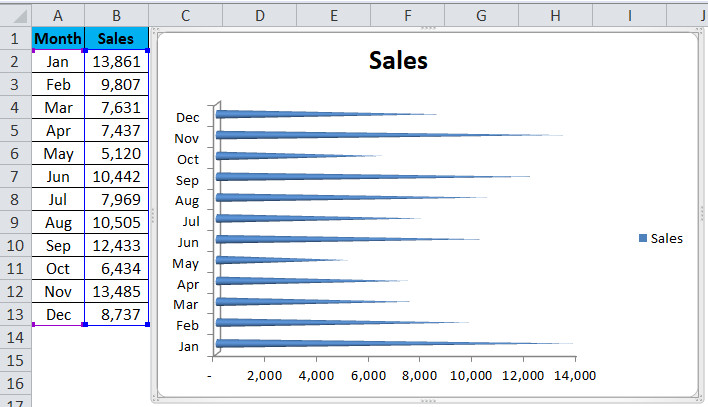
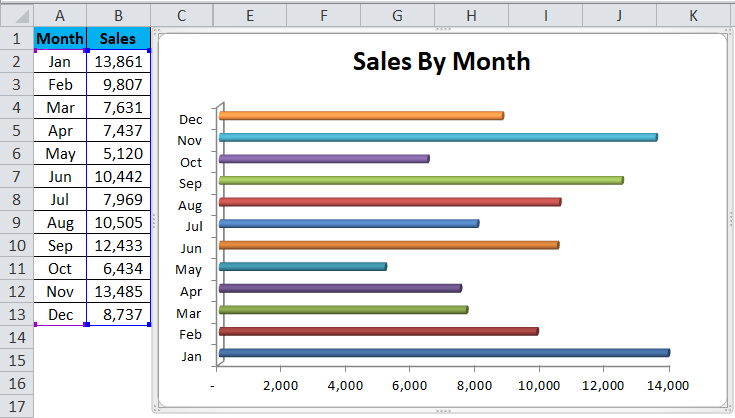
Step 3: Now, we need to modify the chart by changing its default settings.
Remove the gridlines of the above Chart.
Change the chart title to Sales by month.
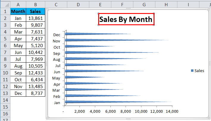
Remove Legends from the chart and enlarge it to make all months visible vertically.
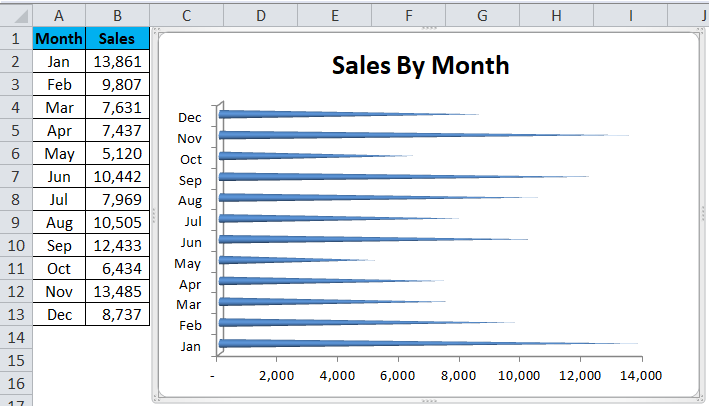
Step 4: Select each cone separately and filled with beautiful colors. After all the modifications, my chart looks like this.
For the same data, I have applied different bar chat types.
Cylinder Chart:
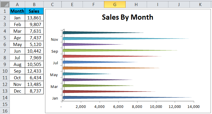
Pyramid Chart:
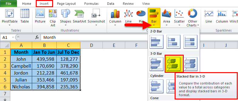
Example #3
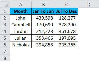
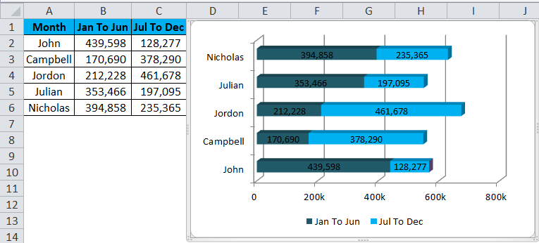
In this example, I am going to use a stacked bar chart. This chart tells the story of two data series in a single bar.
Step 1: Set up the data first. I have the commission data for a sales team, separated into two sections. One is for the first half-year, and the other is for the year’s second half.
Step 2: Select the data > Go to Insert > Bar > Stacked bar in 3D.
Step 3: Once you click on that chat type, it will instantly create a chart.
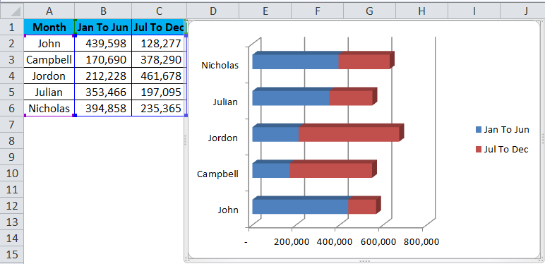
Step 4: Modify each bar color by following the previous example steps.
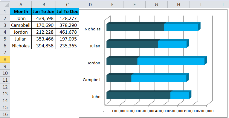
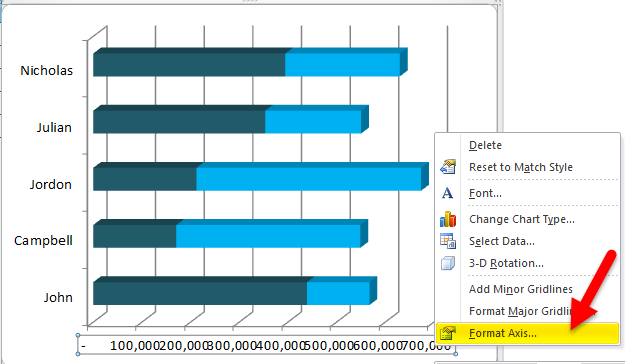
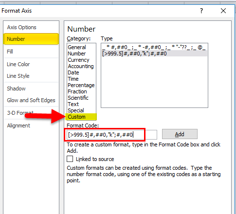
Step 5: Change the number format to adjust the spacing. Select the X-Axis and right-click > Format Axis.
Step 6: Go to Number > Custom > Apply this code [>999.5]#,##0,”k”;#,##0.
This will format the lakhs into thousands. For example, format the 1, 00,000 as 100K.
Step 7: Finally, my chart looks like this.
Advantages of Bar Chart in Excel:
- Easy comparison with better understanding.
- Quickly find the growth or decline.
- Summarize the table data into visuals.
- Make quick planning and make decisions.
Disadvantages of Bar Chart in Excel:
- Not suitable for a large amount of data.
- Do not tell many assumptions associated with the data.
Things to Remember
- Data arrangement is very important here. If the data is not in a suitable format, we cannot apply a bar chart.
- Choose a bar chart for a small amount of data.
- The bar chart ignores any non-numerical value.
- Column and bar charts are similar in presenting the visuals, but the vertical and horizontal axis is interchanged.
Recommended Articles
This has been a guide to a BAR chart in Excel. Here we discuss its uses and how to create a Bar Chart in Excel with Excel examples and downloadable templates. You may also look at these useful functions in Excel –
