EDUCBA

EDUCBA

MENUMENU
  • Free Tutorials
  • Free Courses
  • Certification Courses
  • 360+ Courses All in One Bundle
  • Login
Home Data Science Data Science Tutorials PowerBI Tutorial Power BI Maps
Secondary Sidebar
PowerBI Tutorial
  • Advanced
    • Power BI Tutorial
    • KPI in Power BI
    • Power BI Calendar
    • Power BI Dashboard Samples
    • Power BI DAX
    • Power BI Filter
    • Power BI Icon
    • Slicers in Power BI
    • Power BI IF Statement
    • Power BI Template
    • Power BI Maps
    • Measures in Power BI
    • Power BI Report
    • Power BI SUMX
    • Power BI Charts
    • Power BI Pie Chart
    • Power BI Bullet Chart
    • Power BI Gantt Chart
    • Power BI Bubble Chart
    • Power BI Waterfall Chart
    • Power BI Drillthrough
    • Power BI Themes
    • Power BI Tooltips
    • Power BI Heat Map
    • Creating Reports in Power BI
    • Power BI Connections
  • Basic
    • What is Microsoft Power BI
    • Is Power BI Free?
    • Power BI Visuals
    • Power BI Parameters
    • Power BI Alternatives
  • Interview Questions
    • Power Bi Interview Questions

Related Courses

Power BI Certification Course

Business Intelligence Certification Course

Data Visualization Certification Course

Power BI Maps

By Priya PedamkarPriya Pedamkar

Power BI Maps

What are Maps in Power BI?

In this article, we will see an outline on Power BI Maps. We all have used and inserted the Maps and 3D Maps in MS Excel which is quite complex to implement when we know that the tool which we are using is not meant for creating Map charts. To overcome such situations, Microsoft has given many such options and functions in Power BI which are not easy to use in MS Excel. Maps are one of those charts in Power BI. Now the question comes, how Power BI detects the locations which we have in our data and plot that into charts? And the answer is, through Bing Maps which is also a Microsoft product. Bing Maps locates the city, country and region name with the exact name and fill that into Power BI Maps.

How to Use Maps in Power BI?

In Power BI, there are 2 types of Maps available. One is a Map and the other is Filled Map. Both types are there in the Visualization section as shown below.

Power bi Maps

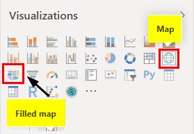
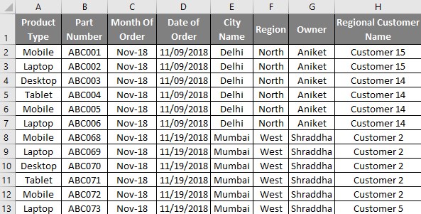
If we use the Filled Map option then we will be getting a global map of all the continents. Whereas if we use the Maps option, then we would see those regions only which are there in our uploaded data. And to use these Map options from Power BI, we need data of such kind which has the city or location names in a standard format. Below is a screenshot of that kind of sales data of the India region. The sales data is of some electronics products such as laptops, Mobile, Desktop and Tablet. Data consists of around 1000 lines which are perfect for plotting that on Maps.

Start Your Free Data Science Course

Hadoop, Data Science, Statistics & others

You can download the excel workbook from the below link which is used for this example.

You can download this Power BI Maps Excel Template here – Power BI Maps Excel Template

Power bi Maps (Excel Data)

Example of Power BI Maps

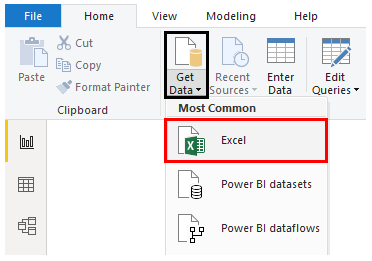
  • Let’s start by first uploading the data in Power BI. For this, go to Get Data option from the Home menu ribbon and select the type of source we want. Here our data is in Excel so we will be selecting the same as shown below.

 Example 1-1 (Menu Ribbon)

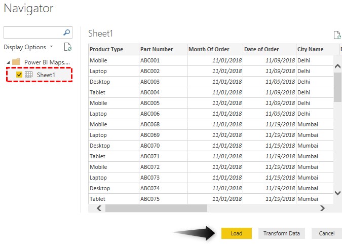
  • Now browse the file location and from the Navigator window select the Sheet which we want to upload. Here that sheet is Sheet1 and then click on Load.

Example 1-2 (Navigator window)

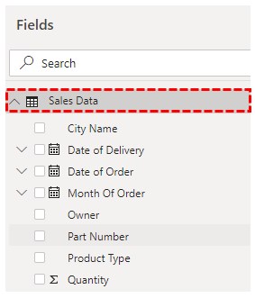
  • This may take a few moments. Then we will see the uploaded data columns in the Field section as shown below. Also, we are renaming the Table name here as well from Sheet1 to Sales Data just to have proper sync.

Power bi Maps Example 1-3

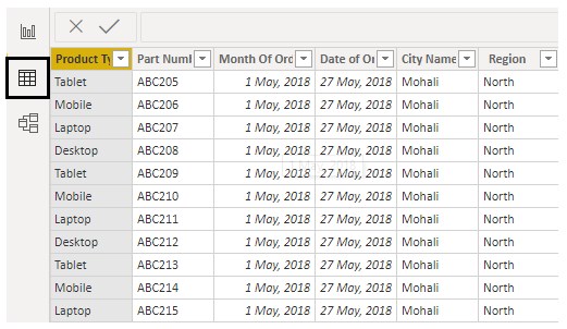
  • We will be able to see the data which we have uploaded there in the Data tab as shown below.

 Example 1-4 (Data Tab)

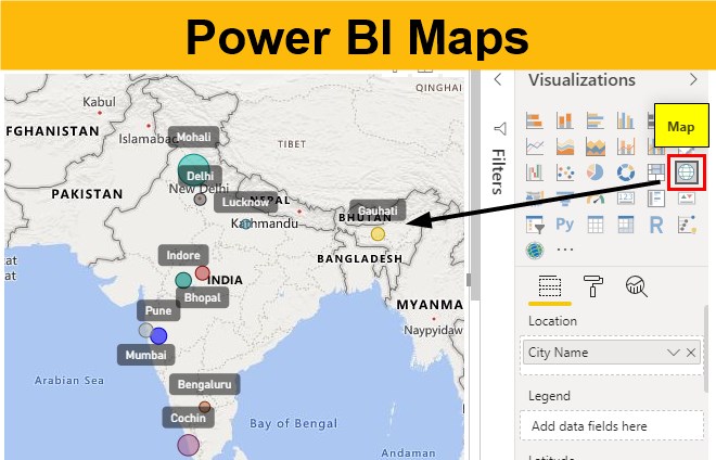
  • Now from the Report section, select Map chart type from Visualization as shown below.

Power bi Maps Example 1-5

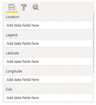
  • Let’s see and understand available fields under Map.

Power bi Maps Example 1-6

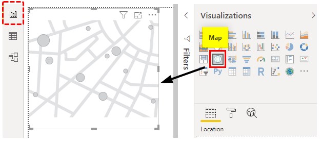
  • Location – It is the geographical location on the Map with the exact name there in Map.
  • Legend – This is like Location, here we can insert any data type by which we want to see the data in Map.
  • Longitude/ Latitude – This helps in finding the location on Bing Map.
  • Size – This can be Population, Quantity or number which can be plotted on Map.

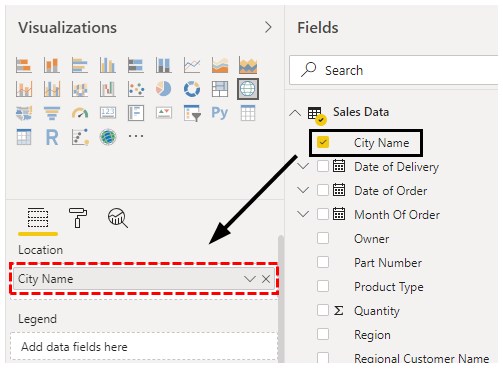
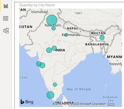
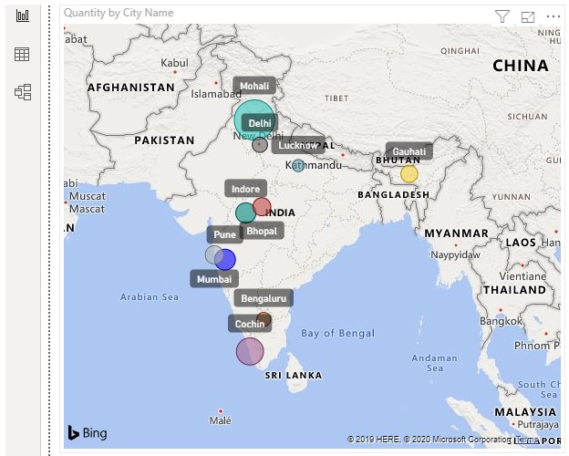
To start with first we will add the City Name into the Location field as shown below.

All in One Data Science Bundle(360+ Courses, 50+ projects)
Python TutorialMachine LearningAWSArtificial Intelligence
TableauR ProgrammingPowerBIDeep Learning
Price
View Courses
360+ Online Courses | 50+ projects | 1500+ Hours | Verifiable Certificates | Lifetime Access
4.7 (86,527 ratings)

Power bi Maps Example 1-7

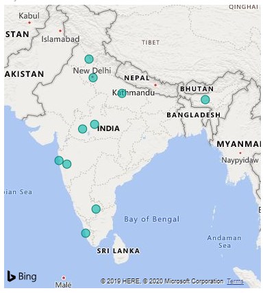
  • We will see the name of cities will get populated on the Map of India. The color by which the city names are highlighted is in a default blue.

Power bi Maps Example 1-8

  • Then we will insert the quantities sold in the Size field section.

Example 1-10 (Fields)

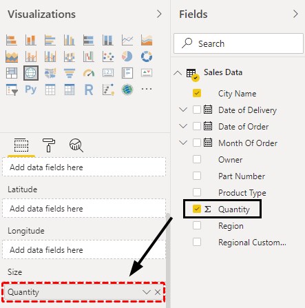
  • As we do that, the size of the buddle there will get increased as per the size of data available in that region. Bigger the size of the bubble, higher the quantities sold in that City.

Power bi Maps Example 1-11

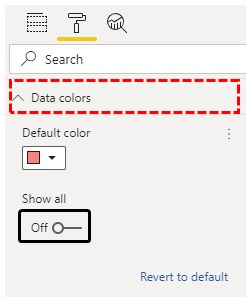
  • This completes the creation of Map in Power BI. Now we can format the data fields as per our need to make created Map look even better. Let’s start by changing the color allocated to the cities. For this, go to Format and select Data Colors as shown below.

Power bi Maps Example 1-12

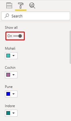
  • To see all the city colors, click on Show All to enable ON. Here we have assigned different colors to each city name to distinguish them separately.

Power bi Maps Example 1-13

  • Then we will turn on the Category labels from the Format option. This will help the viewer to see the name of cities properly.

Example 1-14 (Category Labels)

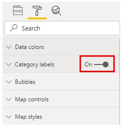
  • As we can see, the names of cities with bubbles are seen much clearly.

Power bi Maps Example 1-15

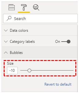
  • We can also change the size of the bubble as per our needs. This can be done from the Format section as shown below.

Power bi Maps Example 1-16

Note: If you have cities more than 6 or 7 then it is not advised to use this option. This will unnecessarily fill our map.
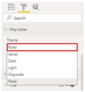
  • We can change the theme of the map as well. By default, the Road theme is selected. We can select any theme to make our map more attractive. The use of this option depends on the data which is using.

Power bi Maps Example 1-17
Note: Power BI Maps file can also be downloaded from the link below and the final output can be viewed.

You can download this Power BI Maps Template here – Power BI Maps Template

Pros of Power BI Maps

  • Power BI Maps, give life to the maps.
  • This is way easier than using Maps in Excel.
  • It automatically picks the city names as per the data which we upload using Bing Map with high accuracy.

Things to Remember

  • We can use Heat Maps if there data is global weather.
  • Use the right theme as per the data used in Power BI for creating Maps.
  • Power BI Maps are better than Filled Maps. Maps visualization gives visuals to those regions which are uploaded. After that, we can zoom in or out to fix the map.
  • Size of the bubble should be used to show the size of the data.

Recommended Articles

This is a guide to Maps in Power BI. Here we discuss how to use visual maps in power bi along with practical examples and downloadable power bi template. You may also look at the following articles to learn more –

  1. Power BI Calendar(Examples)
  2. Creating Report Page Tooltips in Power BI
  3. How to Create Bubble Chart in Power BI?
  4. Power BI Bullet Chart | Custom Visuals in Power BI
  5. Guide to Power BI Connections
  6. How to Sets Power BI Themes?
  7. Guide to Examples of Power BI Parameters
Popular Course in this category
Microsoft Power BI Training (6 Courses, 4 Projects)
  6 Online Courses |  4 Hands-on Projects |  45+ Hours |  Verifiable Certificate of Completion
4.5
Price

View Course

Related Courses

Business Intelligence Training (12 Courses, 6+ Projects)4.9
Data Visualization Training (15 Courses, 5+ Projects)4.8
0 Shares
Share
Tweet
Share
Primary Sidebar
Footer
About Us
  • Blog
  • Who is EDUCBA?
  • Sign Up
  • Live Classes
  • Corporate Training
  • Certificate from Top Institutions
  • Contact Us
  • Verifiable Certificate
  • Reviews
  • Terms and Conditions
  • Privacy Policy
  •  
Apps
  • iPhone & iPad
  • Android
Resources
  • Free Courses
  • Database Management
  • Machine Learning
  • All Tutorials
Certification Courses
  • All Courses
  • Data Science Course - All in One Bundle
  • Machine Learning Course
  • Hadoop Certification Training
  • Cloud Computing Training Course
  • R Programming Course
  • AWS Training Course
  • SAS Training Course

ISO 10004:2018 & ISO 9001:2015 Certified

© 2022 - EDUCBA. ALL RIGHTS RESERVED. THE CERTIFICATION NAMES ARE THE TRADEMARKS OF THEIR RESPECTIVE OWNERS.

EDUCBA
Free Data Science Course

SPSS, Data visualization with Python, Matplotlib Library, Seaborn Package

*Please provide your correct email id. Login details for this Free course will be emailed to you

By signing up, you agree to our Terms of Use and Privacy Policy.

EDUCBA Login

Forgot Password?

By signing up, you agree to our Terms of Use and Privacy Policy.

EDUCBA
Free Data Science Course

Hadoop, Data Science, Statistics & others

*Please provide your correct email id. Login details for this Free course will be emailed to you

By signing up, you agree to our Terms of Use and Privacy Policy.

EDUCBA

*Please provide your correct email id. Login details for this Free course will be emailed to you

By signing up, you agree to our Terms of Use and Privacy Policy.

Let’s Get Started

By signing up, you agree to our Terms of Use and Privacy Policy.

EDUCBA

Download Power BI Maps Excel Template

EDUCBA

Download Power BI Maps Excel Template

This website or its third-party tools use cookies, which are necessary to its functioning and required to achieve the purposes illustrated in the cookie policy. By closing this banner, scrolling this page, clicking a link or continuing to browse otherwise, you agree to our Privacy Policy

Loading . . .
Quiz
Question:

Answer:

Quiz Result
Total QuestionsCorrect AnswersWrong AnswersPercentage

Explore 1000+ varieties of Mock tests View more