EDUCBA

EDUCBA

MENUMENU
  • Free Tutorials
  • Free Courses
  • Certification Courses
  • 360+ Courses All in One Bundle
  • Login
Home Data Science Data Science Tutorials PowerBI Tutorial Power BI Dashboard Samples
Secondary Sidebar
PowerBI Tutorial
  • Advanced
    • Power BI Tutorial
    • KPI in Power BI
    • Power BI Calendar
    • Power BI Dashboard Samples
    • Power BI DAX
    • Power BI Filter
    • Power BI Icon
    • Slicers in Power BI
    • Power BI IF Statement
    • Power BI Template
    • Power BI Maps
    • Measures in Power BI
    • Power BI Report
    • Power BI SUMX
    • Power BI Charts
    • Power BI Pie Chart
    • Power BI Bullet Chart
    • Power BI Gantt Chart
    • Power BI Bubble Chart
    • Power BI Waterfall Chart
    • Power BI Drillthrough
    • Power BI Themes
    • Power BI Tooltips
    • Power BI Heat Map
    • Creating Reports in Power BI
    • Power BI Connections
  • Basic
    • What is Microsoft Power BI
    • Is Power BI Free?
    • Power BI Visuals
    • Power BI Parameters
    • Power BI Alternatives
  • Interview Questions
    • Power Bi Interview Questions

Related Courses

Power BI Certification Course

Business Intelligence Certification Course

Data Visualization Certification Course

Power BI Dashboard Samples

By Priya PedamkarPriya Pedamkar

Power BI Dashboard Samples

Introduction to Power BI Dashboard Samples

If you have ever created a dashboard in MS Excel then creating a sample dashboard in Power BI will be easy for you. But even if you did not, then this article on Power BI Dashboard will make you feel how easy it is to create one. Creating a Dashboard in any BI tool is all about how good is your imagination power and how well you relate between different charts, tables or columns just to create great visualization. Before we proceed for learning how to create a Dashboard in Power BI, first we need to figure out what we want to see on the Dashboard.

A dashboard is a place where we can connect different tables and columns and create a meaningful visualization that will give a good description of any process, project or business.

How to Create Sample Dashboard in Power BI?

Using an ample amount of data for creating Dashboard in any tool leaves a good impression on the Dashboard and Viewers. For this, we have sales data of some electronic products such as Mobile, Laptop, Desktop, and Tablets. Data shows the sale of these products for around a year.

So you can download the excel workbook from the below link which is used for this example.

Start Your Free Data Science Course

Hadoop, Data Science, Statistics & others

You can download this Power BI Dashboard Samples Excel Template here – Power BI Dashboard Samples Excel Template

Power BI Dashboard Samples Example 1-1

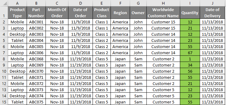
Data that we are using have 1000 lines which are sufficient for creating a sample dashboard in power BI. You use the same data and follow the steps or you can have your own data.

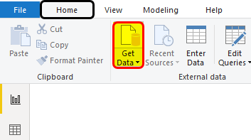
There are two ways to upload the data in Power BI. If the data is less, then we can directly copy the table and paste it in the Enter Data option. If the size of data is huge, as here we have 1000 lines. Then for this, click on Get Data option under the Home menu.

Power BI Dashboard Samples Example 1-2

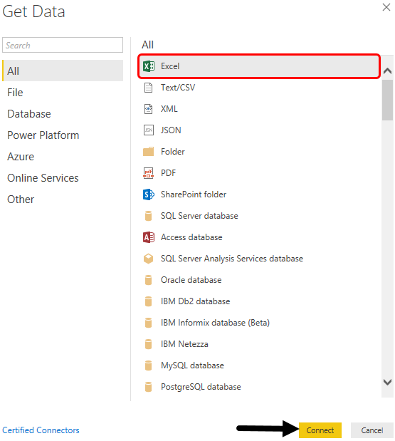
  • Select the source of data. Here, we have our data in Excel so we have selected the same as shown in thr below screenshot.

Power BI Dashboard Samples Example 1-3

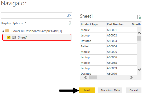
  • Now browse the file location and select the sheet which we want to upload. Here, the sheet having data is named as Sheet1. Once we check the box, then click on Load to upload the data in Power BI.

Power BI Dashboard Samples Example 1-4

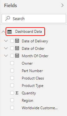
  • Once data is uploaded we can change the name of the table that we have uploaded in any name if we want. Here we have renamed that into Dashboard Data.

Power BI Dashboard Samples Example 1-5

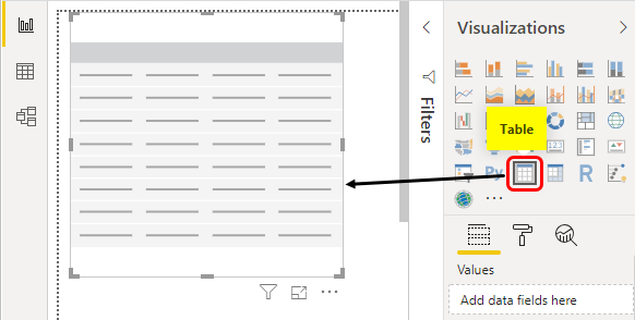
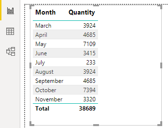
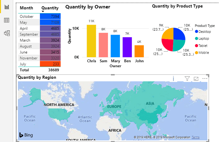
  • Now visualize what you want to see in your dashboard. Let’s create a table chart first where we will project the monthly sales. For this select Table from Visualizations section.

Power BI Dashboard Samples Example 1-6

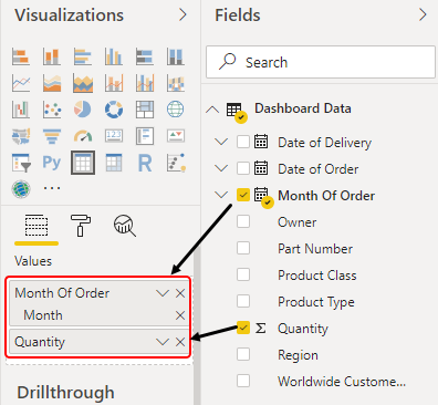
  • Now will select Month and Quantities under Values as shown below.

Power BI Dashboard Samples Example 1-7

  • This will give visualization as shown below.

Power BI Dashboard Samples Example 1-8

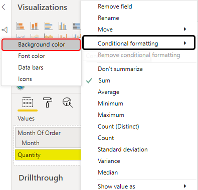
  • Click on the drop-down arrow of Quantity from the visualization section and select Background color under Conditional formatting.

Power BI Dashboard Samples Example 1-9

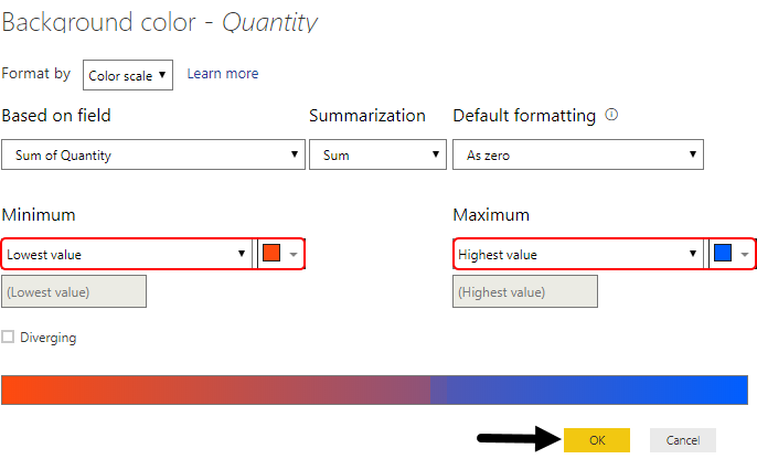
  • Select the lowest and highest value color as per your choice and then click on Ok.

Power BI Dashboard Samples Example 1-10

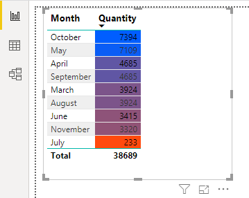
  • We will see the table data color in quantity column is changed as per the lowest and highest value color we chose.

Power BI Dashboard Samples Example 1-11

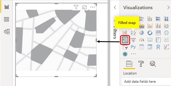
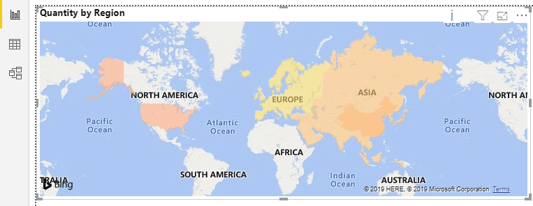
  • Now let’s insert a region-wise chart where we will map the regions with their sales data. For this, we will select the Filled map chart from visualization.

Power BI Dashboard Samples Example 1-12

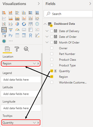
  • Now select the fields Region and Quantity and place them into the Location and Tooltips section to get the proper view on the map.

Power BI Dashboard Samples Example 1-13

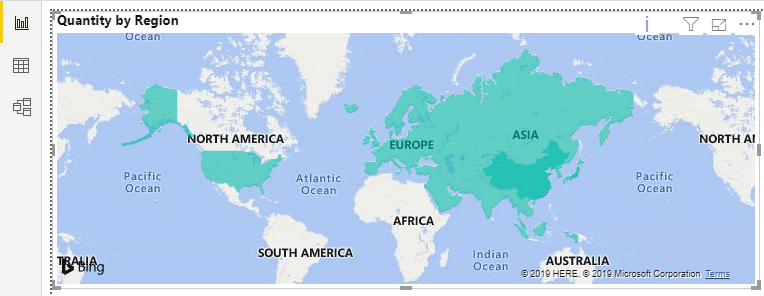
  • We will see, the map is now filled with default colors in each region.

Power BI Dashboard Samples Example 1-14

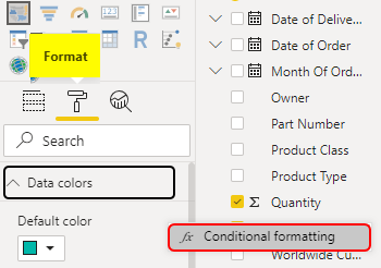
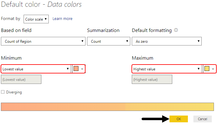
  • Similar to the previous table’s conditional formatting, here also we will do the same. Go to Format, and under Data Color select Conditional Formatting.

Power BI Dashboard Samples Example 1-15

  • Here we have selected some different color ranges which may suit our Map. Click on Ok to exit.

Power BI Dashboard Samples Example 1-16

  • This is how our map is filled with colors we chose.

Power BI Dashboard Samples Example 1-17

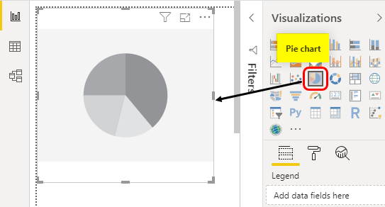
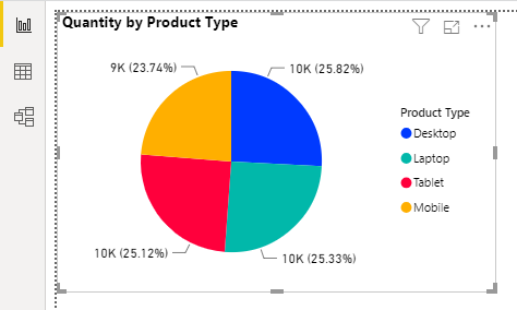
  • Now we will insert another chart. This will be Pie Chart showing the percentage of the products covering the total share. Select the Pie Chart from visualization.

Power BI Dashboard Samples Example 1-18

  • To map the data into Pie Chart, we will drag Product Type and Quantity into Legend and Values as shown below.

Power BI Dashboard Samples Example 1-19

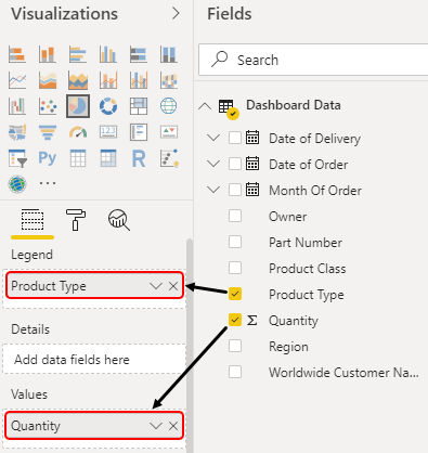
  • This will give our final Pie chart as shown below. We have here added the data labels and change the colors from the Fields section of visualization as per our choice.

Example 1-20

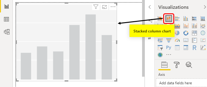
  • Let’s create the last chart which is the Staked Column Chart. Here we will map, which salesmen have sold the number of quantities. Select the Stacked Column Chart from the visualization section.

Example 1-21

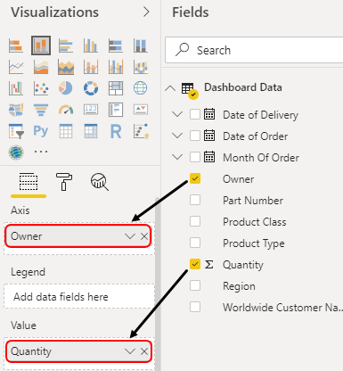
  • Now, we will put the Owner in Axis and quantity in the Values field.

Example 1-22

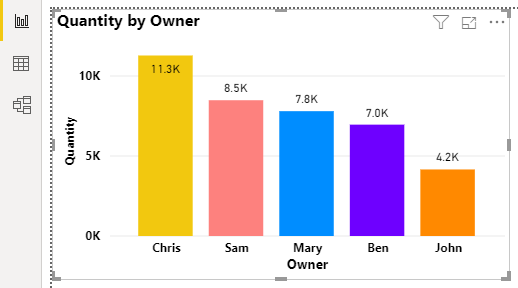
  • We will see our column chart is now having the proper Columns/Towers. Here also we have changed the color of each column and added the data labels as well.

Example 1-23

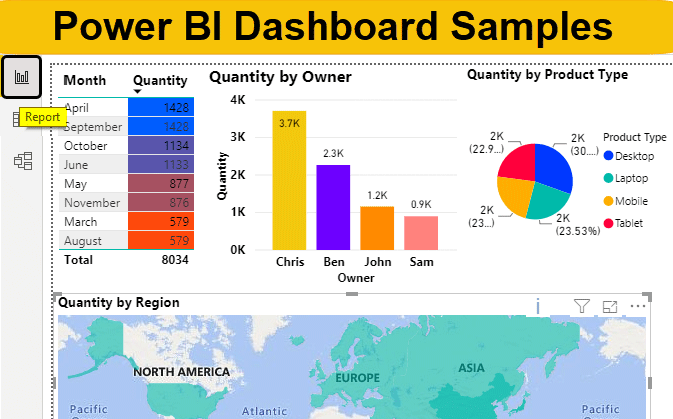
  • After rearranging all the created charts our dashboard will look like below.

Example 1-24

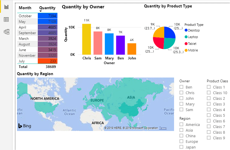
  • At last, we have added the 3 slicers with Owner, Product Class, and Region. By this, we can select any fields which we want to filter.

Example 1-25

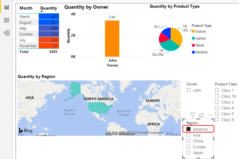
  • To test this, let’s select anything. Here we have selected the America region and apparently all the charts got filtered.

Example 1-26

NOTE: Power BI Dashboard Samples file can also be downloaded from the link below and the final output can be viewed.
You can download this Power BI Dashboard Samples Template here – Power BI Dashboard Samples Template

Pros of Power BI Dashboard Samples

  • Creating a dashboard Sample in Power BI is as easy as creating the same in MS Excel.
  • Even if we don’t create or add slicers in Power BI, we can still filter the dashboard as per our need just by clicking on any of the chart fields.

Things to Remember

  • Although we can choose any color we want to see in our charts. But is recommended not to choose bright colors.
  • In terms of color shades using Conditional Formatting, always use 2 opposite colors or different color wavelengths.
  • We can use DAX language as well for creating a sample Dashboard in Power BI.
  • Once created the dashboard, always fits the visuals maximum to the screen or page available to have better visuals.

Recommended Articles

This is a guide to Power BI Dashboard Samples. Here we discuss how to create a Samples Dashboard in Power BI to connect different tables and columns along with an example. You may also look at the following articles to learn more –

  1. How to Use the IF Statement in Power BI?
  2. Example to Create Power BI Reports
  3. KPI in Power BI Dashboard
  4. Power BI Calendar Function
Popular Course in this category
Microsoft Power BI Training (6 Courses, 4 Projects)
  6 Online Courses |  4 Hands-on Projects |  45+ Hours |  Verifiable Certificate of Completion
4.5
Price

View Course

Related Courses

All in One Data Science Bundle(360+ Courses, 50+ projects)
Python TutorialMachine LearningAWSArtificial Intelligence
TableauR ProgrammingPowerBIDeep Learning
Price
View Courses
360+ Online Courses | 50+ projects | 1500+ Hours | Verifiable Certificates | Lifetime Access
4.7 (86,171 ratings)
Business Intelligence Training (12 Courses, 6+ Projects)4.9
Data Visualization Training (15 Courses, 5+ Projects)4.8
0 Shares
Share
Tweet
Share
Primary Sidebar
Footer
About Us
  • Blog
  • Who is EDUCBA?
  • Sign Up
  • Live Classes
  • Corporate Training
  • Certificate from Top Institutions
  • Contact Us
  • Verifiable Certificate
  • Reviews
  • Terms and Conditions
  • Privacy Policy
  •  
Apps
  • iPhone & iPad
  • Android
Resources
  • Free Courses
  • Database Management
  • Machine Learning
  • All Tutorials
Certification Courses
  • All Courses
  • Data Science Course - All in One Bundle
  • Machine Learning Course
  • Hadoop Certification Training
  • Cloud Computing Training Course
  • R Programming Course
  • AWS Training Course
  • SAS Training Course

ISO 10004:2018 & ISO 9001:2015 Certified

© 2022 - EDUCBA. ALL RIGHTS RESERVED. THE CERTIFICATION NAMES ARE THE TRADEMARKS OF THEIR RESPECTIVE OWNERS.

EDUCBA
Free Data Science Course

SPSS, Data visualization with Python, Matplotlib Library, Seaborn Package

*Please provide your correct email id. Login details for this Free course will be emailed to you

By signing up, you agree to our Terms of Use and Privacy Policy.

EDUCBA Login

Forgot Password?

By signing up, you agree to our Terms of Use and Privacy Policy.

EDUCBA
Free Data Science Course

Hadoop, Data Science, Statistics & others

*Please provide your correct email id. Login details for this Free course will be emailed to you

By signing up, you agree to our Terms of Use and Privacy Policy.

EDUCBA

*Please provide your correct email id. Login details for this Free course will be emailed to you

By signing up, you agree to our Terms of Use and Privacy Policy.

Let’s Get Started

By signing up, you agree to our Terms of Use and Privacy Policy.

EDUCBA

Download Power BI Dashboard Samples Excel Template

EDUCBA

Download Power BI Dashboard Samples Excel Template

This website or its third-party tools use cookies, which are necessary to its functioning and required to achieve the purposes illustrated in the cookie policy. By closing this banner, scrolling this page, clicking a link or continuing to browse otherwise, you agree to our Privacy Policy

Loading . . .
Quiz
Question:

Answer:

Quiz Result
Total QuestionsCorrect AnswersWrong AnswersPercentage

Explore 1000+ varieties of Mock tests View more