Updated June 12, 2023
Column Chart in Excel
A column Chart in Excel is the simplest format that can be easily created if one parameter list is against one set of values. Column Chart can be accessed from the Insert menu tab from the Charts section, which has different types of Column Charts, such as Clustered Charts, Stacked Columns, and 100% Stacked Columns in 2D and 3D wells. This simply compares the values across different categories with the help of vertical columns.
“The Simpler the chart, the better it is”. Excel Column chart straight forward tells the story of a single variable and does not confuse understanding.
This article will look into how to create COLUMN CHARTS in Excel.
Types of Column Chart in Excel
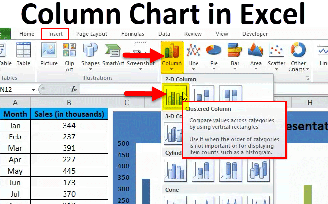
There are totally 5 types of column charts available in Excel. Go to the Insert tab and click on the COLUMN.
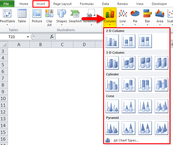
- 2-D Column and 2-D stacked column chart
- 3-D Column and 3-d stacked column chart
- Cylinder column chart
- Cone column chart
- Pyramid column chart
How to Make Column Charts in Excel?
The Column Chart is very simple to use. Let us now see how to make a Column Chart in Excel with the help of some examples.
Example #1
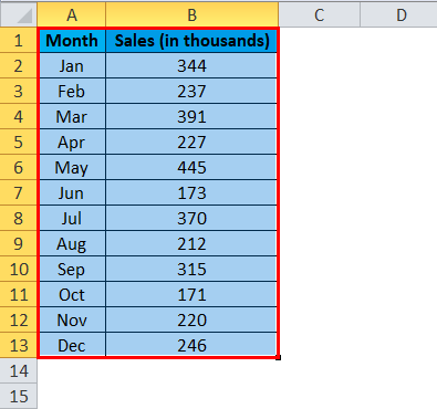
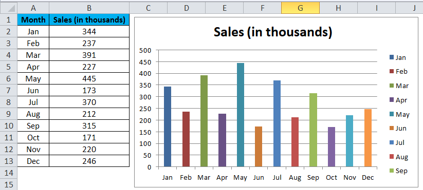
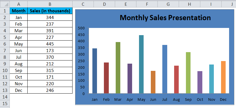
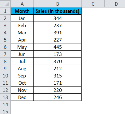
I have sales data from Jan to Dec. to present the data graphically instead of just a table.
I am creating a COLUMN CHART for my presentation. Follow the below steps to get insight.
Step 1: Set up the data first.
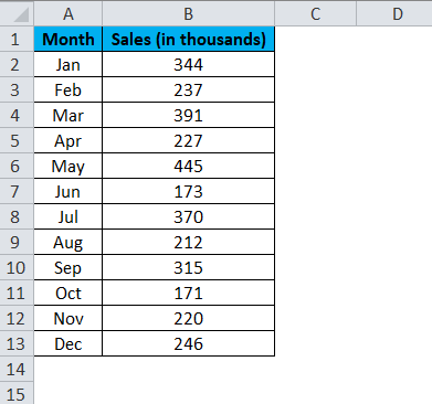
Step 2: Select the data from A1 to B13.
Step 3: Go to Insert, click Column, and select the first chart.
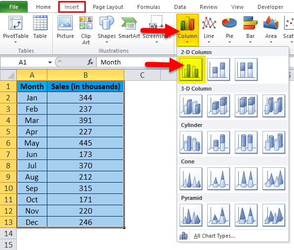
Note: The shortcut key to create a chart is F11. This will create the chart all together in a new sheet.
Step 3: Once you click on that chart, it will insert the below chart automatically.
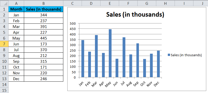
Step 4: This looks like an ordinary chart. We need to make some modifications to make the chart look beautiful.
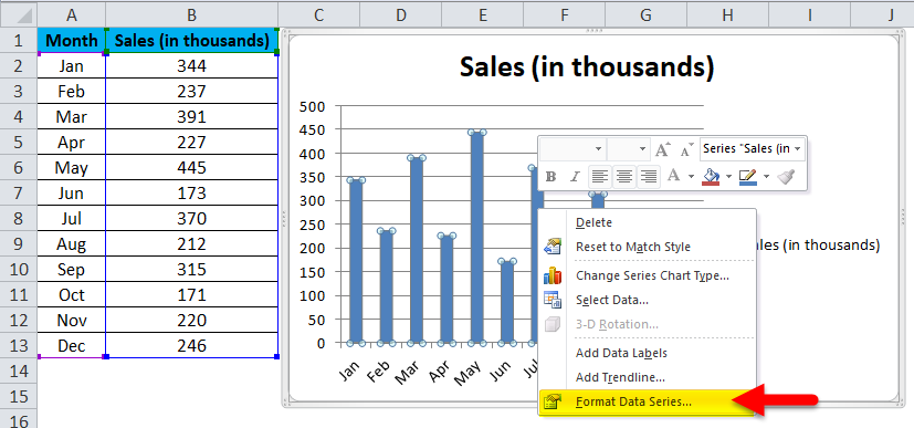
Right-click on the bar and select Format Data Series.
Step 5: Go to Fill and select Vary colors by point.
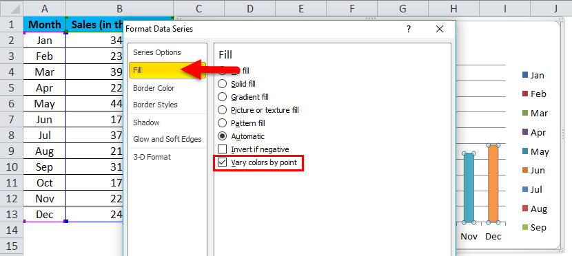
Step 6: Now, your chart looks like this. Each bar is colored with a different color to represent the different months.
Step 7: Remove Legends by selecting them and pressing the delete key.
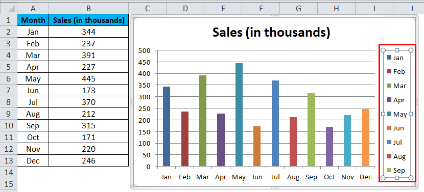
the Legend will be deleted
Step 8: Rename your chart heading by clicking on the title,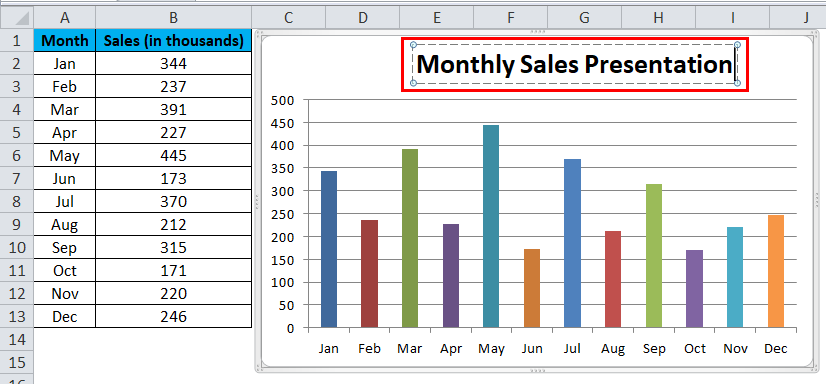
select Gridlines, and click on Format Gridlines.
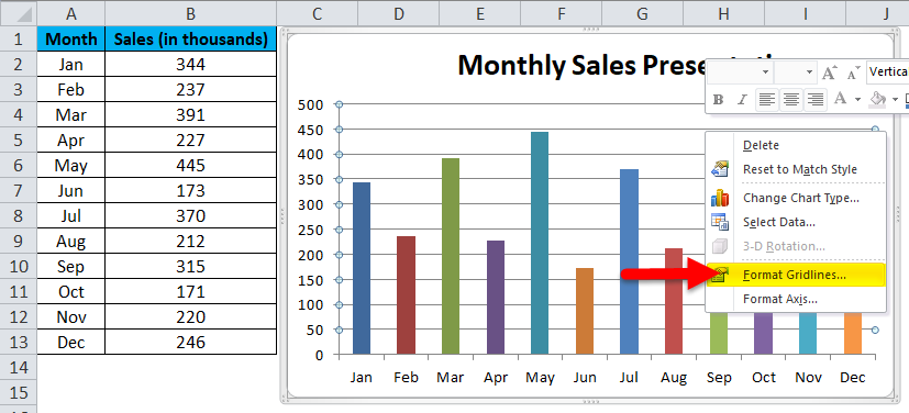
Click on Line Color and select the no-line option
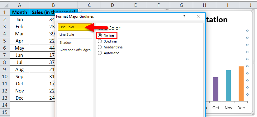
Gridlines will be removed.
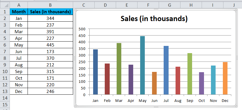
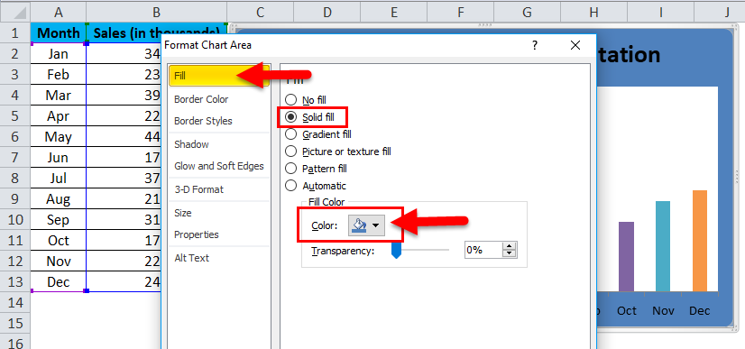
Step 9: Click on Format Chart Area.
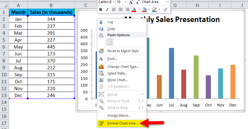
Select the Fill option. Under Fill, Select Solid fill, and select the background color according to your wish.
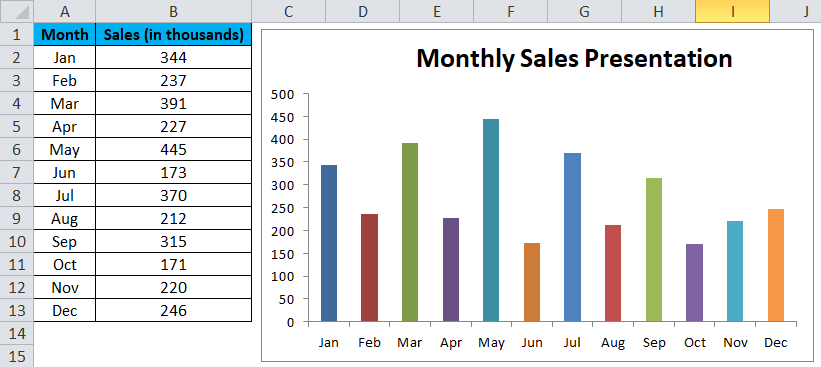
Finally, my chart looks like this.
Example #2
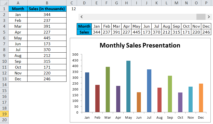
In this example, I will create a user-defined chart, i.e., based on the clicks you make; it will start to show the results in the column chart.
I am taking the same data from the previous example.
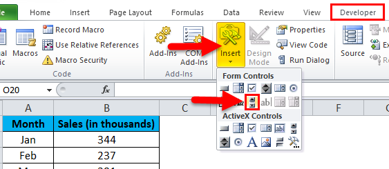
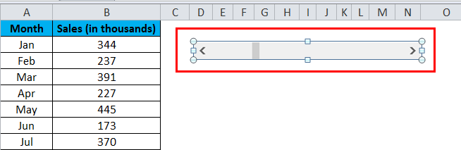
Step 1: Insert a “Horizontal Scroll Bar”. Go to the developer tab > Click on Insert and select ScrollBar.
Step 2: Draw the scroll bar in your worksheet.
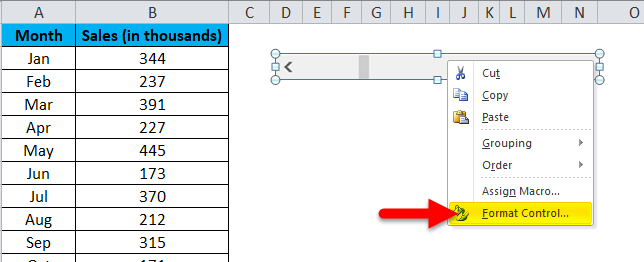
Step 3: Now right-click on the Scrollbar and select Format Control.
Step 4: Now go to Control and make the changes shown in the image below.
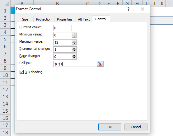
Current Value: This is the present value now. I have mentioned zero.
Minimum Value: This is the bare minimum value.
Maximum Value: This is the highest value to mention. I have chosen 12 because I have only 12 months of data to present.
Incremental Change: Once you click on the ScrollBar, what incremental value do you need to give?
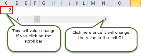
Cell link: This is the link given to a cell. I have given a link to cell C1. If I click on the scroll bar once in cell C1, the value will be 1; if I click on it twice, it will show the value as 2 because it is incremented by 1.
Now you can check by clicking on the scroll bar.
Step 5: We need to rearrange the data to create a chart. I am applying the IF formula to rearrange the data.
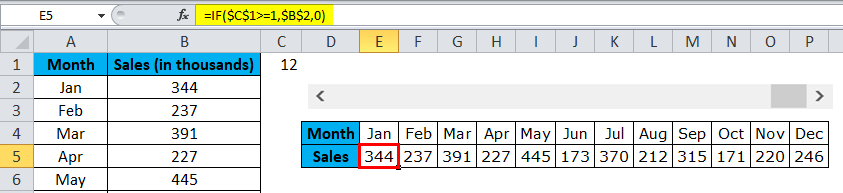
In cell E5, I have mentioned the formula: If the cell C1 (scrollbar linked cell) is greater than or equal to 1, I want the value from cell B2 (that contains Jan month sales).
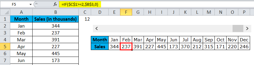
Similarly, in cell F5, I have mentioned if cell C1 (scrollbar linked cell) is greater than or equal to 2, I want the value from cell B3 (that contains Feb month sales).
So like this, I have mentioned the formula for all 12 months.
Step 6: Now insert a COLUMN CHART as shown in example 1. But here, select the rearranged data instead of the original data.
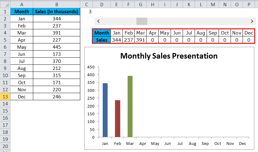
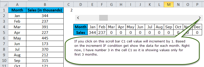
Step 7: Now, the COLUMN CHART has been created. The clicks you make on the scroll bar will start to show the bars in the column chart.
I have clicked the scroll bar only 3 times, so it is showing only for 3 months. If you want to see for the remaining months, you can click the scroll bar up to 12 times.
Advantages of Excel Column Chart
- Easy to make and understand.
- Show differences easily.
- Each bar represents only one series only.
Things to Remember in Dynamic Chart
- Arrange the data before creating a Column Chart in Excel.
- Use the Scroll Bar option to make the chart look attractive.
- If the single series has many data, then it becomes Clustered Chart.
- You can try many other column charts like a cylinder, pyramids, 3-D charts, etc…….…
Recommended Articles
This has been a guide to Excel Column Chart. Here we discuss creating a Column Chart in Excel, practical examples, and a downloadable Excel template. You can also go through our other suggested articles –
