EDUCBA

EDUCBA

MENUMENU
  • Free Tutorials
  • Free Courses
  • Certification Courses
  • 360+ Courses All in One Bundle
  • Login
Home Data Science Data Science Tutorials PowerBI Tutorial Power BI Bubble Chart
Secondary Sidebar
PowerBI Tutorial
  • Advanced
    • Power BI Tutorial
    • KPI in Power BI
    • Power BI Calendar
    • Power BI Dashboard Samples
    • Power BI DAX
    • Power BI Filter
    • Power BI Icon
    • Slicers in Power BI
    • Power BI IF Statement
    • Power BI Template
    • Power BI Maps
    • Measures in Power BI
    • Power BI Report
    • Power BI SUMX
    • Power BI Charts
    • Power BI Pie Chart
    • Power BI Bullet Chart
    • Power BI Gantt Chart
    • Power BI Bubble Chart
    • Power BI Waterfall Chart
    • Power BI Drillthrough
    • Power BI Themes
    • Power BI Tooltips
    • Power BI Heat Map
    • Creating Reports in Power BI
    • Power BI Connections
  • Basic
    • What is Microsoft Power BI
    • Is Power BI Free?
    • Power BI Visuals
    • Power BI Parameters
    • Power BI Alternatives
  • Interview Questions
    • Power Bi Interview Questions

Related Courses

Power BI Certification Course

Business Intelligence Certification Course

Data Visualization Certification Course

Power BI Bubble Chart

By Priya PedamkarPriya Pedamkar

Power BI Bubble Chart

Bubble Chart in Power BI

A bubble graph is used to visualize data set with three dimensions. It is quite related to the Scatter chart. A scatter chart has two value axes. One numerical data long horizontal axis and one along the vertical axis. A scatter chart shows the relationship between the two numerical values. And Bubble chart replaces the data points with bubble size representing the third data dimension. Basically, the Bubble chart represents three sets of data in a graph. One is X-axis coordinate, second is Y-axis coordinate and the final is the Bubble size data set. Scatter and Bubble charts can be plotted in any visualization software including Power BI. With the help of Bubble chart, we can show the relationship between different data sets. A bubble chart can be plotted in Excel or any visualization software like Power BI, Tableau, etc.

Example:

Power BI Bubble Chart Example

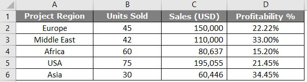
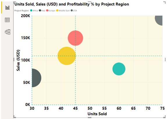
The above chart shows the units sold in X-axis, Profit % on Y-axis. The bubble size shows the sales amount. Placing the cursor on a bubble shows the Project region, units sold, sales and profit in detail. This is the advantage of a Bubble chart which makes data visualization clearer.

Start Your Free Data Science Course

Hadoop, Data Science, Statistics & others

How to Create a Bubble Chart in Power BI?

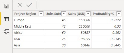
To construct a Bubble chart in Power BI, we must have a set of data. First of all, we need to import that. To demonstrate, we have Excel data for the same.

Power BI Bubble Chart Example

You can also download the excel workbook from the below link which is used for this example.

You can download this Power BI Bubble Chart Excel Template here – Power BI Bubble Chart Excel Template
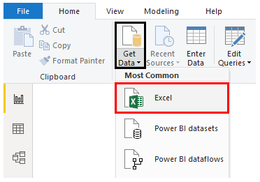
  • To import this data, We’ll go to Power BI > Get data as shown below. Then we have to select the Excel file from the location as shown below.

Power bi Measures Example 1-1

  • Now, our data is imported in Power BI in tabular form.

Power BI Bubble Chart Example 2

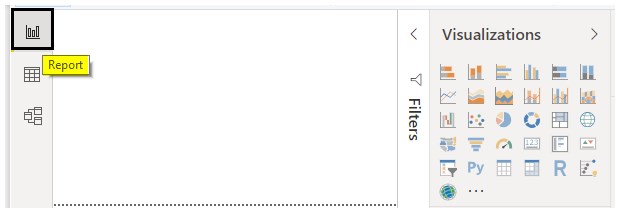
  • Now we have to go to the “Report” tab and then visualization.

Power BI Bubble Chart Example 3

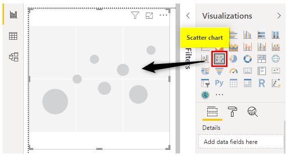
  • From the visualization, we’ll select the Scatter chart as the Bubble chart is an advanced version of the Scatter chart.

Power BI Bubble Chart Example4

  • Now, we need to add values to fields to show it in the graph.

Power BI Bubble Chart Example 5

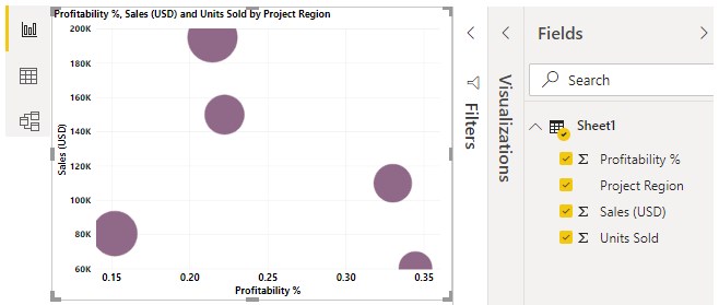
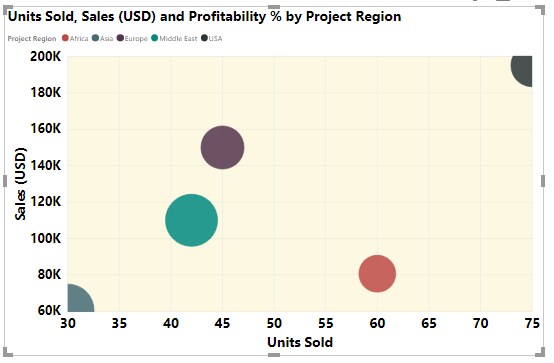
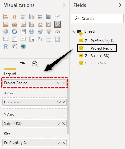
  • Now the Scatter graph is plotted as can be seen above. To plot a Bubble graph, we can just drag the “Project Region” from the “Details” field to “Legend”.

Example 6 (field)

  • The bubble chart can be seen now in different colours for different bubbles.

Power BI Bubble Chart Example7

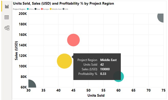
All the regions are shown in different colors. Placing the cursor on a bubble shows all the details including Sales, Units sold, Profit and Region. In this way, the Bubble chart is different from the Scatter chart.

All in One Data Science Bundle(360+ Courses, 50+ projects)
Python TutorialMachine LearningAWSArtificial Intelligence
TableauR ProgrammingPowerBIDeep Learning
Price
View Courses
360+ Online Courses | 50+ projects | 1500+ Hours | Verifiable Certificates | Lifetime Access
4.7 (86,527 ratings)

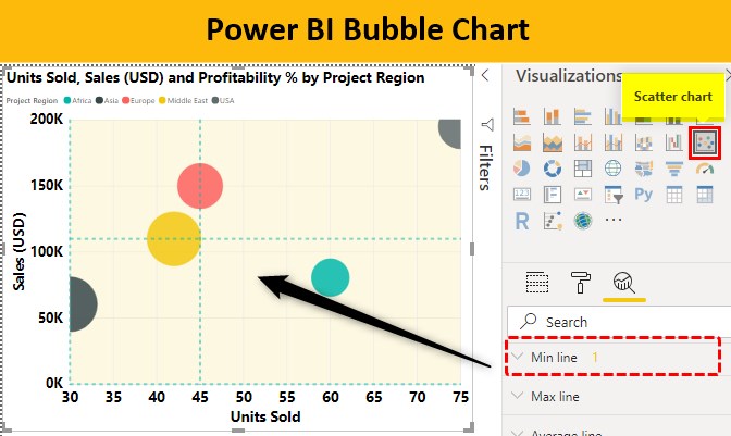
If we need to set the number of data points on Bubble chart, we can simply go to the “Format” tab under visualization, expand “General” and set the “Data Volume” to the maximum to ensure proper visualization.

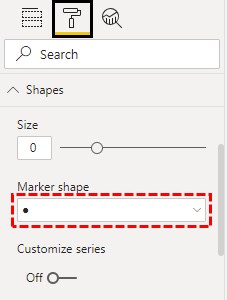
  • To increase the shape of bubbles, we can go to Shape > Size and increase the size as per our convenience. For Bubble chat, we’ll stick to Circle shape. We can change the shape under “Marker Shape” as shown below.

Example 8 (Marker Shape)

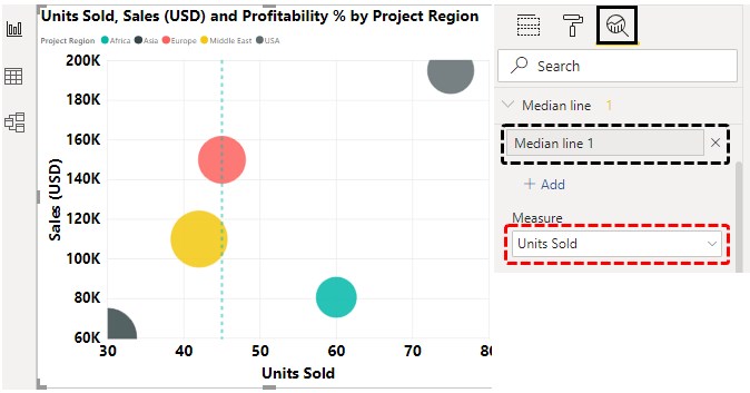
  • To add more information to the chart, we can go to the “Analytics” tab and choose to add a median line. And the measure for the median line we’ll select “Units Sold” as it will create a median line with two points on each side.

Example 9 (Median Line)

  • To show which points have a higher value of X-axis measure compared to Y-axis or vice-versa, we can add “Symmetry shading” to the chart. Symmetry shading shows the background of the Bubble chart based on the current axis upper and lower boundary.

Example 10 (Symmetry shading)

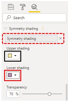
The Symmetry shading can be seen now. Since we don’t have more values or data points, the background has one color as values are higher and similar to each other.

  • With the addition of more features from the “Analytics” pane, we can modify the chart as per our convenience.

Power BI Bubble Chart Example11

NOTE: I have done so much of formatting to these charts, you can download the Power BI Bubble Chart file from below link and apply each formatting technique as applied.
You can download this Power BI Bubble Chart Template here – Power BI Bubble Chart Template

Advantages and Disadvantages of Bubble Chart

There are a lot of advantages when using a Bubble chart:

  • A bubble chart is an eyecatcher and catches the reader’s attention quickly.
  • As it is a visual chart, so it is better and clear than the tabular format.

Some disadvantages which lead to Bubble chart non-use are as follows:

  • It is difficult for a first time user. A new user may need someone’s assistance to visualize.
  • Bubble overlapping is the problem in this chart. If two or more data points have similar X & Y values, a bubble may overlap or hidden behind another bubble.

Things to Remember

  • Data needs to be arranged before plotting a Bubble chart.
  • We need to decide which data set we need to set as a bubble. For the same, we need to identify the targeted audience first.
  • X & Y axis needs to be formatted to a minimum extent to look at the graph look better.
  • Avoid fancy or ugly colors and set a background color to make the chart better and business ready.

Recommended Articles

This is a guide to Power BI Bubble Chart. Here we discuss how to create Bubble Chart and the use of the analytic tab in Power BI along with practical examples. You may also look at the following articles to learn more –

  1. How to Create Gantt Chart in Power BI?
  2. Power BI Calendar(Examples)
  3. Power BI Maps | How to Use?
  4. Power BI Bullet Chart | Custom Visuals in Power BI
  5. Power BI Charts | Steps to Create
Popular Course in this category
Microsoft Power BI Training (6 Courses, 4 Projects)
  6 Online Courses |  4 Hands-on Projects |  45+ Hours |  Verifiable Certificate of Completion
4.5
Price

View Course

Related Courses

Business Intelligence Training (12 Courses, 6+ Projects)4.9
Data Visualization Training (15 Courses, 5+ Projects)4.8
0 Shares
Share
Tweet
Share
Primary Sidebar
Footer
About Us
  • Blog
  • Who is EDUCBA?
  • Sign Up
  • Live Classes
  • Corporate Training
  • Certificate from Top Institutions
  • Contact Us
  • Verifiable Certificate
  • Reviews
  • Terms and Conditions
  • Privacy Policy
  •  
Apps
  • iPhone & iPad
  • Android
Resources
  • Free Courses
  • Database Management
  • Machine Learning
  • All Tutorials
Certification Courses
  • All Courses
  • Data Science Course - All in One Bundle
  • Machine Learning Course
  • Hadoop Certification Training
  • Cloud Computing Training Course
  • R Programming Course
  • AWS Training Course
  • SAS Training Course

ISO 10004:2018 & ISO 9001:2015 Certified

© 2022 - EDUCBA. ALL RIGHTS RESERVED. THE CERTIFICATION NAMES ARE THE TRADEMARKS OF THEIR RESPECTIVE OWNERS.

EDUCBA
Free Data Science Course

SPSS, Data visualization with Python, Matplotlib Library, Seaborn Package

*Please provide your correct email id. Login details for this Free course will be emailed to you

By signing up, you agree to our Terms of Use and Privacy Policy.

EDUCBA Login

Forgot Password?

By signing up, you agree to our Terms of Use and Privacy Policy.

EDUCBA
Free Data Science Course

Hadoop, Data Science, Statistics & others

*Please provide your correct email id. Login details for this Free course will be emailed to you

By signing up, you agree to our Terms of Use and Privacy Policy.

EDUCBA

*Please provide your correct email id. Login details for this Free course will be emailed to you

By signing up, you agree to our Terms of Use and Privacy Policy.

Let’s Get Started

By signing up, you agree to our Terms of Use and Privacy Policy.

EDUCBA

Download Power BI Bubble Chart Excel Template

EDUCBA

Download Power BI Bubble Chart Excel Template

This website or its third-party tools use cookies, which are necessary to its functioning and required to achieve the purposes illustrated in the cookie policy. By closing this banner, scrolling this page, clicking a link or continuing to browse otherwise, you agree to our Privacy Policy

Loading . . .
Quiz
Question:

Answer:

Quiz Result
Total QuestionsCorrect AnswersWrong AnswersPercentage

Explore 1000+ varieties of Mock tests View more