Updated June 2, 2023

Introduction to Power BI Reports
People who are using Power BI for the first time may face little difficulty using Power BI to create reports and charts. Here we will learn how to import the data into the Power BI system and play around with that. As we all know, for creating the reports in Excel or any other tool of MS Office, we can use existing data wherein any file of MS Office, mainly Excel or Word. But in Power BI, we have a way more long list of the sources to which we link and get the data apart from MS Excel and SQL Databases. We will see those in detail in the below examples.
Example for Creating Reports in Power BI
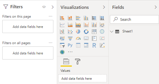
We will be using Filters, Visualization, and Fields to create different types of reports. These options are there in the Power BI windows Report tab at the right-hand side of the window, as shown below.
Once we upload the data in Power BI using any source, we can use the above-shown tools to create different types of reports. To create reports in Power BI, we need data. So you can download the excel workbook from the below link, which is used for this example.
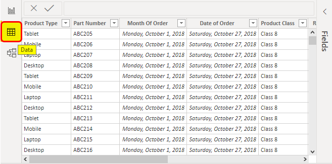
Here we have a sample sales data of some data of electronics product of around 1000 lines as shown below.

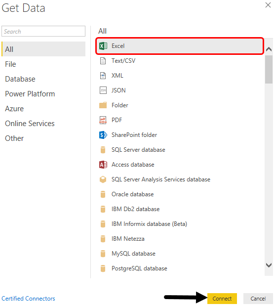
- Go to Power BI and click on the Get Data option as shown below.

- Select the type of database file we want to connect to Power BI. Here our data is in an Excel file. Then click on Connect to proceed further.
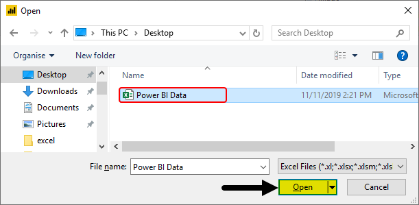
- Power BI will ask us to browse the file location. Do that and then Open it.
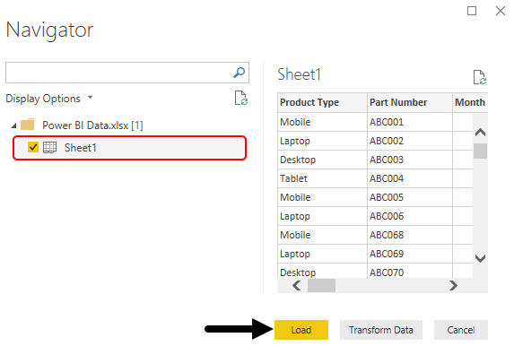
- We will see a navigator window. There check the box for the sheets which we want to load and then click on Load.
- After a moment, we will be able to see our data uploaded in Power BI under the Data tab.
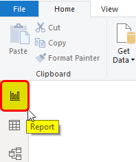
- Now to generate reports in Power BI, go to the Report tab.
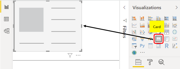
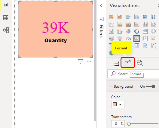
- The process of creating a Report in Power BI is like creating a Dashboard in Excel. Where we use different types of graphs and charts, let’s create our first chart of the report. First, we will select a Card from Visualization, as shown below.
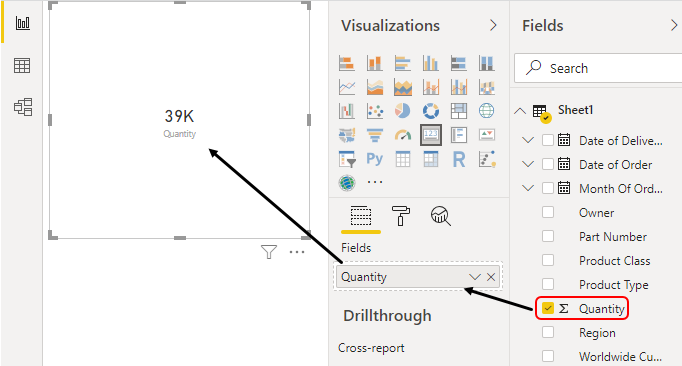
- Now in this, we will see overall how much quality of the product is sold. For this, select Quantity from the Fields section as shown below.
- To make this Card more attractive, we can change the Font and background color as well from the Format section below Visualization.
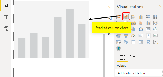
- Let’s create another visualization on the same page. Now we will select Stacked Column Chart.
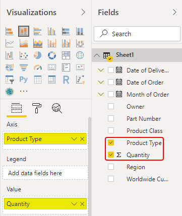
- Now, we will put the Product Type in Axis and quantity in the Values field to see which product is sold most.
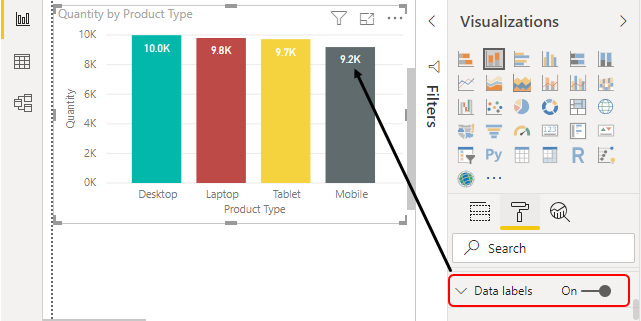
- This will give visualization, as shown below.
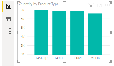
- To make it more attractive, we have changed the color columns from the Format option and included the Data labels.
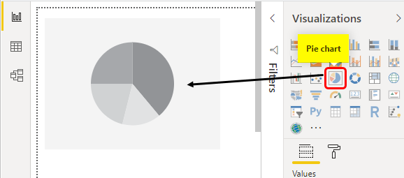
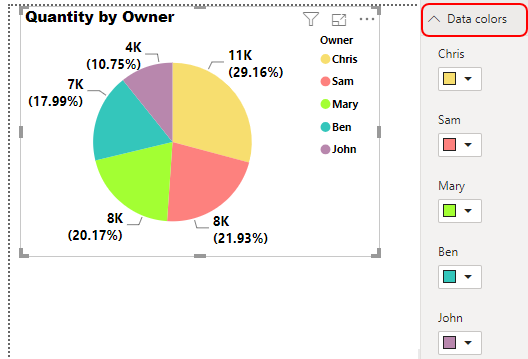
- Let’s create another chart. This time in the same sheet, we will create a Pie Chart where we will plot the Sales Owner wise graph and see which owner of the product has sold how many numbers of products. For this, select Pie Chart from visualization as shown below.
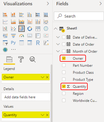
- Now, we will put the Owner in Legend and quantity in the Values field.
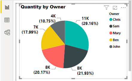
- We will see how easily our Pie Chart has been created.
- Now we will format the chart as per our requirements. We will now change the data color from the Format section.
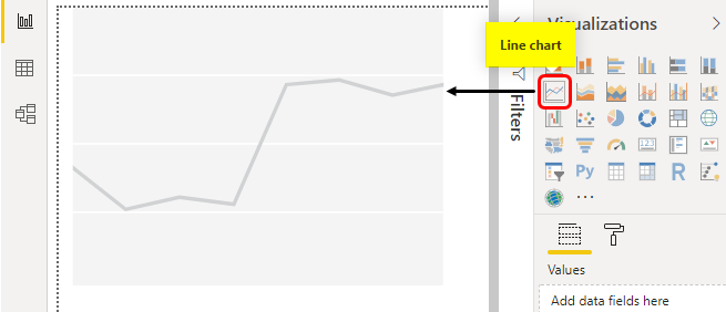
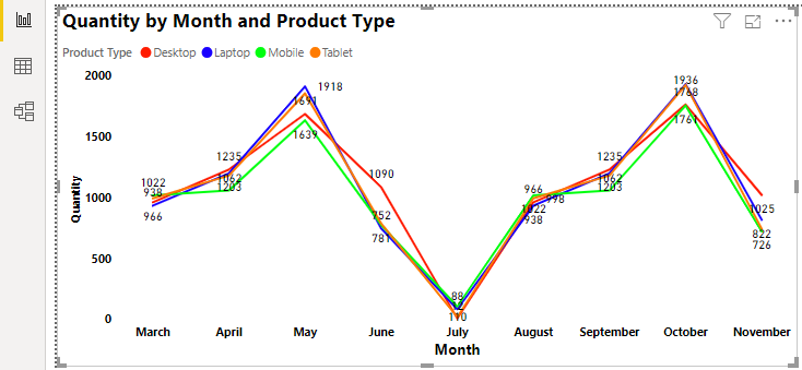
- Now we will plot a Line Chart. The line is way more effective when we want to show the trend and the kind of Trend we can easily show when we have such sales date of month-wise. To plot this, we will select the Line Chart as shown below.
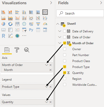
- Now select Product Type, Quantity and Month and when that sale happened, as we will be showing the trend of each product month wise.
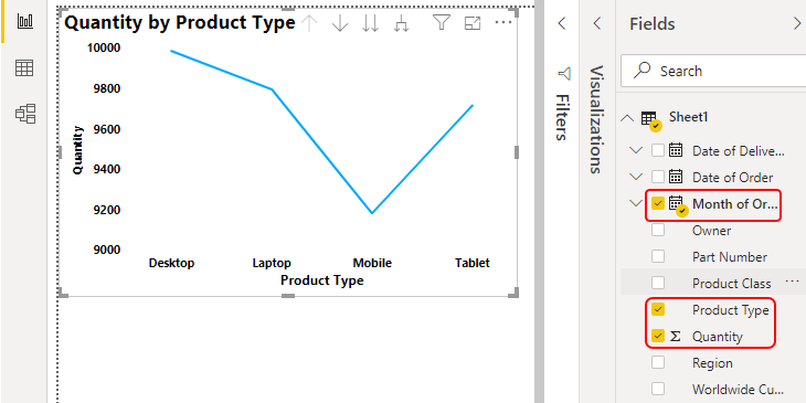
- We will put the month in Axis and Product type in Legend and quantity in Values from the field section.
- By doing this, we will be modifying the created Line chart for showing the trend of products sale like below.
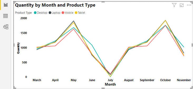
- The colors of the line are in the default theme. We will change the color of each trend line as per the color which we gave in the Stacked Column Chart. Also, we have added the data labels as well as shown below.
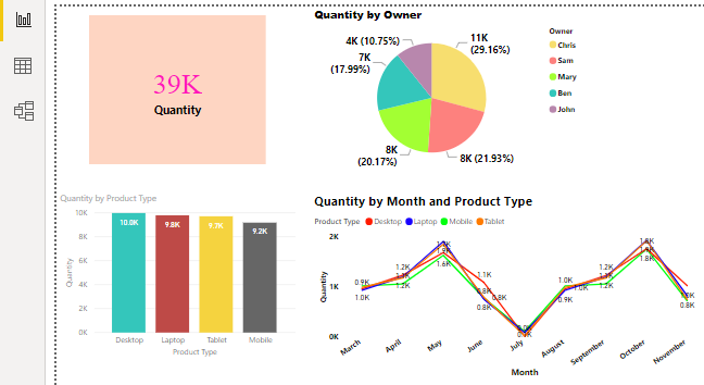
- This completes our Power BI Report on Sales Data which we have uploaded.
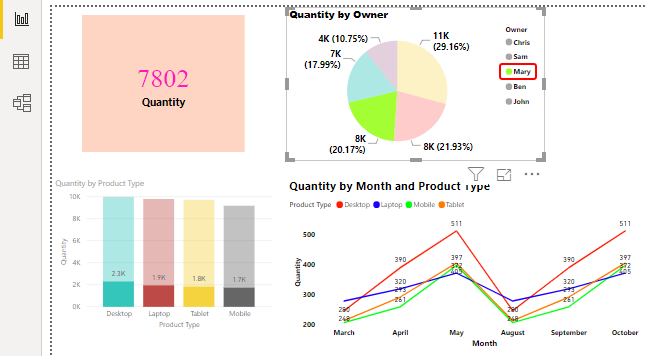
- Now let’s test whether the created reports work and filter the selected section or not. Let’s filter the Pie chart for the owner Mary. For this, just click on Mary in the Pie chart.
- We will see, the complete report got filtered with the data related to Mary. We can see, total quantities sold by Mary is 7802. And the product month 7802 also got filtered in the Stacked Column chart and Line Chart as well.
Pros of Power BI Reports
- We don’t have to link each table, tab, and chart with each other just to sink it. It gets automatically done.
- There are various types of graphs and charts other than those available in MS Office.
- It is very simple to use and create charts in Power BI. We just need to drag the fields into a relevant section.
- We can modify the data in Power BI itself.
Things to Remember
- We can use different pages with the same data which we upload in Power BI.
- It is recommended to modify the data in Power BI itself after uploading that into reports. By this, we can use inbuilt functions, formulas to change the value format and make complete data standard.
- Keep on saving the data once a milestone is reached, as it takes a little more time than it takes to save the data of excel.
Recommended Articles
This is a guide to Creating Reports in Power Bi. Here we discuss how to use charts and cards to create Reports in Power BI, along with a practical example. You may also look at the following articles to learn more –
- Power BI Dashboard vs Report | Top 8 Differences
- Power BI Tutorial For Beginners
- Comparison Between Power BI vs Excel
- What is Microsoft Power BI?
- How to Use Calendar DAX Function in Power BI?
- Power BI IF Statement
- Creating Sample Dashboard in Power BI
- Steps to Create Power BI Charts
- Guide to Types of Power BI Connections
