Updated August 24, 2023
Dashboard in Excel (Table of Contents)
Introduction to Dashboard in Excel
To create a dashboard in Excel, we must create a pivot table using the data. For each visual, we must have one single pivot table. After that, drag and place the pivot table and create a number of sheets as per need. Then, create different visuals using different chart types from the Chart section of the Insert menu tab once we have created and named each Chart. Once the charts are created then, cut all the charts from the respective sheet and place them in the sheet for the final dashboard. We can even insert the slicers as well for the final dashboard.
What is Dashboard?
A dashboard is a visual representation of data. It is a process in which you make all the efforts to make your complex data look easier to understand and manage through some visual techniques. Different Excel tools can be used to create a dashboard. Some of those are:
Bar Charts, Histograms, Pie Charts, Line Charts, Combo Charts, Pivot Table, Slicer, KPIs, etc. These are the tools used to create a dashboard and simplify the usually complex-looking data for understanding.
How to Create a Dashboard in Excel?
Let’s understand how to create the Dashboard in Excel with some examples.
Example #1 – Create a Dashboard using Data
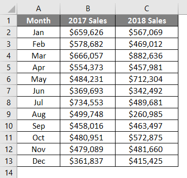
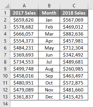
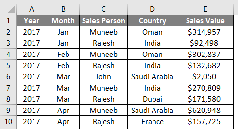
Suppose we have sales data spread across the months for the past two years (2017 and 2018). Next, we need to create a dashboard using this data.
We will add Data Bars for this data and see the comparison across the sales for the past two years. For that, follow the steps below:
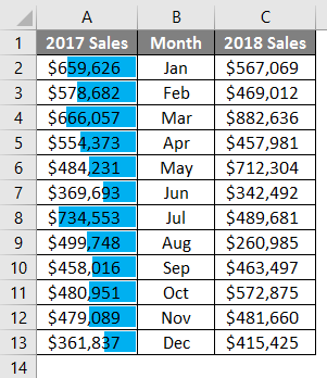
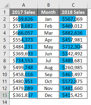
Step 1: Cut the column named 2017 Sales and paste it before the Month column to have a comparative view on both sides of the Month column. We will have 2017 Sales on the left-hand side, and on the right-hand side, we will have 2018 Sales data.
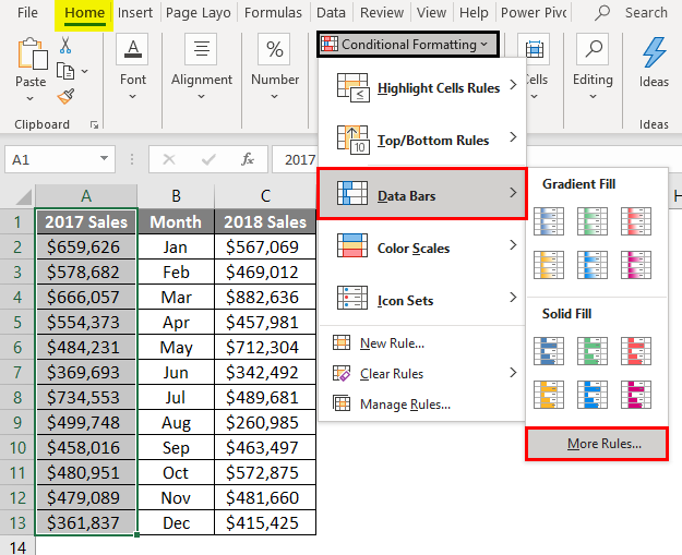
Step 2: Select all the cells in column A, go to the Conditional Formatting dropdown under the Home tab, and click the Data Bars navigation option. There, you’ll see a series of options for data bars. Out of all those, select More Rules and click on it.
Step 3: A “New Formatting Rule” window will pop up when you click on More Rules. You can define new rules for data bars or edit the ones already created.
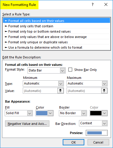
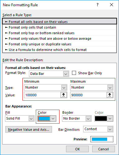
Step 4: You can see different rules available. Choose the one with the name “Format all cells based on their values” as a rule (It is selected by default as it is the first rule in the list). Then, under Edit the Rule Description: change the minimum and maximum values as shown in the screenshot below and the bar colors under Bar Appearance.
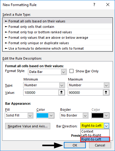
Step 5: Under Bar Direction, change the direction to Right-to-Left and press OK. You’ll see data bars added for 2017 Sales below.
You’ll see data bars added for 2017 Sales below.
Step 6: Do the same for 2018. Just make a change for Bar Direction: as Left-to-Right. It should look like the screenshot below.
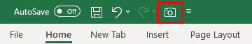
Now, we will use an Excel Camera tool to add the snap of this chart under the dashboard tab. The camera tool can be activated by clicking on File – Options – Quick Access Toolbar – choose a command from a tab -select All Commands – Camera option- Add and OK. Once enabled/added on the main ribbon, you can see a Camera button at the Quick Access Menu bar, as shown below.
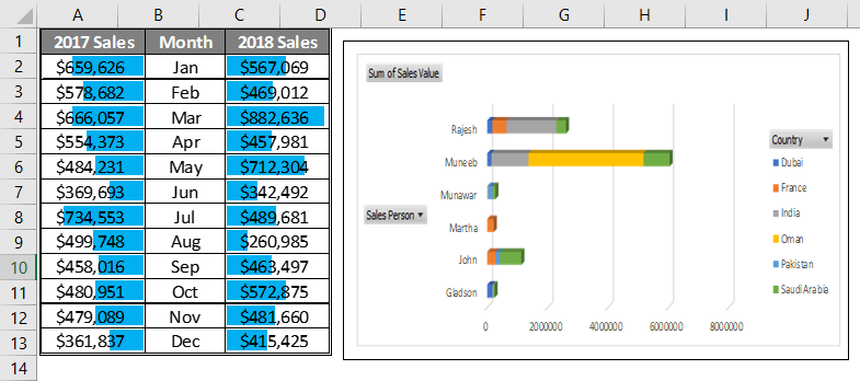
Step 7: Select the data across cells A1 to C13 in the Data tab from your Excel and click on the Camera button to take a screenshot of this selected data.
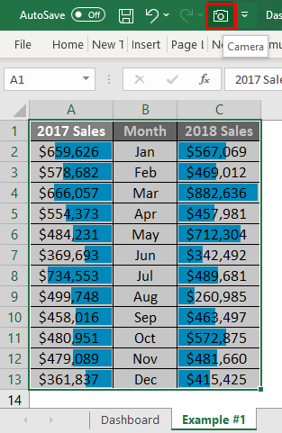
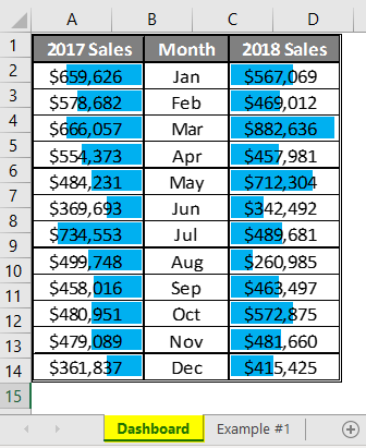
Paste it under the Dashboard tab.
Example #2 – Using Pivot Table in Excel Dashboard
Let’s take an example of the dashboard using Pivot Table.
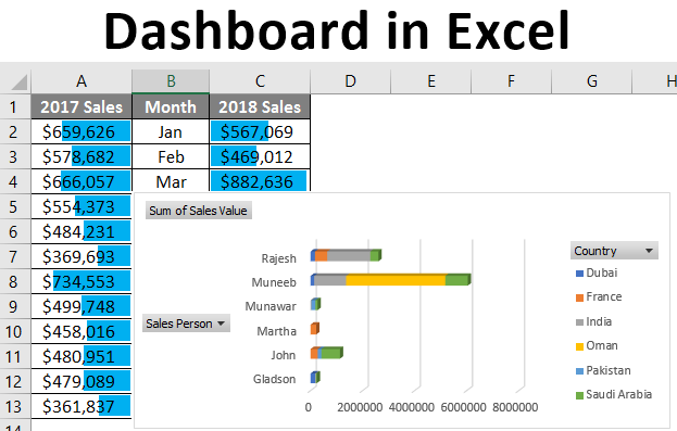
In this example, we will see how to add the pivot charts and slicers to the dashboard. Below is a screenshot of the data we will use for this example.
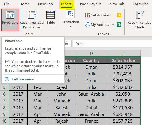
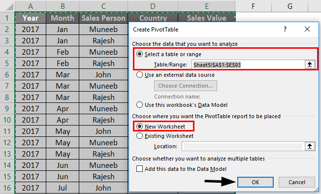
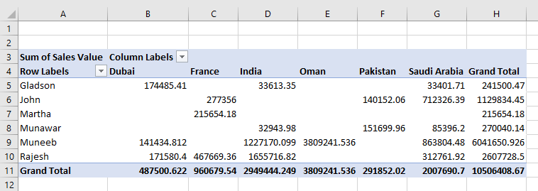
Step 1: Select all the data (A1:E93) and click on the Insert tab. Choose the PivotTable option in the list of options available to insert. It will open up Create PivotTable window. Select the New Worksheet for generating the Pivot table and click OK.
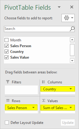
Step 2: Now, mold the pivot as per your requirement. I will add the Sales Person in rows, Country in columns, and Sales Value under the values section. See the layout of the pivot below.
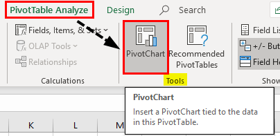
We will now add the pivot chart under our dashboard using this pivot table as a data source.
Step 3: Click the Analyze tab on the Excel ribbon and click the PivotChart option under the Tools section to see the variety of addable chart options.
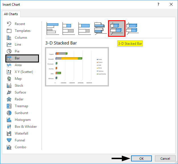
Step 4: When you click on the PivotChart option, you’ll see a series of chart options under a new window Insert Chart. Now, click the Bar button inside the Insert Chart option and select the 3-D Stacked Bar option for a stacked bar chart. Press the OK key once selected.
You’ll be able to see the 3-D Stacked Bar chart below.
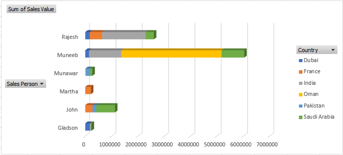
The best thing about pivot charts is that you can apply filters to the different column values and modify the graph in real time. For Ex. you can filter the country and salesperson names in the graph, which will update as per your selections. This makes your dashboard more compact.
Step 6: Select the Chart area and click the Camera button to capture it.
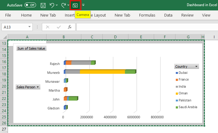
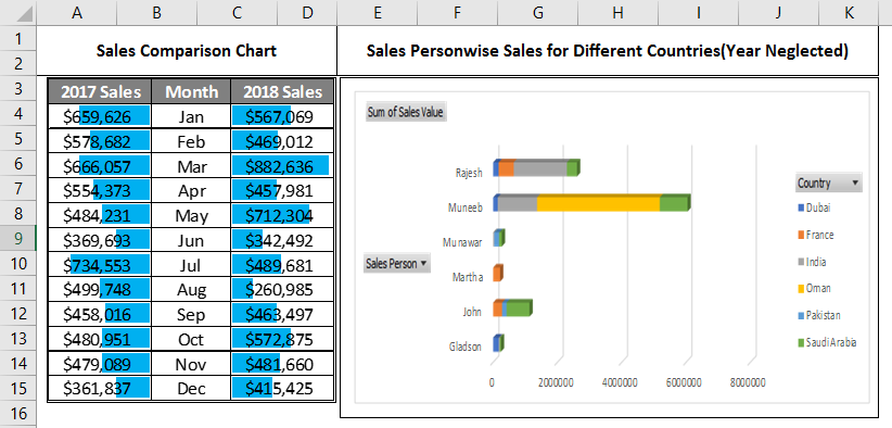
Step 7: Navigate to the Dashboard tab and put the snap at the desired location. Your dashboard should look like the screenshot below.
Step 8: Give the names of each screenshot for a better understanding of the user.
This is how we can create decent dashboards for management, and I have said this is the end of this article. Let’s wrap things up with some points to be remembered.
Things to Remember About Dashboard in Excel
- The dashboard is a great way to represent the data more only to understand the key parameters without looking into actual messy data.
- Using Excel’s Camera tool for creating a dashboard is a great way. The reason is that the camera tool references all the cells and is not only a snap. Therefore, whatever changes you make in the data and graphs will auto-reflect under the dashboard, and you don’t need to copy and paste graphs multiple times. This means it adds flexibility to the dashboard.
Recommended Articles
This is a guide to Dashboard in Excel. Here we discuss Dashboard and How to create a Dashboard in Excel, practical examples, and a downloadable Excel template. You can also go through our other suggested articles –
