Updated August 24, 2023
Contour Plots in Excel (Table of Contents)
Introduction to Contour Plots in Excel
Contour Plots are how you can represent the three-dimensional surface (having a length(X), Width(Y) and depth/volume(Z)) chart on a two-dimensional plane (i.e. in a plane with X and Y axis only). In this chart, lines are drawn for (x, y) coordinates where the response (z) values are occurring. Contour charts are similar to the surface charts that can be seen from above (any height) and are 2-D charts most of the time. A contour graph can be used when we have two predictors X & Y, which have an impact on the response variable Z. The values of Z in the graph are called contours. Contour graphs are frequently used in Cartography which is more associated with geocoding of the regions. However, it also has some utilization under different branches such as Astrology, Meteorology; in statistics, this type of chart is used to check the relationship between two predictors and response.
How to Create Contour Plots in Excel?
Contour Plots in Excel is very simple and easy. Let’s understand how to create the Contour Plots in Excel with some examples.
Example #1 – 2D Contour Graph in Excel
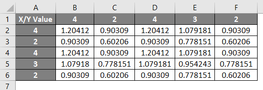
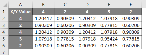
Suppose we are having data of X and Y values on which the Z value is dependent (sum of logarithms to the base 10 for each corresponding X and Y header value for each column and row start). See the screenshot below.
Step 1: To create a graph associated with your data, select all the data from A1 to F6.
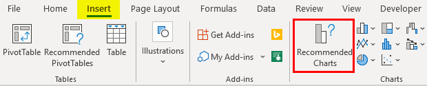
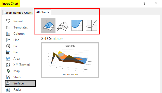
Step 2: Click on the “Insert” tab on the uppermost ribbon in the Microsoft Excel sheet and select the “Recommended Charts” option.
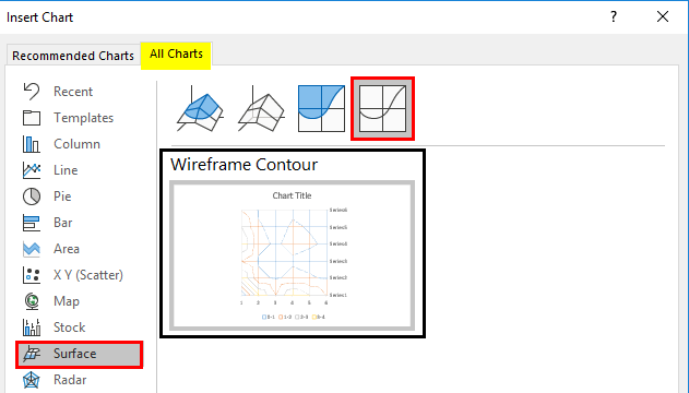
Step 3: Once you click the Recommended Charts option, it will open a new window named Insert Chart. There in that window, click on the All Charts option. A list of charts available under Excel will open up. Out of the different lists of charts, select Surface. Different types of surface charts (4 in number) will be visible.
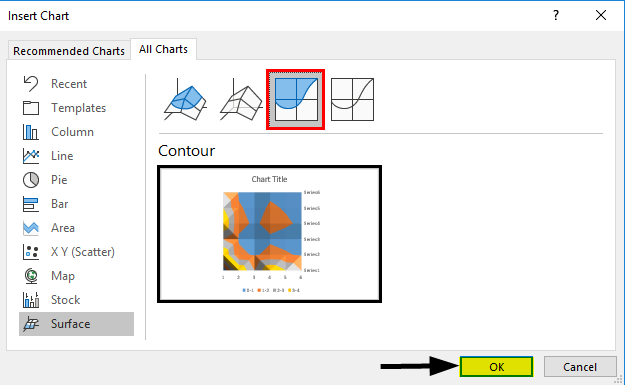
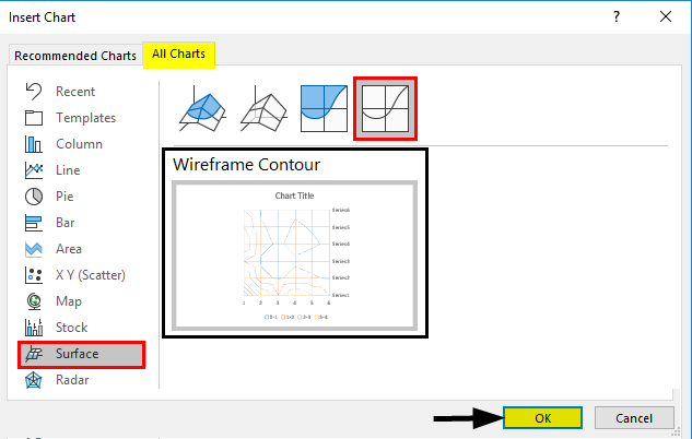
Step 4: Out of the 4 surface chart options available, click on the third contour chart. Once you click on that, you’ll see a visualization of your contour graph associated with the data selected. Click on the OK button to generate the graph.
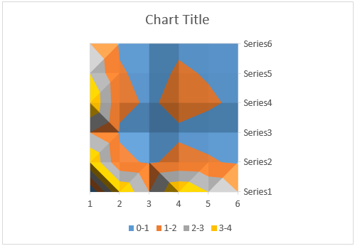
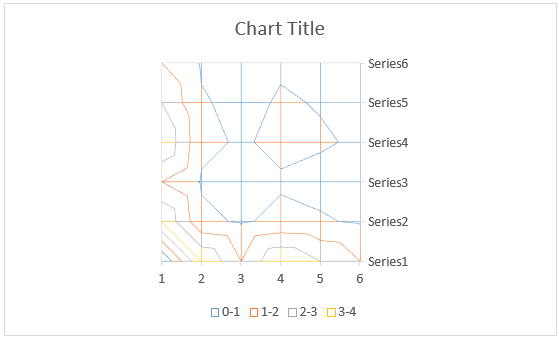
Step 5: Once you click the OK button, that’s it. Your chart is ready; you can see the layout shown in the image below.
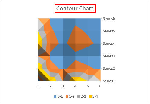
Step 6: Add a title to this chart as the Contour graph under the Chart Title section.
As every chart in Excel has, we have lots of customization available here for the contour graph as well. For now, we will change the color and style of this chart to make it look more decent.
Step 7: Click on the chart area, and a three-tab pane will appear on the right-hand side of the chart, as shown in the image below. Select the Chart Style icon (brush icon) out of those three.
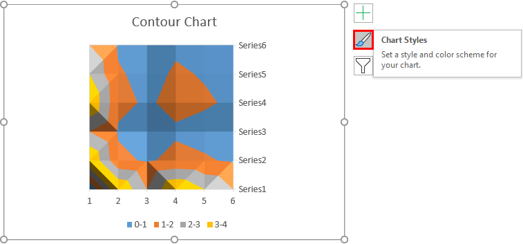
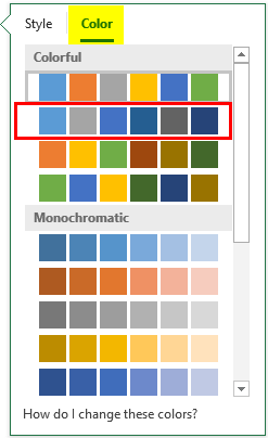
Step 8: Once you click that, you will see a pop-up bar with two options. One for style and the other for color. I will go to the color option and change the color of this chart.
Step 9: Once done, the contour graph should look like the image shown below.
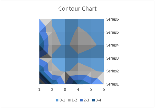
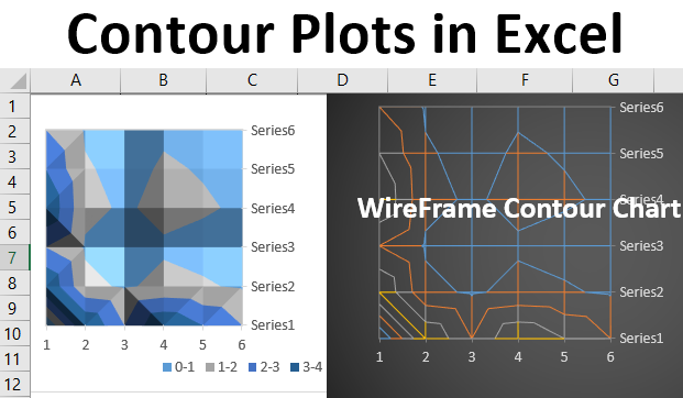
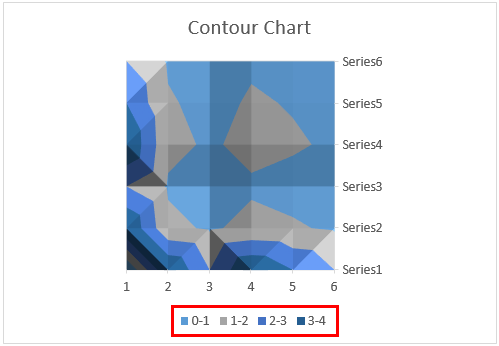
Step 10: In this chart, the colored area represents a specific range of values. You can also see the same in legends at the bottom of the graph.
Step 11: The lines visible are nothing but the interpolation points of X and Y values.
Example #2 – Wireframe Contour Chart in Excel
There is one other way to create a contour chart. Let’s see how:
Step 1: Consider the same data as used in the previous example.
Step 1: Click the Insert tab on the uppermost ribbon in Excel and select All Charts under the Recommended Graph section as we did in the previous example.
Step 2: Under All Charts go to Surface; you can see the four surface charts available. Out of those four, select the chronologically last chart (which appears on the rightmost pane). You will also see a layout of the contour graph.
Step 3: If you are happy with the graph layout, please click OK at the bottom of the Insert Chart window.
- Once you click the OK button, you can see a graph layout below.
Step 4: Add Wireframe Contour Chart as a title under the Chart Title area for this graph.
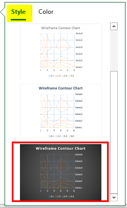
Step 5: In the same way we did in the first example, we can also change the wires’ color in this chart. Click on Chart Area, and a pop up with three tabs will appear on the right side of the graph. There, click on the Chart Style option, which allows you to change either the contour style, color, or both.

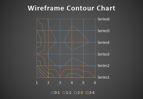
Step 6: Change the graph style in the image below under the Style option for better visualization.
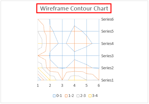
- Your graph should look like the image shown below.
As you could have noticed, Wireframe Charts only provide a mesh of lines (wires) and not the color bands used under Contour Chart (That is why it is called Wireframe Contour). This makes Wireframes difficult to read. Therefore, regarding the contour charts, I recommend using the Contour instead of the Wireframe. It will be visually more appealing, and the color bands will make it easier for the user to understand the value relationships. This is from this article; let’s wrap it up with some things to remember.
Things to Remember About Contour Plots in Excel
- Contour Chart is used to show the 3D surface area in the 2D top view using a different brand of color.
- It can be used when the categories and series are both numeric.
Recommended Articles
This is a guide to Contour Plots in Excel. Here we discuss How to Create Contour Plots in Excel, along with practical examples and a downloadable Excel template. You can also go through our other suggested articles –
