Updated August 24, 2023
Candlestick Chart in Excel (Table of Contents)
Introduction to Candlestick Charts in Excel
If you are unfamiliar with the Candlestick chart in Excel, it is a chart you can use to represent the stock data in Excel. Analyzing stock data in a simpler manner is a big task. Because you always will have a lot of history getting generated. Fortunately, Excel has inbuilt stock charts of different types for this purpose. One of those charts is the Open-High-Low-Close chart, also known as the Candlestick chart. This chart is usually helpful in describing the stock, currency, capital, and derivatives movements over time. It allows the user to have a clean, simple, visually attractive output that is also easy to understand. This graph allows you to have an analysis of stock and price patterns.
There are two types of Candlestick chart in Excel:
- Open-High-Low-Close chart: It is a conventional candlestick chart that uses stock values arranged in order as Opening value, Highest Value, Lowest Value, and Closing Value.
- Volume-Open-High-Low-Close Chart: This chart is similar to the first one. However, it adds the stock volume under graphical representation for better visualization output.
How to Create a Candlestick Chart in Excel?
Candlestick Chart in Excel is very simple and easy. Let’s understand how to Create Candlestick Chart in Excel with some examples.
Example #1 – Candlestick Chart
Now, we will see how to create a conventional Open-High-Low-Close stock chart, a.k.a. Candlestick chart.
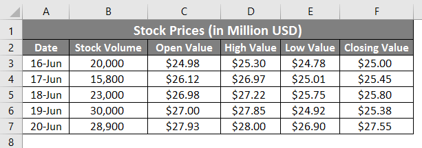
Suppose we have data as shown in the given screenshot below. This data consists of an opening, highest, lowest, and closing value for stock in US dollars.
Now, we will see how we can create a candlestick chart using this information step by step:
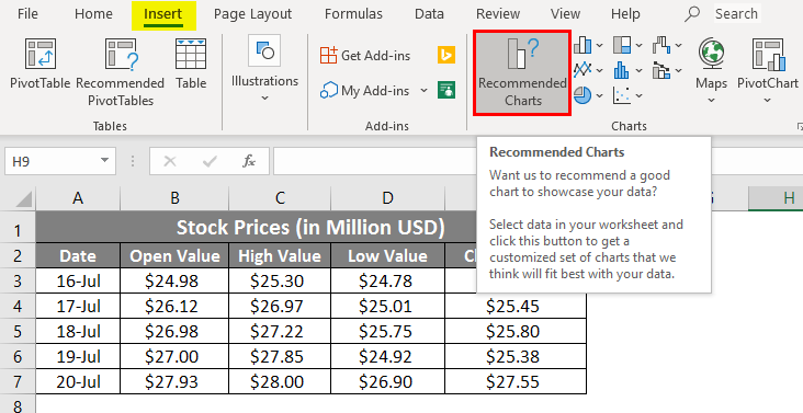
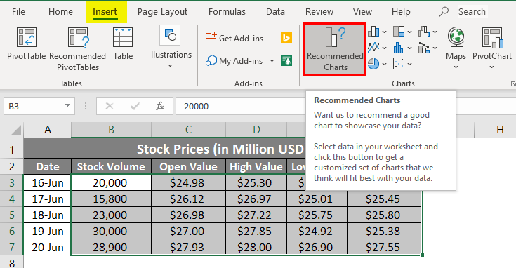
Step 1: Click on the Insert tab on the uppermost corner of the ribbon. Select Recommended Charts under it.
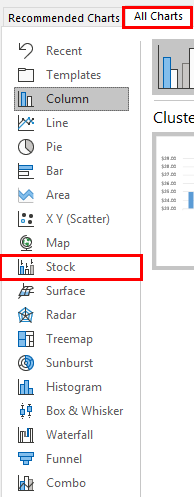
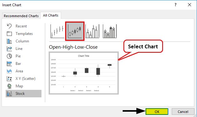
Step 2: Once you click Recommended Chart option, it opens up with a list of charts suitable for your data. Click on the All Charts option to see all the charts listed. Select Stock in the leftmost corner. It has all the charts associated with stock data.
Step 3: On the right-hand side, you’ll see all recommended charts under the stock charts section. Select the Open-High-Low-Close chart under it, which is nothing but a second graph out of four.
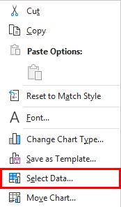
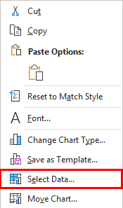
Step 4: After doing this, right-click on the graph layout and choose the Select Data option from the list of options.
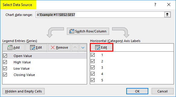
Step 5: A new pop-up window named Select Data Source will appear. In this window, on the right-hand side, go to the Edit option under Horizontal (Category) Axis Labels.
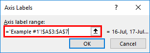
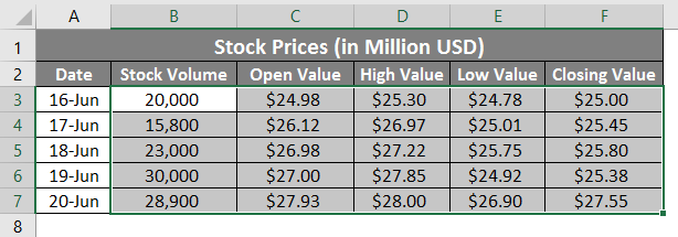
Step 6: A new dialog box called Axis Labels will appear. Under” Axis label range:“, select the range of data that you want to be under the axis. In this example, select A3:A7
Step 7: Click the OK button twice, once for Axis Labels and the second time for the Select Data Source window. Add the chart title as “Candlestick Chart” under the Chart Title option on the graph generated. You should be able to see the graph output as below.
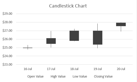
As you can see, this chart has boxes with lines extending upwards and downwards the boxes. If the box is empty, the opening value is the same as the lower value for the stock, and you ideally have gained in your stocks. If the box is filled, the opening value is nothing but the stock’s upper bound/high value, and you ideally have been at a loss.
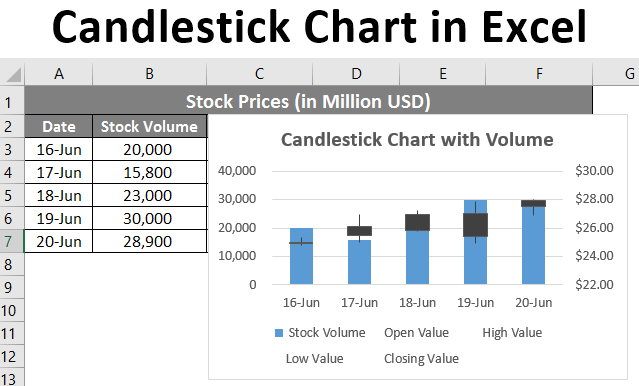
Example #2 – Candlestick Chart with Volume
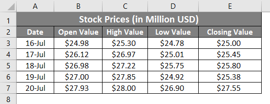
Suppose you have data as shown below, which contains volume traded for stocks, opening value, highest value, lowest value, and closing value.
We will see how to create a candlestick chart from this data with volume.
Step 1: Select the data from cell B3:B7 that must be included in the chart.
Step 2: Click on the Insert tab on the uppermost corner of the ribbon. Select Recommended Charts
Step 3: On the right-hand side, you’ll see all recommended charts under the stock charts section. Select the Volume–Open-High-Low-Close chart under it. Last graph in the list.
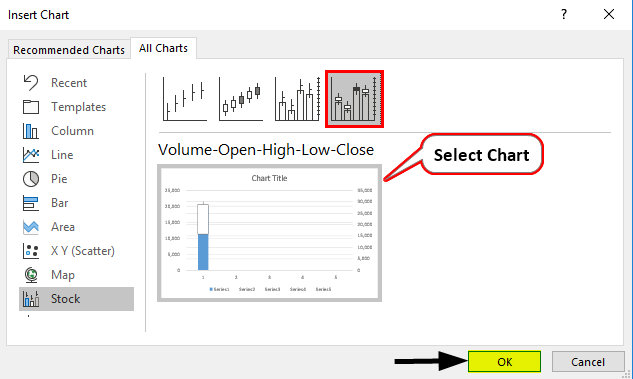
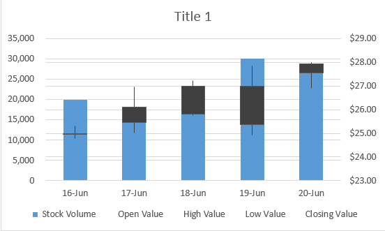
Step 4: Hit the OK button, and you will be able to see the initial graph layout as below.
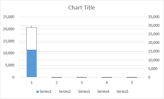
Don’t get confused with the layout. It’s halfway done. We are yet to add the axis labels under it and format the same.
Step 5: Right-click on the graph layout and choose the Select Data option from the list of options.
Step 6: A new pop-up window named Select Data Source will appear. In this window, on the right-hand side, go to the Edit option under Horizontal (Category) Axis Labels.
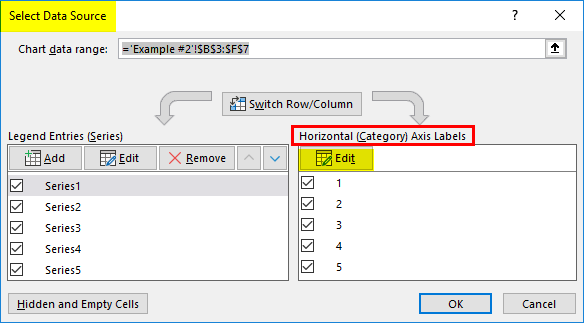
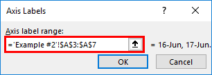
Step 7: A new dialog box called Axis Labels will appear again. Under” Axis label range:“, select the range of data that you want to be under the axis. In this example, select A3:A7.
Step 8: Click OK twice, and you should be seeing the graph layout below:
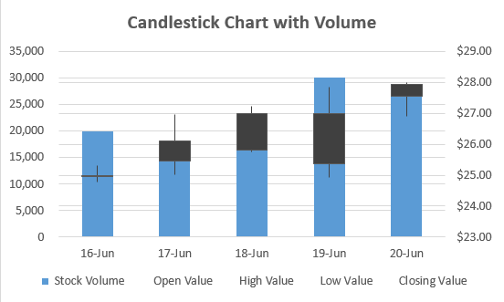
Step 9: Change the chart title to “Candlestick Chart with Volume” and save the sheet.
This is how you create the Candlestick chart in Microsoft Excel with stock data for better visualization, which is from this article on how to create the Candlestick Chart in Microsoft Excel. Let’s wrap the things with some things to be remembered.
Things to Remember About Candlestick Chart in Excel
- It is necessary to put your data column-wise in sequences. As for Candlestick Chart, the sequence in which data should be added in columns is Date, Open Value, High Value, Low Value, and Close Value. The same is the case for Candlestick Chart with volume. If the data is not sequential, you cannot add the chart. Ideally, the chart’s name indicates the sequence of the data to input.
- In Excel, a Candlestick chart is also known as an Open-High-Low-Close chart or Volume-Open-High-Low-Close chart. These are the conventional names for the graphs, and Candlestick Chart is the name used because the graph looks like candlesticks standing tall on the surface.
- Every box has elongated tales with them. These help determine whether the stock value is going up or down, and eventually, you are making money or losing the same.
- This chart is pretty simple to understand, and with the naked eye, the user can decide whether the stock is moving up or down.
Recommended Articles
This is a guide to Candlestick Chart in Excel. Here we discuss How to Create Candlestick Chart in Excel, practical examples, and a downloadable Excel template. You can also go through our other suggested articles –
