Updated August 24, 2023

Plots in Excel (Table of Contents)
Introduction to Plots in Excel
Plots are charts and graphs used to visualize and interpret data so that values for two variables can be represented along the two axes (horizontal axis, i.e., the x-axis, and vertical axis, i.e., the y-axis). Plots are scatter charts that show a graphical relationship between two variables.
Scatter plots display the two data sets’ values using the Cartesian axes or coordinates.
In MS Excel, some layouts that are available for scatter plots are:
- Simple Scatter plot.
- Scatter with smooth lines and markers.
- Scatter with smooth lines.
- Scatter with straight lines and markers.
- Scatter with straight lines.
- Bubble chart.
- 3-D Bubble chart.
We can interpret the scatter plots in the following manner:
- If the data points on the plot look like they are randomly scattered, then it implies no correlation between the two variables.
- The correlation between two variables is strong if the data points are concentrated around a line on the plot.
- If the data points on a plot are spread widely on the plane, then it implies that the correlation between two variables is weak.
- The correlation between the two datasets is positive If the data points’ pattern on the plot goes from lower left to upper right.
- The correlation between the two datasets is negative if the data points’ pattern on the plot goes from upper left to lower right,
Examples of Plots in Excel
Lets us discuss the examples of Plots in Excel.
Example #1 – Simple Scatter Plot
Suppose there is an interrelated dataset where we have some people’s monthly salaries and expenditures. Now the relation between salary and expenditure can Plott in Excel with the help of a scatter plot.
We have the following data on monthly salaries and expenditures in an Excel file:

To create a scatter plot for this data in Excel, you can follow the following steps:
- Select the dataset and click on the ‘Insert’ tab. Now select ‘Scatter Chart’:

- With this, we will have the data plotted as follows:


Now the chart title can be changed by double-clicking on it and then renaming it:

- Now right-click on the scatter lot -> Click on ‘Select Data’:

- On doing this, we will get a popup window:

- In the resulting window, select ‘Salary’ in the ‘Legend Entries’ section, then select Remove.

- Now in the section ‘Legend Entries’, select ‘Expenditure’ in this window, and choose ‘Edit’:

- With this, we will have a popup window for the edit series:

- Now in this ‘Edit Series’ window, select the ‘Salary’ range under ‘Series X values:

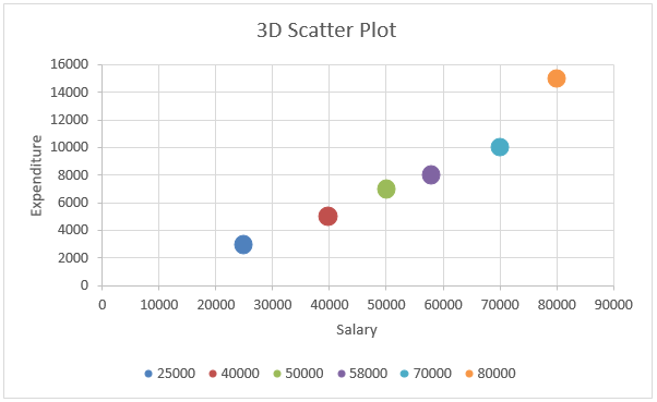
- This will finally generate the below scatter plot:

- Now right-click on any data point or dot) -> Select’ Format data Series’:

- With this, we will have a ‘Format Series’ dialog box. In this, click on ‘Effects’ and choose ‘3-D Format’:


- Now under ‘3-D Format’, select ‘circle’ type top level:

- Now in the ‘Format Series’, choose ‘Fill & Line’ and select ‘Marker’:

- Expand the ‘Fill’ option in the ‘Marker’ section -> Select’ Vary colors by point’:
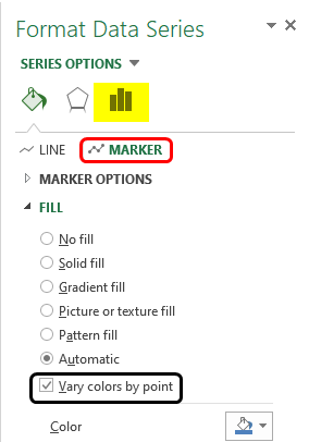
With this, each dot or data point will be represented with a different color
- Now expand ‘Marker Options’ in the ‘Marker’ section. Choose ‘Built-in’ and then increase the value of size:
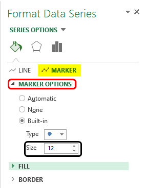
With this, the data points’ size will be increased.
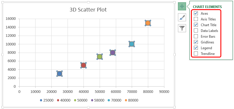
- Now on the right of the plot, click on the ‘Plus’ icon to open the ‘Chart Elements’ dialog box:
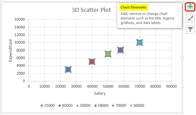
- Now checkmark’ Axis Titles’ in the ‘Chart Elements’ dialog box. In doing this, we will have an ‘Axis Title’ textbox on both axes. (horizontal and vertical
<img class=”alignnone size-full wp-image-343071″ src=”https://www.educba.com/academy/wp-content/uploads/2020/04/Axis-Title.png” alt=%2
